
Design patents seem simple on the surface. You protect how something looks. Easy, right? But the moment you dive into the real process, you hit the word that causes more confusion than almost anything else: obviousness.
Most founders, engineers, and builders hear that word and feel stuck. “How can a design be obvious?” “Obvious to who?” “What does an examiner even look for?” These questions pop up again and again, because design-patent obviousness works differently from utility-patent obviousness. And if you don’t understand how examiners think, you risk wasting time, losing protection, or having someone copy your look and get away with it.
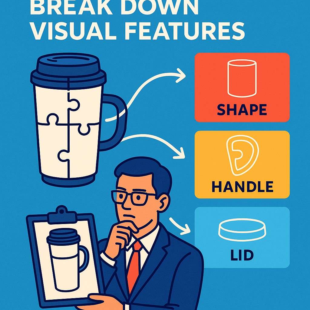
How Design Examiners Break Down Visual Features
A design examiner never looks at your product the way you do. You see the whole thing at once. You see the story behind it, the engineering choices, the reasons for the shape, the feel, the market you’re building for. But an examiner breaks it apart piece by piece.
They do not care why you made it. They care only about what the eye sees and whether someone skilled in the field would think those visual choices feel too close to something that already exists.
To understand how obviousness works in design patents, you need to understand how examiners take in a design. They move slowly, almost like they’re zooming in on different parts of the same picture. They study how those parts play together.
They look at proportions, angles, curvatures, transitions, and the overall vibe of the design. They do not make quick judgments. They compare. They match patterns. They look for anything that feels routine or predictable.
Once you see how examiners think, you can design and write your application in a way that guides their eyes, not just their rules. This is where founders and engineers can gain massive leverage.
When you understand the mental path the examiner follows, you can shape your drawings, language, and strategy so your design stands out as intentional, not accidental. And that difference matters a lot more than people realize.
How Examiners Use Shapes, Edges, and Proportions to Form a First Impression
When an examiner first sees your design, their brain starts categorizing it. They look at the silhouette before anything else. The silhouette is the simple outer shape that the eyes catch first.
If the silhouette feels too familiar, the examiner becomes more skeptical from the start. This doesn’t mean you’re doomed. It simply means the examiner will look deeper to see if your “familiar” shape carries unique visual decisions.
After the silhouette, they move into edges and surface features. They examine how a curve softens. They look at where a line begins and where it ends.
They check whether transitions look natural or forced. These tiny details can be the difference between a clear design leap and a design that feels predictable.
This is why your drawings matter so much. The cleaner the drawings, the easier it is for the examiner to notice what makes your design different.
The key for businesses is understanding that you cannot rely on broad ideas. You must highlight the specific visual moves that make your design feel new.
If your product has a unique taper, or a carved-out channel, or a shifted symmetry that adds new style or functionality, you should lean into it.
Designs that show intentional shifts in shape usually have a much easier time with obviousness rejections.
Why Examiners Compare the “Feel” of Your Design Before the Details
Design examiners do something subtle but very powerful. They judge the overall feel before they judge the parts. This means if a design gives off a familiar vibe, the examiner will dig deeper to see if the differences are meaningful or trivial.
The feel isn’t about function. It’s about visual impression. This is why two designs can have different parts yet still feel the same.
Founders often make the mistake of assuming that small differences will save their design. But examiners are trained to ignore small, decorative tweaks unless those tweaks shift the entire impression. If the vibe stays the same, the design will be treated as obvious.
This is why your patent drawings should make the key changes obvious at first glance. Do not hide the important parts. Do not downplay the big features. Bring them forward.
If you want a strategic advantage, think about the examiner’s first emotional reaction. Does your design feel sharper, smoother, chunkier, lighter, more futuristic, or more refined than anything close to it?
That emotional difference is often the anchor that helps the examiner see the specific details more clearly.
How Businesses Can Use Examiners’ Thinking to Their Advantage
Businesses gain a massive edge when they plan ahead. You should never wait until the last minute to figure out how to present your design. Start documenting the exact visual decisions your team made and why you chose one shape over another.
Even though your explanation will not appear in the final design patent, it helps you prepare the right angles, the right drawings, and the right emphasis.
When you understand how an examiner studies a design, you also start designing your own product with more clarity. You become more intentional about the curve that makes your product yours.
You begin noticing when a small visual change transforms the entire vibe. You also avoid the trap of adding random details that don’t actually move the design into new territory. Examiners see those tricks instantly.
If you want to think like an examiner, ask yourself a simple question whenever you finalize a design: if someone removed your logo, your colors, and your styling, would your product still look uniquely yours?
If the answer is yes, your design is on strong ground. If the answer is no, you may need deeper changes before filing.

This is also why many startups use PowerPatent to avoid getting stuck. The platform helps you capture the core of your design clearly, with real patent attorneys checking your work so you do not miss the elements that make your design stand out.
If you want more clarity on how the process works, you can explore it here: https://powerpatent.com/how-it-works.
How Examiners Treat Familiar Elements Within a New Design
You are allowed to use familiar elements. In fact, almost every design reuses some shapes that have existed in the world for decades. The key is how these familiar pieces come together.
Examiners look at combinations. They ask whether those combinations feel fresh or routine. A familiar body shape with a radical edge treatment may be new enough.
A common handle with a redesigned grip structure may stand out. A simple object with a unique taper or proportion can feel instantly different.
Examiners don’t need your whole design to be groundbreaking. They need the final look to be more than a predictable rearrangement of old ideas. That’s why the composition of the design matters so much.
You should be aware of what’s already out there in your space. You should know what your customers have seen again and again. And you should ask how your design breaks the pattern in a way that is clear on the page.
This is where founders often underestimate the power of subtle geometry. A slight shift in thickness. A new rhythm in spacing. A distinctive curve that shows up across the product line.
These decisions add up. They guide the examiner’s eye. They help the examiner see your design as a full story rather than a remix of known shapes.

If you want a tool that helps you capture those visual stories more precisely, PowerPatent makes it easy to turn your real designs into clean drawings backed by attorney review. You can explore how it works anytime at https://powerpatent.com/how-it-works.
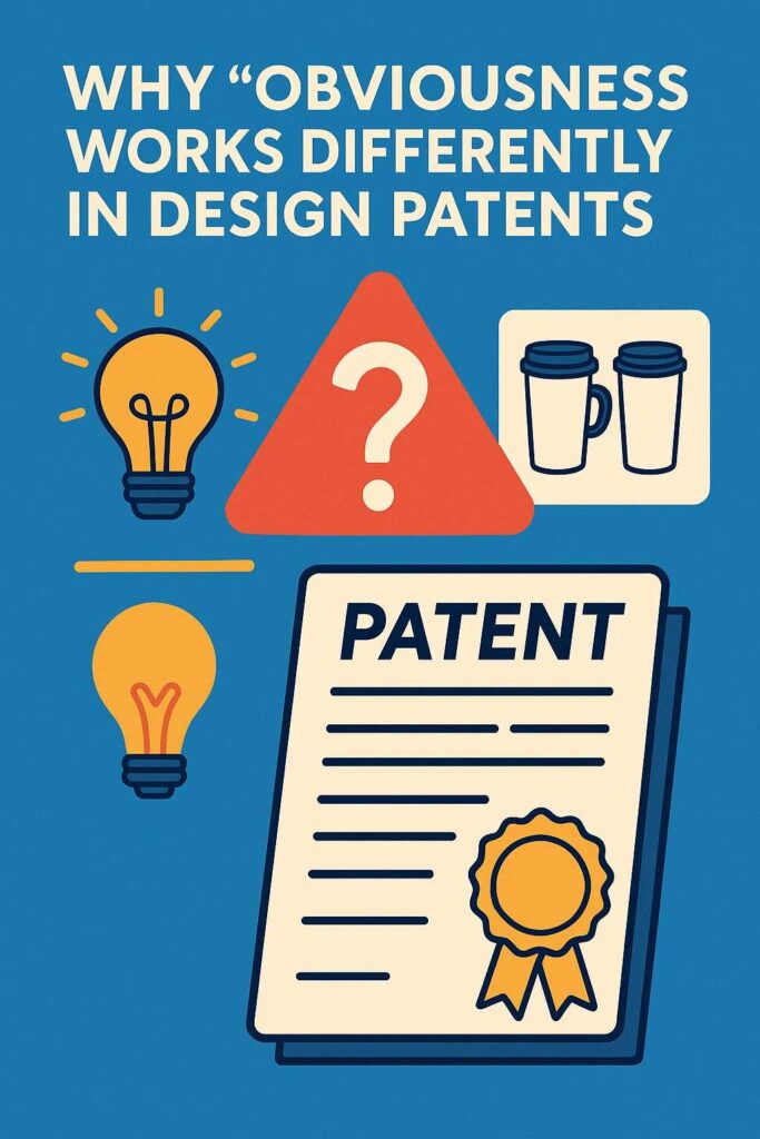
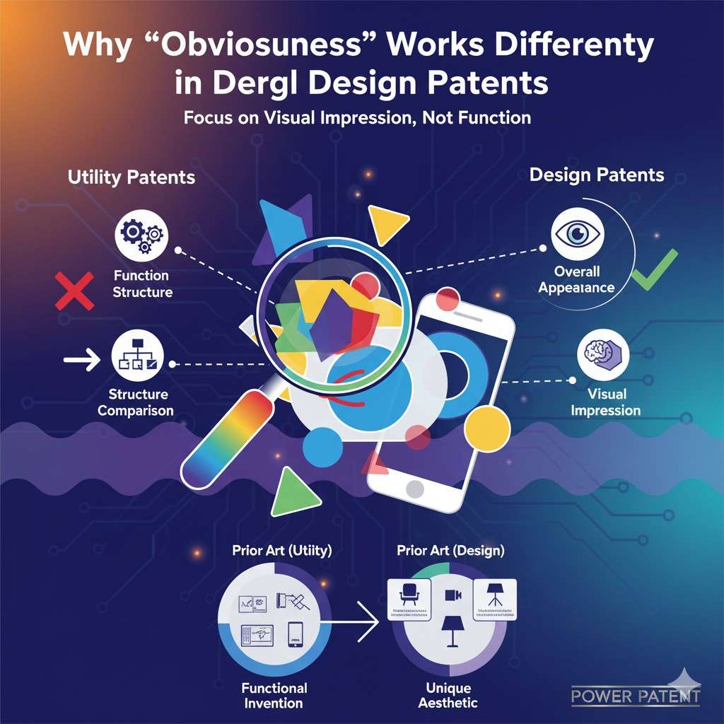
Why “Obviousness” Works Differently in Design Patents
Most founders get confused the moment they hear that obviousness in design patents does not follow the same rules as obviousness in utility patents.
The word is the same, but the test is completely different. In design patents, examiners are not looking for technical steps, mechanical functions, algorithms, or engineering leaps.
They are looking only at what the eye sees. Every decision they make is rooted in visual impression, not function. This is why so many teams misjudge the strength of their design.
They assume that because their product works differently, the design should be safe. But design protection does not care about the inner story. It cares only about the surface story.
Understanding this difference can help a business protect its brand look much more effectively. Many teams discover too late that their design patent was rejected not because the product lacked value, but because the drawings failed to make the visual differences clear enough.
Obviousness in design patents lives in the details, but not the kind of details engineers usually think about.
It lives in the way lines connect, the way surfaces flow, the way proportions feel. These small design choices can speak louder than advanced engineering under the hood.
Why Examiners Look for Predictability in Visual Decisions
A key factor in design obviousness is predictability. Examiners are trained to ask whether the design choices you made would naturally occur to a skilled designer given what already exists.
This is not about copying. It is about what feels like the next expected move in the field. For example, if most products in your space already use a tapered bottom, and your design has a similar taper with only slight changes, the examiner may feel that the change was expected.
But if your design shifts the taper in a new direction or gives the shape a new rhythm that changes the overall impression, the examiner may see it as a true visual step forward.
This is where many founders run into trouble. They assume that a small twist or decorative adjustment proves novelty. But the examiner is not looking for small adjustments. They are looking for meaningful changes that shift the whole impression.
An expected design choice is almost always seen as obvious because it looks like something any skilled designer would try. A non-expected choice forces the examiner to pause and look again. That pause is where your advantage begins.
From a business standpoint, this means every major product you launch should carry at least one or two unmistakable visual choices that do not feel routine.
You do not need wild shapes. You just need intention. When your design choices carry intention, examiners have a much harder time claiming obviousness.
How Examiners Judge Combinations of Known Elements
A design made of familiar pieces can still be new. Examiners know this. They see it all the time. What matters is how those pieces are arranged and how they work together.
If the arrangement feels routine, the design becomes vulnerable. But if the arrangement produces a new impression, even when using common components, the design has real strength.
Imagine a product with a body shape everyone recognizes, like a simple cylinder. If you add a new edge treatment, a distinctive break, or a proportion shift that changes how the cylinder feels in space, the examiner may see it as a non-obvious combination.
But if all you add is a small curve or a minor decoration, the core feeling may stay the same. When the feeling stays the same, examiners often rule the design obvious because the familiar parts blend into a familiar whole.
The same rule applies across many industries. Consumer electronics, tools, home goods, medical devices, packaging, wearables, and even software hardware shells tend to evolve through small, expected steps.
If your design follows the same steps everyone else is taking, the examiner will feel that familiarity instantly.
But if your design jumps sideways rather than forward, the examiner recognizes that you are not simply following the line of evolution. You are changing the pattern.
This is why businesses that think strategically about design early gain more protection later. A small design decision made while still in prototyping can turn a predictable design into something that stands out visually.
It can be as simple as changing the way two surfaces meet or shifting the balance of the object in a way customers notice instantly.
Why the Overall Impression Still Rules Everything
Even though examiners study small details, they always return to the overall impression. They treat the design as a whole picture. If the final impression feels too close to a known design, the entire application can fall apart.
This means your job is not only to have differences but to make those differences visible in the final drawings. The examiner will not guess what you meant. They only look at what you show.
Businesses often forget that customers experience the overall impression the same way examiners do. A strong design patent forces you to think about what makes your visual identity truly yours.
It pushes you to define your brand through shape, not just logo or color. That clarity helps you protect your look across generations of products. It even helps you enforce your rights when someone tries to copy you with slight alterations.
Because the overall impression carries so much weight, founders should think about design cohesion early. Are your changes scattered and minor, or do they guide the eye?
Do the visual choices work together in a way that feels intentional? And does your design own a look that your competitors cannot imitate without making the same impression?
This is also where PowerPatent becomes extremely helpful for teams moving fast. The platform streamlines the capture of your true design impression and helps you prepare drawings that highlight what matters most.

Real attorneys also review your work, which means you avoid the traps that cause examiners to misread your design or overlook the decisions that make your product unique. You can see how the process works here: https://powerpatent.com/how-it-works.
How Businesses Can Plan for Non-Obvious Visual Decisions Before Filing
Most companies accidentally treat design as an afterthought. They finalize shapes late in the process, then scramble to protect them. This timing makes it harder to avoid obviousness problems because the design has already hardened.
But the best teams make design decisions with protection in mind. They ask from the start what sets the visual identity apart in a way the eye will catch instantly.
When you know obviousness hinges on visual predictability, you begin designing with more purpose. You look at competing products not to copy them but to learn where the visual gaps are.
You choose shapes not just because they look good but because they push the category forward. You pay attention to signature lines, anchors, and transitions. You treat the design as a core part of your brand asset rather than an afterthought.
This mindset is extremely valuable in fast-moving markets. A unique design becomes a powerful moat.
Even if your competitors catch up in function, they cannot legally match your look if your design patent is strong. It also makes your marketing easier because customers recognize your brand in the product silhouette itself.
And because investors love companies with defensible assets, a well-positioned design patent becomes a quiet strength behind your growth story.
If you want to make sure your design is captured cleanly, framed correctly, and reviewed by someone who understands how examiners think, PowerPatent can help you avoid the most common design-patent mistakes. You can explore the full process here: https://powerpatent.com/how-it-works.
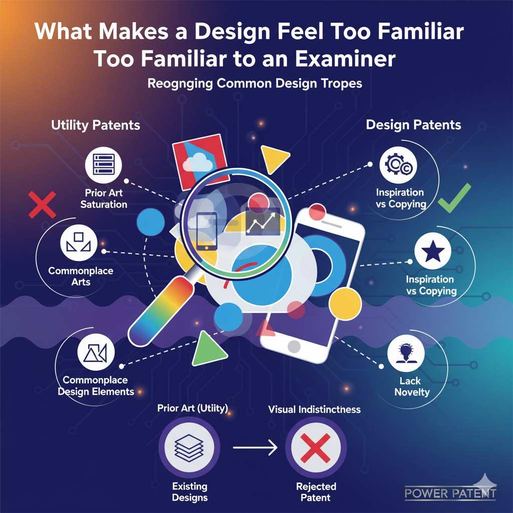
What Makes a Design Feel Too Familiar to an Examiner
A design examiner does not need exact copies to reject something as obvious. They only need to feel that your design sits too close to what already exists. This feeling comes from years of training where they study patterns, shapes, and design trends in the field.
When a new design lands on their desk, they instinctively scan it for signs of familiarity. They look for silhouettes that echo past products. They look for surface patterns that repeat what has already been done. They even look at how your design fits into the natural evolution of the category.
If the examiner senses that your design follows the same steps others have taken, the design becomes vulnerable. This does not mean your design is unoriginal. It simply means your drawings did not communicate the leap clearly.
Many founders underestimate how subtle familiar elements can be. Two designs can differ in features but still feel visually close. That feeling is what triggers the obviousness concern.
When you understand how familiarity works in the examiner’s mind, you start crafting your design and drawings with more clarity.
You start thinking about what truly makes your product look different, not just what makes it work differently. And that change in perspective can dramatically increase your chances of success.
How Examiners Compare Designs Through Visual Memory
Examiners carry a visual memory of the industry. They can recall patterns and shapes from past applications, rejections, prior art references, and product lines that have shaped the field.
When your design arrives, they pull from that mental library and look for visual echoes. They do this almost instinctively. The smallest echo can spark a deeper investigation into similarity.
This is why founders often feel surprised when they see the references used against them. They wonder how something so distant could still matter. But the examiner is not comparing your design to one identical product.
They are comparing it to a pool of designs that share pieces of the same visual vocabulary. If your design pulls heavily from that vocabulary without pushing it forward, the examiner sees it as predictable.
This is why the best way to secure a design patent is to break the visual rhythm. When your design shifts that rhythm in a way that catches the eye, you create a clear distance from past references.
You make it harder for the examiner to place your work in their mental grid. And that distance gives your design the breathing room it needs.
Why Small Tweaks Rarely Help in Design Obviousness
One of the biggest misunderstandings in design patent strategy is the belief that small tweaks can carry the weight of novelty. A small notch, a shallow groove, a decorative bump, or a slight curve almost never changes the impression enough to overcome obviousness.
Examiners are trained to ignore these tiny details unless they change the entire feel of the design.
This is why many startups end up losing protection despite feeling confident in their differences. They assumed those differences mattered more than they did.
They assumed the examiner would focus on the details. But examiners do not start with details. They start with impression. By the time they reach the details, their opinion has already formed.
Businesses can avoid this mistake by ensuring their design decisions are meaningful. A meaningful decision is one that the examiner notices right away. It affects the shape, balance, or silhouette in a way that shifts the perception of the whole object.
These changes do not need to be dramatic or loud. They only need to be clear enough to stand apart from predictable patterns.
When you capture these meaningful changes in your design patent drawings, you set the examiner up to see the new direction instead of the old one.
How Examiners Spot Predictable Evolution
Every product category has a design evolution. Shapes tend to evolve in expected directions. Corners soften over time. Materials influence form. Technology affects spacing.
When your design follows these expected steps, the examiner may treat it as obvious even if it looks modern or stylish. They ask whether your design could reasonably be the next step that any skilled designer would take.
This is where strategic design thinking becomes essential for businesses. You do not want to follow the expected line. You want to sidestep it. When you take a sideways design step instead of a forward one, the examiner finds it harder to view your design as predictable.
A sideways step could be a new transition in shape, a shifted visual balance, a different proportional emphasis, or a design language that breaks from the dominant trend.
Think about the industries where design identity is everything: consumer electronics, hardware tools, home appliances, medical carriers, gaming devices, and wearables.
The biggest brands in those spaces succeed because they intentionally break patterns. Their design becomes a signature, not a continuation.
When your business adopts the same mindset, you naturally create designs that stand out and are harder for examiners to dismiss.
This level of thinking gives you stronger patent protection and a stronger brand presence. When customers recognize your product by shape alone, you have built something defensible.
Why Proportions Often Decide the Fate of a Design Patent
Proportions carry a lot of weight in design obviousness. Even if two designs use similar elements, different proportions can create a completely different impression.
Strong design patents often hinge on distinctive proportion decisions. These decisions are the invisible framework that makes a design look fresh or familiar.
Examiners study proportion closely. They check how wide a body is compared to its height. They check the thickness of edges, the spacing between features, the flow of curves.
If the proportions feel identical to known designs, even if the small features differ, the examiner may view the design as obvious. But if the proportions shift the visual meaning, the design suddenly looks new in a way that matters.
For businesses, this means proportion is one of the most powerful but overlooked tools in design strategy. A slight shift in balance can turn an ordinary design into a signature look.
That signature becomes a visual asset that your competitors cannot copy. And because proportion changes show clearly in drawings, they make your design stronger in the eyes of the examiner.
How Design Context Influences Examiner Decisions
Examiners do not review your design in isolation. They look at the context of the field. They consider what designers in your category usually do. They consider how designs change over time.
They even consider the type of product you are making, because different markets have different visual expectations.
For example, a sharp angular shape may feel expected in a gaming device but unusual in a medical device. A smooth flowing surface may feel common in consumer electronics but fresh in industrial hardware.
Examiners use this context to judge whether your design blends in or stands out.
Businesses gain a strong advantage when they understand this context. If you design within the norms of your category, your design becomes harder to protect.
But if you create something that challenges the norm while still feeling functional, you gain both a stronger patent position and a stronger brand presence.

This is why early design thinking matters so much. By planning ahead, you can choose a visual direction that breaks from competitors in a smart and intentional way.
How Businesses Can Use This Insight to Strengthen Their Design Filings
When you understand how examiners detect familiarity, you can prepare your design in a way that highlights the right features. You can guide their attention.
You can emphasize the changes that matter. And you can frame your design so the examiner sees the leap instead of the similarity.
This is where PowerPatent makes life easier for founders and engineers.
The platform helps you capture your true design clearly, produce precise drawings, and receive oversight from real patent attorneys who know exactly what examiners look for. Instead of guessing, you move with confidence.

Instead of hoping your design stands out, you ensure it does. If you want to see how the process works, you can explore it at https://powerpatent.com/how-it-works.
How Founders Can Strengthen a Design Patent Before Filing
Most design patent problems happen long before an examiner ever looks at your application. They happen during the design phase, during the drafting of drawings, during the internal discussions about what makes the product look unique.
When a founder waits too long to think about protection, the design hardens into something that looks predictable.
At that point, even if the product is new and valuable, the visual identity may not be strong enough to pass the obviousness test. The smart move is to build protection into the process from the beginning.
When a team understands how examiners think, they naturally design with more intention. They begin focusing on the elements that define the brand’s visual identity instead of simply solving functional needs.
The shape becomes a strategic asset. The silhouette becomes a defensive moat. The proportion becomes a signature.
These choices make the design more memorable to customers and harder to replicate by competitors. And when captured correctly, they help your patent survive the harsh scrutiny of obviousness review.
Planning Design Strategy Before You Freeze the Form
The moment you finalize your product shape, your flexibility disappears. That is when teams often realize they missed opportunities to build stronger visual identity.
Once tooling, packaging, or production schedules begin, changing the design becomes expensive. But by thinking ahead, you can guide the shape in a direction that creates a clear visual jump from existing products.
This is not about creating strange or overly dramatic shapes. It is about making intentional decisions that shift the overall impression of the product in a meaningful way.
Sometimes that shift comes from a new proportion, sometimes from a unique transition between surfaces, sometimes from a distinctive silhouette that sets the tone. These decisions can be subtle yet powerful.
To do this well, a business should treat design as a brand asset, not a final step before manufacturing. When you see shape as strategy, you stop following predictable patterns and start leading them.
You create products that customers recognize instantly, even from a distance. And that recognition often becomes your strongest competitive advantage.
This is also where filing strategy intersects with design strategy. When you plan early, you can prepare drawings that highlight your strongest visual choices.
These drawings guide the examiner’s eye toward what matters most. When the examiner sees your intentional design decisions clearly, it becomes harder for them to classify the design as obvious.
Why Clean Drawings Lead to Stronger Protection
A design patent is only as strong as its drawings. They are the heart of the application. They define exactly what you claim. But many teams underestimate how much clarity matters.
Small mistakes in shading, broken lines, inconsistent proportions, or unclear transitions can confuse the examiner. When the examiner feels uncertain about the boundaries of the design, your protection weakens.
Clean drawings do more than look professional. They guide perception. They direct attention. They help the examiner see the design the way you intended.
When the key visual decisions are crisp and easy to interpret, the examiner can immediately distinguish your work from prior art. But when the drawings are fuzzy or imprecise, the examiner may interpret your design as more familiar than it really is.
This is why founders who create their own drawings often run into problems. Even tiny alignment issues can lead to misinterpretation. This is also why PowerPatent plays such a big role for fast-moving teams.
The platform ensures your drawings are clean, consistent, and professionally prepared, with real attorneys reviewing them before you file. This reduces the risk of rejections and removes a major source of delay.
If you want to see how this works in practice, you can explore the process at https://powerpatent.com/how-it-works.
How to Capture the Heart of Your Design Without Overclaiming
One of the most subtle challenges in design patent strategy is deciding how much of the product to claim. Claim too much, and your design looks overly broad and vulnerable to obviousness rejection.
Claim too little, and competitors can copy the essence of your design by changing minor details. The goal is to capture the design elements that define the overall impression without trapping yourself with unnecessary specifics.
This requires you to understand what makes your design yours. What does the customer notice first? What creates the emotional reaction? What part of the silhouette gives your brand identity? These are the elements that should form the core of your claim.
Many founders try to claim every visible surface of their product. But this sometimes backfires. The examiner may find that many of those surfaces look familiar and conclude that the design lacks inventive character.
Instead, a more strategic approach is to claim the distinctive features that transform the product’s impression. These features act as anchors. They pull the entire design into its unique space.
With the right guidance, you can choose which parts to emphasize and which to treat as supporting details. This keeps your claim strong while avoiding unnecessary risk.

This is also where working with both smart software and experienced attorneys creates an advantage, because you can avoid the extremes that lead to weak protection or easy rejection.
How to Use Multiple Filings to Strengthen Protection
Sometimes a single design patent is not enough. When your product has several distinctive visual features, you may need multiple filings to protect them fully.
Each version can isolate and highlight a different aspect of the design. This allows you to protect the silhouette in one filing and a unique surface treatment in another.
It also allows you to create fallback positions that protect you even if one aspect is later challenged.
Examiners tend to treat these filings separately, which means each application gets a fresh review. This increases your odds of success and makes your overall design harder to copy.
Competitors often give up when they see multiple layers of protection, because copying becomes too risky. Even if they change one part of the design, they often run into another layer of your protection.
This is a strategic move many successful hardware and consumer product companies use. And it is straightforward to implement when you have the right tools.
PowerPatent makes it easier to create consistent drawings across related filings so your portfolio feels cohesive and intentional, which is a major advantage when scaling your product line.
If you want to understand how multiple design filings can work for your situation, you can explore the PowerPatent workflow at https://powerpatent.com/how-it-works.
Bringing Legal and Product Teams Together Early
The strongest design patents come from collaboration between product designers, founders, and patent professionals at the right moment. When teams work in isolation, the design may move in a direction that is hard to protect.
But when legal and product teams communicate early, the design usually becomes more defensible. This does not slow down development. It actually speeds it up because you avoid redesigns and rejections later.
Designers know how to shape the product. Founders know the market and brand identity. Patent professionals know how examiners think. When these voices merge early, the team can make visual decisions with protection in mind.
They can explore alternative shapes, adjust proportions, highlight signature lines, and make small but meaningful changes that improve defensibility without affecting function.
This early collaboration is one of the fastest ways to strengthen a design patent portfolio. It also creates a product line with a clear visual identity that customers recognize instantly.
PowerPatent helps startups build this bridge by combining intuitive software with real attorney oversight.
This gives fast-moving teams the ability to file strong design patents without slowing down their development schedule. If you want to see how this collaboration works in practice, visit https://powerpatent.com/how-it-works.
Wrapping It Up
Obviousness in design patents often feels mysterious to founders, but the truth is far simpler than it seems. Examiners are not reading your mind, judging your technology, or analyzing the reasoning behind your choices. They are studying the look of your product with trained eyes that search for familiar shapes, predictable changes, and visual patterns that follow the natural evolution of the field. When your design blends in, even slightly, the examiner senses it. When it stands apart in a clear and intentional way, that difference becomes your advantage.
Leave a Reply