A strong hardware patent is not just about having a smart device, a clever circuit, or a new machine part. It is about showing, in plain terms, what makes your invention different and why that difference matters.
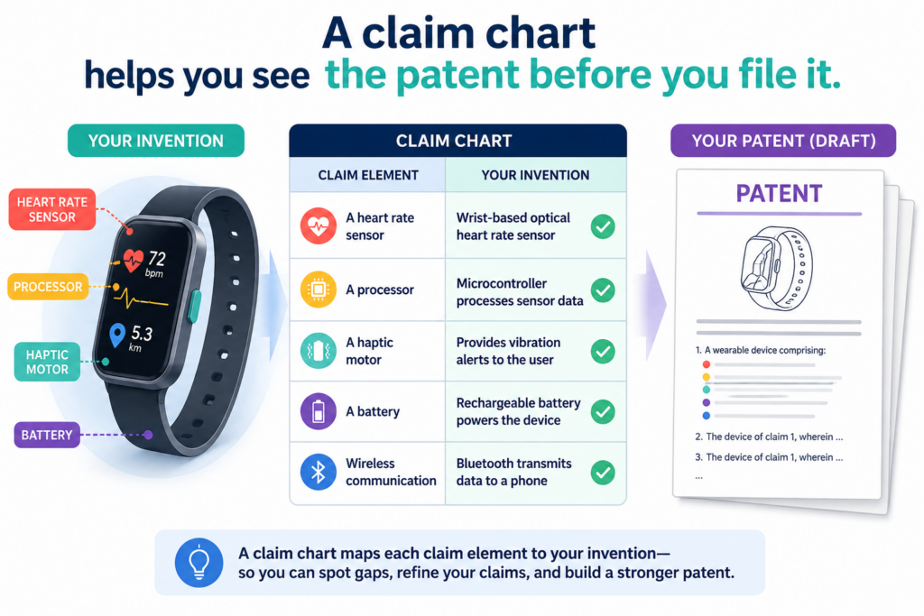
A claim chart helps you see the patent before you file it
A hardware patent can look strong on paper but still miss the heart of the invention. This happens when the claim sounds broad, but the real device has details that are not shown well.
It also happens when the patent talks about parts in a way that does not match the product, the drawings, or the build notes.
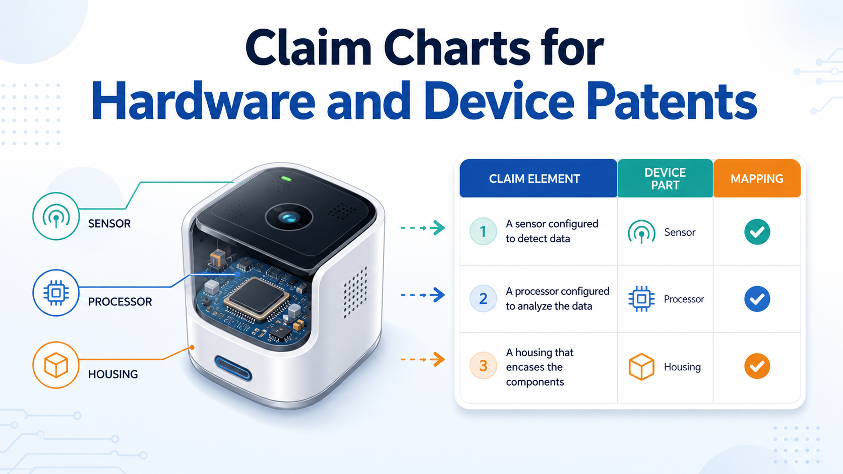
A claim chart helps stop that problem early. It turns the claim into a map. Each part of the claim is matched to something real in the device.
That real thing may be a sensor, a chip, a casing, a hinge, a board layout, a signal path, a connector, a motor, a memory unit, a control module, or a physical step in how the device works.
This is why claim charts are so useful for hardware and device patents. Hardware inventions are not just ideas.
They are made of parts that connect, move, sense, store, send, heat, cool, guide, seal, charge, lock, unlock, or process something. A claim chart helps make those parts easy to see.
If you are building a product and want help turning your invention into a stronger patent with less back-and-forth, PowerPatent can help you move from raw invention notes to attorney-reviewed patent work faster. You can explore the process here: https://powerpatent.com/how-it-works
A claim chart makes vague patent words easier to test
Patent claims can feel strange because they use careful wording. Even when the words are simple, they still need to cover the invention in a clean way.
A claim chart makes those words less fuzzy. It lets you test each phrase against the real device.
For example, a claim may say the device has “a housing.” In a claim chart, that phrase is tied to the outer shell, frame, enclosure, bracket, base, or body shown in the drawings.
If the device has more than one housing part, the chart can show that too. This matters because hardware patents often depend on how parts sit, connect, and work together.
A claim may also say the device has “a controller.” In a real product, that controller could be a microcontroller, processor, embedded board, firmware-driven chip, or another control unit.
A claim chart lets the team point to the exact part that does the work.
The best claim charts remove guesswork before it becomes expensive
Guesswork is dangerous in patent work. It can make the patent too narrow, too broad, or too unclear.
A claim chart gives founders and engineers a clean way to check the invention while there is still time to improve it.
This is especially helpful before filing. If a chart shows that one claim part has no clear support in the product notes, that is a warning sign. It may mean the invention needs better drawings, better detail, better examples, or a better claim plan.
The goal is not to make the patent sound fancy. The goal is to make the invention clear enough that a real attorney can shape it into strong protection.
That is also why PowerPatent combines software with real attorney oversight. The software helps organize the invention fast, while the attorney helps make sure the work is pointed in the right direction. See how that works here: https://powerpatent.com/how-it-works
Hardware patents need claim charts because small parts can carry big value
In software, the value may sit in logic, data flow, or model behavior. In hardware, value often hides inside physical structure.
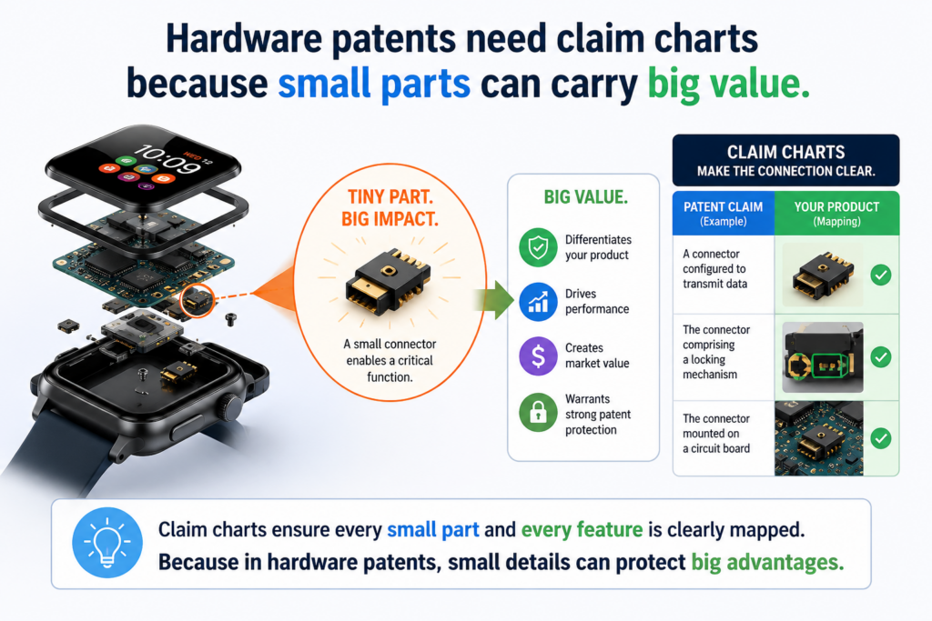
A small part can matter a lot. A new clip, latch, sensor placement, cooling path, power route, hinge shape, board position, sealing method, or device layout may be the thing that gives the product its edge.
This is why hardware claim charts need care. A hardware invention is not only what the device does. It is also how the device is built to do it. A claim chart helps show both.
Many founders think their patent should focus only on the big product idea. That can be a mistake. The big idea may be easy for others to copy in a slightly different way.
But the real strength may be in the device design that makes the product work better, smaller, faster, safer, cheaper, or easier to use.
A claim chart helps you find those points. It slows the invention down just enough to see what is actually new.
A strong chart connects function to structure
One of the most useful things a claim chart can do is connect what a part does with what the part is. That sounds simple, but it is easy to miss.
A device may include a sensor that detects pressure. The claim chart should not only say “sensor.”
It should show where the sensor is, what it measures, how it is mounted, how it sends data, and how the rest of the device reacts. The more clearly the team can explain that link, the easier it is to shape better claims.
This does not mean every small screw needs a long write-up. It means the claim chart should focus on the parts that support the invention. If the invention depends on a sensor being placed in a certain spot, that placement matters.
If the invention depends on a heat sink touching a specific surface, that contact matters. If the invention depends on a module being removable, that removable setup matters.
The chart should show why the device is not just another version of old hardware
A claim chart is not only a matching tool. It is also a thinking tool. It helps you ask, “What makes this device different from what already exists?”
That question matters because hardware products often build on known parts. A wearable device may use known sensors. A robot may use known motors. A medical device may use known pumps.
A smart home device may use known wireless chips. The patent value may come from the way those parts are arranged, controlled, protected, or combined.
The claim chart helps show that story. It can point to the exact mix of parts that creates the new result. It can show that the device is not just a known box with a known chip inside. It can show the real design choice that makes the invention useful.
For a startup, this is very important. Investors, partners, and buyers do not want a weak patent that only sounds impressive. They want protection that matches the product.
PowerPatent helps founders capture those product details earlier, so the attorney does not have to dig through scattered notes later. You can learn more here: https://powerpatent.com/how-it-works
A claim chart should start with the real product, not just the patent claim
Many teams start with a claim and then try to force the product into it. That can create a bad chart. A better way is to start with the device itself.
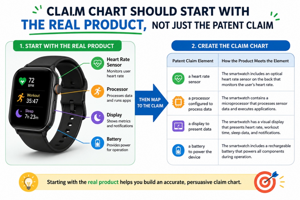
Look at the prototype. Look at the CAD files. Look at the board design. Look at the system diagram. Look at the test notes. Look at the product spec. Then ask what the invention is really doing that matters.
This keeps the claim chart honest. It also helps the attorney see the invention through the eyes of the builder. That is powerful because the builder often knows small design choices that never show up in a rough invention disclosure.
For example, the engineer may know that the device works because a sensor is shielded from vibration. The founder may know that the shape of the housing lowers assembly time.
The hardware lead may know that the board layout reduces signal noise. These details can become very important when building a strong patent plan.
Your chart should make the invention easy for someone else to understand
A claim chart is not only for the person who built the device. It should also help someone else understand the invention without needing a long meeting.
That person may be a patent attorney, a co-founder, a product lead, an investor, or a technical reviewer.
They should be able to look at the chart and see how each claim part appears in the device. They should not have to guess what a term means or hunt through a pile of drawings.
This is why good evidence matters. A chart should point to the right drawing, figure, photo, test file, schematic, CAD view, or design note.
The point is not to drown the reader in files. The point is to give just enough support so each claim part feels solid.
The best source material is the material your team already uses to build
You do not need to create a perfect patent packet from scratch before making a claim chart. In many cases, the best source material is already inside your startup.
Your engineering tickets may show why a design changed. Your CAD files may show the exact device shape.
Your firmware notes may show how the hardware reacts to sensor data. Your test logs may show why a placement choice matters. Your product photos may show real structure better than a rough drawing.
A good claim chart pulls these pieces together. It gives the patent team a clear path through the invention. This saves time because the attorney can focus on strategy instead of chasing missing details.
PowerPatent is built for this kind of workflow. It helps technical teams turn raw invention material into organized patent inputs, with real attorney review layered on top.
That means less confusion, less delay, and better protection for what you are actually building. See the workflow here: https://powerpatent.com/how-it-works
The strongest claim charts explain each claim part in plain words
A claim chart should not feel like a wall of legal text. It should feel like a clean guide to the invention. For hardware and device patents, plain words are a major advantage because they keep the chart useful for both engineers and attorneys.
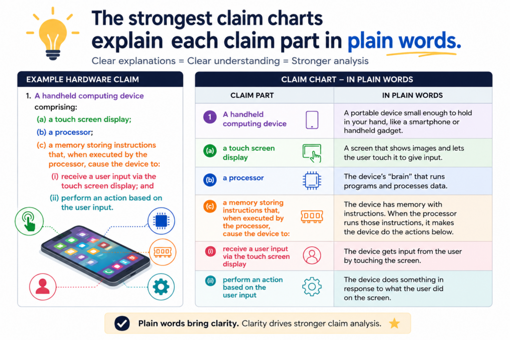
The goal is simple. Take one part of the claim. Explain what it means in the product. Show where it appears. Then explain why it matters.
This is not about dumbing down the invention. It is about making the invention clear. Clear patents often start with clear thinking. A claim chart forces that thinking to happen before the patent is filed or before a claim is tested.
When the chart is clear, the whole team can spot problems faster. Maybe one part of the claim is not shown in the drawings.
Maybe the product has two versions, and only one version has the claimed feature. Maybe a claim uses a word that does not match the words engineers use. These are the kinds of issues that are much easier to fix early.
A clear chart helps your attorney write claims that fit the product
Patent attorneys are trained to write strong claims, but they still need strong invention detail. A claim chart gives them that detail in a useful shape.
For example, instead of saying, “The device has a smart mount,” the chart can explain what the mount includes, where it attaches, how it holds the sensor, how it limits movement, and how that improves the device. That gives the attorney real material to work with.
This matters because hardware claims often need to balance broad coverage with real support. A claim that is too narrow may be easy to avoid. A claim that is too broad may be hard to defend.
A good chart helps find the middle path. It shows the core invention while also showing possible versions of the device.
A useful chart should show the main version and the backup versions
Hardware products change. The first prototype may not be the final product. The first casing may be replaced.
The first sensor may change. The first board layout may get smaller. The first connector may be swapped for a better one.
A smart claim chart should leave room for that. It should not only show one exact part number or one exact shape unless that detail is truly the invention. It should also help capture backup versions.
If the sensor could be optical, magnetic, pressure-based, or motion-based, that may matter.
If the housing could be plastic, metal, or composite, that may matter. If the control unit could be on the main board or a separate module, that may matter.
This is where attorney oversight is key. Founders often know the product roadmap, while attorneys know how to turn that roadmap into patent language.
PowerPatent brings both sides together faster, so your patent work can keep up with your build cycle. Learn how it works here: https://powerpatent.com/how-it-works
A good hardware claim chart should tie every claim part to a real device part
A claim chart becomes useful when it stops being abstract. It should not only repeat the claim in different words. It should show exactly where the claim appears in the device and how the device supports it.
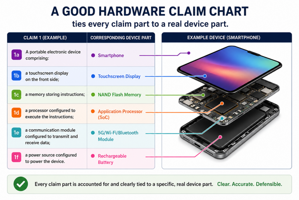
For hardware and device patents, this means each claim part should connect to something physical, something functional, or both.
A physical part may be a housing, circuit board, sensor, actuator, connector, valve, lens, bracket, channel, battery, display, or mount.
A functional part may be a signal path, control step, feedback loop, data readout, power mode, locking action, pressure response, motion sequence, or cooling effect.
The chart should answer a simple question: “Where is this in the product?” If the answer is not clear, the claim may need more support, better drawings, or better wording.
The chart should not hide weak spots
A weak claim chart can make a team feel safe when the patent is not actually strong. This often happens when the chart uses soft words instead of real proof.
It may say a part is “shown generally” or “supported by the device” without pointing to a clear part of the design.
That is not enough. A useful chart should be honest. If a claim part is not shown well, the chart should make that clear. That does not mean the patent is doomed. It means the team found a gap early enough to fix it.
For example, a claim may say the device includes a “seal positioned between the chamber and the outer housing.” If the drawings do not show the seal, the chart should not pretend they do.
The right move is to add better support, such as a drawing, photo, CAD view, assembly note, or written detail that explains the seal and its role.
Honest gaps can turn into stronger patents
Many founders worry when a chart exposes missing detail. In reality, that can be a gift. A gap found before filing is much easier to fix than a gap found after the patent is already in trouble.
Hardware patents often depend on small build details. If those details are missing, the patent may not protect the true invention.
A chart helps the team catch that early. It lets founders improve the invention record while the product is still fresh in everyone’s mind.
This is one reason PowerPatent is useful for technical teams. It helps organize invention details before they get lost in Slack threads, CAD exports, lab notes, and half-finished documents.
Then real attorneys review the work so the claim plan is not just fast, but also thoughtful. You can see how that process works here: https://powerpatent.com/how-it-works
A claim chart should explain the difference between required parts and optional parts
One of the hardest parts of hardware patent work is deciding what must be in the claim and what should stay out.
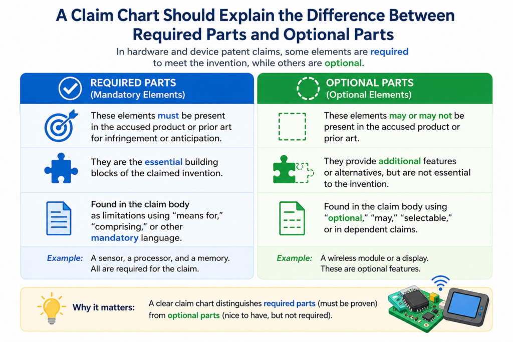
If the claim includes too many details, a competitor may avoid it by changing one small thing. If the claim leaves out too much, it may not describe the invention clearly enough.
A claim chart helps the team make that choice with more care. It shows which parts are central to the invention and which parts are only examples from the current product.
This matters because startups change hardware all the time. A prototype may use one sensor because it is easy to buy.
The final device may use another sensor because it is cheaper, smaller, stronger, or easier to ship. If the patent claim is tied too tightly to the first sensor, the company may end up protecting the wrong version of the product.
Required parts should carry the main invention
A required claim part should be something that helps define the invention. It should not be included only because it appears in the prototype. The chart should help the team ask whether each part is truly needed.
For example, a claim for a smart medical device may require a housing, a sensor, a processor, and a feedback output.
But it may not need to require a certain screw type, color, battery shape, or display size unless that detail is part of the invention.
This is where the claim chart becomes more than a matching exercise. It becomes a strategy tool.
By looking at each part of the claim, the team can ask whether that part helps protect the invention or only makes the claim easier to avoid.
Optional parts should still be captured in the patent
Leaving a detail out of the main claim does not mean ignoring it. Some details are better saved as backup positions. These can appear in other claims or in the written description.
This is useful because hardware products often have several layers of invention. The broad idea may be the way the device senses and responds.
A narrower idea may be the exact way the sensor is mounted. An even narrower idea may be the shape of a shield, seal, guide rail, or chamber.
A claim chart can help map these layers. It can show the broad parts first, then show the supporting details that may become backup claims. This gives the patent attorney more room to build a stronger filing.
PowerPatent helps founders work through this without slowing down the product team.
The platform helps capture the invention in a structured way, while attorney oversight helps decide what should be broad, what should be narrow, and what should be saved as backup. Learn more here: https://powerpatent.com/how-it-works
A strong chart should use drawings and device files in a smart way
For hardware patents, drawings can carry a lot of weight. A clear drawing can show a part faster than a long paragraph.
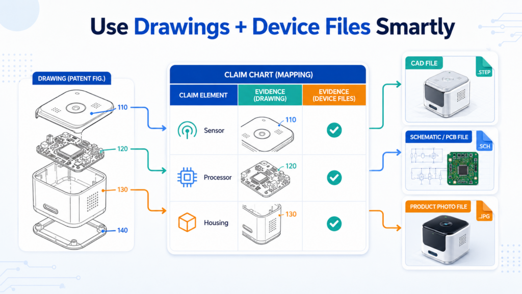
But drawings only help when they are tied to the claim in a clear way.
A claim chart should point to the exact drawing, figure, photo, CAD view, schematic, board layout, or test image that supports each claim part.
It should not simply say “see drawings.” That is too vague. The reader should know where to look and what to notice.
This is especially important when the invention depends on part placement. If the sensor must be near an inlet, the chart should show that.
If a cooling channel wraps around a heat source, the chart should show that. If a latch engages with a notch only after a rotation step, the chart should show that sequence.
The chart should explain what the drawing proves
A drawing by itself may not be enough. The claim chart should also explain why the drawing matters. This helps non-engineers understand the design and helps attorneys see the invention more clearly.
For example, a drawing may show a device housing with an inner chamber. The chart should explain that the chamber guides fluid, air, light, pressure, heat, or motion in a way that supports the claim.
If the drawing shows a board layout, the chart should explain how the layout supports signal flow, power control, shielding, spacing, or sensor response.
The best charts do not make readers guess. They connect the dots in plain words.
Use build materials that show the invention at different levels
A hardware invention can be shown at more than one level. One file may show the full device. Another may show a subassembly.
Another may show a circuit. Another may show how data moves after a sensor reading. Another may show test results.
A good claim chart uses these sources together. It may use a product photo to show the outside, a CAD view to show the inside, a schematic to show the electronics, and a flow diagram to show how the device responds.
This kind of support helps the patent feel grounded in the real product. It also helps the attorney write with more confidence because the invention is not trapped in one drawing or one short note.
If your team has device files spread across tools, PowerPatent can help bring the key invention details into one clearer workflow.
That makes it easier to move from raw engineering work to patent-ready material with real attorney review. The process is here: https://powerpatent.com/how-it-works
Claim charts help teams catch design-around risks before filing
A design-around is when someone studies your patent and builds something close to your product without using the exact claimed setup.
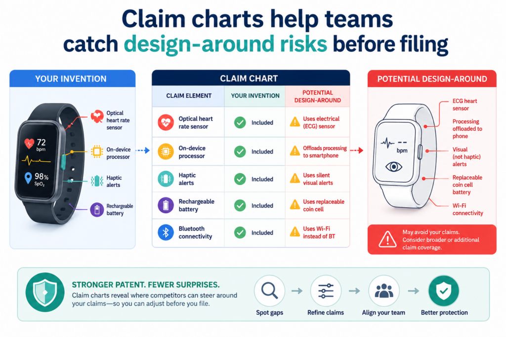
This is a major issue for hardware patents because small physical changes can sometimes help a copycat avoid a narrow claim.
A claim chart can help spot this risk early. When you look at each claim part next to the real product, you can ask how easy it would be for another company to change that part. If the answer is “very easy,” the claim may need a better plan.
This does not mean every claim must cover every possible version. That is not realistic. But the patent should try to protect the real inventive idea, not just one fragile product version.
The chart should help you think like a careful competitor
A founder should not only read the chart as the inventor. They should also read it as someone trying to avoid the patent. This can reveal weak points quickly.
For example, if the claim requires a sensor on the top surface, could a competitor place the sensor on the side and get the same result? If the claim requires a hinge, could they use a sliding joint?
If the claim requires a wired connection, could they use wireless communication? If the claim requires a separate module, could they combine the parts into one board?
These questions do not weaken the invention. They help strengthen the patent plan. A good chart makes it easier to see which words are too narrow and which ideas deserve broader coverage.
A better chart gives your attorney better options
Patent attorneys can often write claims in several ways, but they need to know where the invention can bend and where it cannot. The claim chart helps show that.
If a part can take many forms, the chart should say so in plain words.
If a part must be in one exact position to make the device work, the chart should say that too. This helps the attorney avoid claims that are either too easy to dodge or too broad to support.
For hardware startups, this is not just a patent issue. It is a business issue. Your patent should protect the product you are building now, while also leaving room for the product you may build next.
PowerPatent helps teams capture those design choices early, then adds attorney oversight so the filing is not based on guesswork. You can explore how it works here: https://powerpatent.com/how-it-works
A claim chart helps you protect the device as it changes
A hardware product rarely stays the same from first sketch to final launch. The first version may be large and rough.
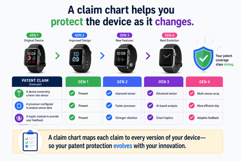
The next version may be smaller, cleaner, cheaper, and easier to build. A later version may add new sensors, remove old parts, change the board, use a new shell, or connect to a cloud system.
This is normal. It is also one of the main reasons claim charts matter.
A claim chart helps you see which parts of the invention are stable and which parts are likely to change.
That matters because a patent should not protect only the first rough prototype unless the rough prototype is the real invention. In most startups, the early version is just a way to prove the idea works.
The chart helps your team ask a better question. It is not just, “What did we build today?” It is, “What is the core device idea that should still be protected even when the product gets better?”
That question can save a company from filing a patent that becomes outdated before the product even ships.
A chart should separate the invention from the current build choice
Not every part of your device deserves the same weight. Some parts are central. Other parts are just choices your team made for speed, cost, supply, or testing.
For example, your prototype may use a certain sensor because it was easy to order. But the invention may not be that exact sensor.
The invention may be the way the sensor is placed, the way it works with a control board, or the way the device reacts to sensor data.
Your prototype may use a plastic case because it was fast to print. But the invention may not be plastic. It may be the inner shape of the case, the path it creates for air or fluid, or the way it holds a part in the right position.
A claim chart helps keep these details in the right place. It lets your team show the current build while also noting other ways the same idea could be built.
This is where many hardware patents become too narrow
A patent can become too narrow when it captures every tiny detail from the first version. That may feel safe because the claim is easy to explain.
But it can be risky because a competitor may change one small thing and avoid the claim.
A claim chart can expose that problem before filing. If the chart keeps pointing to small details that are not truly needed, that is a sign the claim may be too tied to one version.
The better path is to capture the main invention clearly, then use backup claims and written details to cover the smaller parts. This helps the patent stay useful as the product grows.
PowerPatent helps founders do this without turning the process into a slow legal maze.
The platform helps organize device details, design options, and invention notes so real attorneys can shape a stronger filing faster. You can see how it works here: https://powerpatent.com/how-it-works
A claim chart can reveal hidden inventions inside the device
Many hardware teams think they have one invention. But once they build a claim chart, they often find several.
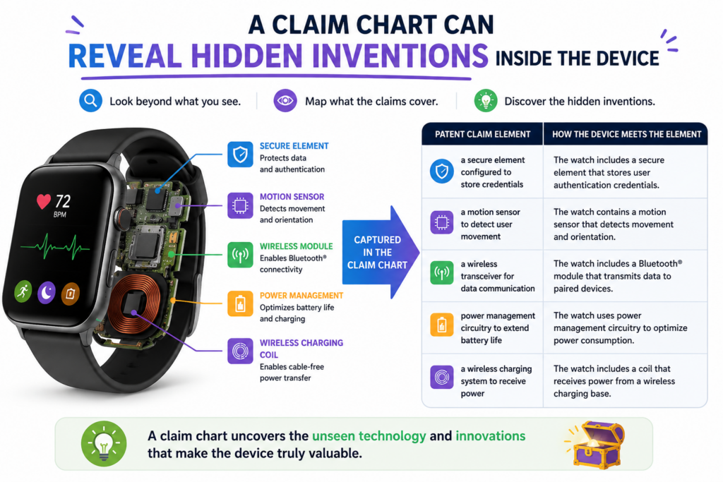
This is common in device work because one product may include new mechanics, new electronics, new sensing methods, new layouts, new control steps, and new user actions.
A claim chart helps break the device apart in a useful way. It shows where value sits. It may show that the housing is not the only new part.
It may show that the real value is in a removable module, a special flow path, a noise-reducing board layout, a new alignment feature, or a safer way to trigger an action.
This matters because a startup may be leaving patent value on the table without knowing it.
A single product can sometimes support more than one patent filing or more than one claim strategy.
The team may choose to protect the main device first, then later protect a subassembly, manufacturing method, control process, or accessory. A claim chart helps you see those paths earlier.
Hidden inventions often live where engineers solved hard problems
The best invention clues often appear in places where the team struggled. A part kept failing, so someone changed the shape. A signal was noisy, so someone changed the board layout.
A sensor gave bad readings, so someone changed its position. A device was too hard to assemble, so someone created a new latch or guide.
Those moments are easy to overlook because engineers see them as normal problem-solving. But in patent work, those fixes can be very important.
A claim chart gives those fixes a place to be seen. When each claim part is mapped to the real device, the team can ask why that part exists.
If the answer is, “Because nothing worked until we did it this way,” that detail deserves attention.
Your claim chart should capture why each smart choice was made
A good chart should not only say what the device includes. It should also explain why the design choice matters.
For example, saying “the device includes a shield” is useful, but it may not be enough. The chart should explain what the shield protects, what it blocks, where it sits, and how it helps the device work better.
The same idea applies to brackets, vents, seals, sensors, magnets, charging contacts, clips, ports, arms, valves, lenses, chambers, and boards.
This “why” helps the attorney understand the invention at a deeper level. It also helps the team decide which details deserve strong claim coverage.
PowerPatent is built to help technical founders capture these details before they fade. You can turn your notes, diagrams, and product thinking into clearer patent material, with real attorney review behind it. The process is simple to explore here: https://powerpatent.com/how-it-works
Claim charts make attorney review faster and more focused
Patent attorneys can do better work when the invention is clear. That does not mean founders need to write legal language. It means founders need to show the device in a way that makes sense.
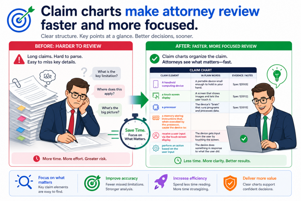
A claim chart does exactly that. It gives the attorney a clean view of the invention. It shows the claim parts, the matching device parts, the source material, and the reason each part matters.
This can reduce long email chains, unclear meetings, and repeated requests for the same details.
For a startup, this is a big deal. Time spent explaining the same device over and over is time not spent building, selling, testing, hiring, or raising money.
A strong claim chart can make the patent process feel less like a drain and more like a smart part of the company’s growth.
It also helps avoid rushed filings. When the attorney gets better information early, they can spot risks and improve the claim plan before deadlines become stressful.
A clear chart gives the attorney better raw material
A patent attorney is not inside your lab every day. They may not know why a part moved two millimeters, why a housing has a certain wall shape, or why a sensor is placed behind a certain cover.
Those details may feel obvious to your engineering team, but they are not obvious to someone reviewing the invention from the outside.
The claim chart bridges that gap.
It lets your team say, in simple words, “This is the part. This is where it is shown. This is what it does. This is why it matters.” That kind of input is far more useful than a broad statement like “our device uses smart sensing.”
A good attorney can turn clear technical detail into a better patent strategy. But the attorney needs the detail first.
Better review starts before the draft is written
Many teams wait until they get a patent draft before they start thinking deeply about claim coverage. That is late. By then, the structure may already be in place, and changes can take more time.
A claim chart helps move that thinking earlier. Before the draft is written, the team can see which invention parts are strong, which parts need more support, and which product versions should be covered.
This makes attorney review more focused. Instead of spending the first review round trying to understand the invention, the attorney can spend more time improving the claim plan and making sure the filing matches the business goal.
That is one reason PowerPatent combines smart software with real patent attorneys. The software helps founders organize the invention quickly.
The attorney oversight helps make sure the work is not just neat, but useful. You can learn more here: https://powerpatent.com/how-it-works
A claim chart should support both broad claims and narrow backup claims
A strong patent filing often needs layers. The broad layer tries to protect the main invention. The narrower layers protect special versions, key details, and backup positions.
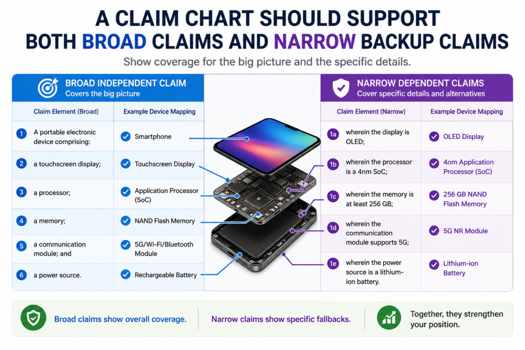
A claim chart can help build those layers with more care. It shows the main parts of the device, then shows the extra details that may support narrower claims.
This is especially helpful in hardware because small details can matter a lot when the patent is reviewed or later compared to another product.
The broad claim may cover the main device structure and how the core parts work together.
A narrower claim may cover a certain sensor position, a certain locking action, a certain channel shape, a certain board layout, or a certain way the device responds to a signal.
Both layers matter. Broad claims can give stronger business value when they are well supported. Narrow backup claims can help preserve value when the broad claim faces pressure.
Your chart should show the main idea first
The main invention should be easy to find. A reader should not have to dig through pages of small details to understand the core idea.
The chart should make the heart of the device clear early.
For example, if the invention is a wearable device that improves sensor accuracy by controlling how the sensor contacts the body, the chart should focus first on the contact structure, the sensor position, and the way the device manages pressure or alignment.
Other details may matter, but they should not hide the main point.
This helps everyone stay focused. The founder sees the business value. The engineer sees the technical value. The attorney sees the claim path.
Backup details should be written before they are needed
Backup claims are much easier to build when the details are captured early. If the team waits months, people may forget why a design choice mattered.
Files may move. Prototypes may be replaced. A small but important feature may disappear from the record.
A claim chart helps prevent that. It gives the team a place to record details while they are still fresh.
That can include alternate materials, different sensor types, optional modules, different shapes, alternate control paths, and other ways to build the same invention.
This does not mean the chart should become messy. It should stay clear and useful. But it should give the attorney enough detail to build claim layers that match the product and the roadmap.
PowerPatent helps make this kind of capture easier for busy startup teams.
Instead of waiting until the last minute, founders can organize invention details earlier and get attorney-reviewed guidance on what should be protected. See how the workflow works here: https://powerpatent.com/how-it-works
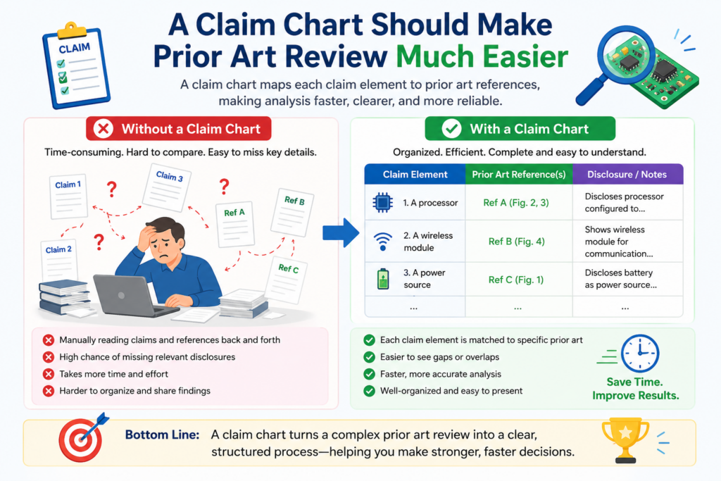
A claim chart should make prior art review much easier
A claim chart is not only useful for showing your own device. It is also useful when your team needs to compare your invention with older products, older patents, public papers, product manuals, videos, or technical pages that may already exist.
This matters because hardware products often build on known parts.
A new device may use known sensors, known chips, known motors, known housings, known valves, known antennas, known displays, or known batteries.
The question is not always whether each part is new by itself. The better question is whether your way of arranging, connecting, controlling, or using those parts creates something different.
A claim chart helps make that comparison clear. It lets you place your claim next to the older reference and ask where the match is strong, where the match is weak, and where your invention has a real difference.
This is useful before filing because it helps your team avoid weak claim paths. It also helps your attorney focus on what may actually be protectable, instead of spending time on broad ideas that older devices may already show.
A chart can show what the old device does not teach
When founders look at older products, they often get nervous. They may see a device that looks close and think their invention is no longer patentable. But visual similarity is not the whole story.
Two devices can look alike on the outside and work very differently inside.
They may use different internal structures, different control logic, different sensor placement, different flow paths, different power methods, different mounting systems, or different feedback loops.
A claim chart helps your team see those differences. It can show that the old device has a housing and a sensor, but does not have your specific sensor position.
It can show that the old device has a controller, but does not use the same response pattern. It can show that the old device has a chamber, but does not guide heat, air, fluid, or force in the same way.
The chart should focus on the real point of difference
A claim chart should not try to make weak differences look strong. If the only difference is color or size, that may not be enough unless that detail changes how the device works in a meaningful way.
The better use of a chart is to find differences that matter. Does the design solve a real problem?
Does it make the device safer, smaller, faster, more accurate, cheaper to build, easier to repair, harder to damage, or better at its job? If yes, that difference may be worth building around.
This is where PowerPatent can help technical founders move with more confidence.
The platform helps organize your device details and invention notes so attorney review can focus on the real value, not just surface-level descriptions. You can see how PowerPatent works here: https://powerpatent.com/how-it-works
A claim chart can help your team avoid overclaiming
Overclaiming happens when a patent claim reaches farther than the invention can support. This can create problems.

The claim may sound powerful, but if the patent does not clearly explain enough support for it, the claim may become hard to defend.
Hardware startups can run into this when they describe a device result without enough structure.
For example, a team may want to claim a device that “improves accuracy” or “reduces noise” or “controls temperature.” Those goals matter, but the patent needs to explain how the device does it.
A claim chart helps by forcing the team to connect the desired result to real parts. It asks what structure creates the result.
It asks what part senses, moves, holds, blocks, opens, closes, supports, seals, routes, or controls something. It turns a broad wish into a clear device story.
That does not mean claims must be tiny. It means broad claims need clear roots.
Strong claims are built from real support
A strong hardware claim often starts with a real device feature that solves a real problem. The chart should show that feature with enough detail to make the invention believable and useful.
For example, if your device reduces heat, the chart should point to the parts that move heat away. That may include a heat spreader, vent path, fan position, material layer, control mode, spacing feature, or housing shape.
If your device improves signal quality, the chart should show the board layout, shielding, grounding, distance, filtering, or sensor placement that helps do that.
This gives the attorney something solid to work with. It also helps avoid claims that sound good but do not have enough detail behind them.
The right chart helps you be broad without being reckless
Good patent strategy is not about claiming everything in sight. It is about protecting the invention with words that are broad enough to matter and specific enough to stand on.
A claim chart helps your team find that balance. It shows where you can use wider terms because the invention supports them. It also shows where you may need narrower wording because the device only works in a certain way.
This balance is very important for founders. A patent that is too narrow may not stop copycats. A patent that is too broad may face trouble later.
The goal is to protect what you truly built and what you can fairly support.
PowerPatent helps make this process less painful. Founders can bring in product notes, technical details, and design choices, then work with real attorney oversight to shape better patent filings faster.
You can explore the process here: https://powerpatent.com/how-it-works
A claim chart should help your team prepare for product changes
A hardware patent should not be written as if your product will never change. Startups change parts because suppliers change, costs change, testing shows issues, customers ask for updates, and manufacturing teams find better ways to build.
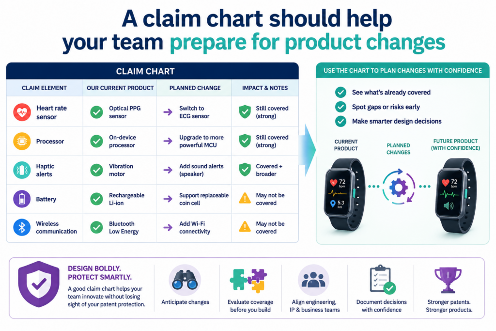
A claim chart can help protect against this problem by making product changes visible early.
It can show which parts are fixed and which parts may vary. It can also show which changes would still use the same invention.
This is important because a patent filed too tightly around one prototype may lose value as soon as the product changes.
If the first version uses a certain connector, but the second version uses a different connector, your patent should not depend on the first connector unless that connector is central to the invention.
A good claim chart lets your team think beyond the current build without drifting into guesswork.
The chart should include likely future versions
Your team already knows many of the changes that may happen. Maybe the sensor may move to a different side of the housing. Maybe the processor may shift from one board to another.
Maybe the display may be removed. Maybe the device may support both wired and wireless charging. Maybe a plastic part may become metal.
These future versions should be captured in plain words when they relate to the invention. The claim chart can note that a part may take several forms, sit in several places, or perform the same role through different structures.
This helps the attorney write with the roadmap in mind. It also helps avoid filings that only protect the lab version.
Future-proofing starts with better invention capture
Future-proofing does not mean making wild guesses about products you may never build. It means capturing realistic versions of the same invention.
For hardware teams, this can include alternate materials, alternate sensor types, alternate mounting points, alternate housing shapes, alternate power sources, alternate control boards, and alternate communication paths.
The key is to explain how each version still supports the same core device idea.
A claim chart is a simple place to collect those options. It keeps them tied to the real invention instead of floating as random ideas.
PowerPatent is useful here because it helps founders capture invention details while the product is still moving. You do not need to wait until everything is perfect.
You can organize what you know, capture where the product may go, and get attorney oversight before filing decisions become rushed. See how it works here: https://powerpatent.com/how-it-works
A claim chart should make your evidence easy to trust
A claim chart is only as strong as the support behind it. If the chart points to unclear files, old screenshots, missing drawings, or vague notes, the reader may not trust the match between the claim and the device.
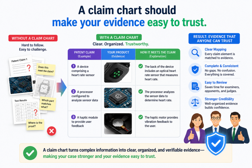
For hardware patents, support should be clean and easy to follow. The chart should show where each claim part appears and why that source is reliable.
It may point to a figure number, a CAD view, a circuit diagram, a board layout, a test image, a lab note, a product spec, or a prototype photo.
The goal is not to create a giant archive. The goal is to create a clean trail. Someone should be able to look at the chart, open the source, and understand the device part without needing a long explanation.
This helps the attorney. It also helps your own team. When invention records are clean, future patent work becomes easier.
Good evidence should be specific enough to remove doubt
A chart that says “shown in CAD files” is not very helpful. A better chart points to the exact file, view, figure, or page that shows the part. It also explains what the reader should notice.
For example, the chart may say that a certain figure shows the sensor mounted inside the inner wall of the housing, facing the flow path.
It may say that a board layout shows the controller connected to the sensor and power circuit. It may say that a test photo shows the latch in the locked position after rotation.
That kind of detail keeps the chart useful. It also makes review faster because the attorney does not need to search for every answer.
Clean evidence can prevent confusion later
Hardware teams move fast, and files can become messy. Versions change. Part names change. Drawings get updated. A feature that was obvious in January may be hard to explain in June.
A claim chart can reduce that risk by locking in a clear record of what mattered and where it was shown. This does not replace attorney work, but it gives the attorney better material.
It also helps when new team members join. A product lead, new engineer, investor, or buyer may need to understand what the patent covers. A clean chart can make that conversation much easier.
PowerPatent helps startups turn scattered technical work into more organized patent inputs, backed by real attorney review.
That means your patent process can move faster without losing the details that make your device valuable. Learn more here: https://powerpatent.com/how-it-works
A claim chart should help your team explain the invention without overloading the reader
A claim chart should be clear, not crowded. Hardware teams often want to include every detail because they know every detail matters somewhere.
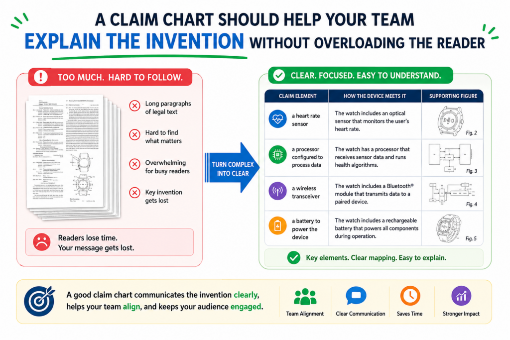
But a chart that tries to explain the whole device all at once can become hard to use.
The best chart gives the reader the right amount of detail at the right time. It should explain the claim part, show where it appears in the device, and describe why that part matters.
It should not turn into a full engineering manual unless that level of detail is needed for the claim.
This is especially important when the device has many layers. A product may include mechanical parts, electronics, firmware, sensors, power control, wireless links, cloud features, and user controls.
A claim chart should not make the attorney hunt through all of that without a clear path.
A clean chart respects the reader’s time. It keeps the invention easy to follow, which makes the patent work faster and sharper.
A useful chart should tell one clear story at a time
A hardware claim often tells a story. It may begin with a device body, then move to a sensor, then to a controller, then to an action taken by the device.
The claim chart should follow that flow so the reader can see how the invention works.
If the chart jumps around too much, it becomes hard to understand. For example, the chart should not explain the housing, then suddenly dive into firmware, then jump back to a latch, then discuss a test result, unless that order matches the claim.
The chart should move in the same order as the claim and build understanding step by step.
This matters because patent claims are not just lists of parts. They show a relationship between parts. The value often sits in that relationship.
A sensor connected to a controller may not be special by itself. But a sensor placed in a certain location, connected to a controller that triggers a certain device action, may be the real invention.
Clear flow helps the attorney protect the right thing
When a claim chart has a clear flow, the attorney can see the invention faster. They can also see where the claim may need to be broader, narrower, or supported with more detail.
This is important for startups because speed matters. Your team should not lose weeks explaining the same device over and over.
A clean claim chart helps the patent team get to the hard questions sooner, such as what the claim should cover, what competitors might copy, and what backup positions should be included.
PowerPatent helps founders bring that order to messy invention material. You can move from rough notes, product files, and technical details into a more structured patent workflow with real attorney review.
That gives your team more control without adding heavy process. You can see how it works here: https://powerpatent.com/how-it-works
A claim chart should make competitor comparison easier
A strong hardware patent is not created in a vacuum. Your device lives in a market where other companies may build similar products, use similar parts, or solve the same customer problem.
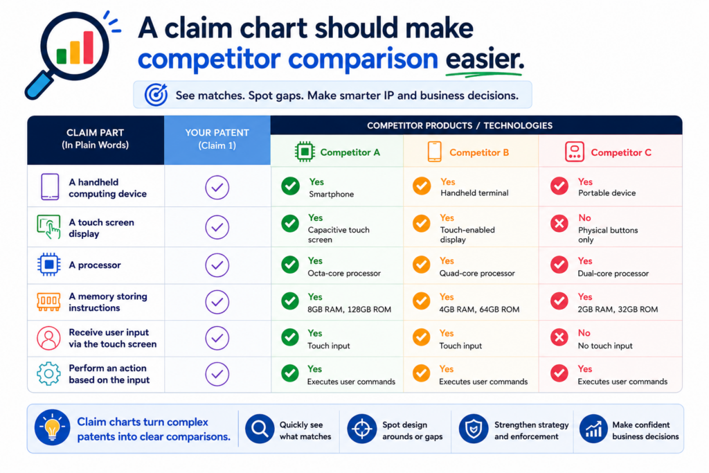
A claim chart can help your team compare your invention against those products with more care.
This does not mean you need to panic every time a competitor has a similar-looking device. Hardware products often look alike from the outside because they solve similar physical problems.
The key is what happens inside, how the parts work together, and where the real design choices sit.
A claim chart gives your team a calmer way to compare. It lets you look at each claim part and ask whether the competitor product appears to have the same part, a different part, or no matching part at all.
That kind of review can help you understand where your patent may be strong and where it may need more planning.
This can also help before filing. If your team already knows the competitive field, the claim chart can help your attorney avoid weak claims and focus on the features that truly set your product apart.
A chart should compare structure, not just product purpose
Two devices may serve the same purpose but use very different structures. For example, two medical devices may both measure pressure.
Two robots may both grip objects. Two wearables may both track movement. Two smart tools may both send data to an app.
That does not mean the inventions are the same.
A good claim chart looks deeper. It asks how the device is built. It asks where the sensor sits, how force moves through the product, how data is created, how the control unit responds, and how the device changes state during use. These details can be much more important than the broad purpose of the product.
This is why founders should not rely only on product pages or marketing claims when thinking about patents.
A product page may say what a device does, but a claim chart helps focus on how the device may do it.
Smart comparison can reveal stronger claim angles
Sometimes competitor review shows that your first claim idea is not the best one. That can be good news if you find out early.
The chart may show that many products use a similar sensor, but none use your mounting design.
It may show that many products have a controller, but none use your device response sequence. It may show that many products have a chamber, but none use your flow path.
Those findings can help your patent attorney focus on stronger ground. Instead of trying to protect a broad product idea that may already be crowded, the patent can focus on the device features that make your product hard to copy.
PowerPatent can help teams organize these invention details before attorney review, so the strongest angles do not get buried in scattered files.
If you are building hardware and want a smarter path from product detail to patent protection, start here: https://powerpatent.com/how-it-works
A claim chart should help founders make better business decisions
A claim chart is not only a patent tool. It can also help founders make clearer business choices.

When you see exactly what your claim covers, you can better understand what part of the product may become a moat, what may need more testing, and what may deserve more investment.
This matters because startups have limited time and money. You cannot protect everything with equal force. You need to know which inventions support the company’s edge. A claim chart helps make that edge visible.
For example, if the claim chart shows that the strongest protection sits around a replaceable sensor module, the team may decide to keep improving that module.
If the chart shows that the unique value is in a calibration device, the team may decide to make that part harder to copy.
If the chart shows that the strongest claim path depends on a certain device shape, the team may think twice before changing that shape without updating the patent plan.
Good patent work should support the business, not sit in a folder.
A claim chart can help align product, patent, and funding plans
Investors often want to know what makes your product hard to copy. A claim chart can help you answer that question with more confidence.
You do not need to show every detail, and you should be careful with private information, but internally the chart can help your team understand the answer.
The chart can show which parts of the device are unique, which parts are standard, and which parts create the result customers care about.
That makes it easier to explain why your product has long-term value.
It also helps with timing. If a major design update is coming soon, the chart may show whether your current patent plan still fits.
If the invention is already clear and valuable, the chart may support filing sooner. If the chart reveals missing detail, the team may need to capture more support before moving ahead.
The chart can prevent patents that do not match the startup story
A patent should not protect a side feature while the main business depends on something else. This happens more often than founders think.
A team may file on what was easiest to describe, not what actually drives the product’s value.
A claim chart helps prevent that mismatch. It forces the team to look at the claim and compare it with the product plan.
Does the claim cover the feature customers care about? Does it match the technical edge? Does it protect what a competitor would likely copy? Does it leave room for the next version?
These questions are not just legal questions. They are startup questions.
PowerPatent is designed for founders who want patent work to match how they actually build.
The platform helps turn technical details into attorney-reviewed patent work, so the filing is not detached from the product or the company strategy. Learn how the process works here: https://powerpatent.com/how-it-works
A claim chart should become part of your invention capture habit
The best time to build a claim chart is not always at the last minute before filing. By then, the team may be rushed, files may be messy, and key design reasons may already be forgotten.
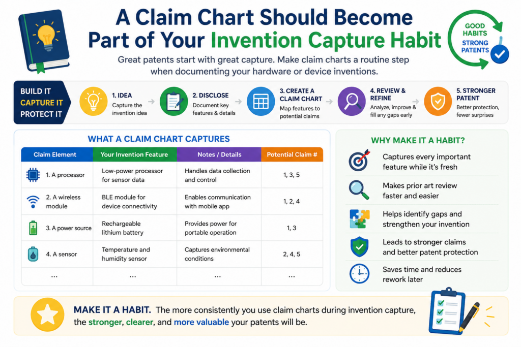
A better approach is to make claim chart thinking part of your invention capture habit.
This does not mean your engineers need to become patent writers. It means your team should get used to recording what changed, why it changed, and how that change improves the device. Those notes can later feed into a stronger claim chart.
For hardware teams, this habit is very useful because product work moves through many versions.
A design choice that seems small today may become central to the patent later. If nobody records why it mattered, the attorney may not know to protect it.
A simple invention capture habit can save a lot of pain later. It can also help your team file with more confidence when the timing is right.
Your team should capture the problem, the fix, and the device result
Good invention notes do not need to be long. They need to be clear. The team should capture the problem they faced, the device change they made, and the result that change created.
For example, if the sensor gave weak readings, note what caused the issue, how the sensor position changed, and how the readings improved.
If the device overheated, note what heat path was added, what part moved, and what happened after testing. If assembly took too long, note what latch, guide, mark, or alignment part solved the issue.
These simple notes make a later claim chart much stronger. They help show why the feature matters and how it connects to real product value.
A steady process beats a rushed patent scramble
Many startups wait until a funding round, launch date, demo, or investor request before thinking seriously about patents.
That can lead to stress. The team may try to gather months of invention history in a few days, and important details can slip away.
A steady process is better. Capture invention details as you build. Keep device files organized.
Mark the design choices that solved real problems. Then, when it is time to prepare a filing, the claim chart has strong material from the start.
PowerPatent helps make this easier by giving founders a clearer way to move from invention capture to attorney-reviewed patent work.
It is built for teams that want strong protection without slowing down engineering. You can explore the workflow here: https://powerpatent.com/how-it-works
Conclusion
A claim chart gives your hardware patent a clear backbone. It shows what the device includes, how each part works, and why the design deserves protection. For founders, this means fewer blind spots, faster attorney review, and a patent plan that matches the real product, not just a rough idea.
The best time to build this clarity is before filing, while details are fresh and choices still matter. PowerPatent helps turn your device notes, drawings, and engineering work into stronger attorney-reviewed patent filings with less friction. Start protecting what you are building here: https://powerpatent.com/how-it-works
Leave a Reply