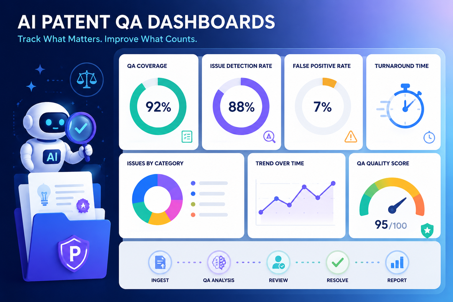
AI can help IP teams move fast. But speed alone is not the win. A patent draft that is quick but weak can cost a company years of value. A review process that finds issues too late can slow product teams down. A dashboard that only tracks volume can make the team look busy while real risk grows in the dark.
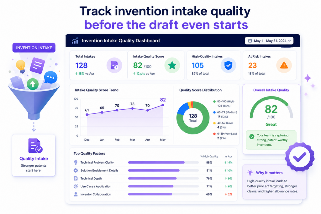
Track invention intake quality before the draft even starts
A strong patent often starts before any claim is written. It starts when the team first explains the invention. If that first handoff is thin, vague, or missing key details, the whole patent process gets harder.
The AI may ask better questions. The attorney may catch gaps. But poor intake still creates delay, rework, and risk.
Your dashboard should make this visible.
The first metric IP teams should track is intake completeness. This means checking whether the invention record has enough detail to support a strong patent review.
It should show whether the inventor explained the problem, the old way of doing things, the new method, the key system parts, the data flow, the technical gain, and the business use case.
This does not need to feel like paperwork. In fact, the best intake flow should feel natural for engineers. It should let them explain the invention in plain words, attach diagrams, share code notes, add model details, and show what changed.
A good AI patent QA dashboard should then show which invention records are ready for review and which ones need more detail.
This is where PowerPatent can help teams move faster without losing control.
The software helps founders and technical teams turn raw invention notes into a cleaner patent workflow, while real patent attorneys stay involved where judgment matters most. You can see how that works here: https://powerpatent.com/how-it-works
Intake quality should be measured by how clear the invention is to a reviewer
A simple dashboard score can show whether the invention is clear enough for an attorney, patent lead, or founder to understand.
This score should not reward long answers. It should reward useful answers. A short but clear note can be better than five pages of loose thinking.
The dashboard should ask a simple question: can someone who was not in the build meeting understand what is new?
If the answer is no, the invention is not ready. The team may need a better diagram, a sharper problem statement, or a clearer view of how the system works. This metric helps IP teams catch weak invention records early, before the drafting process begins.
You can also track how many clarification cycles each invention needs. If most invention records need two or three rounds of questions, the intake process is not doing its job.
If the number drops over time, your team is learning how to explain inventions better. That is a real quality gain.
The best intake dashboards make weak invention records impossible to ignore
A dashboard should not hide missing details in a long form. It should make the gaps easy to see. If the technical problem is missing, the dashboard should show that.
If the inventive step is unclear, the dashboard should show that. If the use case is vague, the dashboard should show that too.
This matters because patents are built on details. A patent application cannot protect what the team never explained.
When teams rush past intake, they often end up with drafts that sound broad but do not have enough support. That can create problems later when the patent is reviewed, challenged, or used in a funding or deal process.
A strong AI patent QA dashboard helps the team slow down at the right moment. Not for weeks. Not with heavy legal work. Just long enough to make sure the invention is clear.
That small pause can save many hours later.
Intake metrics also reveal whether engineers are bought into the patent process
A patent program only works if inventors take part. If engineers see patents as slow, confusing, or detached from real product work, they will avoid the process.
They may wait too long to share ideas. They may leave out key details. They may only submit inventions after a launch, when the timing is already tight.
Your dashboard should track inventor participation. This can include how many inventors submit ideas, how often teams submit new records, how long it takes to complete intake, and where submissions get stuck.
These are not vanity numbers. They show whether the patent system fits the way the company actually builds.
If only one product group submits inventions while others stay quiet, the dashboard should show that gap. If AI engineers are building major model changes but not logging them, the IP team needs to know.
If hardware teams submit great diagrams but weak written notes, the process can be tuned for them.
A clean intake process helps founders protect ideas without slowing the build team down
Founders do not want a patent process that pulls engineers away from product work for days.
They want a system that captures the core invention fast, then guides the team with smart follow-up. That is the point of tracking intake quality.
When the dashboard shows where invention records are weak, the team can fix the exact issue instead of restarting the whole process.
When the dashboard shows which teams submit strong records, leaders can copy that behavior across the company.
The goal is not to make inventors act like lawyers. The goal is to help them share what they know in a way the patent team can use.
That is where AI can be very useful. It can read rough notes, find missing pieces, ask focused questions, and shape the record into something easier to review.
But the dashboard is what keeps the process honest. It shows whether AI is helping capture better invention detail or just making messy notes look polished.
For IP teams, this is the first real quality checkpoint. Before you track draft speed, claim quality, or filing readiness, track whether the invention was captured well in the first place.
Because weak input leads to weak output.
And a dashboard that catches weak input early is already doing some of the most valuable QA work in the patent process.
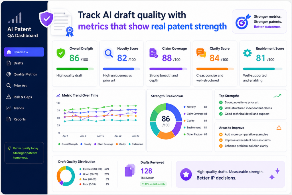
Track AI draft quality with metrics that show real patent strength
Once an invention record is strong enough, the next question is simple: did the AI-assisted drafting process create a useful first draft?
This is where many teams make a mistake. They look at speed first. They ask how fast the draft was made, how many pages were produced, or how many applications moved through the system. Those numbers matter, but they do not prove quality.
A fast draft can still miss the heart of the invention. A long draft can still be thin. A clean-looking draft can still fail to support the claims. A good QA dashboard should look deeper.
The most important AI draft quality metric is invention coverage. This means the draft should clearly cover the core idea, the main system parts, the main steps, the different versions of the invention, and the technical benefit.
The dashboard should show whether the draft reflects what the inventor actually built, not just a broad guess at the field.
This is vital for deep tech companies. In AI, robotics, chips, climate tech, biotech tools, data systems, and advanced software, the value is often in the details.
A small model change, a new data path, a better control loop, or a new training method may be the real invention. If the draft smooths over that detail, the company may lose the strongest part of the story.
PowerPatent is built around this kind of problem. It helps teams move from technical material into patent-ready work while keeping attorney review in the loop.
That mix of smart software and real legal oversight helps teams avoid the trap of fast but shallow drafting. You can learn more here: https://powerpatent.com/how-it-works
Draft quality should be judged by support, not by length
A good patent draft gives support for what the company may want to claim. That support should show up in the description, examples, drawings, system flow, and variations.
Your dashboard should track whether each key claim idea has enough support in the draft.
This can be shown as a support score. For each main claim concept, the dashboard can check whether the draft explains what the feature is, how it works, why it matters, and how it can be used in different settings.
The score should help reviewers find weak spots before attorney review turns into a long cleanup job.
This metric is useful because weak support is easy to miss when a draft sounds smooth. AI can produce text that reads well. But patent quality is not about smooth writing. It is about whether the draft can hold weight later.
If the claims mention a special ranking engine, the draft should explain that engine. If the claims depend on a feedback loop, the draft should show that loop in enough detail.
If the invention improves speed, accuracy, safety, power use, cost, or reliability, the draft should connect the technical feature to that result.
A dashboard should show where the draft sounds confident but lacks detail
One of the biggest risks with AI-assisted patent drafting is false confidence. The draft may sound complete, but the important parts may be thin. The dashboard should help reviewers spot those areas quickly.
For example, the dashboard can flag sections that use broad words without enough technical detail.
It can show where the same point is repeated without adding support. It can compare the inventor notes against the draft and mark ideas that were skipped or weakened.
This is not about making the AI look bad. It is about making the workflow better. AI can help create a strong starting point, but the IP team needs a clear way to test that starting point.
The best dashboards act like a quality map. They do not just say, “draft done.” They show which parts are strong, which parts need review, and which parts may affect claim scope.
Claim alignment should be tracked before the attorney spends time cleaning the draft
Another key metric is claim alignment. This shows whether the claims match the invention record and the draft. If the claims are too broad, too narrow, or aimed at the wrong feature, the dashboard should show that early.
Claims are the part of the patent that define what the company is trying to protect. If they miss the key value, the patent may not help much.
If they reach far beyond the support in the draft, they may create trouble later. If they focus on a low-value detail, the company may spend money protecting the wrong thing.
A strong QA dashboard can compare the claim set to the invention summary. It can show whether the main claim covers the core technical change.
It can show whether dependent claims add useful fallbacks. It can show whether important versions of the invention are missing.
This gives the attorney a better starting point. Instead of reading the entire draft cold and hunting for issues, the attorney can see the likely risk areas right away.
Better claim alignment helps teams protect what makes the startup valuable
For a startup, patent value often depends on whether the claims line up with the product, the roadmap, and the moat. A patent that protects an old version of the product may not help much.
A patent that misses the key model pipeline may fail to protect the real edge. A patent that focuses on a user interface when the real invention is in the back-end process may leave value exposed.
That is why the dashboard should track product alignment too. It should show whether the draft and claims connect to current product features, planned features, platform architecture, and key technical advantages.
This does not mean the patent has to copy the product exactly. In many cases, the patent should cover more than one product version. But it should still be tied to the company’s real technical edge.
When the dashboard tracks this, founders get more confidence. They can see that the patent process is not just producing documents. It is protecting the parts of the company that matter.
That is the real purpose of AI draft QA.
Not more words. Not prettier drafts. Not faster paperwork.
The goal is stronger patent work with less waste.
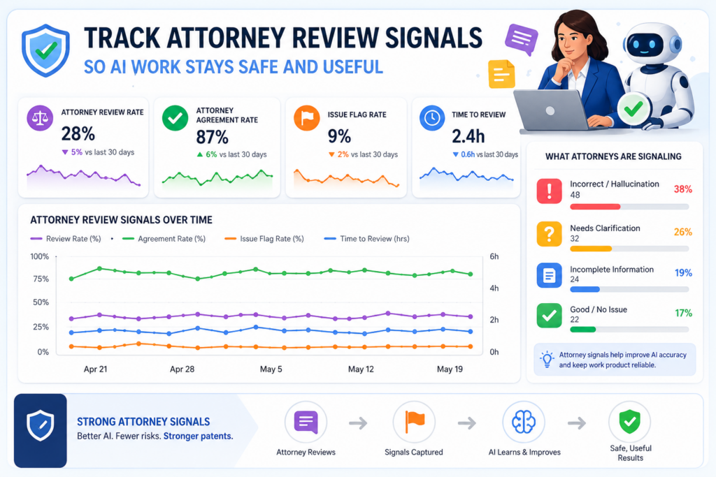
Track attorney review signals so AI work stays safe and useful
AI can speed up patent work, but it should not replace expert review. For serious patent filings, attorney oversight is still a key part of quality control. The dashboard should make that oversight clear, measurable, and easy to improve.
This is especially important for founders. Many founders like the idea of AI because it feels fast and low-cost. But they also worry about mistakes. They do not want to file something weak.
They do not want to miss key claims. They do not want to create problems that show up later during due diligence, fundraising, licensing, or enforcement.
That is why the dashboard should track attorney review signals.
These metrics show how much human cleanup was needed, where the AI draft fell short, and whether the review process is getting better over time. They help the IP team learn from every draft instead of treating each one like a separate fire drill.
A useful metric here is attorney revision depth. This shows how much the attorney had to change after the AI-assisted draft was created. But this metric must be handled with care.
More edits do not always mean the AI did a bad job. Sometimes a strong attorney adds sharper claim strategy, better fallback language, or more useful examples. That is good work.
The dashboard should look at the type of change, not just the amount of change.
Review metrics should separate small edits from real quality issues
Not all edits are equal. A typo fix is not the same as rewriting the main claim. A style change is not the same as adding missing technical support. A better word choice is not the same as fixing a wrong invention summary.
Your dashboard should separate attorney edits into clear quality groups. It should show when edits are about grammar, structure, claim scope, missing support, wrong technical meaning, unclear drawings, weak examples, or invention mismatch.
This gives the team a much better view of quality.
If most edits are small, the AI workflow is likely working well. If many edits are about missing support, the intake or draft generation process needs work.
If attorneys often rewrite claims from scratch, the claim strategy step may need stronger guidance. If technical meaning is often corrected, the AI may not be getting enough source material from inventors.
This is how a dashboard turns review into learning.
Attorney review data should help the system improve with every filing
A good dashboard should not only measure review. It should feed better behavior back into the process. If attorneys keep adding the same kind of technical example, the intake flow should ask for that example earlier.
If attorneys keep correcting the same claim issue, the drafting workflow should flag it sooner. If attorneys keep asking inventors the same question, the inventor form should be improved.
This creates a loop.
The team captures invention details. AI helps prepare the draft. Attorneys review and improve it. The dashboard studies the review. The process gets better next time.
That is how AI becomes useful in a patent team. Not as a magic button, but as part of a controlled system that learns where quality breaks down.
PowerPatent follows this practical view. The goal is not to remove people from the patent process.
The goal is to give founders and IP teams better tools, better speed, and better visibility while keeping real attorney oversight where it matters. See the process here: https://powerpatent.com/how-it-works
Attorney confidence should be a metric the team can actually use
One of the most useful dashboard signals is attorney confidence. After review, the attorney should be able to rate whether the draft is ready, almost ready, or needs major work.
This should not be a vague feeling. It should be tied to clear areas like claim strength, written support, technical accuracy, drawing quality, and filing readiness.
This gives leaders a simple way to understand risk.
If many drafts are marked as low confidence, the team should not just push harder. It should look upstream. Maybe inventors are submitting thin notes.
Maybe the AI workflow is using poor prompts. Maybe the review standard is unclear. Maybe the company is filing too late, when details are already scattered across old tickets and Slack threads.
Attorney confidence also helps founders make better decisions. A founder does not need to read every line of a patent draft to know whether the process is healthy.
A clean dashboard can show whether the attorney sees the draft as strong, whether any high-risk issues remain, and whether the filing is on track.
The best QA dashboards make attorney oversight visible without turning it into a bottleneck
Many teams fear that attorney review will slow things down. That can happen when review is not organized. But when the dashboard shows clear risk areas, attorney time becomes more focused.
Instead of spending hours finding basic gaps, the attorney can spend time on judgment. That means claim scope, strategy, support, risk, and future value. This is where human skill matters most.
A good dashboard helps the attorney move faster because it brings the right issues to the surface. It also helps the rest of the team understand what the attorney is doing and why it matters.
This builds trust.
The product team sees that review is not random. The founder sees that the filing is not blind. The IP team sees where the process is improving. The attorney sees better source material and fewer avoidable gaps.
That is the point of tracking attorney review signals. It keeps AI useful, but not unchecked. It keeps speed high, but not reckless. It gives everyone a shared view of quality.
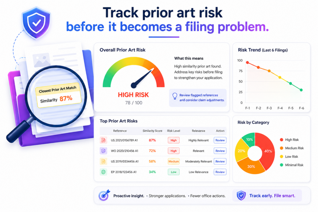
Track prior art risk before it becomes a filing problem
A patent team should never treat prior art review as a last-minute check. Prior art means older public material that may be close to the invention.
It can include old patents, papers, product pages, technical blogs, open-source projects, standards, demos, and public talks.
If the team finds close material too late, the draft may need major changes. In worse cases, the team may learn that the strongest claim idea is not as new as expected.
An AI patent QA dashboard should help the team see this risk early.
The goal is not to prove everything with one search. That is not realistic. The goal is to give the team a clear view of how crowded the space looks, which parts of the invention seem strongest, and which claim ideas may need more care.
This is where a dashboard becomes very useful because it turns research into signals that the whole team can understand.
For example, the dashboard can show whether a prior art scan has been run, whether the closest references were reviewed by a person, whether the draft has been changed based on what was found, and whether the main claim still points to a real technical difference.
These signals help prevent the team from filing a draft that sounds strong but is too close to known work.
At PowerPatent, this is one reason attorney oversight matters. AI can help surface possible issues fast, but a real patent attorney can judge what those findings mean and how the draft should respond.
That is the smart mix founders need when they want speed without guessing. You can see how PowerPatent works here: https://powerpatent.com/how-it-works
The dashboard should show how close the field looks around each invention
A useful metric here is closeness score. This score should help the team understand whether the invention sits in a crowded field or a cleaner space.
A crowded field does not mean the company should stop. It means the draft needs to be more careful.
For example, an AI model training method may have many close papers and patents around it.
But the company may still have a strong invention if it uses a unique data flow, a new feedback method, a better control step, or a special way to reduce compute cost. The dashboard should help the team find that difference.
This is important because many weak patent drafts sound broad on purpose. They try to claim a big idea without enough focus.
That may feel powerful, but it can be risky if the field is already full of close work. A strong draft should aim at the real technical edge. The dashboard should make sure the team does not lose that edge in broad words.
Prior art signals should help the team sharpen the invention story, not scare them away
Many founders get nervous when prior art appears. That reaction is normal, but it is not always helpful. Most serious technical areas have old work.
The point is not to find a blank space where no one has ever tried anything. The point is to understand what makes this invention different and why that difference matters.
Your dashboard should track whether the draft explains the difference clearly. It should show whether the problem statement has been updated after review.
It should show whether the claims focus on the new method instead of a broad known idea. It should also show whether the examples support the difference well.
This turns prior art from a threat into a tool.
When the team sees close references early, it can draft smarter. It can avoid weak claim paths. It can add better examples. It can explain the technical gain with more care.
It can make the patent application easier to review later because the main point is clearer from the start.
Prior art review should be tied to claim quality, not kept in a separate tab
One mistake IP teams make is treating prior art as a separate research file. Someone runs a search. Someone saves links. Someone may write notes. But the actual draft does not always change in a clear way.
That is a problem.
A QA dashboard should connect prior art findings to the claim set. If a close reference affects the main claim, the dashboard should show what changed.
If a reference only affects a narrow feature, the dashboard should show that too. If a reference was reviewed and found less relevant, that decision should be visible.
This creates a cleaner review trail. It also helps the attorney focus on the most important questions. Instead of starting with a folder of links, the attorney can see which findings matter to the draft and why.
A clean prior art trail gives founders more confidence when it is time to file
Founders do not need to become patent search experts. But they do need confidence that the team did not file blindly. A good dashboard gives them that confidence.
It can show that the invention was scanned, close material was reviewed, claim focus was adjusted, and any known risk was handled before filing.
This does not promise that no issue will ever come up. No honest system can promise that. But it does show that the team acted with care.
That matters during fundraising, board updates, diligence, and partner talks. Investors may not read every patent draft, but they care whether the company has a real process.
A clean dashboard helps show that the startup is not just filing patents for show. It is building a thoughtful IP system around the real product.
This is a better way to use AI in patent work. Do not use it to rush past hard questions. Use it to bring those questions forward while there is still time to improve the draft.
Track claim strength so the dashboard measures protection, not paperwork
Claims are where patent value is often won or lost. The rest of the patent explains the invention, but the claims define the protected space.
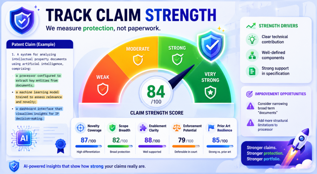
If the claims are weak, unclear, too narrow, or aimed at the wrong feature, the company may end up with a patent that looks good on paper but does not protect much.
That is why claim strength should have its own place in an AI patent QA dashboard.
Many dashboards track process speed. They show how many drafts were made, how many filings moved forward, and how long each step took.
Those numbers are useful, but they do not answer the most important question. Are we protecting the right thing?
A claim strength view should help the team see whether the claims cover the core technical idea, whether they include useful backup positions, whether they match the product roadmap, and whether they have enough support in the draft.
This is not about making the dashboard act like a lawyer. It is about giving the team better visibility before attorney review and final filing.
For startups, this matters a lot. A young company often has limited money and time. Each patent filing should support a real business goal.
It may help protect a product, create leverage in a market, support a raise, block copycats, or build value for a future deal. If the claims do not connect to that goal, the filing may not give the company what it needs.
The dashboard should show whether the main claim protects the real invention
A strong main claim should point to the heart of the invention. It should not get lost in side details.
It should not focus on a feature that is easy for others to avoid. It should not protect an old version of the product while the team has already moved on.
Your dashboard should track main claim alignment. This means comparing the main claim against the invention summary, product feature, technical edge, and roadmap.
If the claim covers a minor part of the system, the dashboard should flag that. If it misses the core workflow, the team should know before the draft moves forward.
For example, a startup may build an AI system that reduces model cost by changing how training examples are selected.
If the claim only talks about displaying outputs to a user, it may miss the real value. The dashboard should help catch that mismatch.
This is where PowerPatent’s mix of software and attorney oversight can help. The software can organize the signals.
The attorney can judge the strategy. Together, the team gets speed and care at the same time. Learn more here: https://powerpatent.com/how-it-works
Claim strength is easier to improve when weak points are shown in plain language
A good dashboard should not hide behind dense patent terms. It should explain the issue in simple words. It should show that a claim may be too narrow because it depends on one optional feature.
It should show that a claim may be too broad because the draft does not explain enough support. It should show that a claim may miss a key product step.
This plain view helps founders and engineers take part in the process.
Engineers can tell the team whether a step is required or just one example. Product leaders can explain which features are likely to matter next year.
Founders can decide whether the filing supports the company story. Attorneys can use that input to shape the claims with more care.
This kind of teamwork is hard when the patent process lives in long documents and private emails. A dashboard brings the issue into the open.
Backup claim quality should be measured because the first path may not always win
A strong patent filing should not depend on only one claim idea. It should include backup positions. These are narrower versions that still protect useful ground if the broadest claim has trouble later.
Your dashboard should track whether the draft includes meaningful backup claims. This does not mean adding random small details.
Backup claims should protect real versions of the invention. They should cover important system parts, process steps, model settings, hardware options, data paths, and use cases that matter to the business.
The metric should ask a simple question. If the broadest claim is challenged, does the filing still have useful fallback options?
If the answer is no, the draft may need more work.
A good fallback strategy can protect value even when the field is crowded
In deep tech, broad protection is not always easy. There may be many older patents and papers. There may be standards.
There may be open-source systems. There may be fast-moving competitors. That does not mean the company has no IP value. It means the claims need to be layered with care.
A dashboard can help by showing how each backup claim maps to a product feature, technical gain, or market use.
This makes the claim set easier to judge. It also helps the team avoid weak filler claims that add length but not value.
The best claim dashboards help teams think like builders and strategists. They ask what would be hard for a competitor to copy around. They ask which parts of the system create real advantage.
They ask where the company may expand next. They help the attorney turn those answers into better claim coverage.
This is how a patent program becomes more than a filing machine. It becomes a way to protect the company’s edge.
Track technical accuracy because a polished draft can still be wrong
AI can write clean text, but clean text is not the same as correct text. This is one of the biggest risks in AI-assisted patent work. A draft can sound formal, organized, and complete while still getting the invention wrong.
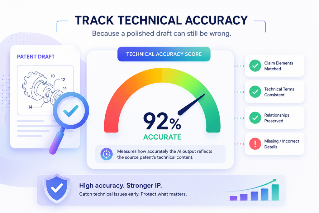
That is why technical accuracy must be a core metric in the QA dashboard.
The dashboard should help the team compare the draft against the real invention materials.
This may include inventor notes, code comments, diagrams, architecture docs, model cards, lab results, product tickets, design files, test data, and engineering chats. The question is simple. Does the patent draft describe what the team actually built?
If the answer is unclear, the draft is not ready.
Technical errors can hurt in many ways. A wrong system step can weaken support. A fake example can create confusion. A claim that depends on the wrong data flow can miss the invention.
A description that uses the wrong model type can make the filing less useful. These problems are easier to fix before filing than after.
A strong dashboard should track how often attorneys or inventors correct technical meaning during review.
If this happens often, the team may need better intake, better AI prompts, or better source documents. The dashboard should not treat these corrections as random edits. They are quality signals.
The dashboard should show whether inventors have verified the technical story
Inventor review is one of the simplest ways to improve draft quality. The inventor does not need to judge claim language. The inventor needs to answer a more basic question. Is this technically right?
Your dashboard should track inventor verification. It should show whether the right inventors reviewed the invention summary, the system description, the main examples, and the drawings.
It should also show whether they approved the technical flow or requested changes.
This step matters because patent drafts often pass through people who were not part of the build. A founder may know the business value.
An attorney may know how to draft. AI may help structure the text. But the inventor knows the fine details of how the system works.
If that person has not checked the draft, the dashboard should show a gap.
Technical review should be fast, focused, and easy for engineers to complete
Engineers are busy. They do not want to read a long patent draft and guess what matters.
A good dashboard should make technical review focused. It can show the invention summary, key system steps, important terms, drawings, and claim concepts in a simple view.
The engineer should be able to confirm what is right and mark what is wrong. The system should make it easy to say, “This step is optional,” “This part works differently,” “This example is not accurate,” or “This feature is not in the product anymore.”
This feedback is gold.
It helps the attorney improve the draft. It helps the AI workflow learn what details were misunderstood. It helps the company avoid filing a patent that does not match the product.
PowerPatent helps technical teams stay involved without making the process feel heavy.
Founders and engineers can work through the invention process with smart tools, while attorney review helps turn the output into stronger patent work. See how it works here: https://powerpatent.com/how-it-works
Accuracy metrics should catch made-up detail before it enters the filing record
AI systems can sometimes add detail that was not in the source material. In a patent workflow, that is dangerous.
A draft should not invent test results, system parts, performance numbers, or implementation details that the team did not provide.
Your dashboard should track unsupported detail. This metric checks whether important statements in the draft can be traced back to real source material or approved inventor input.
It does not need to trace every simple sentence. But it should trace key technical claims, examples, data flows, performance gains, and system parts.
If the draft says the system improves speed by a certain amount, the dashboard should show where that number came from. If the draft says a model is trained in a specific way, the dashboard should show the source.
If the draft adds a hardware component, the dashboard should confirm that the invention actually uses it or that it is a valid example approved by the team.
Source traceability protects the team from quiet errors that look harmless at first
Quiet errors are some of the hardest to catch. They do not look dramatic. They may be only one sentence. But that sentence can create confusion later.
For example, the draft may say the system uses a neural network when the invention is really a rules-based control method. It may say data is encrypted at one stage when that was only a future idea.
It may say the tool works in real time when the current method runs in batches. These details may seem small, but they can change the meaning of the invention.
A dashboard that tracks source support makes these issues easier to see. It also creates better habits. Inventors learn to provide stronger proof.
AI outputs become more grounded. Attorneys spend less time guessing where claims came from.
This is what good QA looks like. It does not wait for mistakes to become expensive. It catches them when they are still easy to fix.
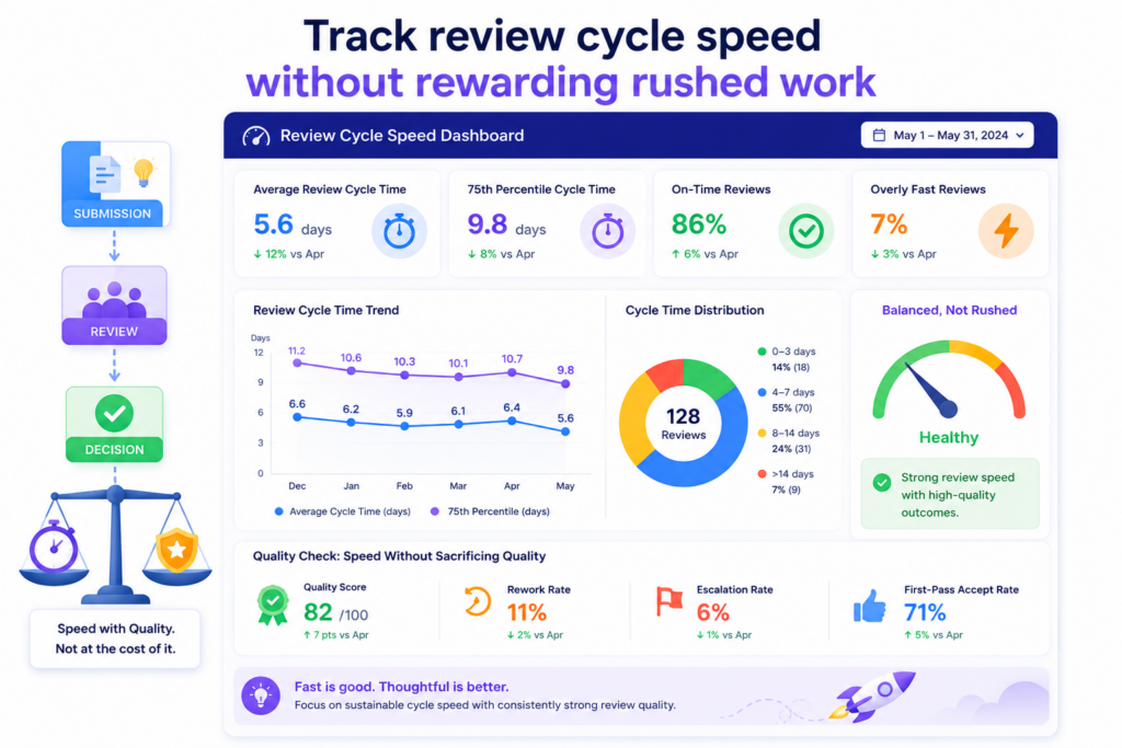
Track review cycle speed without rewarding rushed work
Speed matters in patent work. Startups move fast. Product launches happen quickly. Fundraising timelines change.
Competitors ship new features. Public demos, papers, and sales calls can create pressure. A slow patent process can cause real problems.
But speed can be dangerous if the dashboard rewards the wrong behavior.
An AI patent QA dashboard should track cycle time, but it should not celebrate speed by itself. It should show how fast work moves while also showing whether quality is holding up.
The best metric is not “how quickly did we finish?” The better question is, “how quickly did we reach a strong, review-ready filing?”
This difference matters.
If a team cuts review short to hit a deadline, the dashboard should show the quality risk. If a draft moves fast because intake was strong and review was focused, that is a win.
If a draft moves fast because nobody checked technical accuracy, that is not a win.
A healthy dashboard should track the time from invention intake to first draft, first draft to attorney review, attorney review to inventor approval, and final review to filing decision.
It should also show where delays happen. The point is not to blame people. The point is to find friction that can be removed.
The dashboard should show where patent work gets stuck
Most patent delays do not come from one giant problem. They come from small stalls. An inventor does not answer a question. A diagram is missing. A claim issue waits for review.
A founder has not approved filing. A prior art concern has not been resolved. The team thinks the draft is moving, but it is actually waiting on one person or one missing detail.
Your dashboard should make these stalls visible.
It should show status in plain words. It should show who needs to act next. It should show what is missing. It should show how long the item has been in that state. This simple visibility can save a lot of time.
For example, if three patent drafts are waiting on inventor review, the IP lead can solve that directly. If several drafts are stuck because drawings are missing, the team can improve the intake flow.
If attorney review always slows down at the claim strategy stage, the team can prepare better claim notes earlier.
Fast patent work comes from clear handoffs, not pressure
Founders often try to speed up patents by pushing harder. That rarely works for long. The better move is to make each handoff cleaner.
The inventor should know what to submit. The AI workflow should know what to produce. The attorney should know what needs judgment.
The founder should know what decision is needed. When each handoff is clear, speed improves naturally.
A dashboard helps by showing the health of those handoffs. It can track how many times work moves backward. It can show how many questions are asked after intake.
It can show whether attorney review starts with a clean draft or a messy one. It can show whether filing decisions are made quickly after review.
This is the kind of speed startups need. Not rushed speed. Controlled speed.
PowerPatent is designed for founders who want to protect inventions without slowing down the company.
The platform helps structure the process, while attorney oversight helps keep quality in view. See the process here: https://powerpatent.com/how-it-works
Cycle time should be read together with rework and quality scores
A fast process with heavy rework is not truly fast. It only moves the pain to a later stage. A slow process with almost no rework may still be too slow for a startup. The dashboard should show both.
A useful metric is clean pass rate. This means how often a draft moves from one stage to the next without major rework. If clean pass rate is high and cycle time is low, the process is working.
If cycle time is low but rework is high, the team may be rushing. If cycle time is high and quality is still low, the process needs a deeper fix.
This helps IP leaders make better calls.
They can see whether AI is reducing real work or only creating more review burden. They can see whether attorneys are spending time on strategy or basic cleanup. They can see whether inventors are giving enough detail at the start.
The best speed metric is the time it takes to reach confidence
The true goal is not a finished draft. The true goal is confidence. Confidence that the invention is clear.
Confidence that the technical story is right. Confidence that the claims point to the real value. Confidence that attorney review found and handled the key risks.
Your dashboard should track time to confidence. This metric measures how long it takes for a filing to reach a state where the team agrees it is ready to move forward.
That is a much better signal than raw draft speed.
AI may create a first draft in minutes or hours. But if that draft takes weeks to fix, it did not really save time.
On the other hand, if AI helps gather better invention detail, guide review, and reduce confusion, the whole process can move faster with less stress.
This is what IP teams should aim for. Faster work that stays strong.
Track portfolio coverage so each patent supports the business plan
A patent dashboard should not only look at single filings. It should also show the health of the full portfolio.
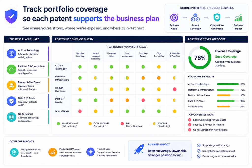
This is where many teams miss value. They file patents one by one, but they do not step back and ask whether the full set protects the company’s real direction.
Portfolio coverage is the metric that answers that question.
For a startup, the patent portfolio should map to the core product, key technical systems, future roadmap, and main business risks. It should not be a random stack of filings.
Each patent should have a reason to exist. The dashboard should help the team see what is covered, what is exposed, and what may no longer matter.
This is especially important in fast-moving companies. The product can change. The model can change. The target market can change. A feature that seemed central six months ago may now be less important.
A new technical method may become the company’s real edge. If the patent dashboard does not track this shift, the portfolio can drift away from the business.
A good dashboard should show coverage by product area, technical feature, market use, inventor team, and roadmap stage. It should help leaders see whether the most valuable parts of the company are protected or still waiting.
The dashboard should connect patents to product and roadmap themes
A useful portfolio dashboard should use language the business understands. It should not only show filing numbers and legal status. It should show which parts of the product each patent supports.
For example, an AI infrastructure company may want coverage across data ingestion, model training, model routing, evaluation, security, deployment, monitoring, and cost control.
A robotics company may want coverage across sensors, control systems, motion planning, power use, safety, and fleet learning. A climate tech company may want coverage across materials, process steps, hardware design, control logic, and manufacturing.
The dashboard should show these themes clearly. It should help the team see whether the portfolio matches the product story they tell investors, customers, and partners.
If the company says its main moat is a new training pipeline, the dashboard should show whether that pipeline has coverage.
If the roadmap depends on a new hardware design, the dashboard should show whether invention capture has started. If an old filing no longer matches the product, the team should know that too.
Portfolio coverage helps founders stop guessing where to file next
Without a dashboard, patent decisions can become reactive. A founder hears about a new feature and asks for a filing.
An engineer submits something interesting. A competitor launches something similar. The company responds case by case.
That is not enough.
A strong dashboard helps the team make patent decisions with more intent. It shows where coverage is thin.
It shows which inventions support important business goals. It shows where the company may need a new filing before a launch, demo, paper, pitch, or partnership.
This is one of the best ways to avoid costly gaps.
PowerPatent helps founders build a more organized patent workflow, from invention capture through attorney-backed filing work.
That matters because a strong portfolio is not built by accident. It comes from a repeatable process that fits how the company builds. Learn more here: https://powerpatent.com/how-it-works
Portfolio metrics should also show stale filings and low-value work
Not every patent idea deserves the same level of effort. Some inventions are central. Some are useful but minor.
Some become outdated before filing. Some no longer match the product. A dashboard should make this visible.
A useful metric is strategic fit. This shows whether a filing still supports the business. It can be based on product relevance, market value, technical importance, competitor risk, and roadmap fit.
If a filing scores low, the team may still choose to continue, but it should do so with open eyes.
This helps startups spend wisely. Patent budgets are not endless. Attorney time is not endless. Engineer time is not endless.
The dashboard should help the team put the most care into the inventions that matter most.
A strong portfolio view makes IP feel less like paperwork and more like company strategy
When founders see patents only as documents, they often delay them. When they see patents as part of the company’s moat, they take them more seriously.
A portfolio dashboard helps make that shift. It shows the link between inventions and business value. It shows where the company is strong.
It shows where it is exposed. It helps the team decide what to file, what to improve, what to pause, and what to revisit.
This is where IP work becomes easier to explain to the board. It becomes easier to discuss with investors. It becomes easier to align with product planning. The dashboard gives everyone a shared picture.
That shared picture is powerful because patent work often fails when people are not aligned. Engineers think in systems.
Founders think in markets. Attorneys think in claims. Investors think in defensibility. A good dashboard connects those views without making anyone learn a new language.
That is how AI patent QA becomes more than draft review. It becomes a way to guide the whole patent program.
Track disclosure timing so the team does not lose rights by moving too late
Timing is one of the most practical metrics an IP team can track. A strong invention can become much harder to protect if the team waits too long after public disclosure. Public disclosure can happen in many ways.
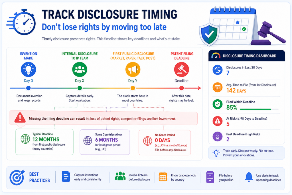
It may be a product launch, demo day, website post, research paper, sales deck, GitHub release, customer pilot, conference talk, webinar, or even a public job post that reveals too much.
A patent QA dashboard should help the team see timing risk before it becomes urgent.
This does not mean engineers should stop sharing work. Startups need to sell, hire, publish, pitch, and launch. The goal is not silence.
The goal is control. The team should know when an invention may become public and whether patent work should start before that happens.
The dashboard should track planned disclosure dates, filing readiness, inventor review status, attorney review status, and risk level.
It should show when a launch or demo is close but the patent workflow is not ready. This gives the founder time to make a smart call.
For deep tech startups, this matters even more. Many teams share technical details to prove that their product works.
They may publish benchmarks, architecture diagrams, model results, hardware specs, or process data. Those details can be powerful for sales and fundraising, but they can also affect patent plans if not handled early.
The dashboard should connect invention records to launch and publication plans
A strong dashboard should not live apart from the business calendar. It should connect invention records to upcoming events. If a product launch is planned, the team should know which inventions may be disclosed.
If a paper is being submitted, the team should know whether the technical method has been reviewed. If a sales deck includes system diagrams, the IP team should have a chance to check whether those diagrams reveal something important.
This is not about slowing the company down. It is about avoiding surprises.
The dashboard can show a simple timing status for each invention. It can show whether there is no known disclosure planned, whether a disclosure is coming, whether the filing should be rushed, or whether the team has already filed. The key is clarity.
When the timing view is clear, founders can move with more confidence. They do not have to choose between growth and protection at the last second.
Early timing signals help teams avoid panic filings
Panic filings are stressful. They happen when the team learns about a public disclosure right before it happens. Everyone rushes. Engineers scramble to explain the invention.
Attorneys work with limited time. The draft may not get the care it deserves. The company files something, but nobody feels great about it.
A dashboard can reduce this risk by catching timing issues earlier.
If a demo is six weeks away, the dashboard can flag related inventions now. If a technical blog is planned, the team can review it before publication.
If a customer pilot will reveal a key workflow, the team can decide whether to file first or adjust what is shared.
This makes the patent process feel calmer and more useful.
PowerPatent is built for founders who do not want patent work to become a last-minute scramble.
It helps teams move faster from invention to attorney-backed patent work, so protection can keep up with the company. See how it works here: https://powerpatent.com/how-it-works
Disclosure metrics should make risk clear without creating fear
A timing dashboard should not scare teams away from sharing anything. That would be bad for the business. Instead, it should help them make smart choices.
The dashboard should show risk in simple terms. It should explain whether an invention has already been shared, whether it is about to be shared, whether a filing is in progress, and whether the team needs attorney input. It should also show what action is needed next.
This kind of clarity helps teams move faster. Engineers do not need to guess whether a public post is risky.
Product leaders do not need to chase legal advice at the last second. Founders do not need to rely on memory. The dashboard keeps the facts in one place.
Timing control is one of the easiest ways to protect more value with less stress
Many patent problems are hard. Claim strategy is hard. Prior art review can be hard. Technical drafting can be hard.
Timing control is often simpler. The team just needs to know what is being shared and when.
That is why disclosure timing belongs in every AI patent QA dashboard.
It gives the team an early warning system. It helps match patent work to business plans. It reduces rush. It protects options. It helps founders move in public without giving away value by accident.
For startups, this can be a major advantage. The company can keep building, selling, hiring, and pitching while still protecting the inventions that matter.
The dashboard becomes a quiet guardrail. It does not block the road. It keeps the team from driving off the edge.
Track data privacy so invention details do not leak while the team moves fast
AI patent work touches some of the most sensitive facts in the company.
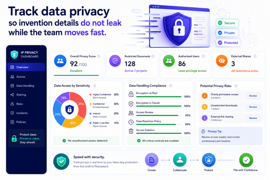
It may include source code ideas, model design, training methods, chip layouts, customer workflows, roadmaps, test results, and early product plans. These are not normal notes. These are the raw parts of the company’s edge.
That is why an AI patent QA dashboard should track data privacy from the start.
A good dashboard should show where invention data comes from, who can see it, where it is stored, what tools touched it, and whether anything was shared outside approved systems. This may sound basic, but it is often missed. Teams move quickly.
Engineers paste details into random tools. Founders send invention notes through chat threads.
Outside counsel asks for files. Contractors help with drawings. Before long, nobody knows where the invention record actually lives.
For a startup, that is risky. The whole point of filing patents is to protect what the company is building. The process should not create new exposure.
PowerPatent is built for teams that want speed, but not chaos. The platform helps structure the path from invention notes to attorney-backed patent work, so founders can move faster with more control. You can see how it works here: https://powerpatent.com/how-it-works
The dashboard should show whether sensitive invention data stays inside trusted workflows
The first privacy metric is controlled access. This tells the team whether only the right people can see each invention record.
Not every engineer needs access to every filing. Not every advisor needs to see the full technical record. Not every outside party should receive the same level of detail.
A strong dashboard should show whether access matches the role. The inventor should see the technical record. The founder or IP lead should see the status and risk.
The attorney should see the draft and source details needed for review. A finance lead may only need to see cost and timing. The dashboard should make this easy to manage.
This is not about making the process slow. It is about avoiding loose access that creates avoidable risk.
A privacy view should also track whether files were downloaded, exported, copied, or shared. If a draft was sent outside the platform, the dashboard should show that.
If a user added a new collaborator, the team should see it. If someone uploaded source material from a restricted project, the system should flag it for review.
Privacy metrics should make safe behavior easy for busy technical teams
Engineers do not want to think about permission rules all day. They want a simple path that lets them share what matters without exposing too much. That is why the dashboard should support safe defaults.
When an inventor submits a record, the system should guide them to add the right material in the right place. When a reviewer needs access, the system should make that request visible.
When a file contains sensitive data, the dashboard should show whether it is approved for use in the patent workflow.
The best privacy controls feel boring in the best way. They work quietly. They do not force people to become security experts. They make the safe path the easiest path.
That matters because invention data is often scattered across code repos, lab notes, product docs, tickets, and slide decks.
If the patent process asks people to copy and paste those details into random places, mistakes happen. If the dashboard creates one clear place for controlled review, the risk goes down.
The dashboard should track AI tool exposure before it becomes a hidden problem
Not all AI tools handle data the same way. Some tools may store prompts. Some may use inputs to improve models.
Some may be approved by the company. Some may not. An IP team cannot treat every AI tool as if it has the same privacy posture.
Your dashboard should track approved AI use. It should show which AI tools are allowed in the patent workflow, what data they can receive, and whether any invention record was processed outside approved rules.
This is very important for founders. Patent work often starts with the most valuable and least public information in the company. A loose AI workflow can put that information in places the company does not control.
The metric here should be simple. Was the invention processed only through approved systems? Were sensitive source materials protected? Were access logs captured? Was any export reviewed?
Strong privacy tracking builds trust across founders, engineers, attorneys, and investors
A clean privacy dashboard helps everyone trust the process. Engineers know their work is not being sprayed across tools. Founders know the company’s core ideas are handled with care.
Attorneys get the source material they need without messy handoffs. Investors see that the startup treats IP like a serious asset.
This is not just a security concern. It is a quality concern.
When people trust the system, they use it earlier. They submit better notes. They share better diagrams. They stop hiding invention details in private threads. That leads to better patent drafts and fewer missed inventions.
A good AI patent QA dashboard should never treat privacy as a side issue. It should show privacy status right next to drafting, review, timing, and filing readiness.
Because if the process protects the patent but leaks the invention, the process has failed.
Track AI output consistency so quality does not depend on luck
AI can be helpful, but it can also be uneven. One draft may be strong. The next may miss key details. One claim summary may be sharp.
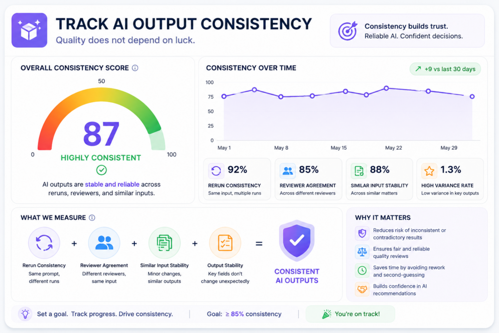
Another may use broad words that do not match the invention. One invention record may get useful follow-up questions. Another may get shallow questions.
That is why AI output consistency should be tracked.
A patent team should not depend on luck. It should not hope the AI produces a good result each time.
It should measure whether the system gives steady, useful, and review-ready output across inventors, product teams, technologies, and drafting stages.
A dashboard can help by showing patterns. It can show whether certain invention types produce weaker drafts. It can show whether some teams submit better source material.
It can show whether certain AI steps often need human correction. It can show whether claim summaries improve after the team changes prompts or intake questions.
This is how the team learns. Without consistency metrics, every issue feels like a one-time problem. With the dashboard, the team can see the pattern and fix the workflow.
PowerPatent helps teams avoid the “blank page and guesswork” problem by using smart software with real attorney oversight.
That blend matters because AI should support a better process, not create random output that nobody can trust. See how it works here: https://powerpatent.com/how-it-works
The dashboard should compare similar inventions against the same quality standard
A strong dashboard needs a clear quality baseline. If two similar inventions go through the same process, the team should expect a similar level of output quality. The draft should cover the invention clearly.
The claim ideas should line up with the technical edge. The examples should be grounded in the source material. The review notes should be easy for the attorney to use.
When output quality swings too much, the dashboard should show it.
For example, one AI workflow may work well for software inventions but struggle with hardware systems. Another may handle data pipelines well but miss control logic.
Another may produce good summaries but weak claim fallbacks. These differences matter because deep tech companies often have many invention types.
A consistency metric helps the IP team tune the process by invention class. The goal is not one generic workflow for everything. The goal is a reliable process that adapts to the kind of invention being reviewed.
Consistency tracking helps teams fix the system instead of blaming the people
When a draft is weak, it is easy to blame the inventor, the AI, the reviewer, or the attorney. Sometimes a person did miss something. But often the workflow itself caused the issue.
Maybe the intake form did not ask the right question. Maybe the AI was not given the right source material.
Maybe the draft template was too generic. Maybe the attorney review checklist did not match the invention type. Maybe the founder’s business goal was never added.
A dashboard helps the team find the real cause.
If the same issue appears across many drafts, it is not a person problem. It is a process problem. That is good news because process problems can be fixed.
The team can update prompts, improve intake, add review steps, change templates, or create better source rules.
This is how AI patent work becomes more dependable over time.
The dashboard should track prompt changes, template changes, and review changes together
AI output quality depends on many moving parts. If the team changes prompts, updates templates, adds a new review step, or changes the intake flow, quality may improve or get worse.
The dashboard should connect those changes to results.
This is often called version tracking, but the idea is simple. When the system changes, the team should know whether the change helped.
For example, if the team adds a new intake question about technical benefits, the dashboard should show whether drafts now include clearer benefit sections.
If the team changes the claim generation prompt, the dashboard should show whether attorneys rewrite fewer claims. If the team adds source traceability, the dashboard should show whether unsupported details go down.
Version history makes AI patent QA easier to manage at scale
As a company grows, more inventions come in. More teams get involved. More attorneys may review work.
More product areas need coverage. Without version history, the process can become hard to control.
A dashboard should show which workflow created which output. It should show which draft came from which template. It should show which prompts were used. It should show whether a later version performed better than an earlier one.
This matters because IP teams need repeatability. A founder should not have to wonder whether the next patent draft will be strong.
An attorney should not have to clean up the same issue again and again. Engineers should not have to answer the same missing questions after every submission.
Good AI patent QA is not about one amazing draft. It is about a system that produces steady, reviewable work again and again.
That is the quality standard worth tracking.
Track filing readiness so the team knows when a patent is truly ready to move
A patent draft can look finished before it is actually ready. It may have claims, drawings, a description, and attorney notes.
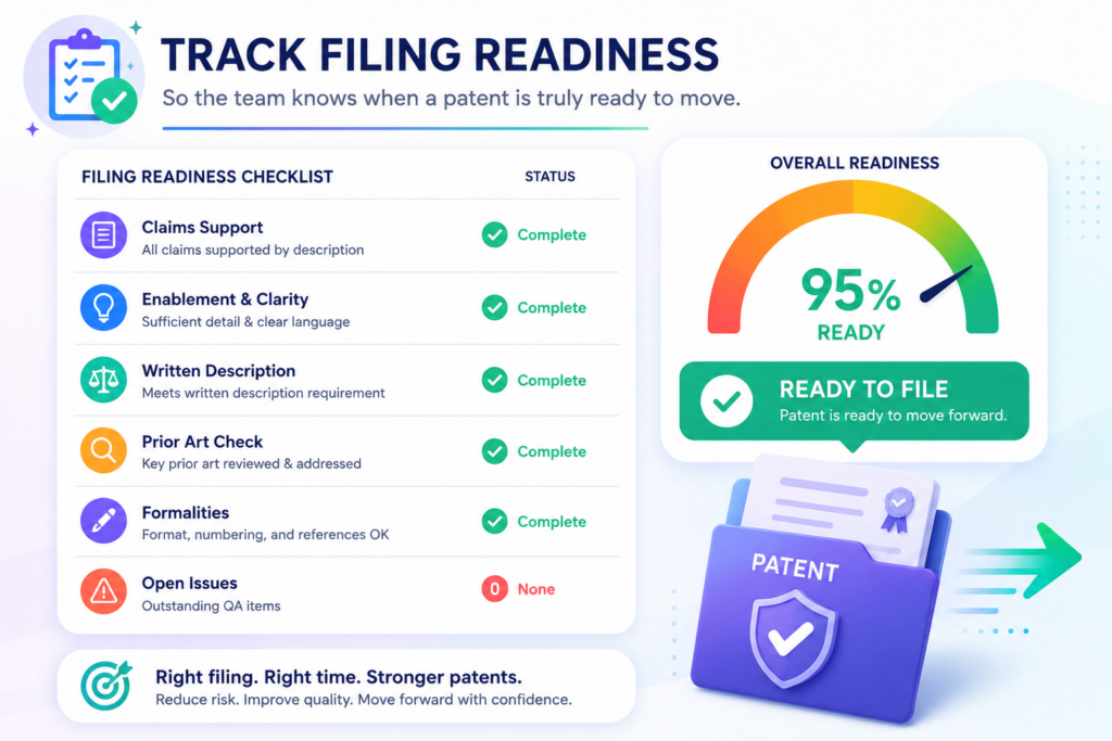
It may look complete on the surface. But if the invention story is unclear, the technical support is thin, or inventor review is missing, the filing may still carry risk.
This is why filing readiness deserves its own metric.
Filing readiness should bring all major quality signals into one clear view. It should show whether intake is complete, technical accuracy is verified, prior art has been considered, claims are aligned, attorney review is complete, drawings are ready, timing risk is handled, and founder approval is done.
This does not need to be complicated. The dashboard should answer one simple question. Is this filing ready to move forward with confidence?
For startups, this view is very useful. Founders often need to make quick decisions. Should we file before the demo?
Should we wait for more test data? Should we add another example? Should we split this into more than one filing? Should we move now because a disclosure is coming?
A filing readiness dashboard helps those decisions become less stressful.
Filing readiness should be based on clear gates, not gut feel
Many patent workflows run on gut feel. Someone says the draft is mostly ready. Someone else says the claims look okay.
The inventor says they reviewed most of it. The attorney says there are a few changes left. The founder asks whether they can file by Friday.
That is not a great way to manage important IP.
A dashboard should use clear gates. Each gate should show whether a key part of the filing is ready. The invention record should be complete. The draft should match the invention.
The claims should have support. The drawings should match the written text. The inventor should confirm the technical story. The attorney should approve the filing path.
These gates give the team a shared view. Nobody has to guess what “ready” means.
Clear gates reduce last-minute stress and prevent weak filings
Last-minute stress often happens because the team discovers missing work too late. The inventor never reviewed the examples.
The drawings do not match the system flow. The main claim depends on a detail that is not well explained. The prior art scan found something close but nobody updated the claim focus.
A filing readiness view catches these gaps earlier.
This helps the attorney do better work. It helps the founder make better decisions. It helps engineers respond to focused questions instead of emergency requests.
It helps the IP team avoid filing just because the calendar is tight.
PowerPatent helps founders move from invention capture to attorney-backed patent work in a more guided way.
That helps teams file with more confidence and less guesswork. You can learn more here: https://powerpatent.com/how-it-works
Filing readiness should show both blocking issues and nice-to-have improvements
Not every issue should stop a filing. Some issues are serious. Others are optional. A good dashboard should make this clear.
A blocking issue may be a missing inventor review, a claim that does not match the invention, a major technical error, or an unresolved timing risk.
A nice-to-have issue may be a cleaner example, a better figure label, or a more polished summary. Both matter, but they do not carry the same weight.
The dashboard should help the team understand the difference. This prevents overreaction. It also prevents dangerous shortcuts.
If every issue feels urgent, the team wastes time. If no issue feels urgent, the team may file too soon. A good readiness view creates balance.
The best readiness score helps founders act without reading every detail
Founders need visibility, but they do not always need to read every line of every draft. A dashboard should give them the right level of control.
It should show the readiness score, the main open issues, the risk level, and the decision needed.
This helps founders stay involved without becoming a bottleneck.
For example, the dashboard might show that the filing is technically verified, attorney reviewed, and ready except for one drawing update.
That is a very different situation from a filing where claims are not aligned and inventor review is missing. The founder can make a smarter call when the facts are clear.
A filing readiness metric also helps the company build discipline. It teaches the team what “ready” looks like. Over time, inventors submit better records. Attorneys get cleaner drafts.
Founders approve with more confidence. The whole system becomes faster because people are not guessing.
That is the real value of this metric. It turns filing from a scramble into a clear decision.
Conclusion
AI patent QA dashboards should not be built to look impressive; they should help IP teams make better calls every day. The right metrics show whether inventions are clear, drafts are accurate, claims protect real value, attorneys trust the work, and founders can file with confidence.
When quality, speed, risk, cost, timing, and portfolio fit live in one view, patent work stops feeling like a maze. It becomes a smart growth system. That is exactly what PowerPatent helps modern teams build with AI tools and real attorney oversight. See how it works here: https://powerpatent.com/how-it-works
Leave a Reply