
Sometimes the simplest choices end up shaping how strong your patent becomes. One of those small-but-mighty choices is deciding whether your figures should be in black-and-white or in color. It sounds tiny. It feels like it shouldn’t matter. But it does—especially when you’re a fast-moving founder trying to get real protection without slowing down.
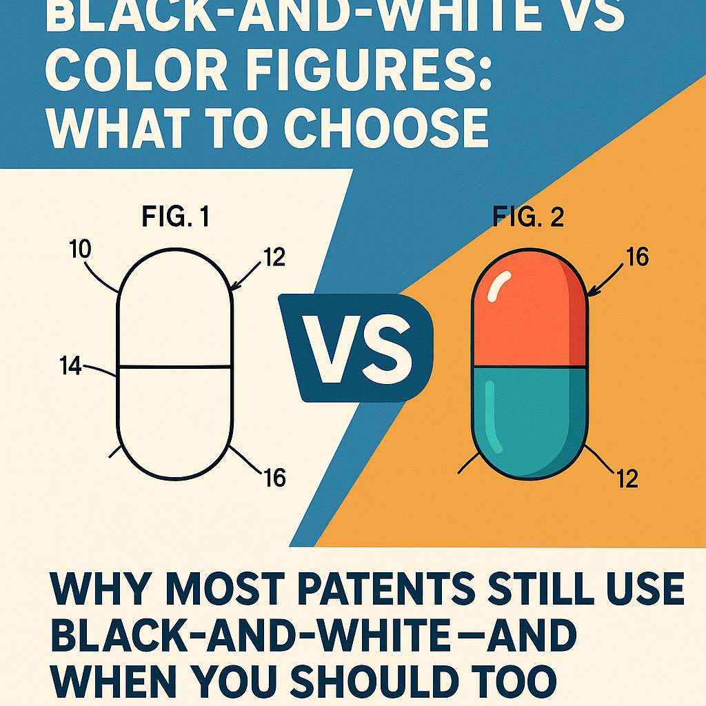
Why Most Patents Still Use Black-and-White—and When You Should Too
Why Black-and-White Remains the Standard
Black-and-white figures continue to be the default choice because they work smoothly inside the patent system.
Examiners can review them quickly since the lines are clear, the shapes are simple, and the meaning is easy to understand without any guesswork. For a fast-moving business, this matters more than most people realize. Every small delay adds friction to your timeline.
If your drawings raise questions, you lose speed. If your figures look complicated or depend on subtle color details, the examiner may take longer to understand the invention.
And when time is tied to funding, competition, and product releases, slowdowns hurt.
Many founders think color might make their idea look more polished or modern. But the patent office does not care about style. It cares about clarity. When your drawings remain clean and high-contrast, you reduce the chance of misunderstandings.
You also avoid extra paperwork, special requests, or added fees that come with color submissions. For most companies, especially those running lean, this keeps the process predictable.
Another quiet advantage is flexibility. Black-and-white figures allow you to describe your invention broadly. Patent law only protects what you describe, so if your drawings are too specific, you lock yourself into a narrow version of your product.
Simple line art leaves room for updates, future models, and improvements. This is important for businesses building fast cycles where the product evolves every few weeks.
When Choosing Black-and-White Protects You
There are moments when black-and-white does not just make sense; it actively shields your long-term strategy.
If your invention includes complex systems, software flows, or mechanical structures that do not depend on color to function, staying with line drawings keeps you safe.
You avoid the risk of having the examiner misunderstand subtle shading or gradients, and you remove any doubt about what each part means.
This choice becomes even more important when your team is preparing a patent during early product development. At this stage, your design may still change.

If you submit color images tied to specific visual details, you may limit your ability to adjust the product without weakening the patent. Black-and-white gives you breathing room, allowing your design to grow while the legal protection stays strong.
How Businesses Can Use Black-and-White Figures More Strategically
If you want your patent to support your business goals, a smart way to use black-and-white drawings is to focus on what truly captures the essence of your invention.
Describe the function, the relationship between elements, and the flow of energy, data, or movement. Do not worry about texture or visual polish. Prioritize what makes your idea unique and valuable.
This helps the examiner grasp the innovation quickly, and it helps future partners, investors, or acquirers understand the value you created.
Another strategic move is preparing drawings that match the real scale of your business story. When you show only what matters, you control the narrative.
You avoid drowning your invention in details that do not advance your protection. This approach also makes it easier to explain your invention to non-technical stakeholders, including investors who may read the patent as part of due diligence.
A very practical piece of advice is to think ahead about the update cycle of your product. If your physical design or interface layout will change often, stick to simple line figures that show the core elements without tying you to a particular version.
This preserves the strength of your filing and reduces the need for later amendments.
If you want this entire process handled smoothly, you can let PowerPatent guide you with software that pulls the key elements from your explanation and shapes them into clean, compliant black-and-white drawings under attorney oversight.

This removes the fear of making a mistake and lets your team stay focused on building.
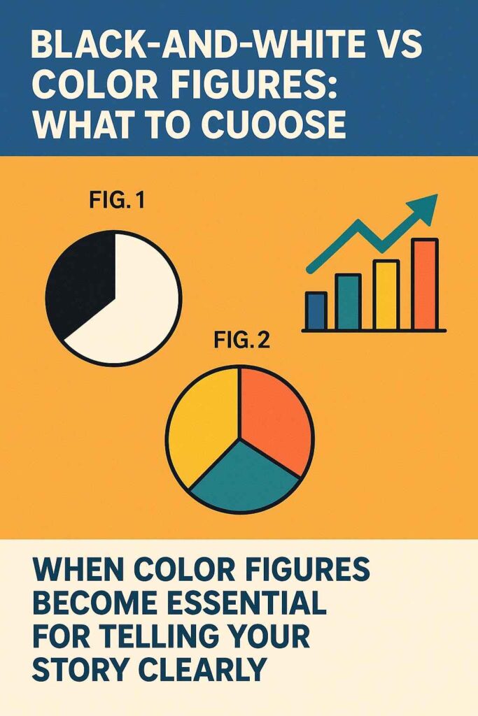
When Color Figures Become Essential for Telling Your Story Clearly
Why Color Sometimes Makes All the Difference
Even though black-and-white drawings work for most patents, there are moments when color becomes more than decoration. It becomes the only clear way to communicate what your invention does.
Some technologies rely on visual signals that do not translate well in plain lines. If your system depends on a color pattern, or if a user interface relies on a visual marker that only makes sense in color, then a simple line drawing may create confusion.
This confusion can weaken your patent or leave space for others to argue that your submission does not fully describe how the invention works.
Color matters even more in fields where the visual output is the invention itself. Think of heat maps, medical imaging, simulation displays, sensor feedback, material layering, or machine learning outputs that produce color-coded information.
In situations like these, telling your story without color is like trying to explain a sunset in grayscale. You can do it, but something important is lost along the way.
When you are building products that depend on clarity of visual signals, skipping color can create gaps in your application. This gap may not seem big at first, but it can open the door for challenges later.
If the examiner cannot see the full picture, you risk getting unclear rejections.
And if a competitor ever tries to argue that your patent does not cover a certain feature because the drawings were too vague, you do not want to be on the weaker side of that argument.
This is why choosing color is less about aesthetics and more about protection. You are not trying to make your patent look pretty. You are trying to make sure the examiner fully understands what gives your invention its power.
When Your Message Is Too Important for Grayscale
There are certain types of inventions where color is almost unavoidable. For example, if your innovation focuses on detecting subtle differences between materials or surfaces, color can show those differences in a way black-and-white cannot.
If your breakthrough relates to how a sensor reads temperature variations or how a machine identifies patterns in a camera feed, showing the actual color data helps explain the value clearly.
In digital products, color also matters when your interface uses color to guide user behavior. If the user experience changes based on color-coded alerts, cues, or warnings, the drawing needs to match what the user sees.
Without color, the examiner may not understand how your feature works in real use. And if the examiner does not understand the feature, you risk losing coverage for something that gives your product a real competitive edge.
Businesses often overlook this. Many founders rush to file and assume simple line drawings are enough for everything. But when your invention has a visual layer that drives performance, skipping color becomes a risk, not a shortcut.
So when your idea depends on visual information that changes in real time, or when your advantage is tied to how the product looks or behaves through color, including accurate color figures becomes part of telling the truth of your invention.
How to Use Color Without Slowing Down Your Filing
If you decide to use color, the key is to use it with intention. The patent office requires you to justify why color is needed. This is not about arguing taste. It is about proving that color is the only way to capture the full function of the invention.
Many founders struggle with this because they try to include color just to make the drawings look good. But the real win comes from linking your color detail to a feature that affects how the invention works.
For example, if your invention uses a display that changes color to show different sensor states, you can explain that the color itself carries information.
If your product shows a heat map, you can explain that each color range represents a specific temperature band. This makes the color essential and not optional.
To avoid slowing down your filing, shape your drawings so that the color is only used where it adds meaning. If the entire figure is filled with color, it may raise questions.
But if you use color sparingly and tie it directly to core elements, the examiner will understand why it is needed. This balance helps you get the clarity of color without extra friction.
Another practical step is to think ahead about future updates. If the color scheme might change later, describe the relationship between the colors instead of tying your invention to specific shades.
Instead of saying that the system requires blue, describe that one color represents a specific state and another color represents a different state. This keeps your patent broad while still making the role of color clear to the examiner.
Using color also becomes simpler when your drawings are handled with tools that understand the patent office rules. PowerPatent can help you prepare color figures that meet all requirements while keeping the process smooth.

Your drawings stay clean, compliant, and tied to attorney oversight, so you avoid mistakes that slow companies down.
https://powerpatent.com/how-it-works
The Strategic Side of Choosing Color
Choosing color is also a business move. When your drawings show the unique way your invention works, you send a clearer message to investors, partners, and future acquirers.
They get to see the innovation in a more vivid way. It is easier to grasp the potential of a product when you can see the core idea exactly as it functions.
This clarity helps during fundraising when you need to show that your idea has strong protection and that your competitive edge is not easy to copy. It helps during partnership conversations when other companies want to understand why your technology works differently from theirs.
And it helps later down the road if you ever face a dispute, because your figures make your claims easier to defend.
Color also builds confidence inside your own team. Engineers and designers often understand the value of their invention visually.
When they see accurate drawings in the patent, it gives them trust that what they built is fully protected. This confidence often leads to faster product development and a bolder approach to innovation.
By using color when it truly matters, you protect the exact part of your invention that sets you apart.
You show the examiner your core insight in a way that black-and-white might not capture. And you give your business a stronger foundation as you scale.
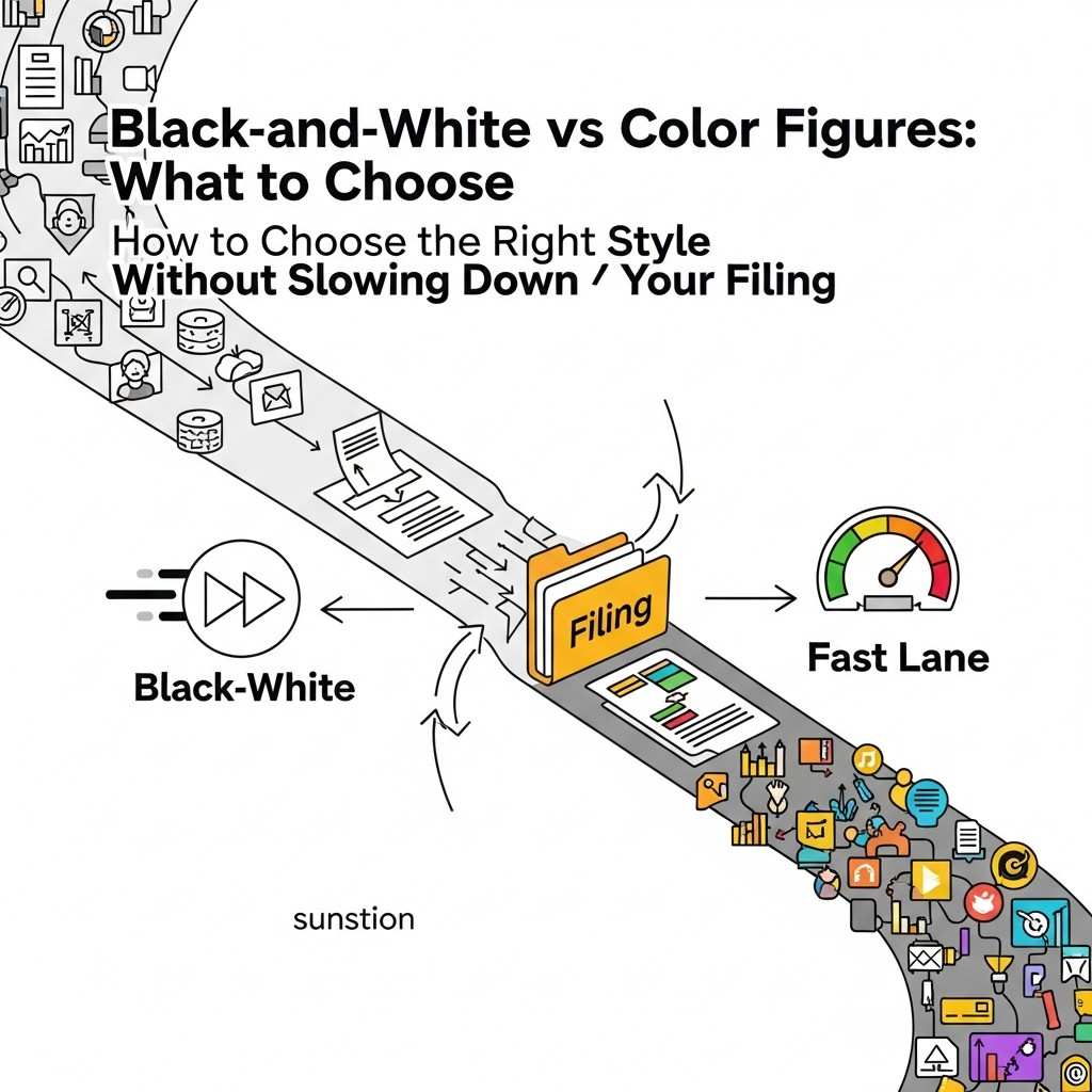
How to Choose the Right Style Without Slowing Down Your Filing
Finding the Style That Matches How Your Business Builds
Choosing between black-and-white and color figures is really about understanding how your business moves, how your product evolves, and how much clarity the patent examiner needs to fully understand what makes your invention special.
Many founders think this choice is simply about what looks clean or what feels modern, but the truth is that the decision has far more to do with how you plan to grow, how your team builds, and how quickly you need protection.
Every startup operates in its own rhythm. Some teams launch features weekly. Some adjust hardware designs monthly. Others work on deep tech that remains stable for years.
When you match the style of your drawings to the pace of your development, you avoid a common trap: filing figures that become outdated faster than expected.
Black-and-white drawings work best for fast-moving products because they strip the invention down to its essential structure. This simplicity makes the drawings future-proof.
Even if your interface changes next month or your hardware gets a redesign next quarter, the patent still protects the core idea because the figures do not lock you into tiny design details.
Color, on the other hand, works well for inventions where the visual detail is stable and central to the function.
If your advantage is tied to something that will not change dramatically over time—like a unique material response pattern, a heat signature display, or a color-coded feedback system—then using color strengthens your story without risking future mismatch.

The key is choosing the option that protects your business not just today, but long into the future.
Using Figures to Strengthen Your Patent Instead of Complicating It
A mistake many inventors make is assuming that more detail equals more protection. In reality, more detail often limits what you can claim later. A patent gives you protection for what you describe, not for what you meant to describe or what you plan to build later.
If your drawings are packed with visual elements that do not matter, a competitor may argue that your claim applies only to the specific version you drew, not to the wider idea. Black-and-white figures solve this problem by forcing you to show only what matters.
When everything is simplified into clean lines, the examiner focuses directly on the functional relationships. This helps ensure that your patent covers the idea, not the cosmetic version of the idea.
For many businesses, especially those building software, AI, robotics, or early-stage hardware, this extra flexibility is not just helpful but essential.
It allows you to adjust your product later without having to change your patent or file add-ons that cost more time and money.
Color figures, on the other hand, can be powerful when used with intention. They help you bring attention to features that cannot be communicated any other way.
For example, if your invention uses a new pigment behavior in a material, a color gradient that conveys energy flow, or a display that changes color to signal state changes, the examiner needs to see that exact visual relationship.
Trying to show this in grayscale may water down your innovation or leave too much room for interpretation. When your invention depends on a color-driven transformation, color becomes not just helpful but necessary to capture the idea accurately.
This precision strengthens your patent because it shows the examiner exactly what you are claiming, eliminating ambiguity and helping you avoid rejection based on unclear disclosures.
Making the Right Choice Without Overthinking
Founders often feel pressure to make the perfect choice when it comes to figures, but the truth is that the best choice becomes clear when you ask one simple question: does color add meaning, or does it add noise?
If color makes the invention clearer in a way that a line drawing cannot match, then color is the better option. If color is only being used to make the figure look polished or more impressive, then black-and-white is usually the smarter and safer move.
Examiners appreciate clarity, not style. They want to see the structure, the flow, the interaction between parts, and the functional relationships that make your invention unique.
They do not need artistic details or color embellishments unless those elements hold actual functional weight. The more directly your figures communicate the invention, the smoother your review process will be.
This simplicity also helps you move faster. When you know that black-and-white is enough, you skip extra steps like preparing a color petition or explaining why color is required.
You stay aligned with patent office norms, which saves time. And when you know that color is necessary, you avoid wasting time filing grayscale drawings that the examiner will question or misunderstand.
Making this choice early helps your filing move forward without friction.
If your team is unsure which direction to take, the clearest path is to focus on the exact user experience or system behavior that makes your product special.
Imagine explaining your invention to someone who has never seen it before.

Would they understand the innovation if all you had were outlines and labels? Or would a color signal or pattern be necessary for the explanation to make sense?
The answer to that question usually tells you what type of figure you need.
Choosing a Path That Saves Time and Protects Your Future
The smartest founders do not choose between black-and-white and color based on personal preference. They choose based on what keeps their company protected without slowing their momentum.
If your product is changing fast, if you are still shaping your interface, if your hardware is evolving, or if your team is testing many variations, black-and-white drawings give you breathing room.
They help you stay flexible and protect the core of your idea while your product continues to grow.
If your invention relies on visual signals, material color behavior, heat patterns, sensor gradients, or a user interface that genuinely depends on color cues, then using color ensures the examiner sees the exact feature that gives you your edge.
The easiest way to make this call with confidence is to use a system that blends smart software and real attorney oversight.
PowerPatent helps you generate drawings that match your invention today but also protect you tomorrow.
It removes the pressure of choosing alone, helps you avoid common mistakes, and ensures your figures meet all rules without slowing you down.
If you want to see how this works in practice, explore the workflow and see how it can help your team file faster with zero friction.
https://powerpatent.com/how-it-works
How Your Figures Shape the Strength of Your Claims
Why the Way You Draw Your Invention Controls What You Can Protect
Many founders underestimate how deeply their figures influence the strength, reach, and flexibility of their claims. Claims are the real shield of your patent, but drawings often determine what those claims can safely cover.
When an examiner looks at your application, they compare your written description to your figures to confirm that everything matches. If the drawings show too many visual limits, your claims may end up narrow even if your invention is broader.
This is why choosing between black-and-white and color becomes more than a stylistic decision. It becomes a strategic move that affects how much ownership you actually gain over your idea.
When you use black-and-white drawings, you show only the essential shapes and relationships, which helps you claim the underlying concept rather than the exact visual details.
This is powerful for early products because it leaves room for your invention to grow. When you use color, you communicate that the color features themselves matter.
This can strengthen a claim when color is part of the function, but it can also tighten the scope if color is not handled carefully.

Understanding this balance helps you choose a drawing style that reflects not just what your invention looks like today, but what you want your patent to defend years from now.
How Examiners Interpret Drawings and Why It Matters to Your Business
Examiners treat figures as evidence. Even though patents are mostly legal and technical documents, drawings often become the clearest way for an examiner to grasp what an invention truly does. But this also means examiners look for consistency.
If your claims describe a feature that does not appear in the figures, or if the figures show details that the claims do not mention, the examiner may question whether the invention is fully supported. This mismatch can lead to rejections that slow your timeline and increase your cost.
When your drawings use clean and simple black-and-white lines, the examiner sees the structure without distractions. This makes it easier to align the claims with the figures and reduces the chance of misunderstanding.
But when color is involved, examiners focus on whether the color is part of the function or simply part of the drawing. If the color is essential, the claim must address it. If the color is optional, the drawing must not imply otherwise.
Your business benefits when these details are handled correctly because it gives you a smoother path through examination and a more predictable outcome.

Every week counts when you are raising funds, pitching partners, or preparing for a launch, and clear figures reduce the chances of avoidable delays.
How Strategic Drawings Help You Defend Against Competitors Later
A strong patent is not only about getting approved. It is about standing strong when a competitor later tries to work around your idea. If your figures are too detailed, the competitor may argue that your claims only cover the exact version shown.
If your figures are too vague, they may argue that you did not fully describe your invention. The right drawing style helps you avoid both extremes. Black-and-white drawings, when done well, focus attention on the mechanism or the logic behind the invention rather than its cosmetic form.
This makes it harder for others to change small visual aspects and claim they built something different. Color drawings help in a different way.
They make it very clear when your advantage relies on color-driven functionality, and they prevent competitors from claiming that your invention is just an abstract idea.
By showing the actual color behavior in the figure, you create a visual anchor that supports your claims and makes your patent harder to challenge.
When you choose your drawing style with these long-term battles in mind, you protect more than your product—you protect your market position.

And if you want these strategic choices to be guided with precision, PowerPatent gives you the tools and attorney oversight to build drawings that hold up not just during filing, but during future enforcement.
https://powerpatent.com/how-it-works
Wrapping It Up
Choosing between black-and-white figures and color figures may seem like a tiny detail in the middle of a very big process, but for a founder, this decision shapes how clearly your invention is understood, how broadly it can be protected, and how quickly your patent moves through review. When you look at the entire journey of building a startup, you start to see that the strongest patents come from simple choices that reduce friction, save time, and keep your narrative focused.
Leave a Reply