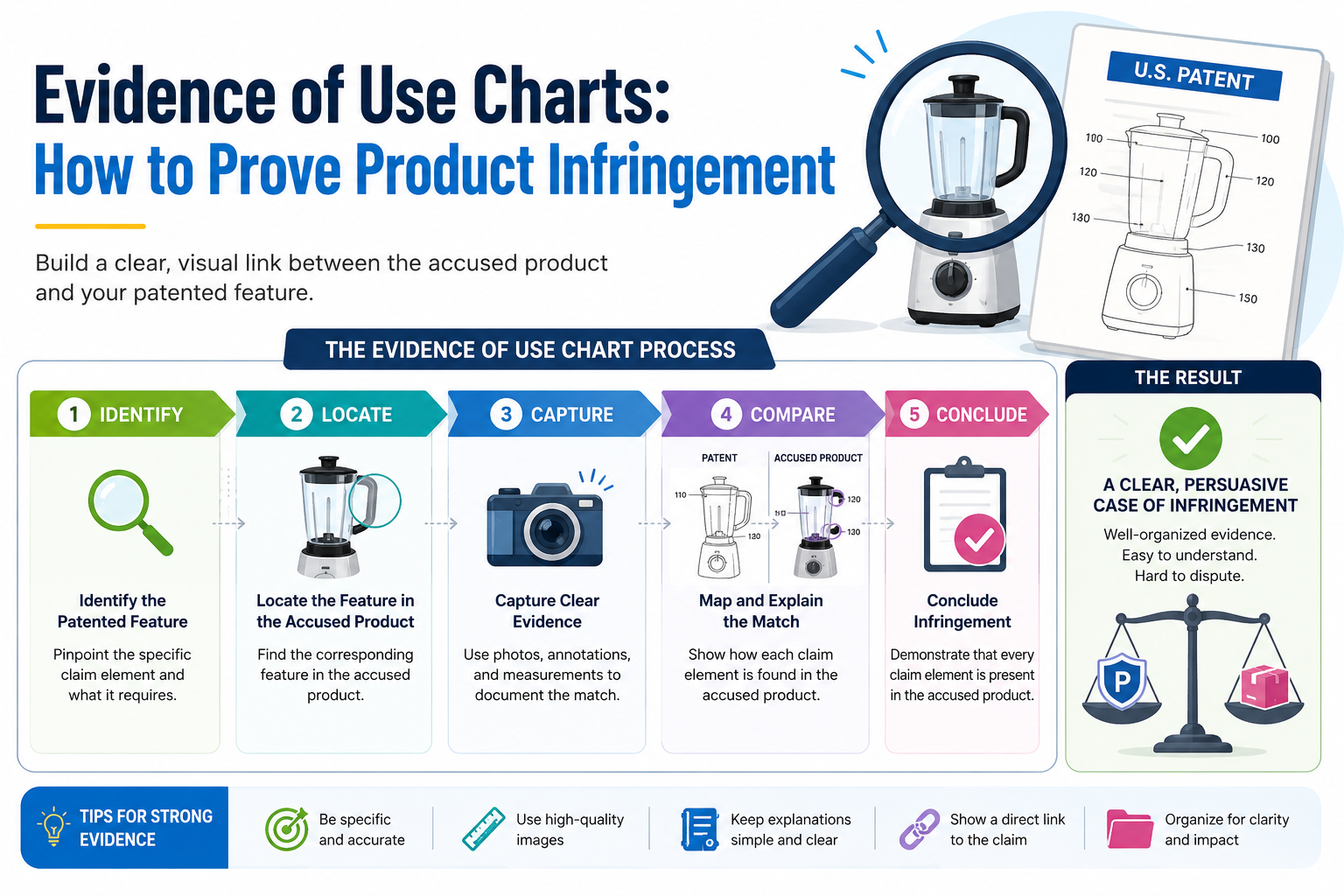
When you believe another company is using your patented idea, guessing is not enough. You need proof. Clear proof. Proof that shows how their product matches what your patent protects. At PowerPatent, we help founders turn complex inventions into stronger patent assets with smart software and real attorney oversight. You can see how the process works here: https://powerpatent.com/how-it-works
An evidence of use chart turns a patent claim into a clear story of proof
A patent can look strong on paper, but the real test comes when you need to show that a real product is using the idea. This is where many founders get stuck.
They may feel sure that a competitor copied a feature. They may see the same flow, the same system, the same result, or the same technical trick. But a feeling is not enough. A good evidence of use chart turns that feeling into a clean, organized story.
The chart does one main job. It shows how each part of a patent claim appears in the product you are studying.
It does not shout. It does not guess. It does not rely on vague statements like, “This looks similar.” It walks the reader through the product step by step and shows the match with proof.
That proof may come from public product pages, help docs, screenshots, demo videos, app screens, white papers, user guides, developer docs, API docs, packaging, product photos, or your own hands-on testing.
In some cases, it may also come from teardown work, network traffic review, lab tests, or source materials that become available later.
The best charts are calm and direct. They make it easy for a busy person to understand what is going on. That person may be an investor, a company buyer, a licensing team, a patent attorney, or a decision maker inside a larger company.
The chart helps them see the link between your patent and the product without forcing them to guess.
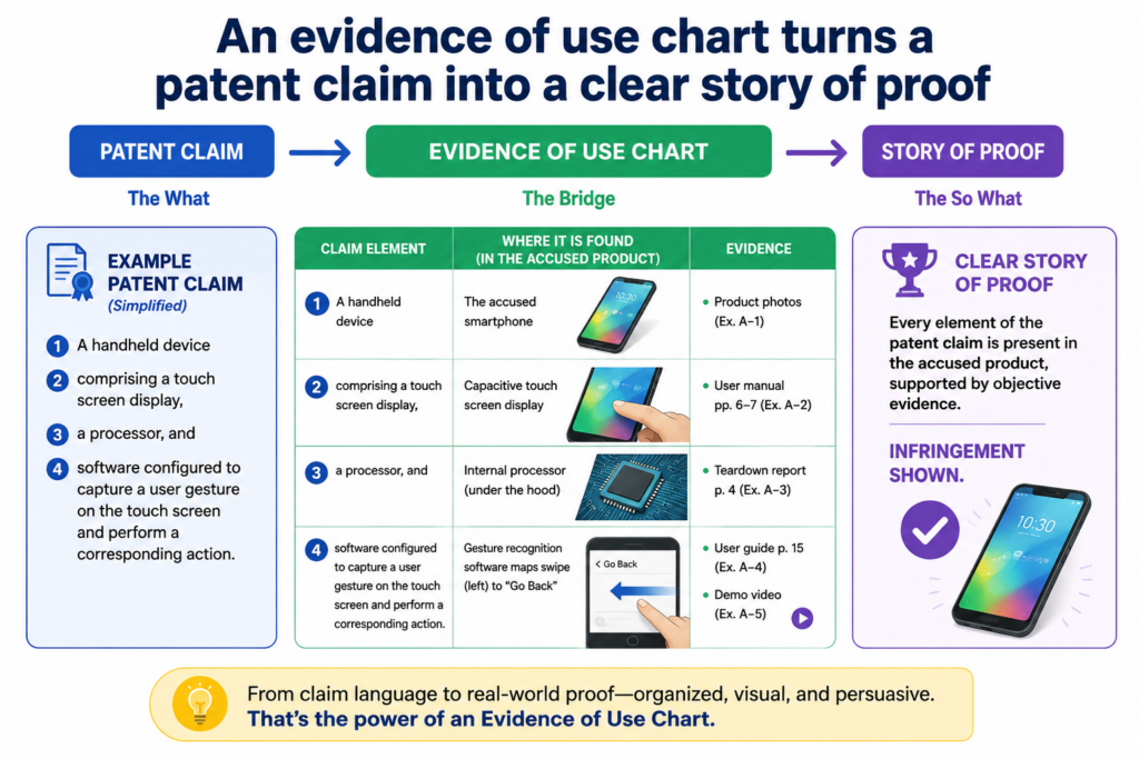
A patent claim is not the same as a product feature
A common mistake is to compare a product to the title of the patent or to the broad idea behind the invention. That is not how strong proof works. The real focus is the patent claim.
A claim is the part of the patent that defines what is protected. It is usually written in a dense way, and it often breaks the invention into smaller parts.
For example, a patent may be about a smart system that predicts equipment failure. But the claim may not protect every system that predicts failure.
It may protect a specific way of collecting sensor data, cleaning that data, training a model, comparing results, and sending a warning. If the chart only says, “Their product predicts failure,” it is too thin. It does not show enough.
A strong chart takes each piece of the claim and asks a simple question. Where is this piece in the product? Then it answers with proof.
The answer may be direct, or it may need careful testing. Either way, the chart should make the logic easy to follow.
The chart should help a smart reader say, “I see it.”
That is the real goal. Not to overwhelm the reader. Not to sound clever. Not to bury them in legal words. The goal is to help them see the match.
If the patent claim says the system receives user input, the chart should show where the product receives user input. If the claim says the system generates a ranking, the chart should show where the product generates a ranking.
If the claim says the system changes a setting based on a detected event, the chart should show the detected event and the changed setting.
This sounds simple, but it is powerful. Most weak charts fail because they skip steps. They assume the reader already agrees. A strong chart never does that. It earns trust by showing the path.
This is also why founders should think about evidence of use before they need it. When you file a patent, you want claims that can be proven in the real world. A claim may sound broad, but if no one can see or test the parts later, it may be hard to use.
PowerPatent helps founders think through this earlier, with smart software and real attorney oversight, so the patent is not just filed fast but built to matter later. You can see how that works at https://powerpatent.com/how-it-works
The claim chart is where product facts meet patent language
An evidence of use chart is often called a claim chart because it maps the product to the claim.
The phrase may sound dry, but the idea is simple. On one side, you have the claim language. On the other side, you have evidence from the product. Between those two sides, you add a short explanation that connects them.
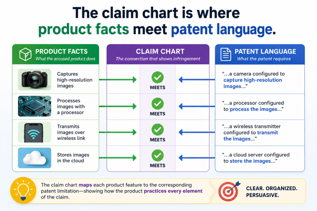
The chart should not feel like a pile of random screenshots. It should feel like a guided walk through the product.
Each part should build on the last part. By the end, the reader should understand not only that the product looks similar, but why the product may fall within the claim.
This is why structure matters. A messy chart can make a strong case look weak. A clean chart can make a hard topic easier to understand. The best charts are not fancy. They are clear, complete, and easy to check.
Each claim part needs its own proof, not just a general match
A claim is usually made of several parts. These parts are often called claim elements, but you can think of them as required pieces.
If a claim has five required pieces, your chart should address each one. It is not enough to prove three and hope the reader fills in the rest.
For example, imagine a claim that covers a software tool. The claim may require receiving data from a user device, processing the data with a trained model, creating a risk score, comparing that score to a rule, and sending an alert.
A product page may clearly say the product creates a risk score and sends alerts. That helps. But what about the trained model? What about the comparison to a rule? What about the data coming from the user device?
A useful chart does not hide those gaps. It names them. If proof is strong, it shows the proof. If proof is indirect, it explains the reason.
If proof is missing, it marks the gap for more research. That honest method makes the chart more useful.
Weak charts try to sound certain about everything. Strong charts show what is known, what is likely, and what still needs support. That difference matters because decision makers do not want hype. They want a clear view of risk, strength, and next steps.
Screenshots are useful only when they prove a specific point
Screenshots can make a chart much easier to read, but they must do real work. A screenshot should not be included just because it looks impressive. It should prove a claim part.
If the claim requires a user dashboard that shows a predicted state, the screenshot should show that dashboard and that predicted state.
If the claim requires a system that changes a control setting, the screenshot should show the before and after state, or a product document should explain the change.
If the claim requires an API request, the chart should show the API document, test result, or output that supports it.
The best charts add short notes under each image. The note should explain what the reader is seeing and why it matters. This keeps the reader from having to study the image like a puzzle.
For a founder, this is where good patent work becomes practical. You do not want patents that only look good in a file folder. You want patents that can be matched to real products, real systems, and real market behavior.
That starts with how the invention is captured and claimed.
PowerPatent helps technical teams explain their inventions clearly, then supports the process with attorney review, so the final patent work has a better chance of being useful in the real world. Learn more here: https://powerpatent.com/how-it-works
The strongest evidence often comes from public sources first
Most teams think they need secret information to start an evidence of use chart. That is usually not true. A lot can be learned from public sources.
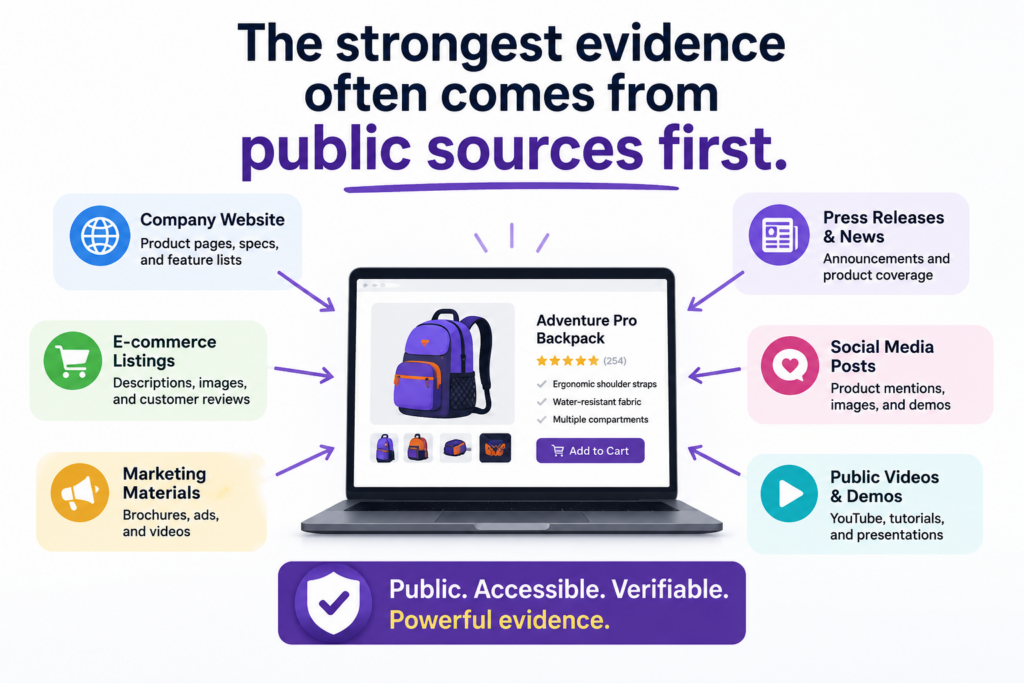
Product pages, support articles, demo videos, customer stories, developer guides, app store listings, release notes, patents, technical blogs, webinars, conference talks, and job postings can all reveal how a product works.
The key is not to collect everything. The key is to collect the right things. You are not building a scrapbook.
You are building proof. Every source should help answer one question. Does this product include this part of the claim?
Public evidence is often the best place to start because it is easy to access, easy to cite, and easy for others to verify. It also helps you understand whether the effort is worth going deeper.
If public sources show a strong early match, then hands-on testing or expert review may make sense. If public sources show a weak match, you may save time and money by moving on.
Product pages can show what the company wants the market to believe
A product page is often written for buyers, not engineers. That means it may not explain every technical detail. Still, it can be very useful.
It may describe what the product does, what data it uses, what result it creates, and what problems it solves. These statements can support parts of the chart.
For example, if a product page says the tool “uses real-time sensor data to predict failures before they happen,” that may support claim language about receiving sensor data and generating a prediction.
It may not prove the full technical process, but it can be a strong starting point.
Customer case studies can also help. They often show how the product works in a real setting.
They may describe workflows, outcomes, integrations, or system behavior. Sometimes they include quotes from users that reveal what the product does day to day.
Developer docs can be even better. They may show inputs, outputs, data fields, system calls, model behavior, and configuration steps.
For software, API docs can be gold. They often reveal the shape of the system in plain sight.
Public sources should be saved before they change
Web pages change. Videos get removed. Docs are updated. Product names shift. Features are renamed. This is why evidence should be saved carefully.
When you find a useful page, keep a copy, note the date, and save the source link. For screenshots, include enough of the page to show the context. A cropped image with no source may be less useful later.
A good evidence record should make it easy for someone else to find the same information.
That means the chart should include the source name, the source date, and a short note about why the source matters. This may feel slow, but it prevents confusion later.
Do not rely on memory. Do not assume a page will still be there next month. If a product launch page, demo video, or technical guide supports your chart, capture it in a clean way right away.
This is especially important for startups. You move fast. Your team is busy. But if a competitor is moving into your space, the early proof may matter.
Clean evidence can help you decide whether to talk to counsel, approach a license deal, update your patent strategy, or build a stronger patent portfolio around the parts of your technology that others are starting to copy.
PowerPatent was built for founders who want this kind of control without slowing down the company.
The platform helps turn technical work into patent-ready material, backed by real attorney oversight, so your IP process does not become a drag on the business. See how it works here: https://powerpatent.com/how-it-works
Hands-on product testing can turn a good chart into a much stronger one
Public sources are useful, but they may not show enough. When a product can be accessed, hands-on testing can fill major gaps.
This is common with software tools, apps, SaaS platforms, hardware devices, and AI systems that expose results through a user interface or API.
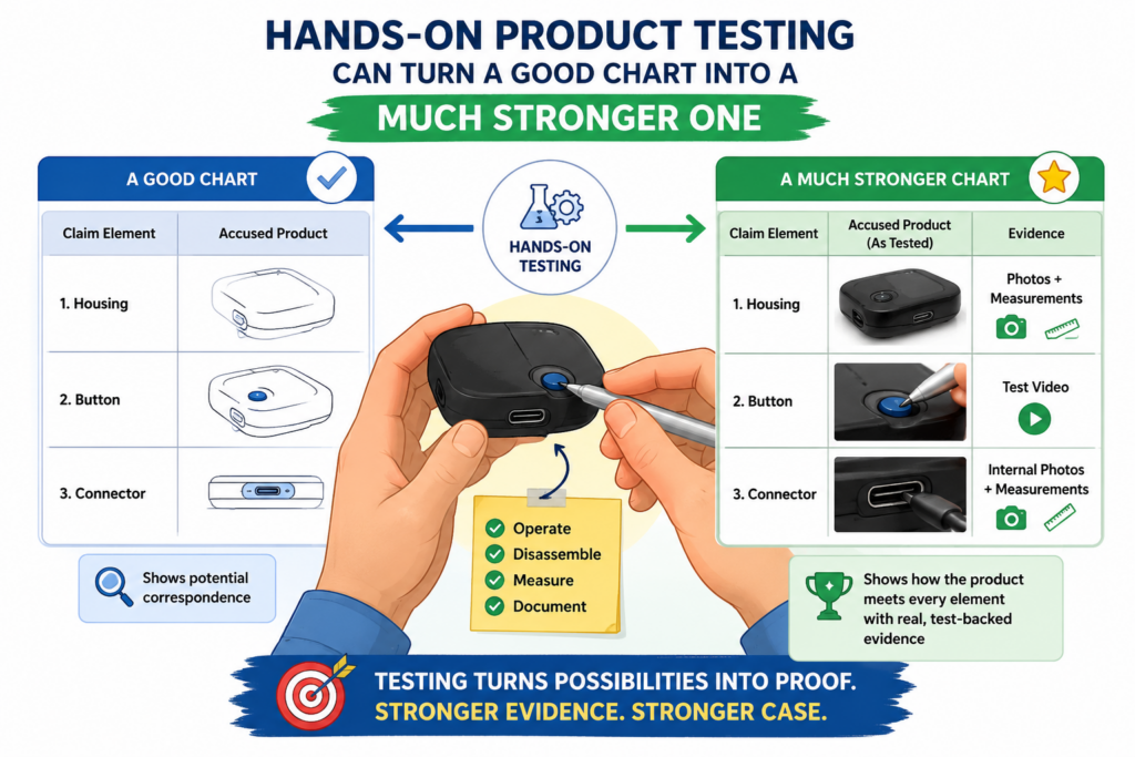
Testing helps you move from marketing claims to observed behavior. Instead of only saying the company claims the product creates a score, you can show that you entered data, ran the process, and received the score.
Instead of only citing a demo, you can show what happened when you used the product yourself.
This does not mean you should break rules, bypass access controls, scrape private data, or do anything improper. The goal is to study the product in a normal, allowed way.
Use public trials, purchased products, normal accounts, official docs, and lawful testing methods. Keep the work clean from the start.
Good testing starts with the claim, not with random clicking
A common mistake is to open the product and explore without a plan. That wastes time. Start with the claim.
Read each claim part and decide what you need to observe. Then design a simple test that may show whether that part is present.
If the claim requires receiving a first input and a second input, create a test that shows both inputs.
If the claim requires generating a recommendation, record the steps that lead to the recommendation. If the claim requires changing an output based on a rule, test different inputs and compare the outputs.
Your notes should be clear enough that another person could repeat the test.
Record what account was used, what version of the product was tested, what settings were selected, what inputs were entered, what output appeared, and when the test was done. If there are screenshots, label them in plain words.
The point is not to create a lab report that no one can read. The point is to make the test easy to trust.
A simple test log can protect the value of your work
When testing is done poorly, the evidence can become hard to use. People forget what they tested. Screenshots get separated from notes.
Dates are missing. Product versions are unclear. Later, no one can tell whether the test proves what the team thought it proved.
A test log fixes this. It can be simple. It should explain what was tested, why it was tested, how it was tested, and what happened. It should connect each test back to the claim part it supports.
For example, if the claim requires a system to generate a ranked list, your log should show what data was entered, what button or command was used, what ranked list came out, and where that result appears in the chart.
If the product changes its output when the input changes, capture both runs. That comparison may be important.
This is where technical founders have an edge. Engineers are already good at testing systems. The only shift is to test with the patent claim in mind. Instead of only asking, “Does the product work?” you ask, “Does the product show this required part?”
That shift can make your patent position much stronger. It can also reveal gaps in your own patent strategy.
If you realize a competitor is using a related method that your current claims do not cover well, that may be a sign to file more patents, improve pending claims, or capture new inventions before the market gets crowded.
PowerPatent helps founders move faster on those decisions by making the invention capture and patent workflow much smoother.
It gives technical teams a better way to work with patent attorneys without the usual delay and confusion. You can explore the process here: https://powerpatent.com/how-it-works
The best charts do not just collect facts; they explain why each fact matters
An evidence of use chart is not a folder of screenshots. It is not a dump of links. It is not a long note that says, “Look, this product does the same thing.”
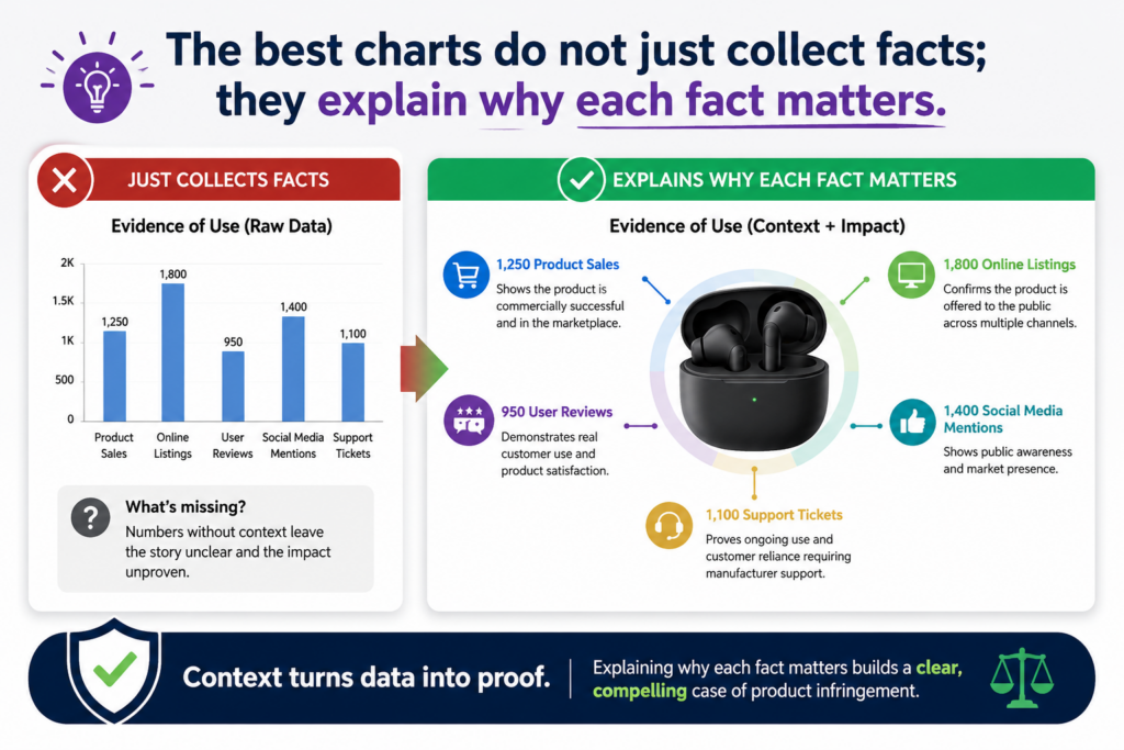
A strong chart explains the match in a way that a careful reader can follow without needing to be inside your head.
This matters because the reader may not know your technology as well as you do. They may not know your product. They may not know the competitor’s product.
They may also be reading fast. Your job is to slow the idea down just enough so they can see the link between the claim and the product evidence.
A useful chart has a clean rhythm. It shows the claim part. Then it shows the product proof. Then it explains the link in plain words. That explanation is where many charts win or lose.
Your explanation should connect the dots without reaching too far
A good explanation does not overstate the case. It does not say a product proves something when the proof is thin.
It also does not hide from hard parts. It simply says what the evidence shows and how that evidence fits the claim.
For example, say your claim requires a system that “generates a confidence score based on a trained model.” The product’s website says it “uses AI to rate the risk level of each transaction.”
That may support part of the claim, but it may not prove the exact model step.
A strong chart would explain that the public statement supports the presence of AI-based scoring, then note that more testing or technical evidence may be needed to confirm the trained model detail.
That kind of honest writing builds trust. It shows that you are not forcing the facts. You are reading them with care.
The same rule applies when the evidence is strong. Say a developer guide shows an API field called “confidence_score,” and the documentation says the score is returned after model analysis.
That is much stronger. The chart should say so in plain words. It should point to the exact part of the document and explain why the field supports the claim part.
The reader should never have to guess what a screenshot proves
Screenshots are easy to misuse. Many teams paste them into a chart and assume the point is clear.
But a screenshot without context can create more work for the reader. It can also weaken the chart because the reader may not know where to look.
Every screenshot should have a short, direct explanation. It should say what the image shows, where it came from, when it was captured, and which claim part it supports. This does not need to be long. It needs to be clear.
For a software product, a screenshot may show a dashboard, a user flow, a settings page, an alert, an output, a score, a data field, or an integration.
For a hardware product, it may show a sensor, a control module, a device connection, a circuit layout, a user display, or a physical part.
For an AI product, it may show an input prompt, model output, confidence rating, classification label, or automated action.
The key is to make the proof easy to inspect. The chart should feel like a guided tour, not a mystery. When the reader moves through it, they should feel more confident at each step.
This is also why strong patents and strong evidence should work together. A patent that is hard to map to a real product can be painful to use. A patent that was built with real product proof in mind can be much more useful.
PowerPatent helps founders capture the invention clearly, work with real patent attorneys, and build a patent process that supports business goals instead of slowing them down. You can see how that works here: https://powerpatent.com/how-it-works
A strong evidence chart starts with the right patent claim
Not every claim is equally useful for an evidence of use chart. Some claims are easier to prove because their steps show up in the product.
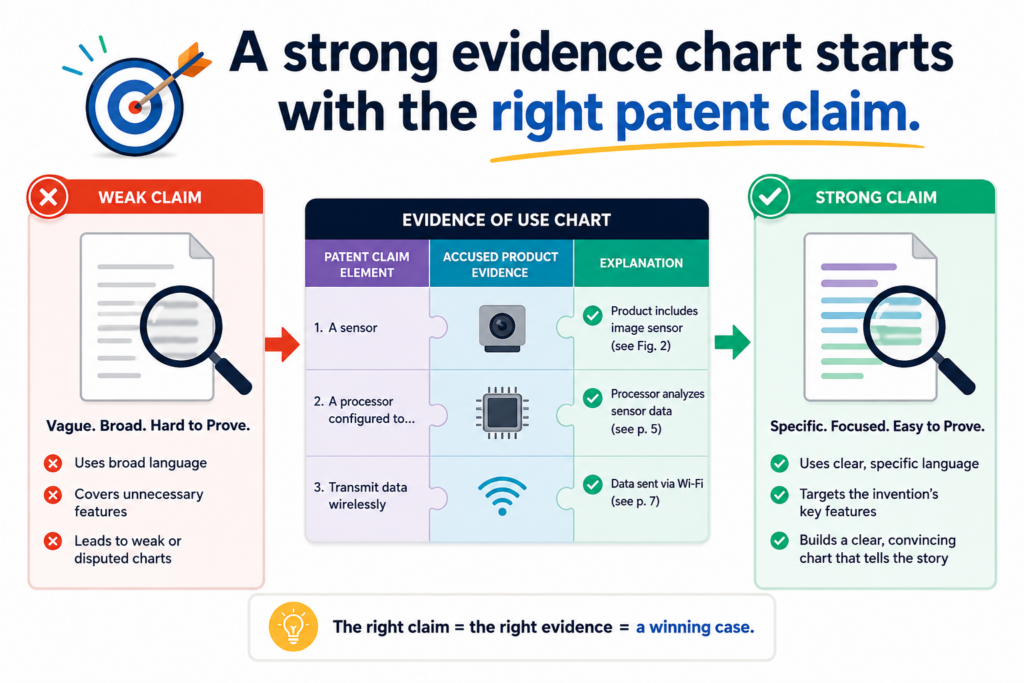
Other claims may describe internal actions that are hard to see from the outside. This does not mean those claims are bad, but it does mean they may need deeper proof.
Before you spend time building a chart, choose the claim with care. Look for a claim that lines up well with what the product appears to do.
The goal is not to pick the broadest claim just because it looks powerful. The goal is to pick the claim that gives you the cleanest path from claim language to product facts.
This is especially important for startups with limited time. You do not want your team spending days on a claim that cannot be supported with available evidence. Start with the claim that gives you the strongest early read.
A product-facing claim is often easier to prove than a hidden back-end claim
Some inventions happen deep inside a system. They may involve server logic, data structures, training steps, model updates, memory handling, network routing, or internal control rules.
These can be very valuable, but they may not be visible from the outside.
Other claims focus on things that appear at the surface.
These may include user inputs, displayed outputs, alerts, rankings, recommendations, device actions, sensor readings, system responses, or API results. These are often easier to show with public evidence or hands-on testing.
For example, a claim that requires “displaying a ranked list of recommended actions” may be easier to chart than a claim that requires “storing an intermediate vector representation in a distributed memory layer.”
The second claim may still matter, but it may need discovery, source review, expert testing, or other deeper work before it can be proven well.
This is not just an enforcement issue. It is a drafting issue. When your patent is being prepared, it helps to think about what parts of the invention will be visible later.
If the claims only cover hidden details, proving use may be harder. If the claims include observable results and smart technical steps, the patent may be easier to use in real business talks.
The best claim is the one that lets proof flow naturally
A strong chart feels natural because the claim parts match facts that can be shown. The product receives something. You can show that input. The product processes something.
You can show the process through docs, outputs, or behavior. The product produces something. You can show the result. The product changes something. You can show the before and after.
This flow matters. It makes the chart easier to build and easier to believe.
When a claim has too many hidden steps, the chart may become full of guesses. It may say things like “the product likely does this” or “the system appears to do that.”
Some of that may be fair when the facts support it, but too much guessing weakens the chart. A reader may start to wonder whether the claim really fits.
For founders, the lesson is simple. Do not wait until a competitor appears before thinking about proof.
When you file patents, think about how your invention could be seen in the market. Think about what a future product might show. Think about what evidence could be gathered from normal product use.
This is one reason PowerPatent is built around both smart software and attorney oversight. The software helps founders move fast and explain the invention in detail.
The attorney review helps shape that raw material into a stronger patent path. That combination can help you avoid filing work that sounds good but is hard to use later. You can learn more here: https://powerpatent.com/how-it-works
Public product statements can be powerful when they match claim language
Companies often describe their own products in ways that are very useful for evidence of use. They publish pages to sell the product.
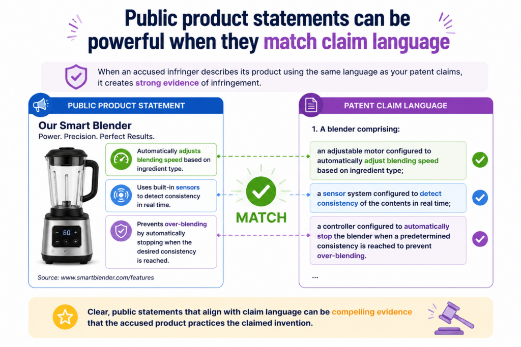
They create docs to help users. They release demos to explain features. They post talks to attract customers, partners, and engineers. In doing so, they may reveal exactly how the product works.
This does not mean every marketing line is proof of infringement. It means public statements can support the chart when they match a claim part. The stronger and more technical the statement, the more useful it may be.
A vague line like “our platform is smart” does not prove much. A clear line like “our platform uses real-time sensor data to predict machine failure and trigger alerts” is much more useful.
It speaks to inputs, analysis, prediction, and output. Those facts can be mapped to claim parts.
The best public statements are specific, technical, and tied to product behavior
When reviewing public sources, look for statements that describe what the product receives, what it does with that information, and what result it creates. These are often the core parts of a claim.
A support article may explain that a user uploads a file and the system extracts key fields. A developer guide may explain that an API returns a score, a label, or a recommended action.
A case study may explain that the system detects a problem and sends a message before failure occurs. A video demo may show the full user flow from input to output.
These details matter because they move the chart away from broad similarity and toward specific proof. The more specific the public statement, the easier it is to connect to a claim part.
But there is a trap. Do not bend the public statement to say more than it says. If a page says the product “uses automation,” do not treat that as proof of a specific machine learning model.
If a video shows a warning message, do not treat that alone as proof of a specific back-end rule. Use the source for what it actually supports.
Job postings and technical blogs can reveal hidden product design
Product pages are not the only public source. Hiring pages can be surprisingly useful.
A job posting may say that the company is building a real-time ranking engine, a computer vision pipeline, a model training system, a distributed data platform, a signal processing layer, or an edge device control system.
That may help support a technical theory about how the product works.
Technical blogs can be even better. Engineers often write about architecture, scaling problems, model design, deployment choices, data flows, and performance gains.
These posts may not name every product feature, but they can show how the company built the system behind the product.
Conference talks, webinars, patents, open-source repositories, SDKs, help centers, changelogs, and integration guides may also help.
Each source should be treated with care. The chart should show where the source came from, what it says, and how it maps to the claim.
This kind of work takes patience. It also takes a sharp eye. You are not trying to collect noise. You are trying to find facts that make the claim match clearer.
For a founder, this is where a patent portfolio can start to feel real. Your patent is not just a document.
It becomes a tool for reading the market. It helps you spot when others move toward the same technical ground. It helps you decide whether to build, file more, license, partner, or push back.
PowerPatent helps technical founders turn hard-to-explain inventions into clearer patent filings with less friction.
When your patents are easier to understand and better tied to how products work, your IP can become a real business asset. See the process here: https://powerpatent.com/how-it-works
Product teardowns can help when public evidence does not show enough
Sometimes public sources are not enough. A company may describe the benefits of its product but hide the technical path.
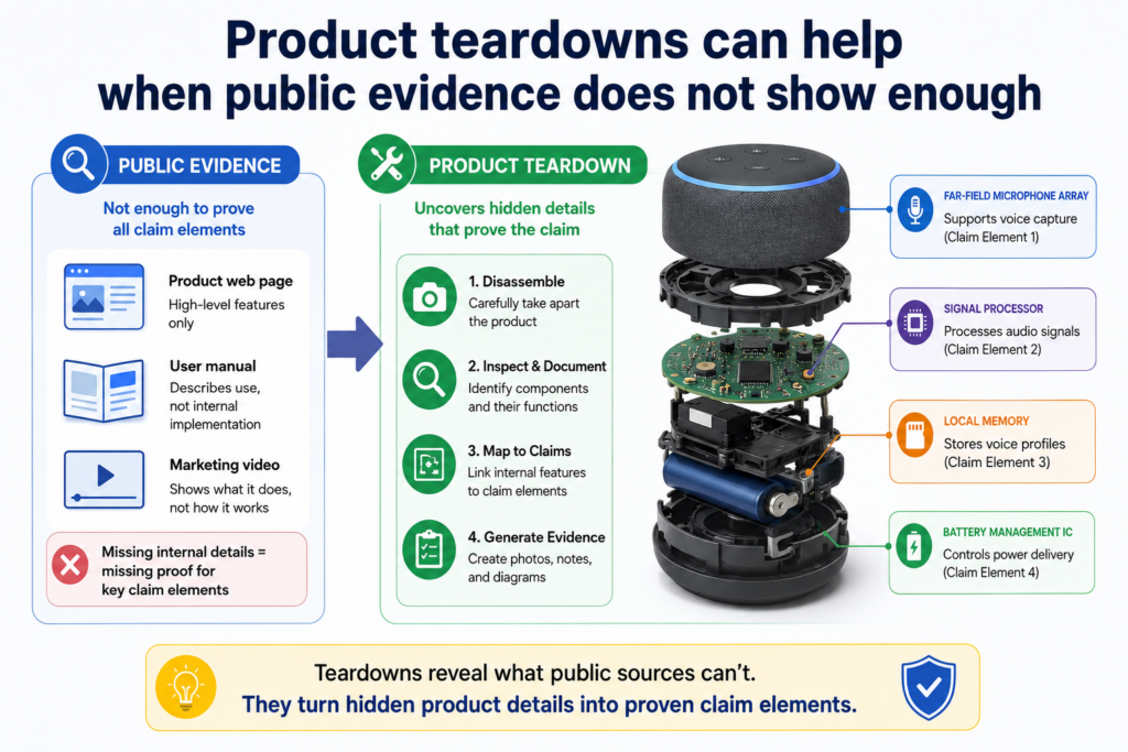
A device may perform the same result, but the key parts sit inside the hardware. A software tool may show the output, but not the steps that create it.
In those cases, a product teardown may help. A teardown is a careful review of the product to learn how it works. For hardware, this may mean looking at physical parts, chips, sensors, boards, wiring, modules, labels, and signals.
For software, it may mean studying normal app behavior, API calls, logs, network traffic, configuration files, or system outputs in a lawful and proper way.
A teardown should be done carefully. It should not break access rules, steal secrets, bypass protections, or use improper methods. The point is to study what can be lawfully observed from a product you can access.
A teardown should answer claim questions, not satisfy curiosity
The best teardown starts with the claim. Before touching the product, decide what you need to prove. Do you need to show that the product has a certain sensor? Do you need to show that it sends data to a server?
Do you need to show that it changes operation based on a detected condition? Do you need to show that a software output changes when input data changes?
This claim-first method keeps the work focused. Without it, a teardown can become a long technical adventure that produces many facts but little useful proof.
For a hardware device, take clear photos during each stage. Record model numbers, board markings, component labels, and visible connections.
If testing signals or behavior, note the setup, tools, inputs, outputs, and dates. If the device has an app, capture the app flow and the device response together.
For software, focus on normal product use. Capture screens, inputs, outputs, settings, API responses, and system behavior.
If network traffic is reviewed, keep the work within proper access limits and document the method. The evidence should be clean enough that a serious reader will trust it.
The strongest teardown evidence shows cause and effect
A teardown becomes more powerful when it shows not just what is inside the product, but how the product behaves when something changes. Cause and effect can be very persuasive.
For example, if the claim requires the system to adjust a device setting based on sensor data, the teardown should try to show the sensor input and the setting change.
If the claim requires classifying an image and sending a result, the test should show different images leading to different classifications. If the claim requires ranking items based on a score, the test should show how the ranking changes when the data changes.
This kind of proof helps the reader see the invention in action. It is often stronger than a single static screenshot.
The chart should then bring the teardown back to the claim. Do not leave the teardown as a separate technical report with no clear link.
Pull the important facts into the chart. Show the claim part. Show the teardown evidence. Explain the match.
For founders, this level of proof can change the tone of a conversation. Instead of saying, “We think they copied us,” you can say, “Here is how their product maps to our claim, and here is the evidence we have so far.” That is a very different position.
Of course, this work should be reviewed with proper patent counsel before any serious action is taken.
PowerPatent helps founders build the patent side with more speed, clarity, and attorney oversight, so when market questions come up, you are not starting from zero. Learn how PowerPatent works here: https://powerpatent.com/how-it-works
The chart should show the product, the patent claim, and the proof in one clean path
A strong evidence of use chart should feel easy to follow, even when the invention is complex.
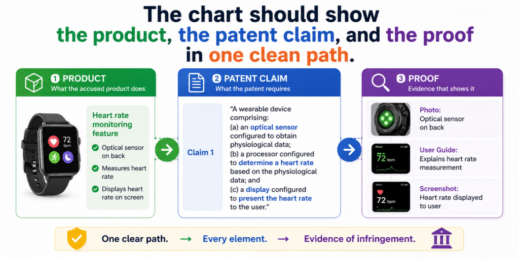
The reader should not have to jump between five folders, ten links, and a messy set of notes. The chart should bring the key material into one place and guide the reader through it.
This is where many teams make the chart too hard. They collect a lot of proof, but they do not shape it.
They paste in screenshots, add long quotes, and use technical words that only their own team understands. The result may be full of information, but it does not persuade. It makes the reader work too hard.
The better path is to build a clear flow. Start with the claim. Break it into small parts. Match each part to evidence.
Explain the match in simple words. Then move to the next part. When the chart is done well, it reads like a careful product walkthrough.
The chart should reduce doubt at every step
The best charts do not ask the reader to trust your conclusion too early. They earn trust step by step. Each row should answer one small question. Does the product have this part? Where do we see it? What proof supports it? Why does that proof matter?
For example, if the claim says a system receives image data from a user device, the chart should show the product receiving image data.
That may come from a help article showing image upload, a screenshot of the upload screen, or a test where the user uploads an image and the system accepts it.
If the claim then says the system applies a model to detect a feature in the image, the chart should not simply point back to the upload screen. It needs separate support.
That support may come from a product statement saying the system uses AI image review, a result screen showing detected features, or testing that shows different image inputs create different detection results.
This is how a chart becomes strong. It does not blur all proof together. It keeps each claim part clean.
A good chart makes weak spots visible before they become problems
One of the biggest benefits of building a chart is that it shows gaps early. A gap is not always bad. Sometimes it simply tells you what to test next.
Sometimes it tells you which source to find. Sometimes it tells you that a different claim may be a better fit.
A weak team hides gaps. A strong team studies them.
If a chart shows clear proof for four parts of a claim but thin proof for one part, that is useful.
You can decide whether to run more product tests, review more technical docs, look at another public source, ask a patent attorney for guidance, or shift to another claim. That is much better than pretending the gap is not there.
For founders, this mindset is valuable. It keeps you from wasting time on wishful thinking.
It also helps you use your patent budget with more care. Instead of asking broad questions like, “Are they infringing?” you can ask sharper questions like, “What evidence do we still need for this claim part?”
That sharper question saves time. It helps your attorney give better advice. It helps your leadership team understand the real strength of the position.
It also helps you decide whether your next move should be more evidence work, a licensing talk, a new patent filing, or no action at all.
PowerPatent helps founders build this kind of clarity earlier in the patent process. With smart software and real attorney oversight, your team can turn raw technical work into patent material that is easier to understand, review, and use. You can see how it works here: https://powerpatent.com/how-it-works
The evidence should be clear enough for a non-technical decision maker
Your chart may be based on deep technical work, but it should not read like an internal engineering note. Many important readers will not be engineers.
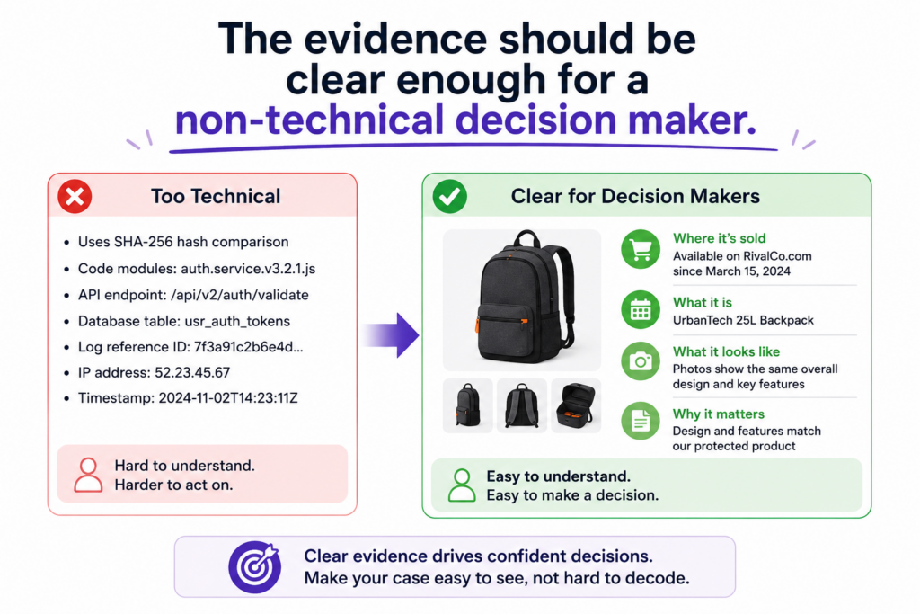
They may be investors, business leaders, board members, licensing teams, or company executives. If they cannot understand the chart, they may not trust it.
This does not mean you should dumb it down. It means you should make it clear. Use plain words. Explain what the product does.
Explain how the evidence supports the claim. Avoid long, tangled sentences. Do not hide the point inside technical detail.
A great chart lets both technical and non-technical readers get value. The technical reader can inspect the proof. The business reader can understand the risk and opportunity.
Plain language makes the chart stronger, not weaker
Some people think patent work must sound complex to be serious. That is not true. Clear writing is often more powerful because it leaves less room for confusion.
For example, instead of writing, “The accused platform appears to instantiate a data-driven inference process that outputs a classification object,” you can write, “The product uses the uploaded data to create a label for the item.” If the patent claim uses more formal language, you can still explain the match in simple words beside it.
The claim language itself should remain accurate. But your explanation can be human. A reader should be able to say, “The claim says this. The product does this. The evidence shows it here.” That is the core of the chart.
This is especially important when the chart is used in early business talks. A company may not want to read a dense legal memo just to understand the issue. A clean evidence chart gives them a fast way to see why the patent matters.
Do not use big words when small words carry more force
Simple words create speed. Speed creates understanding. Understanding creates action.
If a product sends an alert, say it sends an alert. If it ranks results, say it ranks results. If it stores sensor data, say it stores sensor data. If it changes a setting, say it changes a setting. You do not need to dress up the truth.
This kind of writing is not casual. It is precise. It respects the reader’s time. It also makes the evidence harder to ignore.
For founders, this is a major advantage. You are often trying to move fast while dealing with complex ideas. Your patent work should not slow the business down with unclear writing. It should help the business make better choices.
That is why PowerPatent focuses on making the patent process easier for builders. Engineers and founders can explain what they built in their own words, while smart tools and real patent attorneys help shape that work into stronger patent filings.
The result is a smoother path from invention to protection. You can explore it here: https://powerpatent.com/how-it-works
The chart should separate facts from opinions
An evidence of use chart becomes weaker when it mixes facts, guesses, and opinions without making the difference clear.
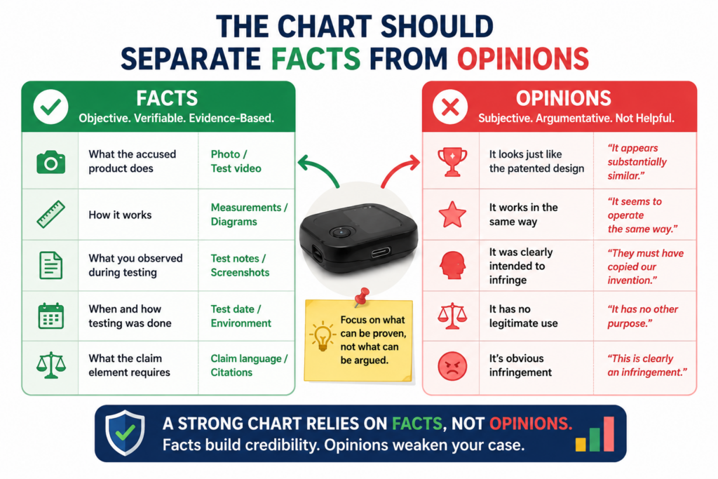
A reader should always know what is directly shown, what is inferred from behavior, and what still needs more proof.
A fact may be a screenshot showing a feature. A fact may be a product manual stating that the system sends an alert.
A fact may be a test result showing that a specific input produced a specific output.
An inference is different. It is a reasoned view based on facts. For example, if the product creates a fraud score after reviewing transaction data, you may infer that the system processes transaction data to generate that score.
That may be reasonable, but the chart should not pretend it is the same as seeing the source code.
This honesty does not weaken the chart. It strengthens it. It shows that you are careful.
Strong charts use careful language where the proof is indirect
When proof is direct, say it directly. When proof is indirect, be clear about that too. Phrases like “this supports,” “this indicates,” or “this is consistent with” can be useful when the evidence points toward a match but does not prove every internal detail by itself.
For example, a public API document may show that a product returns a risk score. That directly supports the presence of a risk score.
It may also support an inference that the product uses some scoring process before returning the result. But unless the document explains the scoring method, it may not directly prove the exact internal method.
That difference matters. If you overclaim, the reader may lose trust. If you are too cautious, you may undersell strong evidence. The right tone is firm where the facts are firm and careful where the proof is still developing.
This is the tone of a serious chart. It does not panic. It does not brag. It simply shows the evidence and explains what it means.
A chart should help your attorney move faster
When you separate facts from opinions, you also make the chart much more useful for patent counsel. An attorney can quickly see what evidence exists, where the match looks strong, and where more work may be needed.
This can save time and cost. Instead of paying someone to untangle messy notes, you give them a clean starting point.
They can then focus on the harder questions, such as claim fit, claim meaning, product mapping, legal risk, and next steps.
For startups, that matters. Legal budgets are not unlimited. Founder time is not unlimited. The cleaner your evidence, the better your conversations can be.
It also helps you make calm decisions. Not every similar product is worth action. Not every patent claim is worth charting.
Not every chart is strong enough for a licensing conversation. A well-built chart helps you see the difference.
This is exactly the kind of practical patent thinking founders need. You want speed, but not sloppiness.
You want protection, but not confusion. PowerPatent helps technical teams build patent assets with smart software and attorney review, so the work is clearer from the start. See how PowerPatent supports founders here: https://powerpatent.com/how-it-works
Timing matters because evidence can disappear or change
Product evidence is not frozen in place. A company can change its website, rename a feature, remove a help page, update an API, edit a demo video, change pricing pages, or redesign the product flow.
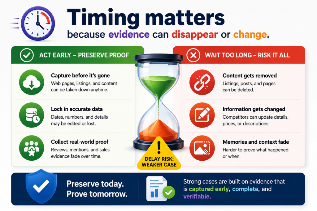
If your team waits too long, useful proof may become harder to find.
This is why timing matters. When you spot a product that may be using your patented invention, start preserving public evidence early. You do not need to make a dramatic move.
You do not need to contact the other company right away. You do need to be careful about saving what you see.
A clean record can make a big difference later. It shows what the product said or did at a specific point in time. It also helps your team avoid confusion when the product changes.
Evidence should be captured with context, not as loose fragments
A screenshot by itself may not be enough. A cropped image with no date, no source, and no page context can raise questions.
Where did it come from? When was it captured? Was it part of the product? Was it from a demo? Was it from an old version?
Good evidence includes context. When saving a page, capture the page title, source link, date, and the part that matters.
When saving a video, note the title, publisher, date if available, and the time where the important feature appears. When testing a product, record the version, account type, settings, inputs, outputs, and test date.
This may sound basic, but it is often the difference between useful proof and a confusing file pile.
Good evidence habits also help your team work together. If one engineer finds a useful API page and another founder finds a demo video, both pieces can be added to the same chart in a clean way.
Later, your attorney can review the material without chasing everyone for missing details.
Early evidence can shape your next patent filings
Evidence of use work is not only useful after a patent issues. It can also teach you what the market is doing. If you see several companies moving toward the same technical pattern, that may be a sign that your space is heating up.
If your current filings do not fully cover the way the market is moving, you may want to capture more inventions while you still can.
For example, your first patent filing may cover your core system. But evidence work may show that competitors are copying a specific workflow, model output, device control method, data pipeline, or user-facing automation. That insight can guide future filings.
This is where patents become part of company strategy, not just paperwork. You are not filing patents because someone told you to. You are using patents to protect the parts of your work that create market power.
PowerPatent is built for this kind of founder. It helps you move from invention to patent filing with more speed, more control, and real attorney support.
That means you can protect important ideas without letting the patent process slow down product work. See the workflow here: https://powerpatent.com/how-it-works
A useful evidence of use chart should be built for real business action
A chart is not made just to sit in a folder. It should help your company make a better decision.
That decision may be to speak with a patent attorney, watch the product more closely, contact a potential license partner, prepare for investor review, file more patents, or leave the issue alone for now.
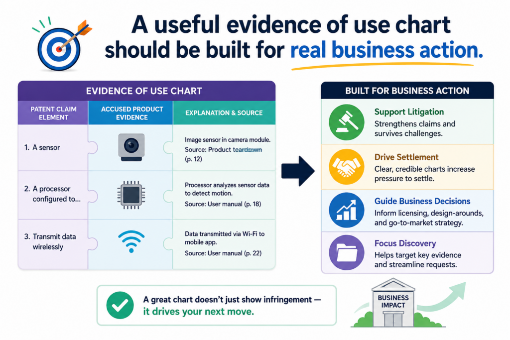
This is why the chart should be practical from the start. It should not try to be huge just to look serious. It should answer the main business question in front of you.
Does this product appear to use what our patent protects? If yes, how strong is the proof? If not, where does the match break down?
A chart that answers those questions can be very valuable. It gives your team a shared view of the facts. It helps stop emotional debates. It lets founders, engineers, and patent counsel talk from the same page.
The chart should make the next step easier to choose
When a founder sees a competitor launch a similar feature, the first reaction is often anger or fear. That is normal. You worked hard to build something new. Seeing another company move close to your idea can feel personal.
But business moves should not be driven by panic. They should be driven by proof. A strong evidence of use chart gives you that proof in a calm format.
It helps you see whether there is a real issue or only a surface-level similarity.
For example, the product may look similar on the outside but use a different technical path. Or the product may use the same core method, but your current claim may not cover that version.
Or the product may match several claim parts but leave one part unclear. Each of these outcomes calls for a different next step.
This is where the chart becomes more than a document. It becomes a decision tool.
Your chart should point to the action, not just the problem
A weak chart ends with confusion. A strong chart points toward a practical next move. If the evidence is strong, the next move may be attorney review and a deeper claim study.
If the evidence is promising but incomplete, the next move may be more testing. If the evidence shows a gap, the next move may be filing new claims around what the market is doing.
This does not mean the chart should make legal conclusions by itself. It should not try to replace a patent attorney. But it should help your attorney move faster and give better guidance.
For a founder, that is a major win. You do not want to walk into an IP conversation with vague claims like, “They copied us.”
You want to walk in with a clear chart, clean evidence, and specific questions. That changes the quality of the conversation.
PowerPatent helps founders get to that level of clarity earlier. The platform is built to help technical teams capture inventions, explain them clearly, and work with real patent attorneys without the slow back-and-forth that often makes patents feel painful.
You can see how PowerPatent works here: https://powerpatent.com/how-it-works
The chart should be honest about missing proof
Not every chart will be complete on day one. That is fine. In fact, one of the best uses of a chart is finding out what you do not know yet.
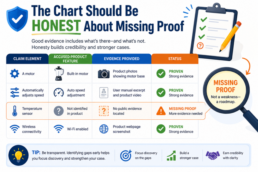
Missing proof is not failure. It is a signal. It tells you where the next test should happen, which source you need to find, which product flow needs review, or which claim may not be the best fit.
The danger is not having gaps. The danger is pretending they are not there.
A founder should want the truth early. If the chart is weak, you want to know that before spending money or starting a serious conversation.
If the chart is strong, you want to know why it is strong so you can act with confidence.
Gaps should be named in plain words
A gap should not be hidden behind soft language. It should be clear. If the product clearly shows an output but does not show how that output is created, say that.
If the public docs show the system sends alerts but do not explain the rule that triggers them, say that. If the product appears to use a model but does not reveal the model type, say that.
This kind of honesty helps everyone. Your engineers know what to test. Your attorney knows what to review. Your leadership team knows how much confidence to place in the chart.
It also prevents wasted effort. Without clear gaps, teams may argue in circles. One person thinks the evidence is strong. Another thinks it is weak. A clear chart shows exactly where the proof stands.
That is the kind of clarity that saves time.
A gap can reveal a better patent strategy
Sometimes a missing proof problem is not only an evidence problem. It may also be a patent strategy problem.
The claim may be aimed at something too hidden to prove from the outside. Or it may focus on a step that competitors can avoid while still copying the real business value of your invention.
That does not mean the patent is useless. But it may mean your company needs more coverage.
You may need claims that cover the visible workflow, the user-facing result, the system-level behavior, or the way the product interacts with other tools.
This is especially important in fast-moving fields like AI, robotics, chips, climate tech, health tech, developer tools, and data platforms. Competitors may not copy every internal detail.
They may copy the outcome, the flow, or the key system behavior. Your patent strategy should think about those paths.
Evidence of use work can help you see this. It shows how real products in the market behave. That feedback can guide better future filings.
PowerPatent is useful here because it helps founders move faster when new invention ideas appear.
Instead of waiting months to start a patent process, technical teams can capture the idea, organize the details, and work with attorney oversight in a much smoother way. Learn more here: https://powerpatent.com/how-it-works
The strongest charts are written for both speed and depth
A busy reader should be able to understand the main point quickly. A careful reader should be able to inspect the evidence deeply. A strong chart does both.
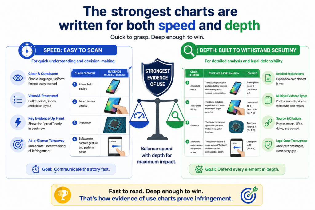
This balance matters. If the chart is too short, it may not provide enough support. If it is too long, the main point may get buried.
The best chart gives the reader a clear path at the top level, then enough detail to check the work.
Think of the chart like a bridge. On one side is the patent claim. On the other side is the product. The chart helps the reader cross from one side to the other without getting lost.
Use short explanations that carry real weight
The explanation beside each piece of evidence should be short, but it should not be empty. It should tell the reader exactly why the source matters.
For example, do not write, “This shows infringement.” That is too broad and too final. Instead, write something like, “This screenshot shows the product receiving a user-uploaded image, which supports the claim part requiring image data from a user device.”
That sentence is simple. It does real work. It names the evidence, states what the product does, and links it to the claim part.
This kind of writing keeps the chart moving. It also helps avoid overstatement. You are not trying to win the whole case in one sentence. You are trying to prove one claim part at a time.
That is how good charts become persuasive. They build belief piece by piece.
Depth should be available without making the chart hard to read
Sometimes a chart needs deeper support. A screenshot may need a longer test note. A public statement may need source context.
A technical result may need an explanation of the test setup. That deeper material should be available, but it should not make the main chart unreadable.
A practical way to handle this is to keep the main chart clean and place longer support in linked notes, exhibits, or backup files.
The main chart should show the key proof. The backup material can show the full page capture, full test log, full video timestamp notes, or full technical review.
This keeps the chart useful for different readers. A founder can review the main story. An engineer can inspect the test detail. A patent attorney can dig into the source material.
For startups, this matters because different people need different levels of detail. Your board may need the business meaning. Your patent attorney may need exact claim support.
Your engineering lead may need to confirm the technical behavior. A good chart serves all of them.
This is the same mindset that makes PowerPatent helpful for technical teams. The goal is not to make patents feel heavier. The goal is to make the important details easier to capture, review, and use.
With smart software and real attorney oversight, founders can protect important inventions without losing speed. See how it works here: https://powerpatent.com/how-it-works
The chart should avoid emotional language and stay focused on proof
It is tempting to write with anger when you believe someone copied your invention. Words like “stole,” “ripped off,” or “blatantly copied” may feel true in the moment. But they usually do not help the chart.
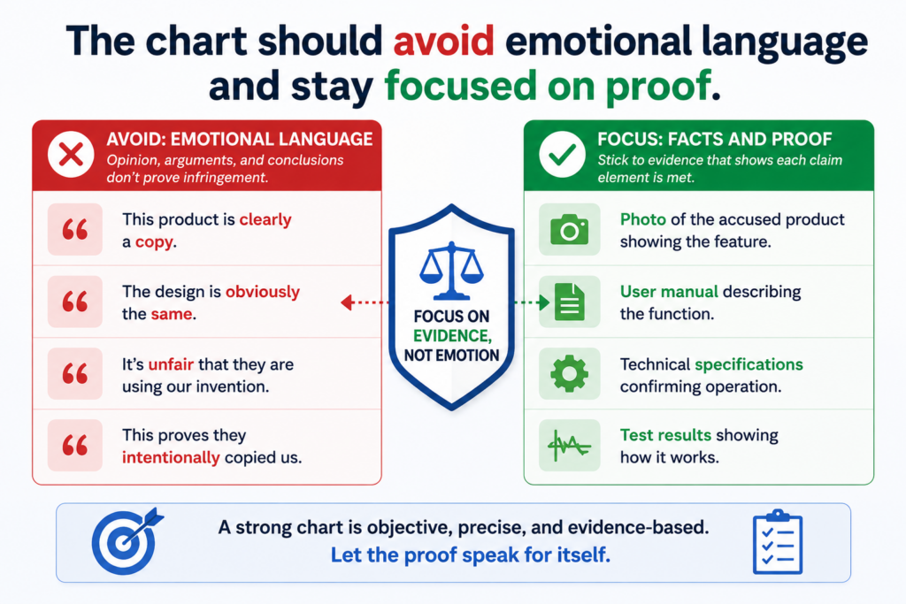
An evidence of use chart should be calm. It should not sound like a complaint. It should sound like a careful review of facts. That tone makes the chart stronger because it shows discipline.
A serious reader does not need drama. They need proof. If the proof is strong, it will speak for itself. If the proof is weak, emotional words will not fix it.
A calm tone builds trust faster than a loud one
The best charts use clear, measured language. They say what the product does. They say what the claim requires. They show the evidence. They explain the match. That is enough.
For example, instead of writing, “The competitor clearly stole our automated alert system,” write, “The product documentation states that the system monitors device data and sends an alert when a risk condition is detected. This supports the claim part requiring an alert based on monitored data.”
The second version is stronger. It is specific. It points to evidence. It does not ask the reader to share your emotion. It gives the reader facts they can evaluate.
That matters in licensing talks, investor review, diligence, and attorney conversations. Calm proof travels better than angry claims.
Precision is more persuasive than pressure
Founders often feel pressure to sound strong. But in patent work, strength comes from precision. A careful chart can be firm without being loud.
Precision means using the right source for the right claim part. It means not using one screenshot to prove five things unless it truly does.
It means not treating a marketing claim as a full technical admission. It means not jumping from “similar feature” to “covered by the claim” without showing the steps.
This approach may feel slower at first. But it saves time later because it reduces confusion.
It also helps your attorney give better guidance. They can see the real shape of the evidence instead of peeling away dramatic language.
For founders, this is a smart habit. When you handle IP with care, you look more serious to investors, partners, and buyers. You also put your company in a better position if the issue becomes important later.
PowerPatent helps founders take that serious but practical path. It gives you a better way to turn invention details into patent work, with real attorney review layered into the process.
That means you can move fast while still building protection with care. Explore the process here: https://powerpatent.com/how-it-works
A good evidence chart should make the accused product easy to understand
Before a reader can judge whether a product matches a patent claim, they need to understand what the product is and how it works at a basic level. This is often missed.
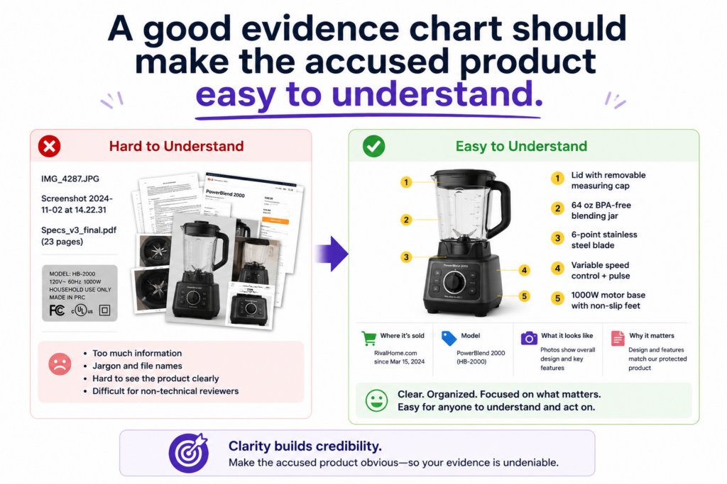
Teams jump straight into claim language, but the reader has no picture of the product in their mind yet. That makes the chart harder to follow.
A short product overview can fix this. It should explain what the product does, who uses it, what problem it solves, and what main workflow matters for the chart.
This does not need to be long. It should give just enough context so the reader can understand the evidence that follows.
For example, if the product is an AI tool for reviewing contracts, the chart should briefly explain that users upload documents, the system reads them, the system flags issues, and the user sees suggested edits.
If the product is a connected device, the chart should explain what data it senses, what action it takes, and how the user interacts with it.
The product overview should support the claim map without becoming a sales review
The goal is not to write a full product review. The goal is to frame the facts that matter. A product may have many features, but only a few may matter for the patent claim. The overview should stay close to those features.
This helps the reader avoid confusion. If the chart is about a ranking system, the overview should focus on how the product receives items, scores them, ranks them, and displays the result.
If the chart is about device control, the overview should focus on sensing, decision-making, and control actions. If the chart is about data security, the overview should focus on access, checks, risk signals, and actions taken by the system.
A focused overview also prevents the chart from feeling bloated. Many weak charts become too large because they include every interesting thing about the product.
That may feel useful, but it can hide the main proof. The strongest charts keep the reader’s attention on the claim.
A clear product story helps decision makers move faster
A founder, investor, or business lead may not have time to study every product detail. They need the main story fast.
A clean overview helps them see why the product matters, why the patent claim may matter, and why the evidence deserves attention.
This is also useful for attorneys. A patent attorney can read the overview and quickly understand the product context before looking at each claim part.
That can make the review more efficient and more focused.
The product story should be simple and factual. It should not say the product infringes. It should not use heated language.
It should simply explain what the product appears to do based on available evidence.
When this is done well, the chart feels easier from the first page. The reader is not dropped into dense claim words with no map. They get a simple product picture first, then they see the claim mapping piece by piece.
For founders, this is the same kind of clarity that helps across the whole patent process. When you can explain what you built in plain words, it becomes easier to protect it.
PowerPatent helps technical teams turn complex inventions into clear patent-ready material, backed by smart software and real attorney oversight. You can learn how it works here: https://powerpatent.com/how-it-works
The claim language should be broken into small parts before any proof is added
Patent claims can be hard to read because they often pack many ideas into one long sentence.
If you try to map the full sentence at once, the chart becomes messy. The better approach is to break the claim into smaller parts first.
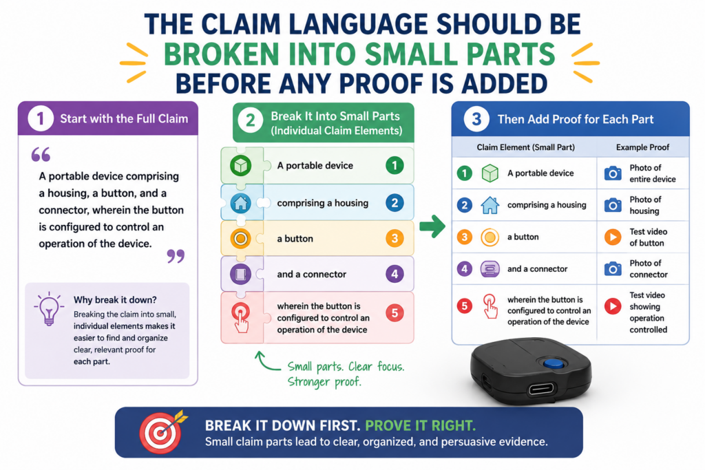
Each small part should represent one thing the product must have or do. This makes the chart easier to build and easier to check.
It also helps prevent the team from missing a required part of the claim.
For example, a claim may describe a system that receives data, processes the data, creates a score, compares the score to a rule, and sends a message.
Each of those actions should be treated separately. That way, each part gets its own evidence and its own explanation.
Small claim parts make the proof cleaner
When claim parts are too large, the evidence becomes vague. A single row may try to prove three or four things at once.
That creates confusion. The reader may see proof for one part but not the others.
Smaller parts solve this problem. One row can focus on the product receiving data. Another row can focus on the product creating a score.
Another row can focus on the product sending a message. This structure makes gaps easier to see and strengths easier to explain.
It also helps your team stay honest. If there is no proof for one part, you will notice it. You will not hide it inside a long paragraph that sounds complete but leaves out an important point.
This kind of structure is especially helpful for technical products. AI systems, data tools, robotics platforms, medical devices, chip designs, climate systems, and developer tools often involve many steps.
Breaking the claim into smaller parts keeps the work manageable.
The chart should preserve the claim meaning while making it easier to read
Breaking a claim into parts does not mean changing the claim. You should keep the meaning intact. The chart should not rewrite the claim in a way that makes it broader, softer, or easier to prove than it really is.
A practical method is to keep the exact claim language in one place, then add a plain-word explanation beside it.
The exact language keeps the chart tied to the patent. The plain explanation helps the reader understand what the claim part means.
For example, if the claim says “transmitting a notification to a remote user device,” the plain explanation may say, “The system sends an alert to the user’s phone or computer.”
That makes the point easier to grasp without changing the core idea.
This is another reason attorney oversight matters. Founders and engineers can explain the technology, but claim meaning can be sensitive.
A patent attorney can help make sure the chart stays accurate and does not stretch the claim beyond what it supports.
PowerPatent was built to make that collaboration easier. It helps founders capture the technical detail while real patent attorneys guide the patent work.
That combination helps startups move faster without losing care. See how PowerPatent works here: https://powerpatent.com/how-it-works
The evidence should be ranked by strength so the reader knows what matters most
Not all evidence carries the same weight. A public product manual may be stronger than a vague marketing line. A hands-on test result may be stronger than a general blog post.
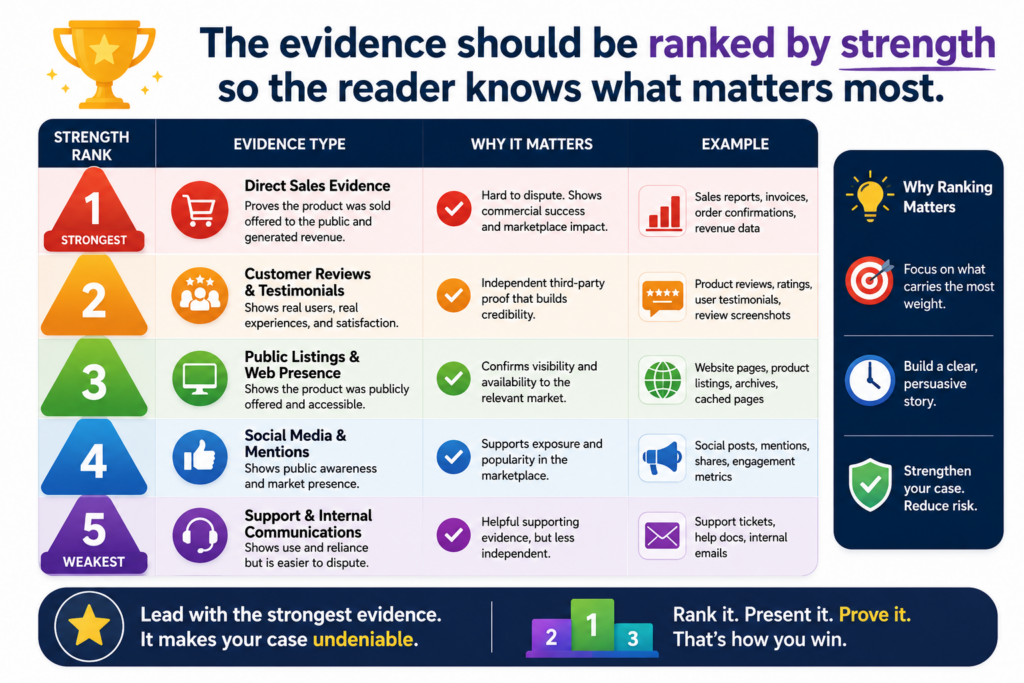
A developer guide may be stronger than a customer quote. A teardown photo may be stronger than a product image from a sales page.
A useful evidence chart should make this difference clear. The reader should be able to see which facts are direct, which facts are supporting, and which facts only suggest a possible match.
This does not require a complex scoring system. It requires clear writing. When the proof is direct, say why it is direct. When the proof is indirect, explain what it supports and what it does not fully prove.
Direct evidence should be placed where the reader can see it quickly
If you have strong evidence, do not bury it. Put the clearest proof close to the claim part it supports. A screenshot of the product output, a line from the official documentation, or a test result should be easy to find.
For example, if the claim requires the system to return a confidence score and the product’s API guide shows a field named “confidence score,” that should be near the top of the evidence for that claim part.
You may include other sources too, but the best source should lead.
This helps the reader trust the chart faster. It also keeps the chart from feeling like it is trying to win by volume.
Ten weak sources are not always better than one strong source. A strong chart uses the best proof first, then adds support where needed.
The same rule applies to screenshots. If one image clearly shows the required product behavior, use that image before adding extra context.
The reader should not have to search through clutter to find the key proof.
Weak evidence can still help when it is used in the right role
A weaker source is not useless. It may help support the broader story. A marketing page may show how the product is positioned. A customer story may show real-world use.
A job post may suggest internal architecture. A blog post may explain the technical direction of the company.
The problem comes when weak evidence is treated like direct proof. A product page saying “smart automation” should not be used as proof of a specific model pipeline.
But it may support the idea that the product uses automation, especially when paired with better sources.
Good charts use evidence in the right role. Direct evidence proves a clear point. Supporting evidence adds context.
Indirect evidence helps explain why a certain inference may be reasonable. Missing evidence is named as a gap.
This careful ranking makes the chart more credible. It also makes it easier for your attorney to review. They can quickly see which parts are strong and which parts need more work.
For founders, this is a practical way to protect time and money. You do not need to chase every possible source. You need to find the sources that move the decision forward.
PowerPatent helps founders focus the patent process around clear invention details, strong attorney review, and faster action. Learn more here: https://powerpatent.com/how-it-works
The chart should be updated as the product changes
Products change fast. This is especially true in software, AI, cloud tools, connected devices, and developer platforms.
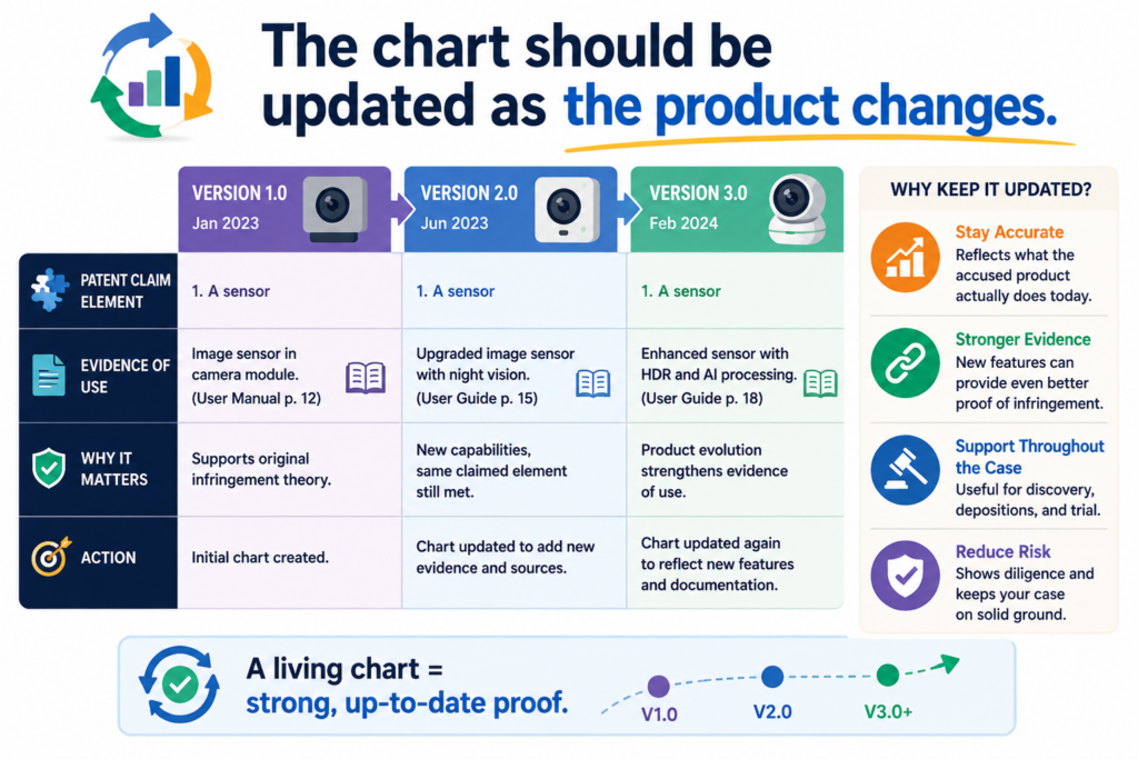
A feature may be added, removed, renamed, hidden behind a paid plan, or moved into a new workflow. The evidence chart should not be treated as a one-time task if the product keeps changing.
An old chart can still be useful, but it may not reflect the current product.
If your company is watching a key competitor or preparing for a serious business discussion, the chart should be refreshed before major decisions are made.
Refreshing the chart does not mean starting over. It means checking the main sources, reviewing the product flow again, updating screenshots, confirming links, and noting any changes that affect the claim mapping.
Updates should be tracked so the evidence history stays clean
When a product changes, do not erase the old evidence without thinking. Past evidence may still matter. A product may have used a feature during a certain period and later changed it. That history could be important.
The chart should make the timeline clear. It should show when evidence was captured and whether the product still appears to work the same way.
If a page changed, keep the older capture and add the new one. If a feature moved, note where it moved. If a test result changed, record the new test conditions.
This helps avoid confusion later. A reader can see what was true at one point and what appears true now. That is much better than mixing old and new evidence without dates.
For startups, this is also useful during fundraising, acquisition talks, or partner discussions. If someone asks about your patent position, you can show that your team has been tracking the market in a serious way.
A living chart can guide both enforcement and product strategy
An updated chart can do more than support a patent issue. It can also teach your team where the market is going.
If a competitor keeps adding features that move closer to your patented technology, that may matter. If several companies start adopting the same method, that may matter too.
This information can guide future patent filings. It can also guide product strategy. You may see which parts of your invention the market values most.
You may learn where competitors are weak. You may spot new invention areas based on how your own product is evolving.
This is why patents should not be treated as a box to check. For a deep tech startup, patents can be part of how you understand your market, protect your edge, and create more company value.
PowerPatent helps founders build that kind of patent system without the old slow process.
The platform combines smart software with real attorney oversight so technical teams can move faster, stay in control, and protect what matters. You can see the full process here: https://powerpatent.com/how-it-works
Conclusion
An evidence of use chart helps turn patent value into clear proof. It shows what the patent protects, what the product does, and where the facts match. For founders, this can change everything. Instead of guessing, reacting, or hoping, you can make smart moves with confidence.
A strong chart can support licensing talks, investor trust, patent strategy, and real action against copycats. The key is to stay clear, careful, and evidence-first. PowerPatent helps founders build stronger patent assets with smart software and real attorney oversight, so protection does not slow growth. Learn how it works here: https://powerpatent.com/how-it-works
Leave a Reply