A strong claim chart is not built by filling boxes with random proof. It is built by matching each part of a patent claim to clear support in the product, system, code, model, document, or accused tool. To see how PowerPatent helps protect your work faster, visit https://powerpatent.com/how-it-works
Claim element mapping is the quiet skill that makes a claim chart work
A claim chart can look neat and still be weak. It can have rows, notes, screenshots, labels, and long text, yet still fail to show the real match between the claim and the product.
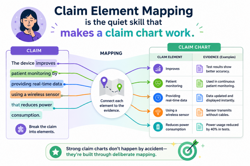
That is why claim element mapping matters so much. It is not just a step in the process. It is the skill that holds the whole chart together.
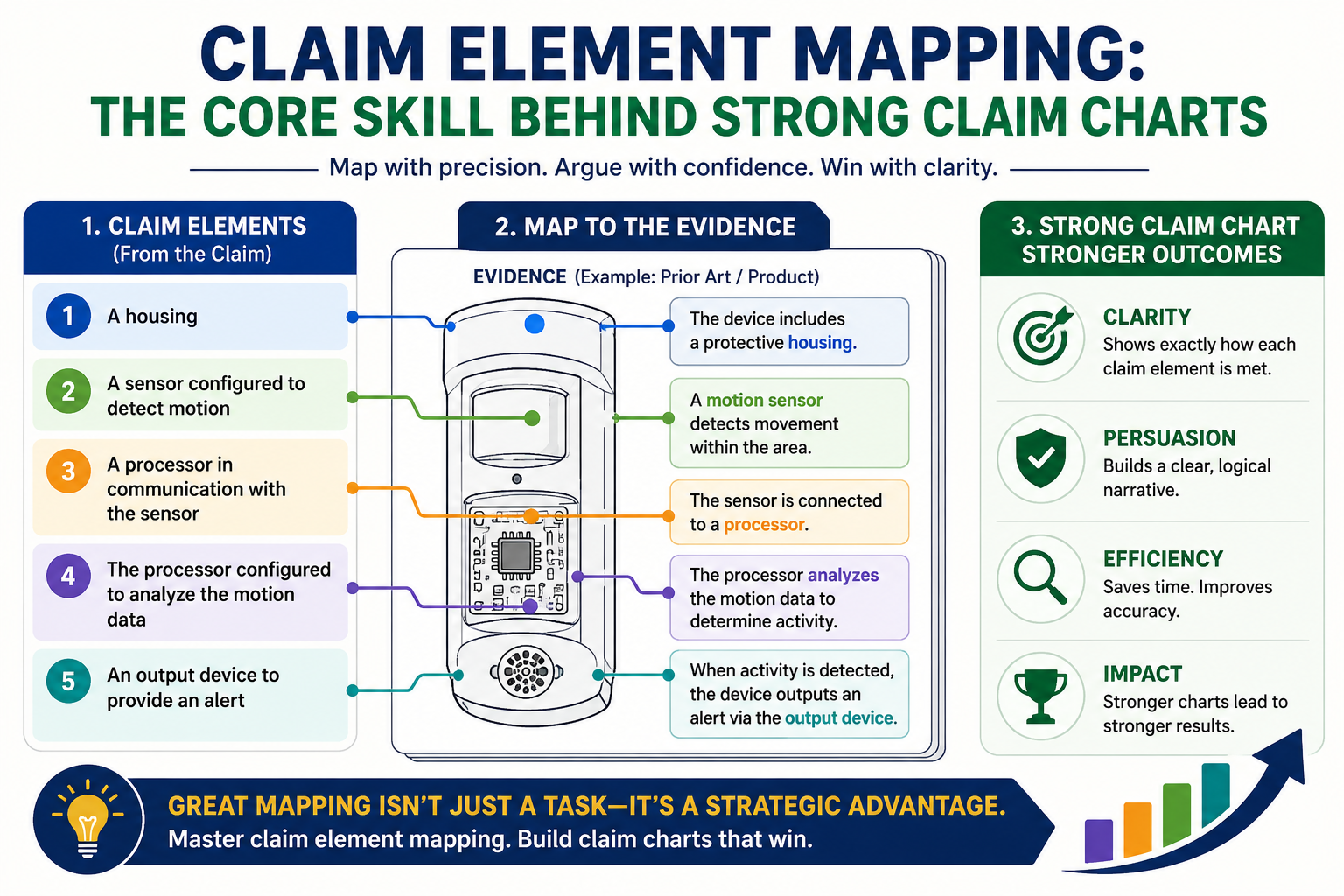
Claim element mapping means breaking a patent claim into small parts, then finding where each part appears in the thing you are studying. That thing may be your own product.
It may be another product in the market. It may be a system, a method, a model, a workflow, a device, or a piece of code.
The goal is not to sound smart. The goal is to be clear.
When mapping is done well, a reader can follow the chart without stress. They can look at one part of the claim, then look at the proof beside it, and quickly see why the match makes sense. That is the power of clean mapping. It makes the claim chart feel grounded, not forced.
Strong mapping starts before the chart is made
Many teams think a claim chart starts when they open a table. That is not true. A strong chart starts earlier, when someone reads the claim with care and asks what each part really means in plain language.
This is where many weak charts go wrong. The person making the chart may rush into finding proof before they understand the claim.
They may grab screenshots, product pages, code notes, or diagrams too soon. Then the chart becomes a pile of facts instead of a clear match.
A better way is slower at first, but faster later. You read the claim. You break it into pieces. You name what each piece is asking for. Then you look for proof only after you know what you need.
The plain meaning should guide the first pass
On the first pass, keep the language simple. Do not try to turn every word into a hard legal debate. Ask what the claim is saying in normal words.
If the claim says a system receives data, processes the data, and sends an output, you should first understand those actions as normal product steps.
This simple view gives you a clean starting point. Later, a patent attorney can help review the wording and make sure the chart stays aligned with the claim. That mix is powerful.
Engineers bring product truth. Attorneys bring claim care. PowerPatent is built around that kind of teamwork, with smart software and real attorney oversight helping founders move faster without losing control.
You can see how this works here: https://powerpatent.com/how-it-works
Mapping is not about making a product fit a claim at any cost. It is about finding the real match. If the match is strong, the chart should make that clear.
If the match is weak, the chart should reveal that too. That honesty is useful because it saves time, money, and bad decisions.
A claim element is not just a sentence fragment
A claim element is a part of a patent claim that needs its own proof. It may be a full step, a feature, a connection, a data action, a hardware part, or a software function.
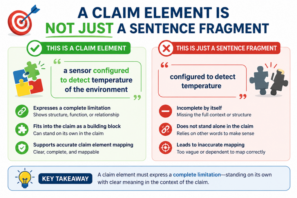
In a strong claim chart, each element is treated with care because each one carries weight.
This is where founders and engineers often have an edge. They already know how systems are built.
They understand inputs, outputs, modules, models, sensors, APIs, databases, training data, user actions, control flows, and product states. Claim element mapping takes that same product thinking and applies it to patent claims.
The hard part is that patent claims do not always sound like normal product notes. A claim may say “a processor configured to” when the product team would simply say “the backend runs this job.”
A claim may say “receiving a first signal” when the engineer would say “the app gets a webhook.” The words may differ, but the mapping job is to find whether the real function is there.
The best claim charts translate without twisting
A good claim chart does not copy product language blindly. It also does not twist the claim language until it fits.
It sits between those two mistakes. It explains the claim element in simple terms, then points to product proof that shows the same idea.
For example, if a claim element requires “storing user profile data in a memory,” the chart should not only point to a marketing page that says the product is personalized.
That may be helpful background, but it is not enough by itself. Stronger support may come from a database schema, system diagram, API record, technical document, or code path showing that user profile data is stored.
The proof should match the actual element. If the element is about storing, show storage. If it is about ranking, show ranking.
If it is about sending, show sending. If it is about training a model, show training. This sounds basic, but it is where many charts become weak.
Each element should answer one clear question
A useful way to map each element is to turn it into a question. If the element says the system “receives sensor data from a wearable device,” the question becomes simple. Where does the product receive sensor data from a wearable device?
That question keeps the work clean. It stops you from adding proof that sounds close but does not answer the point.
A product page saying the product works with wearables may help, but it may not show receipt of sensor data. A developer guide, API log, integration document, or data flow diagram may be stronger.
This kind of clear thinking is not just useful for claim charts. It helps founders understand the patent value of what they are building.
It helps teams see which parts of the invention are truly important. It also helps avoid vague filings that miss the real technical edge.
That is one reason PowerPatent is helpful for technical teams. It helps turn the messy truth of product building into clearer patent work, with the right structure and attorney review built in. Learn more here: https://powerpatent.com/how-it-works
Strong mapping begins with breaking the claim the right way
Breaking a claim into elements is not the same as cutting it at every comma. Some people do that because it feels easy.
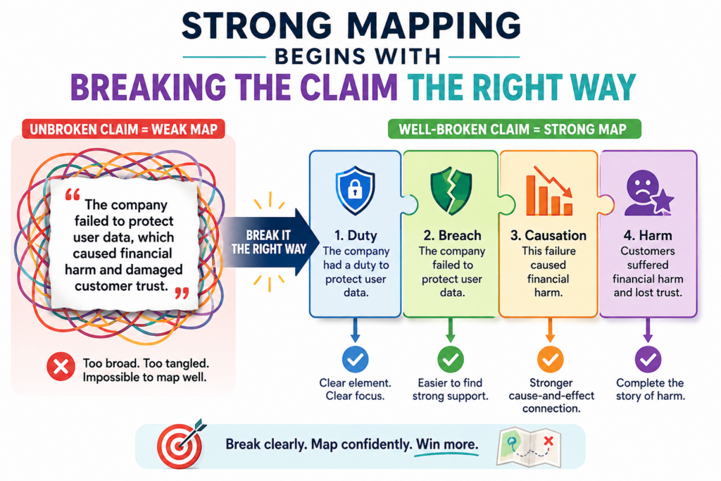
But patent claims often use long sentences with many parts tied together. If you split the claim in the wrong place, the chart can become confusing fast.
The better goal is to split the claim into meaningful parts. Each part should be small enough to prove clearly, but not so tiny that the chart loses the main idea.
You want the reader to see the full path of the claim without getting buried in scraps.
Think of it like reading a recipe. If one step says to mix flour, water, and yeast, then let the dough rise, you could break that into two useful parts. One part is mixing.
The other part is letting the dough rise. But if you split every noun into its own row, the recipe becomes harder to follow. Claim mapping works the same way.
The claim should drive the split, not the table
A table is only a tool. It should not decide the logic. The claim should decide the logic. Before adding rows, read the claim from start to finish.
Find the main thing being claimed. Then find the actions, parts, links, and limits that give the claim its shape.
For a software claim, you may see steps like receiving data, cleaning data, training a model, making a score, and sending a result.
For a device claim, you may see parts like a sensor, a controller, a power unit, and a communication module. For a system claim, you may see servers, client devices, databases, rules, and outputs.
The key is to avoid lazy splitting. Do not create one giant row for half the claim. That hides too much. Also do not create ten tiny rows that all need the same proof. That makes the chart heavy without making it stronger.
A clean split makes the proof easier to judge
When the split is right, the proof becomes easier to test. You can ask whether each row has direct support.
You can see where the chart is strong. You can see where it needs more proof. You can also see where the claim may not fit the product as well as expected.
This matters a lot when a startup is making fast choices. Founders do not have endless time to chase weak paths.
They need to know where their IP story is strong and where it needs more work. Claim element mapping helps create that clarity.
A clean split also helps attorneys do better work. Instead of spending time untangling a messy chart, they can focus on judgment, strategy, and risk. That can make the whole patent process smoother.
At PowerPatent, this is the kind of work we care about. The goal is not to make patents feel scary. The goal is to help builders protect what matters with more speed and less guesswork.
The software helps gather and shape the details, while real patent attorneys help keep the work sharp. You can explore the process here: https://powerpatent.com/how-it-works
The proof must match the element, not just the general idea
One of the biggest mistakes in claim charts is using proof that only shows the general product, not the exact claim element. This may make the chart look full, but it does not make it strong. A strong chart needs proof that lands on the point.
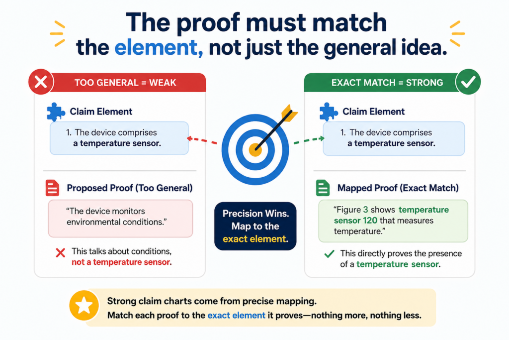
Say a claim element is about “generating a risk score based on transaction history.” A weak chart may point to a web page that says the product helps detect fraud.
That is related, but it does not prove the element. A stronger chart would show where the product uses transaction history and creates a risk score.
That proof could come from a technical paper, product guide, admin screen, API output, model card, patent filing, or another reliable source.
The reader should not have to guess. They should not have to fill in missing steps. The chart should do the work for them.
Close is not the same as mapped
This is a simple rule, but it saves a lot of trouble. Close is not mapped. Similar is not mapped. Implied is not always mapped. A strong chart shows the feature, step, or link with enough detail that the reader can see the match.
This is especially important for deep tech startups. In AI, robotics, health tech, chips, climate tech, biotech tools, and advanced software, many products sound alike at the surface level.
The real value is often in the details. Those details may include how data moves, how a model is trained, how a device reacts, how a signal is changed, or how a system chooses one action over another.
That is why claim element mapping is such a core skill. It forces the work to stay tied to real technical facts.
The best proof is specific and easy to trace
Specific proof gives the chart strength. A screenshot may help if it shows the feature clearly. A code comment may help if it shows the function. A product manual may help if it explains the step.
A data flow diagram may help if it shows the path. A public demo may help if it shows the system in action.
But proof also needs to be easy to trace. The chart should make it clear where the proof came from and why it matters. A reader should be able to find the source again.
They should be able to check it. They should be able to understand the link without needing a private tour of the product.
For founders, this is a major reason to capture invention details early. If your team waits too long, the proof may get buried in old tickets, stale docs, lost Slack threads, retired code, or a teammate’s memory. That creates stress later.
PowerPatent helps founders avoid that mess by making it easier to capture the right invention details while the team is still close to the work.
That means less scrambling and more confidence. See how it works here: https://powerpatent.com/how-it-works
A strong chart tells a clear story from top to bottom
A claim chart is not a blog post, but it still tells a story. The story is simple: this claim requires these things, and here is where each thing appears.
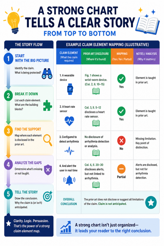
When the story is clear, the chart feels calm and strong. When the story jumps around, the reader loses trust.
Good mapping keeps the story in order. It follows the claim. It does not skip hard parts. It does not bury weak support under long text. It does not use fancy words to hide gaps. It builds trust by being direct.
This is where good writing matters. A chart is a technical document, but it still needs human clarity.
The explanations should be short enough to follow, but full enough to show the match. The language should help the reader, not impress them.
The chart should reduce mental work for the reader
The reader should not have to ask, “Why is this proof here?” The chart should answer that question in plain words.
For each element, explain the match in a direct way. Use the claim words when needed, but also explain the product feature in simple terms.
If the claim element says “selecting a route based on real-time traffic data,” the chart should show the product selecting a route and using real-time traffic data.
The explanation should connect both parts. It should not only say the product has maps. It should not only say the product has traffic. It must show the link between route selection and traffic data.
That link is the heart of mapping. A claim chart is not just a storage place for evidence. It is a bridge between claim language and real product facts.
Good mapping makes hard decisions easier
A strong chart can support many business decisions. It can help a startup understand whether a patent claim covers an important feature.
It can help a team decide what to file next. It can help show investors that the company has real protected value. It can help prepare for licensing talks, partner talks, or market review.
It can also show when a claim is not as strong as hoped. That may not feel good, but it is useful.
Bad news early is better than bad news late. Early clarity helps teams fix gaps, improve filings, or choose a better path.
This is why strong claim element mapping is not just a legal task. It is a business skill for builders. It helps protect the work without slowing the team down.
PowerPatent was built for that kind of founder. The founder who wants strong IP but does not want to get trapped in slow, old ways of working.
With smart tools and real attorney review, the process becomes easier to manage and harder to ignore. Start here: https://powerpatent.com/how-it-works
Claim element mapping starts with the words, but it does not end there
A patent claim is made of words, but a strong claim chart is made of proof. That is the key shift. You cannot stop at reading the claim. You have to move from the claim language into the real world and show where the thing exists.
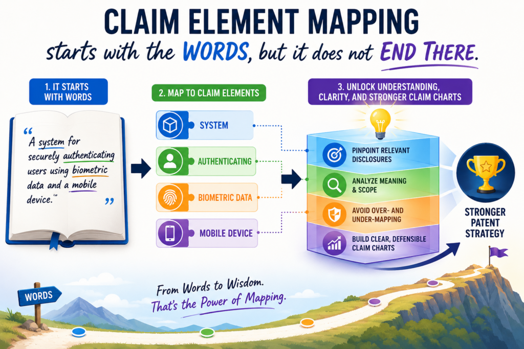
This is why claim element mapping is both careful and practical. You are not only asking what the words say.
You are asking what facts can support those words. That is where the work becomes useful for founders, engineers, and product teams.
A claim may use broad words. A product may use different words. A document may call the same feature by another name.
Your job is to connect these without forcing the fit. The chart should show that the same idea is present, even when the labels are different.
The exact product term may not match the claim term
A claim might say “authentication module,” while the product docs say “login service.” A claim might say “training data,” while the engineering team says “labeled examples.”
A claim might say “remote server,” while the architecture diagram says “cloud backend.”
These differences do not automatically create a problem. What matters is whether the thing described in the claim is actually present in the product.
Good mapping explains the connection in plain terms so the reader can understand why the proof supports the element.
The danger comes when the chart treats two terms as the same without explaining why. That leaves the reader with doubt. It also makes the chart easier to attack. A stronger chart takes a moment to bridge the gap.
The bridge should be short, clear, and tied to facts
The best bridge does not sound like a speech. It sounds like a clean explanation.
It may say that the product’s login service performs the claimed authentication because it checks a user’s identity before allowing access. Then the chart should point to proof that shows that check taking place.
This is where technical teams can help a lot. Engineers know what the product terms really mean. They know when two names point to the same system part.
They also know when something only sounds similar but is not the same thing. That honest input can make a chart much stronger.
For startup teams, this is also why early capture matters. When the invention is still fresh, it is easier to explain what each feature does and why it matters. Later, people forget.
Docs change. Code moves. Team members leave. A strong process keeps the key details from slipping away.
PowerPatent helps founders turn those details into clearer patent work with smart software and real attorney oversight.
It helps your team protect what you are building without pulling everyone into a slow, painful process. You can see how it works here: https://powerpatent.com/how-it-works
The strongest claim charts show the full path, not just isolated proof
Many weak claim charts fail because they show each element as if it lives alone. But claims often describe a chain. One thing receives data. Another thing processes it.
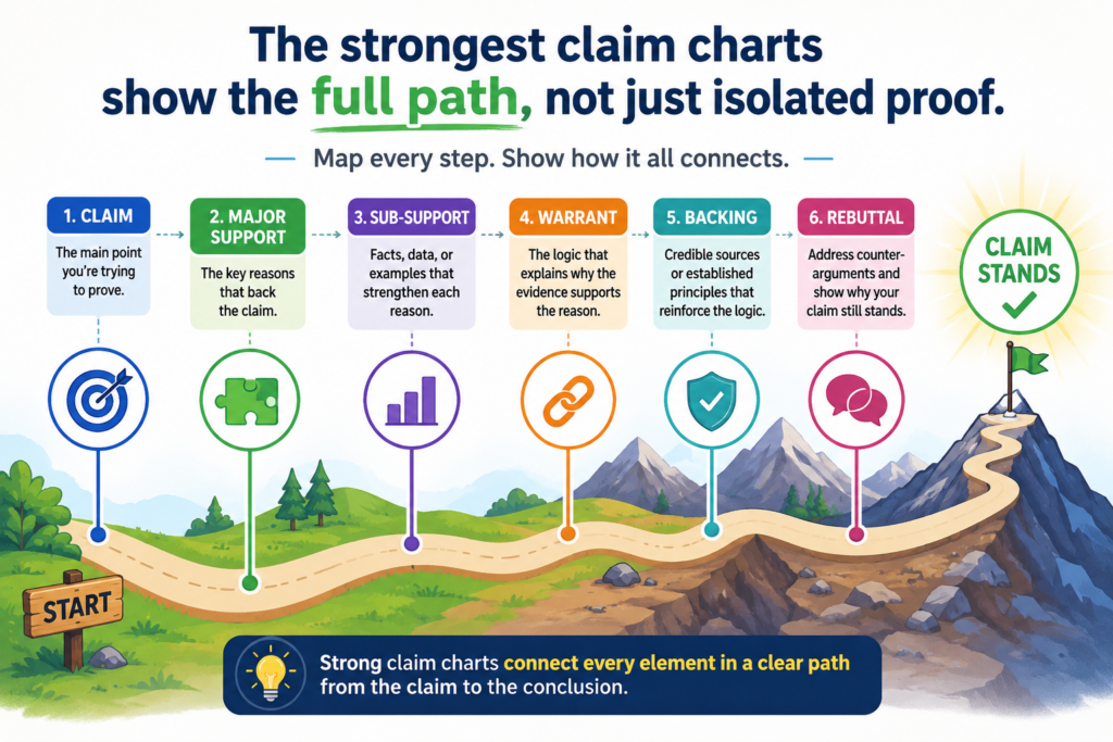
Another thing creates an output. Another thing sends that output somewhere. If the chart does not show the path, the reader may not see the invention.
Strong claim element mapping follows the chain. It shows how the parts work together. This is especially important for software, AI, systems, networks, robotics, and data products. In these fields, the value often comes from the flow, not just from one feature sitting by itself.
A claim chart should help the reader see that flow. Each row may focus on one element, but the full chart should still feel connected.
A feature match is stronger when the surrounding steps also make sense
Imagine a claim that covers a system for detecting a fault in a machine. One element says the system receives sensor data.
Another says it compares that data to a model. Another says it creates an alert. If your chart shows sensor data in one row and an alert in another row, but does not show the comparison step, the story feels broken.
The missing link matters. The alert may exist for another reason. The data may be used for another process. Without the middle step, the chart asks the reader to assume too much.
Good mapping closes those gaps. It shows how the product moves from input to decision to output. It does not need to bury the reader in every tiny detail, but it should show enough of the path to make the match credible.
The best charts make the product feel understandable
A strong claim chart does more than support a claim. It teaches the reader how the product works in the areas that matter.
That does not mean it explains every feature. It means it gives enough context for the claim mapping to feel natural.
This is very useful when the product is complex. Many deep tech inventions are hard to explain because the value is hidden inside the system. The user may only see a simple screen or result.
The real invention may happen in the data path, the model logic, the control loop, the chip design, the sensor fusion layer, or the backend workflow.
Claim element mapping brings that hidden work into view. It shows where the invention lives. It turns quiet technical value into something people can understand and act on.
That is one of the reasons PowerPatent exists. Founders should not have to choose between building fast and protecting deeply.
With the right process, your team can capture the technical truth and turn it into stronger patent work. Learn more here: https://powerpatent.com/how-it-works
Good mapping uses the right level of detail for each element
Not every claim element needs the same amount of detail.
Some elements are simple and can be mapped with a short explanation and one clear source. Other elements are more complex and need more support. The skill is knowing the difference.
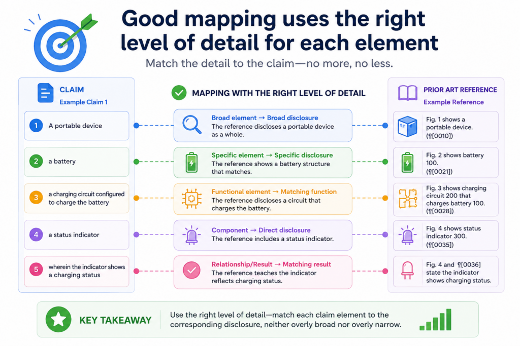
Too little detail makes the chart weak. Too much detail makes it hard to read. Strong mapping finds the middle. It gives the reader enough proof to trust the match without drowning them in extra material.
This balance is important because claim charts are used by busy people. Attorneys, founders, investors, partners, and technical reviewers all need clarity.
They may not have time to untangle a messy chart. If the chart is hard to follow, even good proof can lose impact.
Simple elements should not be overworked
Some claim elements are basic. If a claim requires a mobile device, and the product is clearly a mobile app running on a phone, the chart may not need a long explanation. It still needs support, but the point may be simple.
The mistake is spending too much space on the easy parts while rushing past the hard parts. This makes the chart feel uneven. It also wastes the reader’s energy before they reach the real issues.
A better chart gives simple elements simple treatment and saves more explanation for the places where the match needs care.
Complex elements deserve more than a quick note
When an element involves a special rule, a model step, a hardware relationship, a timing condition, or a data change, the chart should slow down. These are the places where weak mapping often hides. A single vague sentence is usually not enough.
For example, if a claim requires “updating a machine learning model based on user feedback,” the chart should not only show that users give feedback.
It should also show that the feedback is used to update the model. Those are different things. One is input. The other is model change. A strong chart keeps them separate and then connects them with proof.
This kind of detail is where engineering notes, system diagrams, model docs, test results, or code paths can be very helpful.
They show what actually happens behind the scenes. They help the chart move from surface claims to real technical support.
For a founder, this can be the difference between a patent story that sounds generic and one that feels grounded in real invention.
PowerPatent helps teams capture these details early and shape them into stronger filings with attorney guidance. To see the process, visit https://powerpatent.com/how-it-works
The best claim element mapping avoids vague filler words
Vague words make a claim chart weaker. Words like “appears to,” “may,” “possibly,” “seems,” and “generally” can be useful when the facts are not fully known, but they should not be used to cover a weak match.
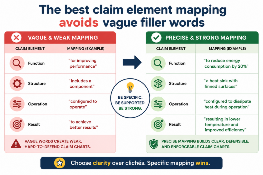
If the proof is strong, say it clearly. If the proof is not strong, find better proof or admit the gap.
This does not mean every chart must sound aggressive. It means the chart should be honest and direct. A strong chart does not need to shout. It simply shows the match with calm confidence.
Vague filler often shows up when the person making the chart has not done enough mapping work. They may have found something close, but not exact. Instead of looking deeper, they add soft language.
That may help the chart look complete, but it does not help the chart become stronger.
Clear words make the evidence easier to trust
Good mapping uses simple verbs. The product receives the data. The server stores the file. The model generates the score.
The app sends the alert. The sensor detects the change. The controller adjusts the output.
These words are easy to follow because they point to real actions. They also match how engineers think. A product does things.
A system has parts. Data moves. Rules apply. Models produce results. Devices respond. The chart should speak in that same clear way.
When the writing is clear, the reader can focus on the proof. When the writing is vague, the reader starts to wonder what is being hidden.
Do not use long language to cover short proof
One common mistake is using a long explanation when the proof is thin. The chart may include a paragraph full of broad claims, product benefits, and technical-sounding words, but still fail to show the required element.
This does not make the chart stronger. It only makes the weakness harder to spot for a moment.
A better approach is to make the gap visible. If you do not yet have proof for a claim element, say what proof is needed.
That might mean a technical document, a demo, a source file, a system diagram, a data sample, or a product manual. Once you know the gap, you can fix it.
This is another reason a modern patent process matters. Founders move fast. They do not have time to rebuild the story from scratch each time they need a filing, chart, or review.
PowerPatent helps make invention capture and attorney-backed patent work feel more organized and less painful. Start here: https://powerpatent.com/how-it-works
Good claim element mapping separates what is shown from what is assumed
A strong claim chart does not make the reader guess. It shows what is known, where it is shown, and why it matters. That sounds simple, but it takes discipline. Many charts become weak because they mix facts with assumptions.
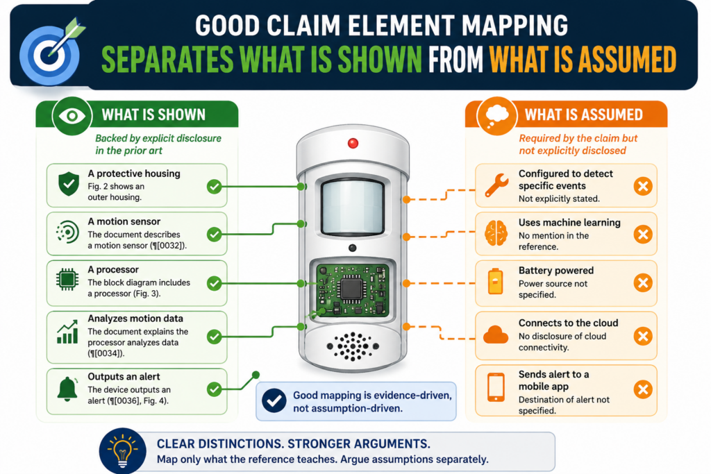
The chart may say a product “must” do something because the result appears on screen. But unless the proof shows the step, that may still be an assumption.
This is very common in software and AI products. A user may see a score, a result, a message, or a recommendation. But the claim element may require a specific way of creating that result.
If the chart only shows the final result, it may not prove the required step. It may suggest the step, but suggestion is not the same as mapping.
The safest approach is to treat every element like a question that needs direct support. If direct support is not available, the chart should make that clear and keep looking for better proof.
Strong maps do not hide gaps
A gap is not always a failure. Sometimes a gap simply means the team needs more information. Maybe the public product page does not explain the backend.
Maybe the demo shows the output but not the logic. Maybe the source document uses a different name for the same feature. Maybe the evidence exists, but it is buried in a technical file.
A weak chart hides the gap with soft words. A strong chart shows the gap so the team can solve it. This makes the whole process more honest and more useful.
For founders, this matters because bad patent decisions can cost real money. A team may spend time chasing a weak claim. Or they may miss a strong claim because the first chart was too shallow. Good mapping helps avoid both mistakes.
The right next step depends on the kind of gap
When a gap appears, the next move should be practical. If the issue is missing proof, the team should look for a better source.
If the issue is unclear language, the team should ask someone technical to explain the feature in plain words. If the issue is a claim that does not fit the product, the team should stop trying to force it.
This is where PowerPatent can help founders move with more confidence.
The platform helps teams capture invention details, organize the key facts, and work with real patent attorneys so important gaps are caught early instead of late. That means fewer surprises and a cleaner path from idea to protection.
You can explore how PowerPatent helps technical teams protect their work here: https://powerpatent.com/how-it-works
A good claim chart uses context without letting context replace proof
Context is helpful. It helps the reader understand the product, the system, and the reason the evidence matters.
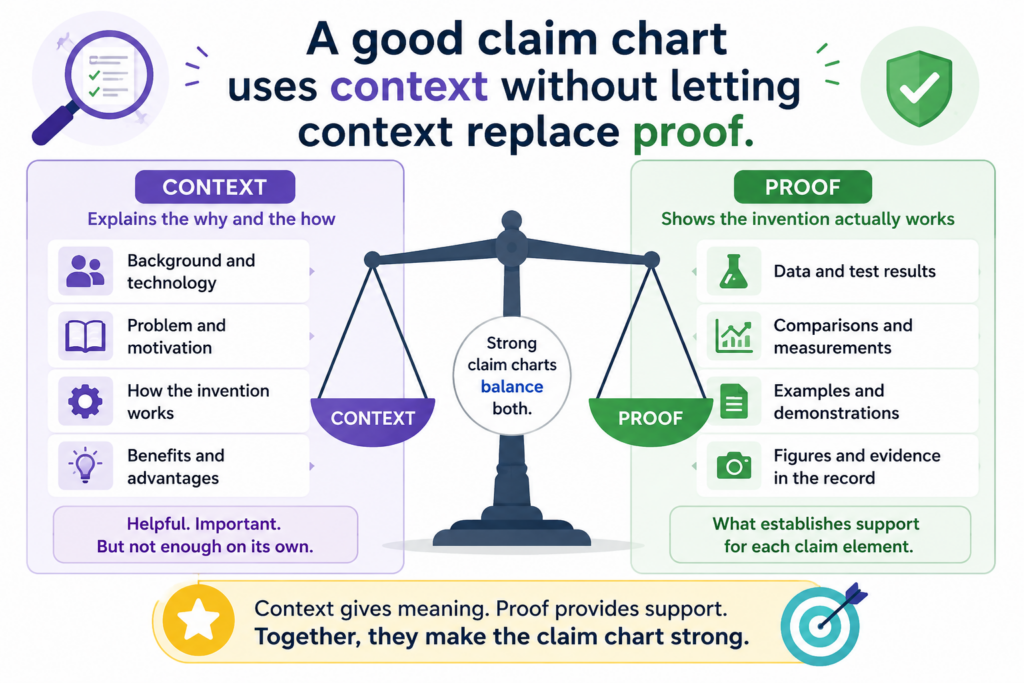
But context is not the same as proof. This is one of the easiest places to make a claim chart look stronger than it really is.
For example, a product page may say a platform “uses AI to improve customer support.” That is useful background.
But if the claim element requires “classifying a support request based on intent,” the chart still needs proof of classification and intent. The broad AI statement cannot carry the full weight.
Context should set the stage. Proof should carry the element. When those two roles are mixed up, the chart gets soft.
Background facts should support the story, not replace the match
A strong chart may use a short product overview to help the reader understand what the tool does.
That is fine. It may explain that the product is a cloud platform, a medical device, a robotics system, or a model training tool. That context can make the chart easier to follow.
But when the chart reaches each claim element, it must become exact. The evidence must show the feature or step in that element. If the element is about ranking, the proof should show ranking.
If the element is about encryption, the proof should show encryption. If the element is about sending a control signal, the proof should show that signal being sent.
The reader should never feel like the chart is saying, “This product is in the same field, so the element must be there.” That is not mapping. That is guessing with a nicer outfit.
Context is most useful when the product is hard to understand
Some inventions need more context because the feature is not visible from the outside.
A chip design, a model pipeline, a sensor system, or a backend control process may not be easy to see in a screenshot. In those cases, the chart may need to explain the system before mapping the claim.
Even then, the chart should stay tight. The goal is not to teach the entire product. The goal is to give enough background so the claim match makes sense.
This is also why founders should not wait until the last minute to think about patents. The best evidence often comes from the people who built the thing. Their notes, diagrams, and design choices can make the patent story much stronger.
PowerPatent helps capture those details while they are still fresh, then pairs smart software with attorney oversight to shape them into stronger work.
See how PowerPatent helps founders file better patents faster here: https://powerpatent.com/how-it-works
Claim element mapping is stronger when engineers are part of the process
Engineers often think patent work is only for lawyers. That belief can hurt the company. Patent attorneys are important, but they need the real technical story.
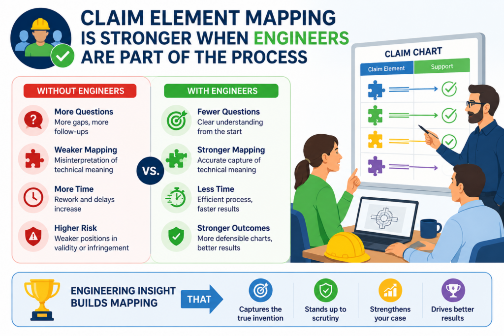
Engineers know where the invention lives. They know what changed, what was hard, what was built from scratch, and what makes the system different.
Claim element mapping becomes much stronger when engineers help explain the product in simple terms. They do not need to write legal arguments. They only need to tell the truth about how the system works.
This matters because many valuable inventions are not obvious from the user interface.
The real invention may be in how data is cleaned, how a model is updated, how a device saves power, how a control system avoids error, or how a workflow cuts time. Engineers can point to those facts faster than anyone else.
The best input from engineers is clear and practical
A strong engineering note does not need to be long. It needs to be clear. It should explain what the feature does, what input it uses, what output it creates, and why the design matters. It should also point to where the proof can be found.
This may include design docs, code files, diagrams, logs, test results, product specs, API docs, or internal demos.
The exact source depends on the product. The key is to connect the claim element to real material, not memory alone.
When engineers are part of the process early, patent work becomes less painful. The team does not have to dig through old systems months later.
The attorney does not have to guess what the product does. The founder does not have to carry the whole IP story alone.
Founders should make invention capture part of building
The best time to capture invention details is when the team is already building. That does not mean slowing down the roadmap. It means creating a simple habit of saving the key facts that show what was invented.
When a team solves a hard technical problem, that moment should not disappear into a ticket update and a few chat messages.
It should be captured in a way that can support future patent work. What was the problem? What was the new approach? Why was it better? What parts of the system make it work?
PowerPatent is built for this kind of founder-friendly process. It helps turn raw technical work into stronger patent material, with smart AI tools to organize details and real patent attorneys to review the work.
It gives founders more control without forcing them to become patent experts.
You can learn how the process works here: https://powerpatent.com/how-it-works
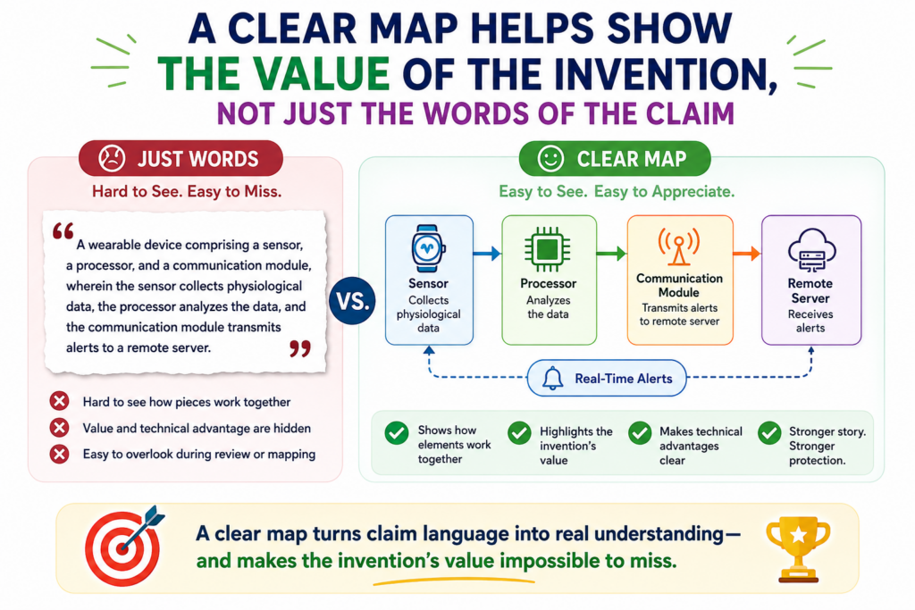
A clear map helps show the value of the invention, not just the words of the claim
Claim element mapping is not only about proving that a claim reads on a product. It also helps show why the invention matters. When each element is mapped with care, the chart can reveal the technical value inside the claim.
This is important for startups because value is not always easy to see. Investors, partners, buyers, and even team members may know the product is useful, but they may not see which parts are protectable.
A good claim chart can make that value more visible.
The chart shows what the claim covers. It shows how the product works. It shows which features are central.
It also shows whether the claim is tied to something the market cares about. That is useful business insight, not just patent work.
Strong mapping connects the claim to real product advantage
A claim element may look dry on paper. It may say something like “generating a control command based on a predicted state.”
That sounds plain. But in the product, that step may be the reason the robot moves more safely, the battery lasts longer, or the machine avoids damage.
Good mapping can help bring that value into view. It does not need hype. It simply shows how the claimed step supports the product’s real advantage.
This is where a claim chart can become more than a table. It can become a clear story about why the company’s technology is hard to copy. It can show the link between invention and market edge.
The strongest charts help teams make smarter IP choices
Once the mapping is clear, founders can make better choices. They can see which claims line up with core product features. They can see which inventions need more protection.
They can see which areas may need follow-on filings. They can also see where the current patent story does not match the business direction.
That kind of clarity can save money. It can also help the company move faster. Instead of treating patents like a slow task handled far away from the product team, founders can use mapping as a way to understand and protect what matters most.
PowerPatent helps make this possible by bringing software, structure, and attorney review into one easier process.
The goal is simple: help technical founders protect strong ideas without getting stuck in old, slow patent workflows.
To see how PowerPatent can help your team turn real invention details into better patent work, visit https://powerpatent.com/how-it-works
Claim element mapping helps founders avoid weak patent stories
A weak patent story usually does not fail all at once. It starts with small gaps. A feature is described too broadly. A key step is left out. A product detail is assumed instead of shown.
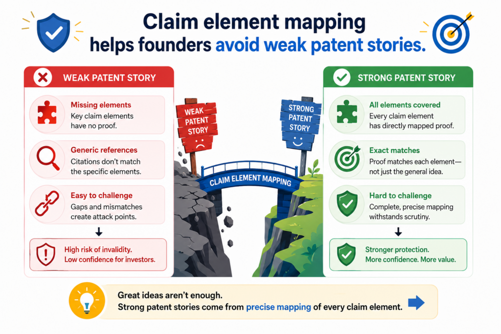
A claim sounds strong, but the proof behind it is thin. Over time, these small gaps can make a patent feel less useful than it should be.
Claim element mapping helps prevent this because it forces the team to slow down in the right places.
It asks a simple question again and again: where is this claim element shown in the real system? That one question cuts through noise fast.
For founders, this is powerful because it turns patent work from a vague task into a clear review. Instead of asking, “Do we have good IP?” the team can ask, “Which exact parts of our invention are covered, and how clearly can we show them?”
That is a much better question.
A weak story often starts with broad invention notes
Many invention notes start with a big idea. The team may write that the product uses AI to improve decisions, saves time, reduces errors, or automates a hard task. These are useful starting points, but they are not enough for strong patent work.
A patent story needs the how. How does the system improve the decision? How does it reduce the error? How does it choose the next step? How does it process the data? How does it change the output?
Claim element mapping pushes the team toward that deeper level. It moves the story from benefit to mechanism. That is where the real strength often lives.
Strong mapping turns vague value into clear technical proof
A founder may know the product is valuable because customers care about the outcome. But a claim chart needs to show the technical path that creates that outcome.
That path may include a data filter, a model update, a sensor reading, a ranking rule, a control signal, or a special way of storing and using information.
When those details are mapped well, the patent story becomes more solid. It is no longer just “our product is smart.” It becomes “our system does these specific steps in this specific way to create this useful result.”
That shift matters. It helps the team see what is truly special. It also helps patent attorneys draft and review with more care because the real invention is easier to see.
This is one reason PowerPatent is built for technical founders. The goal is to help teams capture the real substance of their work, then turn it into stronger patent filings with smart software and real attorney oversight. You can see how the process works here: https://powerpatent.com/how-it-works
Claim element mapping works best when the evidence is organized early
A strong claim chart depends on good evidence. The problem is that evidence often gets scattered.
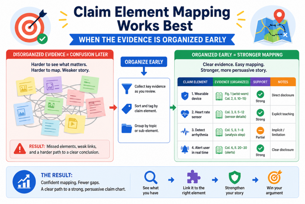
It may live in design docs, code comments, product specs, test notes, demo videos, sprint tickets, diagrams, emails, customer pilots, or founder notes. When the team waits too long, finding that evidence becomes harder than it needs to be.
Early organization makes claim element mapping smoother. It also makes the final chart stronger because the team is not forced to rely on memory. Memory is useful, but it is not the same as proof. A good chart needs sources that can be reviewed and traced.
For startups, this does not mean building a heavy process. It means making the right details easy to find when they matter.
Evidence should be saved in the same language builders use
The best invention evidence is often simple. It may be an engineer explaining why a new method worked better. It may be a diagram showing how data moves.
It may be a test result showing that a new control method reduced errors. It may be a model note showing how training data was selected.
The key is to save these details in a way that later readers can understand. Patent work becomes much easier when the technical story is already clear.
The attorney does not have to pull every detail out of the team one meeting at a time. The founder does not have to guess which feature matters most. The engineer does not have to rebuild the past from old messages.
Good evidence does not need to sound legal. In fact, it is often better when it sounds plain. The legal shaping can come later. The first job is to capture what was built and why it matters.
Early evidence helps avoid last-minute patent stress
When a startup waits until a funding round, launch, partnership, or public demo to think about patents, the process can feel rushed.
The team may need to move fast, but the facts may be spread everywhere. That creates pressure, and pressure can lead to missed details.
Claim element mapping benefits from early capture because the important proof is already close at hand.
The team can map each element with real support instead of scrambling for sources. The attorney can review a clearer record. The founder can make decisions with more confidence.
This is exactly the kind of problem PowerPatent helps solve. It gives founders a smarter way to collect invention details, organize the story, and work with real patent attorneys without slowing the team down.
If your company is building something hard to copy, it is worth seeing how PowerPatent can help here: https://powerpatent.com/how-it-works
Good mapping keeps the claim chart honest without making it weak
Some teams worry that being honest about gaps will make their patent position look worse. In reality, the opposite is often true.
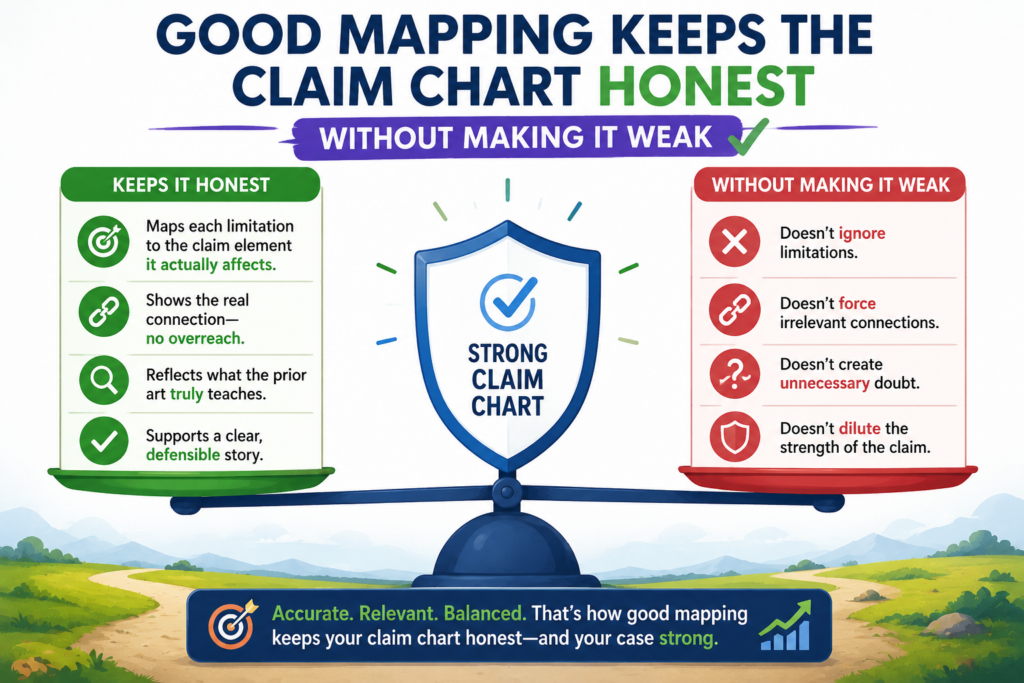
A chart that hides weak spots can create false comfort. A chart that shows the truth helps the team make better moves.
Claim element mapping is not about pretending every match is perfect. It is about knowing where the support is strong, where it is thin, and where more work is needed. That kind of honesty is not a weakness. It is a sign of control.
A founder should want that clarity early. It is much better to learn that a claim element needs more support while there is still time to fix the record, improve a filing, gather better evidence, or adjust the patent plan.
Honest mapping helps teams spend time where it matters
Every startup has limited time. The product team is busy. The founder is selling, hiring, raising, and building.
The attorney needs clear input. No one benefits from chasing bad leads or polishing weak charts that do not support real decisions.
A good map points attention to the right places. It shows which elements are backed by direct proof. It shows which ones need more review.
It shows which claims may fit the product well and which ones may not.
This makes the process more useful. Instead of treating the chart as a finished answer, the team can use it as a working tool. It becomes a way to improve the patent story while there is still time to make it stronger.
A gap can become an action item, not a dead end
When a claim element is not fully supported, the team should not panic. The right response is to ask what is missing. Maybe the proof exists but has not been found.
Maybe the feature is present, but the documents use different words. Maybe an engineer needs to explain the flow. Maybe the current claim is not the best fit for the product.
Each of these paths is useful. The gap becomes a guide. It tells the team what to do next.
This is where a modern patent process can make a real difference. PowerPatent helps founders move from scattered details to clearer action, with software that supports speed and attorneys who help review the work with judgment.
That mix helps teams avoid blind spots without getting buried in process.
To see how PowerPatent helps founders protect important ideas with less drag, visit https://powerpatent.com/how-it-works
Claim element mapping should match the business goal behind the chart
Not every claim chart is made for the same reason. Some charts are used to study a company’s own patent coverage. Some are used to compare claims to a product in the market.
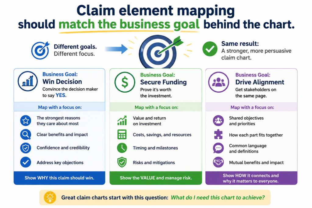
Some help prepare for licensing talks. Some help a startup understand whether a new filing is worth pursuing. The goal matters because it shapes how the mapping should be done.
The core skill stays the same. Each claim element still needs clear support. But the depth, sources, and tone may change based on the purpose of the chart.
A chart for internal planning may include open questions and rough notes. A chart for a serious business discussion needs cleaner proof and tighter writing.
The mistake is treating every chart like a fill-in-the-blank task. A good chart should serve a real decision.
The chart should help someone decide what to do next
A claim chart is only useful if it helps the reader act. If the goal is to review patent strength, the chart should make strong and weak claim areas easy to see.
If the goal is to prepare for a product review, the chart should show where the product matches the claim and where proof is missing. If the goal is to support a filing strategy, the chart should reveal which technical details deserve more protection.
This is why claim element mapping is not just a paperwork skill. It is a decision skill. It helps turn patent language into business clarity.
For founders, that clarity can be a major advantage. It can help the team avoid wasting money on weak paths.
It can help them protect features that matter to customers. It can help them tell a better IP story to investors or partners without overclaiming.
The best charts are built with the end reader in mind
Before writing a chart, it helps to picture the person who will read it. A patent attorney may need technical precision.
A founder may need strategic clarity. An engineer may need a faithful view of how the system works. An investor may need to see that the company has a real moat, not just a pile of filings.
Good mapping respects that reader. It does not bury them in extra words. It does not skip important steps.
It does not use legal-sounding language to cover a weak match. It makes the claim, the proof, and the business point easier to understand.
That is the kind of patent work modern startups need. PowerPatent helps founders protect real technical work in a way that is faster, clearer, and backed by real attorney review. Start exploring the process here: https://powerpatent.com/how-it-works
Claim element mapping gets stronger when the team knows what not to include
A strong claim chart is not a dumping ground. It should not include every screenshot, every product line, every feature note, or every possible clue. Good mapping is selective.
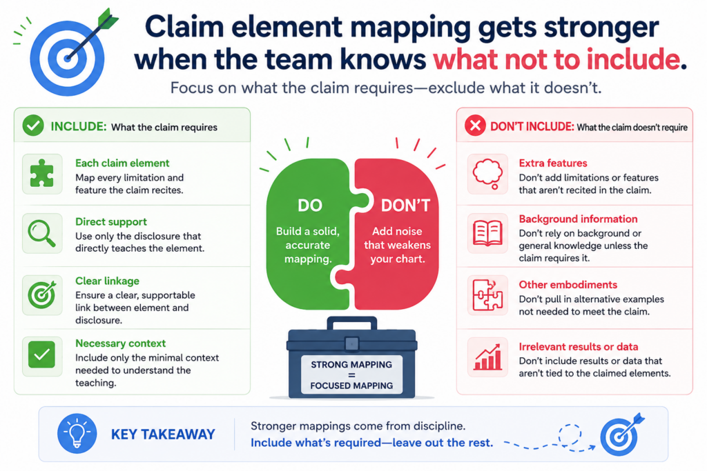
It uses the proof that helps the element and leaves out the noise that makes the chart harder to read.
This matters because extra material can weaken the chart. When a reader has to dig through too much, the match becomes less clear. The chart may feel busy, but not strong. It may look like the team is trying to impress instead of prove.
Claim element mapping is about precision. You want the right proof in the right place. The chart should feel clean.
It should guide the reader from the claim element to the matching product fact without making them work too hard.
Too much evidence can hide the strongest evidence
Many teams add more evidence because they think volume creates strength. That is not always true.
Ten weak sources do not equal one clear source. A chart with too many loosely related items can feel uncertain, even if one great proof point is buried inside it.
The better move is to choose the evidence that directly supports the element. If a diagram clearly shows the data path, use it. If a code note clearly shows the function, use it.
If a product guide clearly explains the feature, use it. Then write a short explanation that connects the proof to the claim.
This makes the chart easier to trust. It also saves time for everyone who reviews it.
Clean mapping helps the reader see the real match faster
When each element has focused support, the reader can move through the chart with confidence.
They do not have to wonder which part of the evidence matters. They do not have to guess why a source was included. The chart makes that work simple.
For founders, this is a major advantage. Patent work already feels heavy to many startup teams.
A clean claim chart lowers that burden. It turns a hard review into a clear path. It helps the founder understand where the invention is strong and where more proof may be needed.
This is the kind of clarity PowerPatent is built to support. Instead of making founders fight through old, slow patent processes, PowerPatent helps teams capture the right details, organize them, and work with real patent attorneys who can help shape the work into stronger protection.
You can see how it works here: https://powerpatent.com/how-it-works
Good claim element mapping keeps the claim language visible
A claim chart should not drift too far away from the claim itself. The product proof matters, but the claim language is still the anchor.
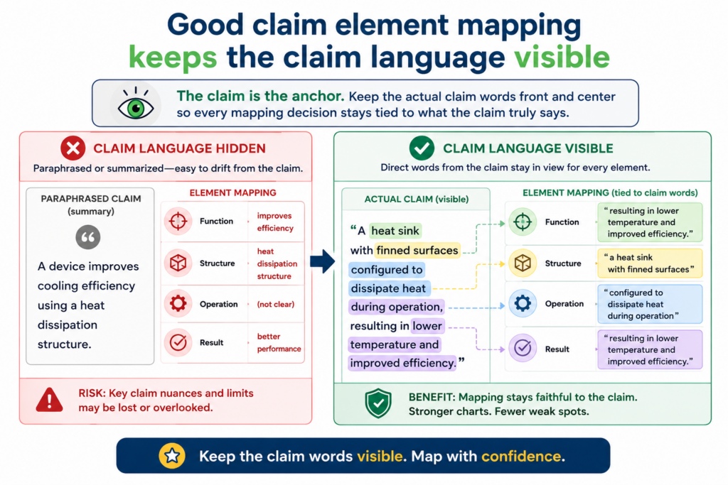
If the chart stops using the claim words, the reader may lose the connection between what is required and what is shown.
This does not mean the chart should copy every claim phrase over and over. It means the chart should keep the key terms visible enough that the match is easy to follow. The reader should always know which part of the claim is being mapped.
This is especially important when the product uses different words than the patent.
A chart may need to explain that a “prediction engine” in the claim maps to a “forecast service” in the product. That is fine, but the chart should not let the product name fully replace the claim term without explanation.
The claim term should be tied to a product fact
A strong map does more than repeat the claim term. It ties the term to something real. If the claim says “receiving input data,” the chart should show what data is received, where it comes from, and where the proof shows that receipt.
If the claim says “generating an output,” the chart should show the output and the process that creates it.
This kind of writing keeps the chart grounded. It avoids the common trap of saying the product has a feature because the product name sounds similar to the claim word.
For example, a claim may require “user behavior data.” A product page may say the product “understands users.” That is not the same thing by itself.
The chart should show what behavior data is collected or used. It should point to a source that explains clicks, views, actions, sessions, purchases, signals, or other user activity.
The best wording is simple and exact
Good mapping language should feel plain. The product’s session tracker records user clicks and page views.
Those recorded actions are user behavior data. The proof shows those actions are stored and used by the recommendation service.
That kind of wording is clear because it connects each idea. It does not lean on buzzwords. It does not ask the reader to make a leap. It shows the path.
This is also why PowerPatent focuses on helping technical teams explain inventions in simple, useful ways.
Engineers and founders often have the right details in their heads, but those details need structure before they can become strong patent work.
PowerPatent combines smart software with real attorney oversight so the invention story is captured, reviewed, and shaped with more care.
You can explore the process here: https://powerpatent.com/how-it-works
Strong mapping handles missing information with discipline
Every claim chart runs into missing information at some point. Maybe the product proof is not public. Maybe the team has not found the right internal document.
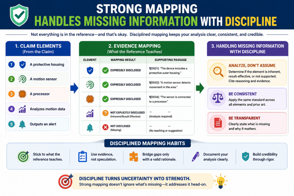
Maybe the claim uses a term that needs more review. Maybe the system performs a step, but the current evidence only shows the result.
This is normal. The problem is not missing information itself. The problem is pretending the information is not missing.
Strong claim element mapping handles uncertainty with discipline. It does not overstate. It does not fill gaps with hope. It notes what is known, identifies what is not yet shown, and points the team toward the next useful source.
A missing source should lead to a clear next move
When proof is missing, the chart should help the team move forward. It should not just say the element is unsupported and stop there. It should make clear what kind of evidence would help.
If the claim element is about a backend rule, the team may need a design document, a code path, or an engineer explanation tied to a source.
If the element is about a user interface action, a screenshot or deo may help. If the element is about model training, the team may need training notes, data records, model documentation, or experiment logs.
The point is to turn uncertainty into action. A good chart makes the next step easier to see.
Uncertainty should never become fake confidence
Fake confidence is dangerous in patent work. It can make founders believe a claim is stronger than it is. It can cause teams to spend money on the wrong path. It can make a chart look polished while hiding a weak match.
A better chart is honest. It may say the available source shows the output, but more support is needed to confirm the claimed processing step.
That kind of note is not a failure. It is useful because it tells the team exactly what to check next.
For founders, this kind of disciplined review can prevent costly mistakes. PowerPatent helps by giving teams a clearer way to gather invention details, spot gaps, and work with real patent attorneys before those gaps become bigger problems.
That means the patent process becomes less about guessing and more about building a strong record around what the company actually made.
See how PowerPatent supports faster, clearer patent work here: https://powerpatent.com/how-it-works
Conclusion:
Claim element mapping is the heart of a strong claim chart because it turns patent words into clear product truth. When each element is matched to real proof, the chart becomes easier to trust, easier to review, and easier to use for smart business choices. For founders and engineers, this skill helps show what is truly protected and where more support is needed.
The best charts are simple, honest, and tied to facts. PowerPatent helps teams capture those facts early, shape them with smart software, and review them with real patent attorneys. Start here: https://powerpatent.com/how-it-works
Leave a Reply