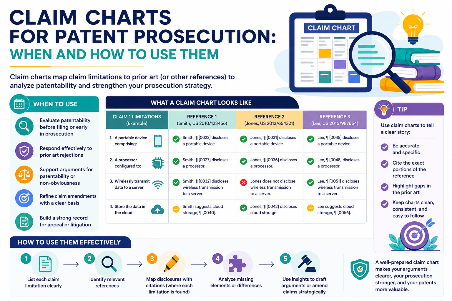
A patent application can look strong on day one, then get stuck when the patent office pushes back. This is normal. The hard part is not just saying your invention is new. The hard part is showing it in a clear way, piece by piece.
Claim charts help you prove the point, not just argue the point
A patent response can fall flat when it sounds like a debate. The examiner says an older patent teaches your idea. You say it does not. The examiner repeats the rejection. You repeat your argument. Everyone burns time.
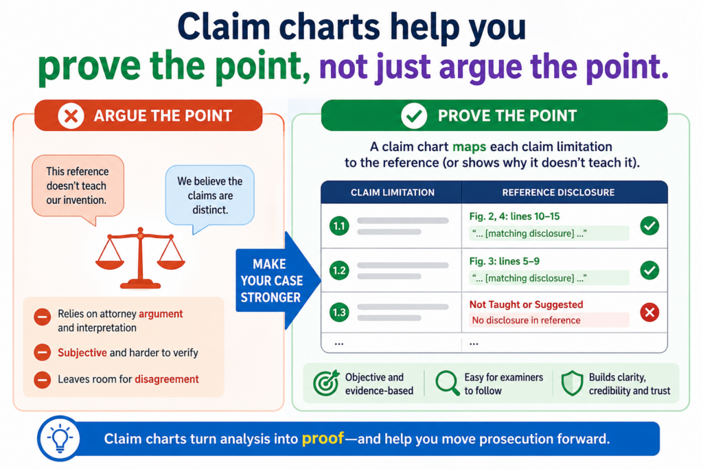
A claim chart changes the shape of the talk. It moves the work from “trust us” to “look here.”
When you use a claim chart, you take each part of a patent claim and place it next to the exact proof that matters. That proof may come from the older patent the examiner cited.
It may come from your own patent filing. It may come from a product spec, a drawing, a system flow, source code notes, lab results, or a technical paper.
The chart does not replace the legal response. It makes the response easier to understand. It gives the attorney a cleaner way to explain the gap.
It gives the founder a faster way to see risk. It gives the engineer a direct way to help without needing to learn patent language.
A claim chart breaks the claim into plain pieces
A patent claim is often one long sentence. That sentence can hold many parts. It may describe inputs, steps, data flows, system parts, model behavior, sensors, training rules, outputs, timing, user actions, or hardware links.
The problem is that a long claim can hide the real issue. One small part may be the key.
The older patent may show most of the claim, but not the new step that makes your invention work. Without a chart, that missing part can get buried inside a long argument.
A claim chart brings that missing part into the open.
The best claim chart makes the examiner’s job easier
This matters more than many founders think. Examiners handle many cases. They do not have hours to decode every technical story from scratch. If your response is hard to follow, even a strong point can lose force.
A clean claim chart says, in effect, “Here is the claim part. Here is what the examiner used. Here is why it does or does not match.”
That is powerful because it lowers the work needed to agree with you. Good patent prosecution is not about sounding smart. It is about making the right answer easy to see.
For a startup, this can be a huge edge. You are often trying to protect something complex, like AI systems, robotics, chips, cloud tools, biotech platforms, energy systems, or medical devices. The invention may be deep, but the response still needs to be clear.
PowerPatent helps teams pull invention details into a stronger patent workflow, with smart software and real attorney oversight.
That means your technical proof does not stay trapped in notes, code, or old slides. It can be shaped into something useful for a real patent filing or response. You can see how the process works here: https://powerpatent.com/how-it-works
A claim chart is not only for litigation
Many people hear “claim chart” and think of lawsuits. That is fair. Claim charts are often used when one side compares a patent claim to a product or an older reference.
But claim charts are also useful during patent prosecution. Patent prosecution simply means the back-and-forth with the patent office before a patent is allowed. In that setting, the claim chart is not about suing anyone. It is about getting clear.
It helps answer simple but important questions.
Does the old reference really show every part of the claim?
Does your patent filing clearly support the claim language?
Can you narrow the claim without giving away the heart of the invention?
Can you explain the technical difference in a way that is easy to check?
Those questions decide whether a response is strong or weak.
The chart gives your team one shared view of the case
A founder may care about business scope. An engineer may care about technical truth. A patent attorney may care about claim support and examiner reasoning. A claim chart gives all three people the same page to look at.
This saves time because the team stops talking past each other.
Instead of saying, “The examiner does not understand our system,” the team can say, “The examiner points to paragraph 42 for this part, but paragraph 42 only shows a static rule, while our claim needs a live model update based on sensor feedback.”
That kind of detail wins progress.
It also keeps the team honest. Sometimes the chart shows that the examiner has a stronger point than expected. That is not a failure. That is useful. It helps you adjust before you spend money on a weak response.
Use a claim chart when the rejection is detailed, technical, or easy to misunderstand
Not every office action needs a claim chart. A short and simple response may be enough when the issue is clear.
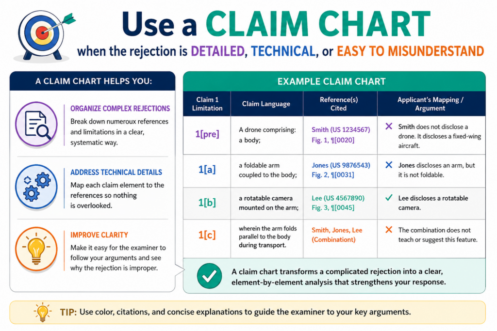
But when the rejection gets dense, a chart can save the whole response from becoming a wall of words.
The best time to use a claim chart is when the examiner has mapped your claim to one or more older references.
If the examiner says Reference A shows part of the claim and Reference B shows the rest, a chart can show where that mapping breaks.
This is especially useful when the invention lives in small details. In many startup patents, the value is not in the broad idea. It is in the way the system does the job.
The timing, data path, model step, control loop, device link, training method, or user flow may be the real invention.
Use a chart when the examiner stretches the old reference too far
A common problem is that the examiner uses a broad reading of an older patent. The older patent may be in the same field. It may use some of the same words. It may look close at first glance.
But close is not always the same.
For example, an older patent may describe sending sensor data to a server. Your claim may require using sensor data to update a local model on the device before sending a changed output to the server.
Those are not the same steps. The chart lets you show the gap without burying it inside a long paragraph.
The same pattern comes up often in AI, software, hardware, biotech, clean tech, and medical device cases. The examiner finds a reference that sounds related. Your job is to show the exact difference.
The chart should focus on the words that matter most
A weak chart copies the whole claim and adds long notes everywhere. That makes the reader work too hard.
A strong chart gives special attention to the claim parts that drive patentability. It still covers the needed parts, but it does not pretend every word has the same weight.
The goal is not to make the biggest chart. The goal is to make the clearest chart.
This is where founders and engineers can help a lot. Engineers know which details are real and which details are surface-level.
Founders know which claim scope matters to the business. The patent team can turn that input into a clean response that fits the rules.
PowerPatent is built for this kind of work. Instead of forcing technical teams to squeeze invention details into old forms and long email chains, it helps collect the right invention facts earlier, so the attorney review starts with stronger raw material.
That can make prosecution smoother later. Learn more here: https://powerpatent.com/how-it-works
Use a chart when you are deciding whether to amend the claims
A claim amendment can help move a patent application forward. But it can also shrink the patent too much if done carelessly.
This is one of the most important moments to use a claim chart.
Before you amend, the chart can show which claim parts are already found in the older references and which parts are not. That helps the team choose a change that is both true to the invention and useful for protection.
Without a chart, teams often amend based on fear. They add too much. They make the claim narrow. They give up room they may need later.
With a chart, the team can amend with more control.
A good amendment should solve the rejection without giving away the invention
The best amendment is not always the longest one. It is the one that draws a clean line between your invention and the old reference.
For example, say your system predicts machine failure. The old reference predicts failure using stored sensor logs.
Your invention predicts failure by comparing live sensor streams against a self-updating model that changes after each repair event. The chart can make that difference clear.
Then the team can decide whether to amend around the live stream, the self-updating model, the repair event, or the way the output triggers action. Each choice may protect a different business angle.
That is a real strategy. It is not just paperwork.
For a startup, this can affect funding, partnerships, deals, and future exits. A claim that protects the real engine of the product is much more useful than a claim that sounds broad but cannot survive review.
Use claim charts to find the real gap between your invention and the old art
A patent rejection can feel personal, but it is not. It is a test of detail. The examiner is asking whether your claim is truly different from what was already known. Your job is to answer that question with care.
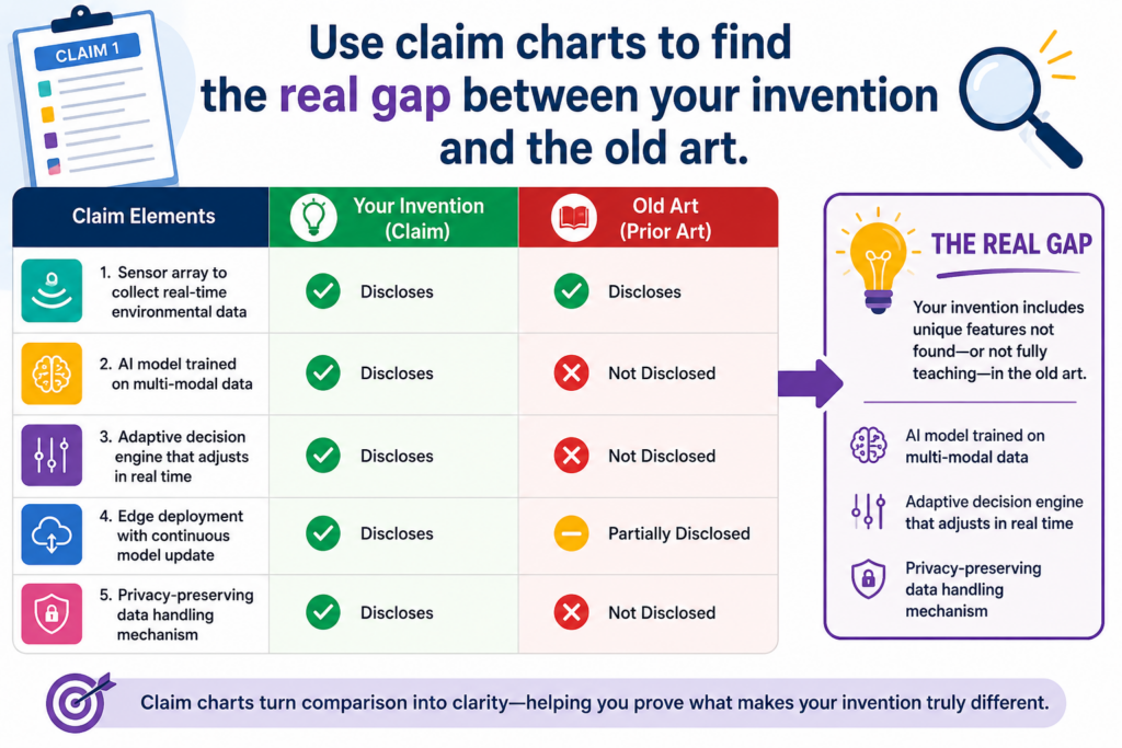
This is where many teams lose time. They try to explain the whole invention again. They talk about the product, the market, the goal, and the big idea. That may feel useful, but it often misses the point.
The examiner is not asking whether your product is better in the market. The examiner is asking whether the claim, as written, has something the old art does not show.
A claim chart helps you stay locked on that question. It turns a broad fight into a clear comparison. It keeps the team focused on the claim words, the cited reference, and the exact missing part.
A strong chart starts with the claim, not the product story
Founders often want to explain the invention from the product side. That is natural. You live inside the product. You know why it matters. You know the pain it solves. You know what makes users care.
But patent prosecution works from the claim side.
The claim is the legal fence around the invention. The product may be bigger than the claim. The claim may cover only one key part of the product.
The examiner will compare that claim to older references, not to your pitch deck.
So the chart should begin with the claim language. Each key part should be separated in a way that makes the comparison easy. Then, for each part, the team should ask one plain question: where does the examiner say this is shown?
That question keeps the work grounded.
The chart should show both matches and missing pieces
A weak response only talks about what is missing. A stronger response also shows what the examiner may be right about.
That may sound odd, but it builds trust. If the old reference really does show a sensor, a processor, a model, a database, a display, or a basic step, there is no need to fight that point. Fighting every small thing makes the response feel less clear.
The better move is to accept the parts that are not in dispute and then put all the light on the part that matters.
For example, the old reference may show collecting image data from a camera. It may also show sending that image data to a server.
But your claim may require changing a model threshold based on a user action before the image data is scored. That middle step may be the gap.
A claim chart makes that gap easy to see. It can show that the old reference has the camera and the server, but not the threshold change tied to the user action.
That is much more useful than saying, “The reference does not teach the invention as claimed,” without showing why.
The real gap is often smaller than the founder expects
When founders first read a rejection, they often think the examiner missed the whole invention. Sometimes that is true. More often, the examiner understood part of it but missed one important technical feature.
That feature may be small in words but huge in value.
It may be the order of steps. It may be where data is processed. It may be how a machine learning model is trained. It may be how a device decides when to act. It may be how two systems share state. It may be how a result is checked before it is used.
A claim chart helps you spot that exact feature. Once you find it, the whole response can become sharper.
The chart can stop your team from overexplaining
Overexplaining is one of the quiet killers in patent prosecution. It can make a good point harder to find. It can also create confusion by adding side issues that do not matter.
A claim chart forces discipline.
Instead of writing five pages about the whole platform, the team can show that one claim part is not found in the old art. Then the written response can explain that point in plain language.
This is also helpful when the invention is hard to describe. Deep tech teams often build things that are not easy to explain in a short paragraph. The chart gives the team a place to organize the hard parts before they turn into a final response.
That is one reason PowerPatent is useful for technical founders. The platform helps capture the invention in a way that supports real patent work, not just a rough summary.
Smart software helps organize the details, while real patent attorneys help shape the strategy. You can see the workflow here: https://powerpatent.com/how-it-works
Use claim charts before you file, not only after a rejection
Most people think of claim charts after the patent office says no. That is common, but it is not the only use.
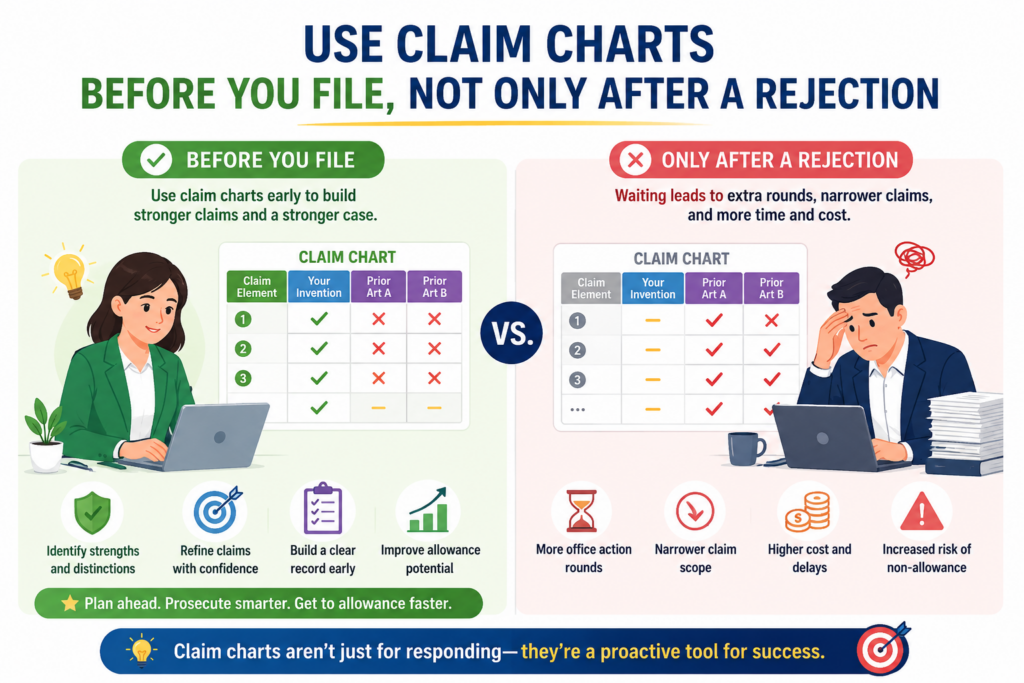
A claim chart can also help before filing. In fact, this is one of the best ways to make a patent application stronger from the start.
Before filing, the chart can compare your planned claims against your own invention notes.
It can show whether the patent draft has enough support for each claim part. It can also help find weak spots before the examiner ever sees the case.
This matters because many patent problems begin early. A claim may sound good, but the draft may not explain it enough.
Or the draft may describe the product at a high level while leaving out the details that make the invention different.
A pre-filing claim chart helps catch that.
A pre-filing chart helps prove that the draft supports the claims
Every claim should be backed by the patent application. That means the application should describe the parts of the claim in enough detail.
If the claim says the system updates a model based on a repair event, the draft should explain what that means, how it happens, and why it matters.
A chart can compare each claim part to the draft before filing. This is a simple but powerful check.
The team can look at each claim part and ask whether the patent draft clearly supports it. If the answer is weak, the team can add better detail before filing. That is much easier than trying to fix the problem later.
The best time to add detail is before the application is filed
Once an application is filed, you cannot freely add new invention details to that same filing. That makes the first draft very important.
A pre-filing chart can help your team avoid regret. It can show where the draft needs more examples, more system detail, more data flow, more drawings, or more explanation of the technical step.
For a startup, this is a major point. Your product may change fast. Your team may move from prototype to launch to enterprise deals in a short time.
If your patent filing is thin, you may later find that it does not fully support the claim scope you need.
A claim chart helps turn vague invention notes into a stronger filing plan.
This is exactly the type of problem PowerPatent is designed to help with. Founders and engineers can bring in technical material, and the platform helps turn that raw work into a patent process with attorney oversight.
That gives you more control and less guesswork. Learn how PowerPatent works here: https://powerpatent.com/how-it-works
A pre-filing chart also helps choose what not to claim yet
A good patent strategy is not only about what to include. It is also about what to hold back, what to file later, and what to protect in a different way.
A claim chart can help with that choice.
When you map planned claims against the current technical proof, you may see that some ideas are ready and some are not.
One claim may be fully supported by working code, test data, and system diagrams. Another claim may be based on a future feature that is not yet clear.
That does not mean the future feature is bad. It means the team should be careful.
Filing too early on a vague idea can weaken the whole strategy
Startups move fast, and speed matters. But filing on unclear material can create problems. If the claim is too broad, it may be easy to reject.
If the draft lacks detail, it may not support the claim. If the team guesses at how a future feature will work, the filing may not match the final product.
A claim chart brings these risks to the surface.
It helps the team decide whether to file now, add more detail, create another filing later, or adjust the claim set around the strongest invention points.
That is a better way to move fast. It is not delay for the sake of delay. It is fast action with better aim.
This is especially useful for AI and software teams. A product may have many possible invention points, such as data cleaning, model training, inference speed, user feedback, security, privacy, deployment, edge processing, and system monitoring.
A claim chart helps decide which parts are ready to protect now and which parts need more work.
A claim chart can help you answer obviousness without making the case harder
Obviousness is one of the most common reasons a patent application gets rejected.
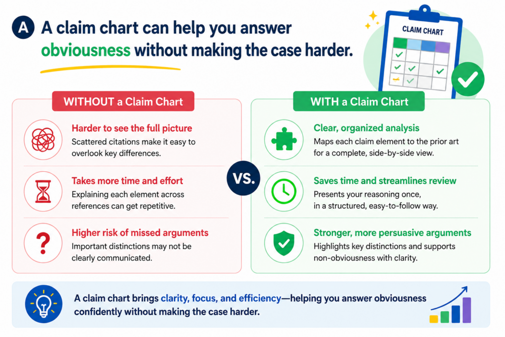
In plain words, the examiner is saying that even if one old reference does not show your whole claim, a person in the field could have joined two or more old ideas and reached your claim.
This type of rejection can be hard to answer because it is not always about one missing part. It may be about how the examiner joined the parts.
The examiner may say one reference teaches the base system, another teaches a feature, and a third gives a reason to combine them.
A claim chart helps you slow that down. It lets you see whether the pieces really fit together. It can show whether the references solve different problems, use different data, work in different settings, or rely on steps that would not make sense in your system.
The chart should show why the combination still misses the invention
When an examiner combines references, do not only ask whether each part appears somewhere. Ask whether the full claimed setup is actually shown or suggested in a clear way.
This is where many teams miss a strong argument. They focus only on saying, “Reference A does not show this.” But the examiner may not be using Reference A for that part. The examiner may be using Reference B.
A chart helps you avoid that mistake. It shows which reference is being used for each claim part. Then you can see if the combination is real or forced.
The key is to make the missing link easy to understand
A strong response does not just say the examiner is wrong. It shows the reader where the logic breaks.
For example, one old reference may describe a cloud model that improves search results. Another may describe a local device that filters sensor data. The examiner may say it would be obvious to use the cloud model with the local filter.
But your claim may require the local device to update its filter based on a model confidence score created during live use.
That is not just placing a known model into a known device. That may be a different control flow, a different timing rule, and a different reason for changing the filter.
The claim chart lets you show that difference in a calm and direct way.
This is important because obviousness rejections often look strong at first. The references may use similar words.
They may seem to be in the same field. But when you map the claim part by part, you may find that the examiner has skipped over the heart of the invention.
That is the moment where a chart earns its value.
A claim chart also helps you avoid emotional arguments
Founders care deeply about what they build. That is a strength. But in patent prosecution, passion alone does not carry the response.
The examiner needs a technical reason to withdraw or change the rejection. The response should not sound like frustration. It should sound like proof.
A claim chart keeps the tone firm and clean. It helps your team avoid saying things like “the examiner clearly misunderstands the invention” and instead say something much better: “The cited portion describes stored rules, while the claim requires updating the decision model after a live event.”
That kind of statement is harder to ignore.
A clean chart can make the attorney response sharper
Your patent attorney can use the chart to build a stronger written answer. The chart does the sorting work first. Then the final response can focus on the best arguments.
This also saves founder time. Instead of going back and forth over long emails, the team can look at the chart and agree on the real issue. Engineers can add facts. Founders can confirm business importance. The attorney can shape the response.
That is a better way to work.
PowerPatent is built around this kind of clear, team-based patent work. It helps founders and engineers bring the real invention details forward, while real patent attorneys guide the process.
That means less guessing and fewer slow handoffs. See how it works here: https://powerpatent.com/how-it-works
A claim chart can help you decide when to interview the examiner
An examiner interview can be very useful. It gives your patent team a chance to speak with the examiner and discuss the rejection. But an interview works best when the team is prepared.
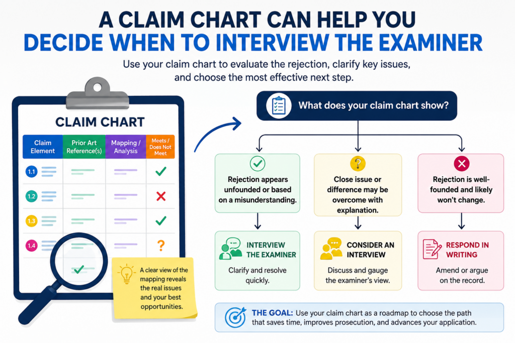
A claim chart can make that preparation much stronger.
Before the interview, the chart helps the team decide what to ask, what to explain, and what amendment may be worth discussing. It also helps prevent the meeting from becoming too broad.
The goal is not to teach the examiner your whole company story. The goal is to move the application closer to allowance.
A chart helps keep that goal in view.
The chart gives the interview a clear path
A good examiner interview is focused. The patent team should know which claim parts matter most and which parts are not worth debating.
A claim chart helps create that focus. It shows the examiner’s mapping, your team’s view, and the exact gap between them. That makes the interview more useful because everyone can talk about the same point.
Without a chart, the interview can drift. The team may spend too much time explaining background. The examiner may repeat the rejection. No one gets closer to a clear answer.
The best interviews are built around one or two key issues
Trying to cover too much in an interview can weaken your position. It is better to pick the strongest points and make them easy to discuss.
For example, if the examiner has rejected ten claim parts, but only one part truly separates the invention from the old references, that one part should guide the interview. The chart can show why that part matters and where the cited references fall short.
This does not mean the other points are ignored. It means the team uses the limited time well.
A founder should care about this because examiner interviews can affect speed. A useful interview can help the team understand what the examiner is willing to allow, what needs more support, and what claim language may create a cleaner path forward.
A chart can help you test possible amendments before making them
Sometimes the best use of an examiner interview is to test an amendment idea. The team may say, in effect, “If we add this feature to the claim, does that overcome the rejection?”
A claim chart makes that talk easier.
The chart can show the current claim, the cited references, and the proposed new feature. The examiner can then respond to the real point instead of guessing what the team means.
This can prevent wasted amendments.
A rushed amendment can create long-term damage
When a team is tired of rejections, it may be tempted to add narrow language just to move forward. That can be risky.
A patent that is allowed too narrowly may not protect the product well. It may be easy for others to design around. It may also miss the part of the invention that investors, partners, or buyers care about.
A claim chart helps the team stay careful. It can show whether the proposed amendment solves the rejection while still protecting the core business value.
For example, adding “on a mobile device” may overcome one reference, but it may also give up coverage for server-side or edge-device versions.
Adding “after a repair event” may be better if that is the real technical line between your invention and the old art.
The right choice depends on the invention, the references, and the business goal. The chart gives the team a way to make that choice with more control.
This is one reason modern founders need a better patent workflow. Patent work should not feel like a black box. With PowerPatent, technical teams can move faster because the process is built to capture the real details and bring attorney review into the right moments. You can see the full process here: https://powerpatent.com/how-it-works
A claim chart can protect your strongest claim from becoming too small
The biggest danger in prosecution is not just losing. Sometimes the bigger danger is winning in a way that leaves you with weak protection.
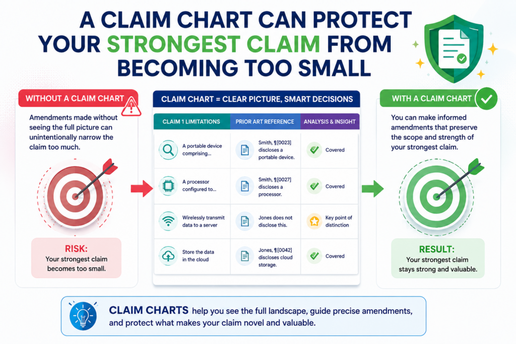
That can happen when a team keeps narrowing the claim until the examiner allows it. The patent issues, everyone feels relief, and later the company finds out the claim is too small to matter.
A claim chart can help prevent that. It gives the team a clear view of what each amendment does to the claim. It helps you see whether you are drawing a smart line or giving away too much ground.
The chart should connect claim scope to business value
Patent claims are not just words. They are business tools. A claim should protect the part of the invention that matters to your product, your market, and your future plans.
A chart can show whether the current claim still covers the key version of the product. It can also show whether it covers likely future versions.
This is very important for startups because the first product is rarely the final product. Your system may move from cloud to edge.
Your model may change. Your hardware may shrink. Your workflow may become more automated. Your first customer use case may not be the biggest one.
A strong claim should leave room for the product to grow
When you chart a proposed amendment, do not only ask whether it beats the rejection. Ask whether it still protects the path your company may take.
For example, if your invention is about how a model updates from live feedback, you may not want the claim to depend too heavily on one exact type of user device.
If your invention is about a special sensor fusion method, you may not want the claim to be tied too tightly to one sensor brand or one data format.
The chart can make this visible.
It can show which claim words are doing real work and which words are extra weight. It can also help the team spot language that may sound safe now but become a problem later.
A claim chart can reveal when you need more than one claim strategy
Sometimes one claim cannot do everything. You may need one claim path for the broad system, another for the method, another for the device, and another for the software flow.
A chart can help you see that.
When you compare different claim sets against the same references, you may find that one claim is best for broad coverage, while another is better for quick allowance. Both may have value. The key is to make the choice on purpose.
A smart patent plan often uses layers of protection
Think of claims like layers around the invention. One layer may be broad. One may be focused on the product as built today. One may protect a key technical step. One may protect a fallback version in case the broad claim faces a hard rejection.
A claim chart helps manage those layers.
It can show which layer is under pressure from the prior art and which layer still looks strong.
It can also help the team decide whether to keep fighting for broad coverage, move a narrower claim forward, or file another application with more focused claims.
This is where attorney guidance matters. Software can help organize the facts, but claim strategy should be reviewed by a real patent professional.
PowerPatent combines both, giving founders a faster and clearer way to build serious patent protection. Learn more here: https://powerpatent.com/how-it-works
A claim chart can help engineers give better input without learning patent law
Engineers often know the answer before anyone else does. They can tell when an older reference is close, when it is not close, and when the examiner is using a word in a way that does not match how the system really works.
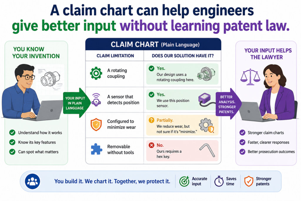
The problem is that engineers are usually not trained to write patent responses.
They may explain the invention in product terms, code terms, or research terms. That input is useful, but it still needs to be shaped into a patent argument.
A claim chart gives engineers a clean place to help. They do not need to write a legal memo. They can look at each claim part and explain whether the cited reference truly matches it.
The chart turns engineering facts into usable patent facts
A good engineer may say, “That old system does not update the model the way ours does.” That is a helpful start, but it is not enough by itself.
The chart helps turn that thought into something more exact. It asks where the old reference shows the update, what type of update is being used, what triggers it, where it happens, and what changes after the update.
Now the team has usable detail.
Instead of a broad statement, the attorney can work with a clear technical point.
The final response can say that the cited reference uses a fixed rule, while the claim requires a model update based on live system feedback. That is much stronger.
Engineers should explain what happens, when it happens, and why it matters
The best engineer input is not long. It is clear. It explains the real system flow in plain words.
For each claim part, the engineer should explain what the product does, where the proof lives, and how that differs from the cited reference.
That proof may be in a system diagram, a design doc, a code comment, a test result, a model card, an API flow, or a hardware spec.
This helps the patent team avoid guesswork.
It also helps prevent a common mistake: arguing a feature that is not actually in the claim. Sometimes the product has a great feature, but the claim does not say it clearly.
A claim chart exposes that gap. Then the team can decide whether to amend the claim, argue the existing language, or save that feature for another filing.
This is where PowerPatent can make the process much easier. It gives technical teams a better way to bring forward the real invention details, while real patent attorneys help turn those details into patent work that can stand up.
See how the workflow supports founders and engineers here: https://powerpatent.com/how-it-works
A claim chart can reduce long back-and-forth with counsel
Without a chart, prosecution can create a lot of scattered messages. The attorney asks a question.
The founder forwards it to an engineer. The engineer gives a long answer. The attorney asks for more detail. The team loses days.
A chart can make this faster.
Everyone can see the same claim part, the same cited reference, and the same question. The engineer can answer in the right place. The founder can review the business impact. The attorney can shape the response.
The chart keeps the team focused on the decision that matters
The goal is not to collect every possible technical fact. The goal is to decide what to do next.
Should the team argue? Should it amend? Should it request an interview? Should it file a continuation? Should it change claim focus? Should it accept a narrower claim now and keep broader claims alive elsewhere?
A chart helps answer those questions because it shows the case in a usable form.
For a busy startup, that matters. Your team should not lose a week trying to understand a rejection from scratch. You need a clear way to decide, act, and keep building.
A claim chart can help you avoid saying too much in the written response
A patent response should be clear, but it should not say more than needed. Extra words can create extra risk.
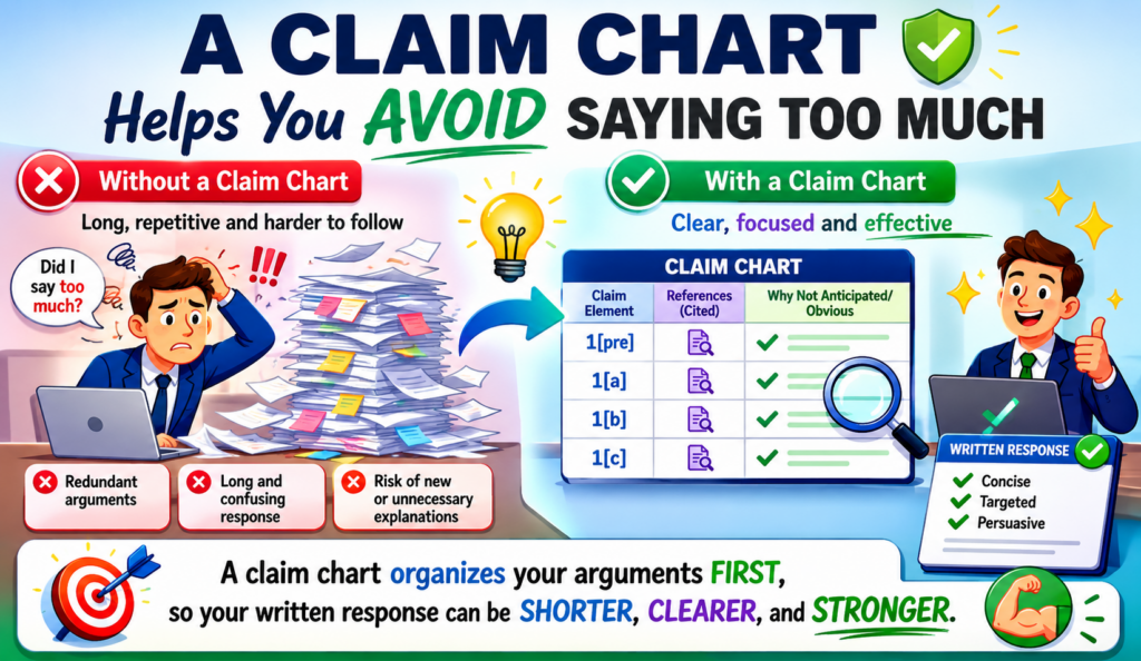
They can confuse the issue. They can make the record messy. They can also limit how your claims may be read later.
A claim chart helps you prepare before writing. It gives the team a place to explore ideas, test arguments, and compare options. Then the final response can be more focused.
This matters because not every thought in the chart needs to go into the official response. The chart is a work tool. The response is the final message.
The chart helps separate useful facts from risky noise
When a team first reacts to a rejection, it may come up with many possible arguments. Some are strong. Some are weak. Some are true but not useful. Some may be useful for one claim but harmful for another.
A chart helps sort this out.
The team can mark which facts support the main argument and which facts are only background. Then the written response can use the best points and leave out the rest.
That is not hiding the ball. It is good strategy. A patent response should be accurate, direct, and focused on the issues that matter.
A clean response often comes from a messy first chart
The first version of a claim chart does not need to be perfect. In fact, it often should not be perfect. It is a thinking tool.
At first, the team may add notes, questions, citations, screenshots, claim ideas, and engineer comments.
Then the team can refine it. Weak points can be removed. Strong points can be sharpened. The final response can be built from the clearest parts.
This is much better than drafting the response too early.
If you start writing before you understand the chart, you may end up with a long response that sounds busy but does not solve the rejection. If you chart first, the writing gets easier because the real point is already clear.
The chart can help avoid accidental limits on claim scope
One danger in prosecution is making statements that sound narrow. For example, a team may say, “The invention requires a mobile phone,” when the real invention could work on many edge devices.
Or it may say, “The model is always trained in the cloud,” when future versions may train locally.
Those statements can matter later.
A claim chart helps the team slow down before making broad statements. It lets the team ask whether the statement is needed, whether it is true for all versions, and whether there is a better way to say it.
The final response should protect the future, not just answer today
The goal is not only to get past the current rejection. The goal is to keep the patent useful.
This is why founders should be involved in claim strategy. The attorney knows the rules. The engineer knows the system. The founder knows where the company may go next. A claim chart gives those views a place to meet.
For example, if the company may later support hospital devices, factory sensors, and home devices, the response should avoid language that locks the invention to only one setting unless that limit is truly needed.
PowerPatent helps founders stay closer to these decisions without getting buried in patent paperwork.
The platform is built to make patent work clearer, faster, and more tied to the actual technology. You can learn more here: https://powerpatent.com/how-it-works
A claim chart can help you decide whether to keep fighting or change course
Not every rejection should be fought forever. Sometimes the best move is to argue hard. Sometimes the best move is to amend.
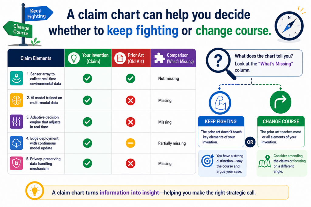
Sometimes the best move is to let one claim set move forward while keeping other claim options alive in another filing.
A claim chart helps the team make that call with eyes open.
It shows whether the rejection is weak, strong, or somewhere in the middle. It also shows whether the claim language is doing its job. That can save money and time.
The chart can show when the examiner has a fair point
This is not always what founders want to hear, but it is valuable.
Sometimes the examiner has found a reference that is closer than expected. The old art may show the main system, the key step, or the same data flow. When that happens, pretending the reference is weak does not help.
A chart makes the strength of the rejection visible.
That can lead to a better decision. The team may amend around a real difference. It may focus on a dependent claim.
It may prepare a continuation with better claim angles. It may choose to accept narrower coverage because speed matters more for that filing.
A strong patent strategy is not the same as fighting every point
Good prosecution is not about winning every debate. It is about building useful protection.
If the broad claim is likely to fail, it may be smarter to pursue a claim that protects a core feature and then use another filing to chase broader or different coverage. A claim chart helps the team see that path.
This is especially important for startups with limited time and money. You do not need endless patent drama. You need clear protection that supports the business.
The right decision depends on the invention, the market, the references, and the company’s goals. The chart does not make the decision by itself, but it gives the team a much better view.
The chart can also show when you should push back firmly
There are also times when the rejection looks stronger than it is. The examiner may rely on a word that appears in an old reference, but the old reference may use that word in a different way.
The examiner may combine references that do not fit well together. The examiner may skip a claim part.
A chart can reveal these problems.
When the chart shows a clear gap, the team can push back with confidence. The response can be firm without sounding emotional. It can show the missing part and explain why it matters.
The best pushback is simple, exact, and tied to the claim
A strong argument often follows a simple path. The claim requires a certain feature. The examiner cites a certain passage. That passage does not show the feature. Because the feature is missing, the rejection should be withdrawn or changed.
The chart supports that path.
It keeps the response from drifting into side issues. It also helps the attorney choose words that are precise and safe.
For founders, this can change how patent prosecution feels. Instead of waiting in the dark, you can understand the choices.
You can see why the attorney recommends one path over another. You can help protect the parts of the invention that matter most.
That is the kind of patent process modern startups need. PowerPatent brings software, structure, and attorney review together so founders can protect deep tech without slowing the company down. Explore how it works here: https://powerpatent.com/how-it-works
Build the claim chart around the exact rejection, not around what you wish the rejection said
A claim chart is only useful when it tracks the real rejection. This sounds simple, but it is where many teams go wrong. They build a chart around their own view of the invention, not around the examiner’s actual reasoning.
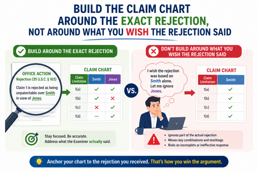
That creates a response that may feel strong inside the company but does not answer the patent office.
The first job is to read the rejection with care. Look at which claim is rejected. Look at which older reference is used. Look at which paragraph, figure, table, or passage the examiner points to. Then place that information into the chart in a clean way.
The chart should not be a product demo. It should be a direct answer to the rejection in front of you.
The examiner’s mapping should be copied before you challenge it
Before you disagree with the examiner, make sure you understand the examiner’s map. This does not mean you accept it. It means you record it clearly.
If the examiner says a certain paragraph shows a claim part, put that paragraph in the chart. If the examiner relies on a figure, note the figure.
If the examiner uses one reference for the main system and another for the missing feature, show that split.
Once the map is clear, you can test it.
This keeps your response from becoming vague. Instead of saying the examiner is wrong in a broad way, you can show that the cited passage does not teach the claimed step, does not show the required timing, or does not include the needed link between two parts.
The chart should answer the rejection line by line
A strong chart creates a calm record. It does not need to sound dramatic. It just needs to show the facts.
For each claim part, the chart should make clear what the claim requires, what the examiner cited, and whether the citation really matches. When it does not match, the chart should explain the gap in plain words.
For example, the claim may require a system that changes a model based on a live signal. The examiner may cite a reference that stores a fixed model and uses it later. Those are different ideas. The chart should say that clearly.
This is where a good patent workflow matters. Founders and engineers often know the old reference is wrong, but the response needs to show that in a way the patent office can use.
PowerPatent helps technical teams bring the right facts forward while real patent attorneys guide the filing and response process. See how PowerPatent works here: https://powerpatent.com/how-it-works
Do not let the chart become a dumping ground
A claim chart should be detailed, but it should not become a storage bin for every thought. Too much noise makes the strong point harder to see.
The best chart has discipline. It includes what helps the team decide the next move. It leaves out facts that sound interesting but do not matter to the claim.
This is especially important when engineers are involved. Engineers may want to explain many side details because they care about accuracy. That care is good. But the chart should still serve the prosecution goal.
Clear charts beat large charts
A large chart can look impressive, but size does not equal strength. A shorter chart that finds the true missing feature is usually more useful than a giant chart that hides the key point.
The test is simple. After reading the chart, a person should understand why the rejection should change. If the reader still feels lost, the chart needs work.
The chart should help the final response become shorter, cleaner, and harder to dismiss.
Use the chart to protect the story of the invention without turning it into a sales pitch
A patent application is not a pitch deck. But it still needs a clear story. The examiner should be able to understand what the invention does, why the claim is different, and where the old references fall short.
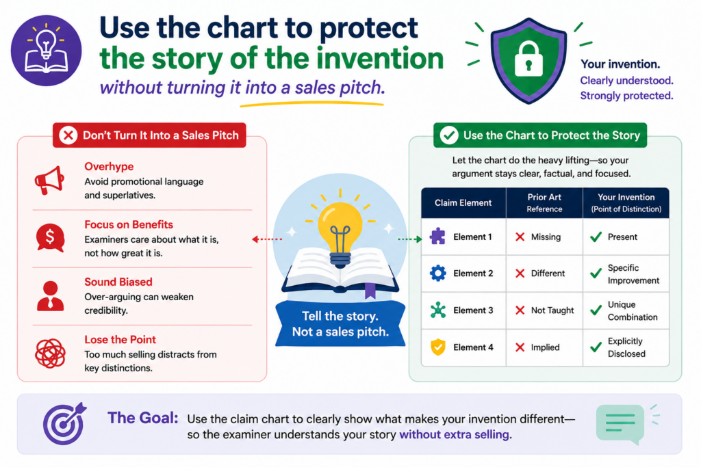
A claim chart can help tell that story in a controlled way.
The story should not be emotional. It should not say your product is amazing or the market is huge. It should stay tied to the claim and the technical feature that matters.
But it should still feel clear. A human being is reading it. If the response is dry, scattered, or hard to follow, your best argument can lose power.
The chart helps turn technical detail into a clean patent story
A strong patent story often has three parts. First, it shows what the claim requires. Second, it shows what the old reference actually teaches. Third, it explains the difference in a way that is easy to check.
The chart supports all three parts.
For example, suppose your claim covers a medical device that changes a treatment setting based on both patient movement and sensor confidence. An old reference may show patient movement.
Another may show sensor readings. But the claim may require the system to use a confidence score to decide when the treatment setting should change.
That detail is the story. The chart helps keep it from getting buried.
The story should make the missing feature feel obvious to the reader
The reader should not have to work hard to find your point. The chart should lead them there.
This does not mean you make the issue simple by ignoring detail. It means you explain the detail in the right order. The claim says this. The examiner cites that. The cited material does not show this required link. Therefore, the rejection has a gap.
That is clear. That is useful. That is much better than a long response that says the same thing in ten different ways.
Good copywriting and good patent writing share one rule: do not make the reader guess. Make the point easy to follow.
Keep the product story in the background unless it helps the claim
Founders often want to explain why the product is better. That may matter for business, but it may not matter for prosecution unless the claim captures the reason.
If the product is faster, safer, cheaper, or more accurate, ask why. What technical feature creates that result? Is that feature in the claim? Is that feature missing from the old reference?
The chart helps answer those questions.
A product win only helps when it connects to claim language
If your platform reduces false alarms because it changes model thresholds after certain feedback, the claim should say something that captures that process.
If your chip saves power because it shuts down part of a circuit based on a special timing signal, the claim should reflect that. If your robot improves grip because it combines force data and image data in a new control loop, the claim should point to that loop.
The chart checks whether the product story and claim story match.
When they do not match, your team may need to amend the claim, add a dependent claim, file a continuation, or focus the response on a different feature.
This is where PowerPatent can help founders avoid common patent mistakes. The platform is designed to capture the real invention early, connect it with attorney review, and help teams move with more clarity. Explore the process here: https://powerpatent.com/how-it-works
Use claim charts to prepare better dependent claims
Dependent claims are often treated like backup. That is true, but they can be much more than backup. They can be a smart way to protect the real details that make your invention valuable.
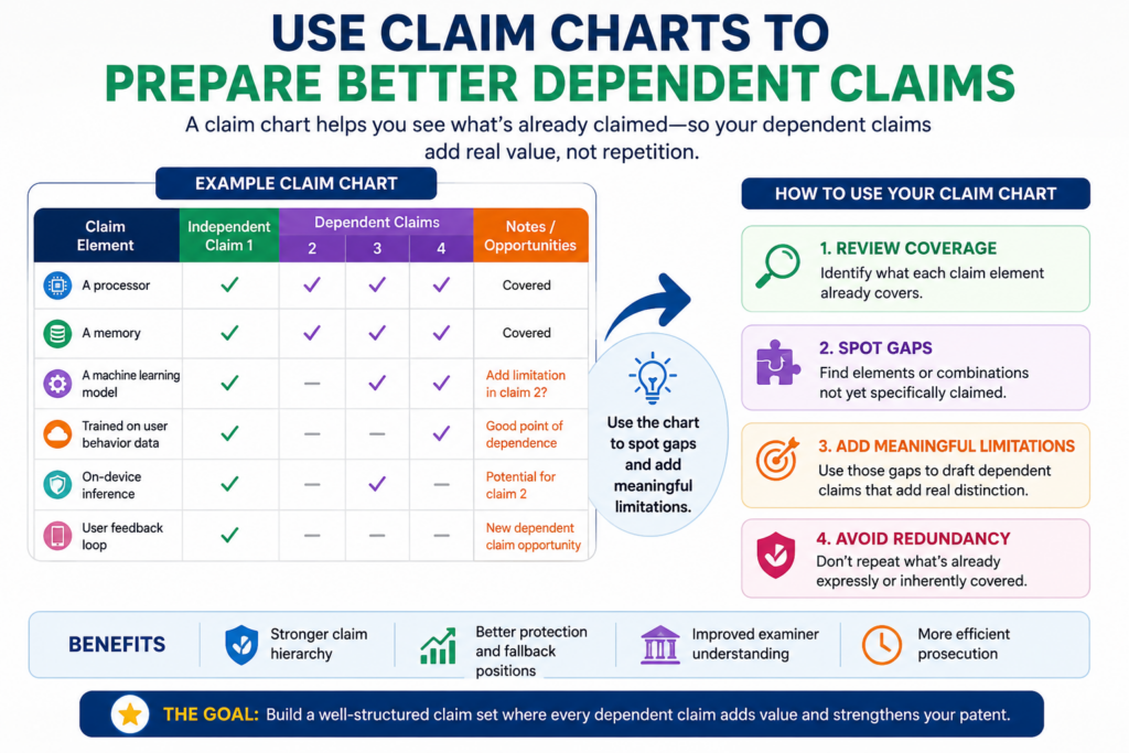
A claim chart can show which dependent claims are useful and which ones are weak.
This matters during prosecution because the broad claim may face a hard rejection. A strong dependent claim may offer a cleaner path to allowance. It may also point to a feature the examiner has not found in the old art.
The chart helps you see that before you give up too much.
A dependent claim should not be random detail
Some patent filings include dependent claims that feel like filler. They add small details, but those details may not matter to the business or the technical difference.
That is a missed chance.
A good dependent claim should protect a meaningful version of the invention. It should cover a feature that makes the system work better, harder to copy, easier to defend, or more tied to your product advantage.
A claim chart helps test that.
The chart can show which dependent claims carry real weight
When you chart the broad claim and then chart the dependent claims, patterns appear. Some dependent claims may add nothing useful because the old references already show the added feature. Others may add a feature that creates a strong gap.
Those strong dependent claims deserve attention.
For example, a broad claim may cover updating a prediction model. A dependent claim may say the update happens only after a verified event, such as a repair, a user correction, a lab result, or a safety check.
If the old art does not show that verified event, the dependent claim may be important.
The chart helps the team find that value fast.
Dependent claims can also guide future filings
A claim chart can show that some fallback ideas are too important to leave buried. If a dependent claim protects a key product path, it may deserve a broader claim in a continuation or later filing.
This is a smart move for fast-growing startups.
Your first patent application may protect the core idea. But as your product matures, you may find new claim angles. Some may be based on actual customer use.
Some may be based on performance improvements. Some may be based on new technical choices your team made after launch.
A good chart helps you spot the next patent before competitors do
Patent strategy should not be frozen on filing day. Your technology changes, and your patent plan should keep up.
A chart can show where the current application is strong and where more coverage may be useful. It can also help your team decide whether a feature belongs in the current response, a continuation, or a new application.
For a founder, this is not just legal housekeeping. It is business defense. If the feature is hard to build, useful to customers, and likely to be copied, it may deserve serious protection.
PowerPatent helps founders move from “we should probably file something” to a more structured patent plan backed by smart software and real attorney review. See how it works here: https://powerpatent.com/how-it-works
Use the chart to keep your prosecution record clean
The prosecution record is the history of what you said to the patent office. It can matter later. That is why your response should be careful, accurate, and focused.
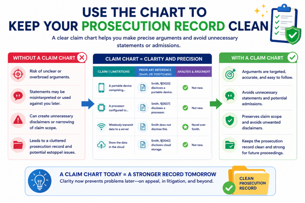
A claim chart can help because it gives your team a private place to think before making public statements in the official record.
Not every idea belongs in the response. Not every technical detail needs to be stated. Not every difference needs to be turned into a broad claim limit.
The chart helps your team choose words with care.
The chart should help you say enough, but not too much
A response should explain the reason the rejection is wrong or why the amended claim should be allowed. It should not add extra limits unless those limits are needed.
This is a balance. Say too little, and the examiner may not understand the point. Say too much, and you may create statements that limit the patent later.
The chart helps you find the middle.
A clean record starts with clean thinking
Before the final response is filed, the team can use the chart to test each statement. Is it true? Is it needed? Does it apply to all versions of the invention? Does it help this claim? Could it hurt a related claim later?
These questions are simple, but they can prevent real damage.
For example, saying “the invention requires cloud processing” may help today if the old reference is local. But if your invention can also work at the edge, that statement may be too narrow.
A better response may focus on the actual feature that matters, such as how the model is updated or how the output is controlled.
That is why attorney review matters. A founder or engineer may know the technology, but a patent attorney can help shape the record so the company does not trade future value for short-term speed.
A chart helps align the response with future enforcement
Even during prosecution, you should think about future use. A patent is not just a certificate. It may later be used in deals, diligence, licensing, fundraising, or enforcement.
The response you file today can affect how strong the patent feels later.
A claim chart helps protect that future. It encourages the team to make arguments based on exact claim language and exact technical gaps, not broad statements that may box the company in.
The best response protects both allowance and leverage
Allowance matters. You want the patent to issue. But leverage matters too. You want the patent to remain useful after it issues.
That means the team should avoid panic amendments and loose statements. It should use the chart to find the cleanest path: one that answers the examiner, protects the core invention, and keeps room for the company to grow.
This is the kind of patent work founders deserve. PowerPatent gives technical teams a clearer, faster way to protect what they build, with software that makes the process smoother and attorney oversight that keeps the work serious. Learn more here: https://powerpatent.com/how-it-works
Use claim charts to make amendments safer before you file the response
A claim amendment can be the right move, but it should never be a guess. Once you change the claim, you may change the value of the patent. That is why a claim chart is so useful before the response is filed.
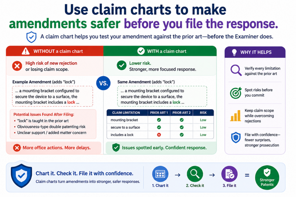
The chart lets you test the amendment in a calm way. It shows what the current claim says, what the examiner cited, what the proposed new words would add, and whether those new words actually solve the problem.
This helps your team avoid adding limits that feel helpful but do not really move the case forward.
A good amendment should be based on the real missing feature
Many weak amendments come from pressure. The team wants to get past the rejection, so it adds a detail that sounds narrow enough to win. The problem is that the detail may not be the right one.
A claim chart can stop that mistake. It helps the team ask whether the added feature is truly missing from the older reference. It also helps the team ask whether the added feature protects something that matters to the business.
The chart should test the amendment against every cited reference
An amendment may beat one reference but fail against another. That is why the chart should not look at only the reference that feels most important. It should compare the proposed new words against the full rejection.
For example, suppose the examiner uses one reference for the main system and another reference for the added feature.
If you amend the claim to focus on the added feature, the examiner may simply point back to the second reference. The amendment may not help.
A better chart shows where each claim part is found, where each proposed feature is found, and where the true gap remains. That makes the final amendment much more thoughtful.
This is especially important for startups because each patent filing should support the company’s larger plan.
You are not just trying to get a patent. You are trying to protect the part of the technology that gives your company power.
PowerPatent helps founders build that kind of patent process with smart software and real attorney review. You can see how it works here: https://powerpatent.com/how-it-works
A chart can reveal when no amendment is needed
Sometimes the best move is not to amend at all. If the chart shows that the examiner clearly missed a claim feature, a strong argument may be enough.
This matters because unnecessary amendments can shrink claim scope. They may also make the patent easier for competitors to avoid. If the claim is already different from the old art, you may not want to add extra words just to look cooperative.
The safest path is not always the narrowest path
A narrow claim may feel safer because it looks easier to allow. But a claim that is too narrow may not protect your product well. It may also fail to cover future versions of your technology.
The chart helps the team see whether narrowing is truly needed. It can show when the current claim already has a strong difference. It can also show when a small, focused amendment would be better than a broad, heavy one.
This is how you keep prosecution from turning into slow surrender. You respond with care, but you do not give away more than needed.
Use claim charts to compare your claims against your own product roadmap
Patent prosecution should not happen in a vacuum. The claims should be checked against where the product is going, not only where the product is today.
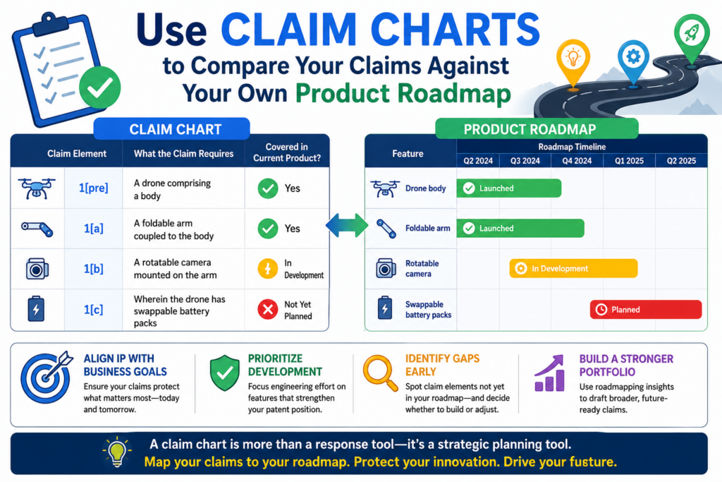
A claim chart can help your team compare the patent claims with the product roadmap. This is useful because startups change fast.
The feature you are protecting today may become part of a bigger system next year. The product may move into a new market, use a new data source, or run on a different device.
If your claim becomes too tied to the first version of the product, it may lose value later.
The chart should show whether the claim covers future versions
A claim chart can be used to compare the claim language to the current product and likely future versions.
This does not mean the chart should turn into a business plan. It means the team should check whether the claim language is flexible enough to cover the real invention as it grows.
For example, a startup may first run a model in the cloud, but later move part of the model to edge devices.
If the claim is amended to require only cloud processing, that may hurt future coverage. A chart can show this risk before the response is filed.
Product direction should shape claim strategy before the claim gets too small
Founders should be part of this conversation because they know where the product may go. Engineers should be part of it because they know which parts of the system are likely to change.
Patent counsel should guide the final wording because claim language can create long-term effects.
The claim chart gives everyone a shared view.
It can show whether a proposed amendment still covers the product roadmap. It can also show whether the team should keep a broader claim alive, pursue a narrower claim for faster allowance, or file another application for a different version of the invention.
This is where PowerPatent can help teams move faster without losing control. It helps organize technical invention details and supports a workflow where real patent attorneys can review the strategy.
Founders get a clearer path and fewer blind spots. See how PowerPatent works here: https://powerpatent.com/how-it-works
A chart can help avoid locking the patent to one customer use case
Early customers can shape product language. That is good for selling, but it can be risky for patents. A claim that is too tied to one customer setting may not cover the broader invention.
For example, your system may start in hospitals but later work in factories. It may start with trucks but later work with drones.
It may start with one type of sensor but later use another. If the patent claim is narrowed too early around the first use case, you may lose future room.
The claim should protect the engine, not only the first use case
A claim chart can help the team find the deeper technical idea. Is the invention really about a hospital workflow, or is it about how sensor confidence changes a control action? Is it really about warehouse robots, or is it about a new way to merge location data and force data?
When the chart points to the true engine, the claim strategy gets stronger.
That does not mean every claim must be broad. Sometimes a focused claim is useful. But the focus should be chosen on purpose, not by accident.
Use claim charts when multiple inventors see the invention differently
In many startups, different people see different parts of the invention. One engineer may focus on the data pipeline.
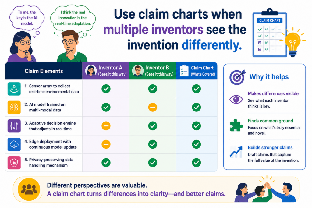
Another may focus on the model. A founder may focus on the customer problem. A product lead may focus on workflow. All of them may be right, but their views may not line up.
A claim chart can bring those views into one place.
This is useful during prosecution because the rejection may touch only one slice of the invention. The chart helps the team see which slice matters for the claim and which details are outside the current issue.
A chart can turn scattered founder and engineer input into one clear view
When a rejection arrives, teams often react in different ways. One person says the examiner missed the point.
Another person says the claim is too broad. Another says the old reference is not even close. Another says the cited reference is close but missing one step.
The claim chart helps sort these reactions.
It gives each person a place to add useful input tied to a specific claim part. That keeps the discussion from turning into a broad debate.
The chart should capture disagreement before the response is drafted
Disagreement is not bad. In fact, it can make the response stronger if it is handled early. The chart can show where the team agrees and where it does not.
For example, an engineer may think a feature is required by the product, while the attorney may note that the claim does not clearly say that feature. That is an important gap.
The team can then decide whether to argue the current claim language, amend the claim, or save the feature for another filing.
This is much better than discovering the mismatch after a response has already been drafted.
PowerPatent is built for this kind of teamwork. It helps founders and technical teams turn invention details into a clearer patent process, with attorney oversight where it matters.
That can reduce confusion and help teams avoid costly mistakes. Learn more here: https://powerpatent.com/how-it-works
A chart also helps confirm who contributed what
Patent work often needs a clear view of who helped create the invention. A claim chart is not a full inventorship decision by itself, but it can help organize the facts.
When each claim part is mapped to technical input, design notes, prototypes, or team explanations, it becomes easier to see who contributed to the claimed subject matter. That can help the attorney ask better questions.
Better records can make the patent process smoother
Startups often move quickly, and invention details can get lost. People change roles. Code changes. Design docs move. Whiteboard ideas become product features. Months later, it can be hard to remember who did what.
A claim chart can help preserve useful context.
It does not need to be fancy. It just needs to connect claim features with the technical record. That can help the team during prosecution, future filings, diligence, and internal IP planning.
Use claim charts to spot when you need a continuation strategy
A continuation can let you pursue more claim coverage based on an earlier patent application.
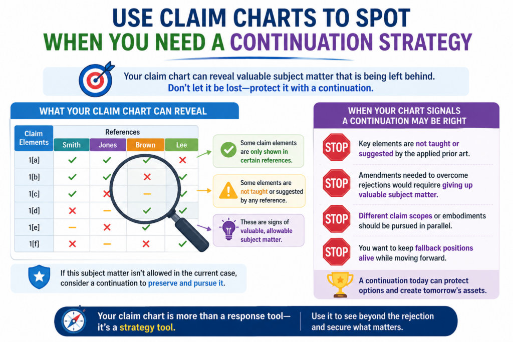
For startups, this can be very useful because products change and markets shift. You may want one claim set allowed now, while keeping room to pursue other angles later.
A claim chart can help you decide when that strategy makes sense.
During prosecution, the chart may show that the examiner is willing to allow a narrower claim, but broader or different claims may still be worth pursuing. Instead of forcing everything into one response, the team can think in layers.
The chart can show which claim angles are worth keeping alive
A good chart does more than answer the current rejection. It can show other valuable features that are supported by the application but not fully pursued in the current claim set.
Those features may deserve future attention.
For example, the current claims may focus on model training, but the chart may reveal strong support for deployment, monitoring, data privacy, edge processing, or feedback control. If those features matter to the business, they may be good candidates for a continuation.
A continuation can protect value that does not fit the current fight
Sometimes the current prosecution path becomes narrow because of a specific reference. That does not mean every other claim angle is weak. It may only mean the current claim set is under pressure.
A continuation strategy can let the team accept useful coverage now while still pursuing other forms of protection later.
The claim chart helps make that choice with more care. It shows what has been argued, what has been amended, what remains supported, and what may be worth claiming next.
This matters for founders because patent value often grows with the company. The first filing may start the protection. Later filings can follow the product as it becomes more real, more tested, and more valuable.
PowerPatent helps founders build that kind of smarter patent path with software plus real attorney support. See how it works here: https://powerpatent.com/how-it-works
A chart can keep the team from treating allowance as the finish line
Getting a patent allowed is a big step, but it should not end the strategy. The real question is whether the allowed claims protect the business in a useful way.
A claim chart can help answer that question before the case closes. It can show whether the allowed claim covers the product, whether competitors could easily avoid it, and whether another claim path may be needed.
The best time to think about next claims is before the current case ends
Once a case is allowed or close to allowance, the team should review the chart with fresh eyes. What did the examiner allow? What did the team give up? What important features were not claimed broadly? What parts of the product roadmap are still uncovered?
These questions are not busywork. They can shape the next stage of the patent plan.
For a startup, this can be the difference between having one narrow patent and building a real IP position around the core technology.
Use claim charts to make prior art review less painful and more useful
Prior art review can feel like a slow walk through a foggy room. You may have old patents, papers, product docs, examiner citations, and search results scattered across the team. Everyone may have a different opinion about which reference matters most.
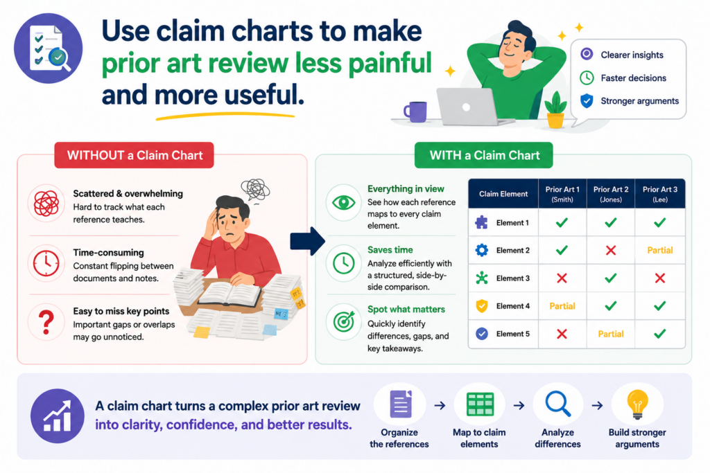
A claim chart brings order to that mess.
Instead of reading each reference from start to finish and hoping the answer becomes clear, the chart lets you compare the reference against the actual claim. This is faster, sharper, and much easier to act on.
The chart should keep the review tied to the claim language
Prior art only matters in prosecution because of how it compares to the claims. A reference may look close to your product, but if it does not show the claim feature that matters, it may not be as dangerous as it first appears.
The reverse is also true. A reference may look boring or old, but it may still show a key claim part. That can make it important.
The claim chart keeps the team honest. It stops people from judging a reference by gut feel alone. It asks a better question: what does this reference actually teach, and where does it match the claim?
The chart should capture the exact place where the reference matters
When reviewing prior art, do not just write “Reference A is close.” That is not enough. The chart should capture the exact paragraph, figure, table, claim, or passage that matters.
This saves time later. When the attorney writes the response, the proof is already organized. When the engineer reviews the issue, they do not have to hunt through a long patent again. When the founder wants to understand the risk, the answer is visible.
This is one reason PowerPatent is built around a better patent workflow. Strong patents come from strong invention detail, clean records, and real attorney review.
The old way often hides key facts in long email threads. PowerPatent helps teams bring those facts into the process earlier. See how it works here: https://powerpatent.com/how-it-works
Prior art review should not become a fear exercise
Founders sometimes panic when they see older patents that sound close. That is understandable. But close words do not always mean close claims.
A claim chart slows the fear down. It lets the team inspect the reference piece by piece.
Maybe the old patent uses the same field. Maybe it solves a related problem. Maybe it even uses some of the same parts. But if it does not show the required data flow, timing rule, model update, device action, or control step, there may still be a strong path forward.
A calm review can reveal better claim strategy
The goal of prior art review is not to prove that every old reference is harmless. The goal is to understand the real risk and make a smart move.
Sometimes the chart shows that the current claim is strong. Sometimes it shows that the claim should be amended.
Sometimes it shows that a dependent claim is the better path. Sometimes it shows that a new filing should be prepared around a different feature.
That is useful. It turns prior art from a threat into a guide.
A startup does not need to fear every old patent. It needs a clear way to know what matters and what does not.
Use claim charts to make software and AI inventions easier to explain
Software and AI patent work can get confusing fast. The invention may involve models, data sets, prompts, embeddings, agents, training loops, feedback signals, APIs, edge devices, cloud services, and user actions. It may not look like a simple machine with visible parts.
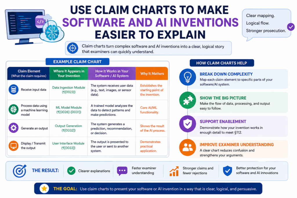
That makes claim charts even more useful.
A chart can turn an abstract system into a clear sequence. It can show what data enters the system, what changes inside the system, what decision is made, and what output is produced.
The chart should make the hidden steps visible
In software and AI, the most valuable part of the invention is often hidden inside the flow. A user may only see a simple screen or result, but the real invention may happen behind the scenes.
For example, the system may clean data in a new way before training. It may change model weights after a certain event. It may route requests between models based on confidence.
It may protect private data while still improving output. It may run part of the process on a local device to reduce delay.
These details need to be shown clearly.
The best chart explains the flow without drowning the reader
A chart should not make the invention feel more complex than it is. It should make the complex part easier to see.
For software and AI claims, the chart should show the order of steps and the reason that order matters. It should also show where the examiner’s reference fails to match that order.
This is important because older references may use similar words. Many references may talk about training, scoring, classification, prediction, or automation. The real difference may be how the system does the work.
A good chart helps your team say, “This reference does not do the same thing,” with proof instead of hope.
AI claim charts should focus on technical behavior, not buzzwords
Words like AI, machine learning, neural network, generative model, and automation are not enough. They are broad words. They do not show the invention by themselves.
The chart should focus on what the system actually does.
Does it change a model based on user feedback? Does it select a model based on a live score? Does it transform data before inference? Does it block unsafe output using a special rule? Does it improve speed by splitting work between local and cloud systems?
Those are the details that can matter.
The claim should protect the working engine behind the AI feature
Many startups say they have an AI product. That is not the same as having a patentable AI invention.
The invention often lives in the system design, the data flow, the training method, the control logic, the privacy method, or the way outputs are used.
A claim chart helps separate the true invention from the label.
This is where founders need a process that understands technical work. PowerPatent helps deep tech teams turn code, models, and invention notes into stronger patent filings with smart software and real attorney oversight.
That can help you protect what is real, not just what sounds trendy. Learn more here: https://powerpatent.com/how-it-works
Conclusion
Claim charts are not extra paperwork; they are a way to see the truth of a patent case clearly.
They help you compare each claim to the cited art, find the real gap, guide smarter amendments, and keep the team aligned. For founders, that means fewer blind spots, faster choices, and stronger protection around the technology that drives the company.
Use charts before filing, during rejections, and when planning future claims. If you want a clearer patent process backed by smart software and real attorney review, explore PowerPatent here: https://powerpatent.com/how-it-works
Leave a Reply