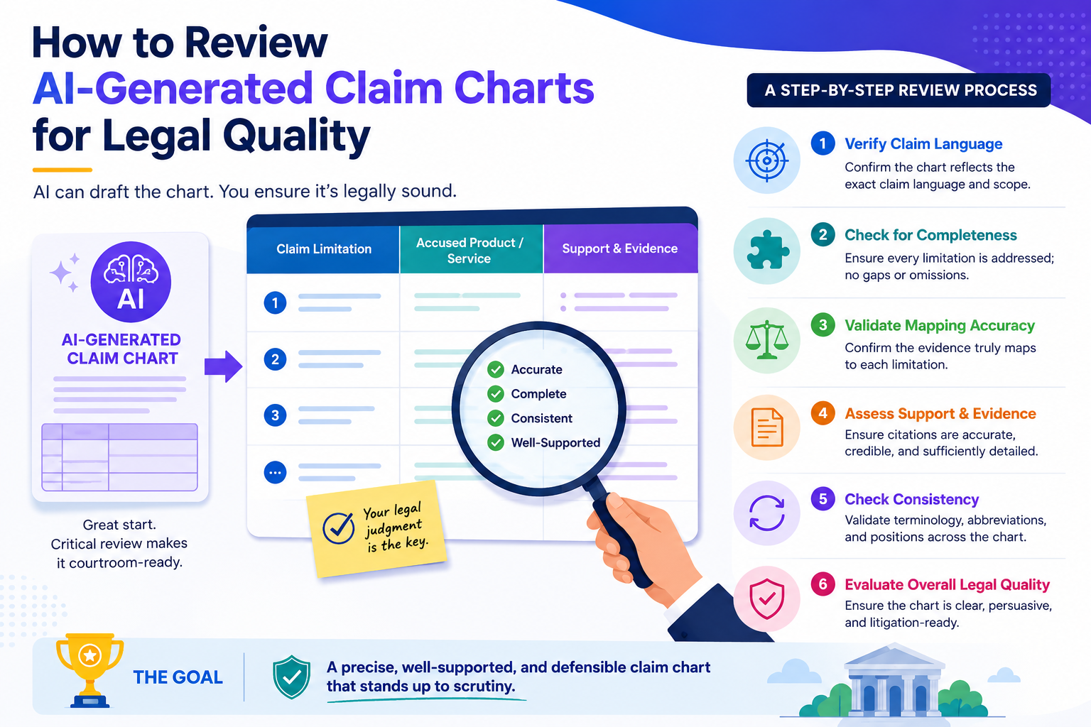
AI can build a claim chart fast. That is useful. But speed alone does not protect your invention. A claim chart can look neat, sound smart, and still miss the point that matters most: does it clearly show how each part of the claim is found in the product, system, paper, code, or standard being reviewed?
Start by checking whether the chart understands the claim, not just the words
An AI-made claim chart can often find matching words. That does not mean it understands the claim. This is the first thing to check. A strong review starts with the claim itself, not with the evidence.
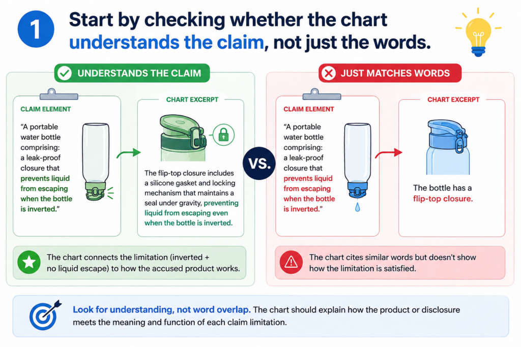
A patent claim is like a map. Each part tells you what must be found. If one part is missing, weak, or stretched too far, the whole chart can become hard to trust.
This is why you should not begin by asking, “Does the chart look complete?” You should begin by asking, “Did the AI break the claim into the right pieces?”
A good review starts with the exact claim language
Read the claim slowly before you look at the chart. Do not skim it. Do not assume the AI split it correctly. Many weak claim charts start with a bad claim breakdown.
The AI may split one idea into too many parts. It may also group two different ideas into one row. Both mistakes can cause trouble.
If the claim says that a system “receives sensor data, filters the sensor data, and sends an alert based on the filtered data,” each action matters.
Receiving is not filtering. Filtering is not alerting. Alerting must be based on filtered data, not just any data.
That may sound simple, but this is where many charts go wrong. AI may find a source that talks about sensor data and alerts, then treat that as enough.
A legal-quality review pushes deeper. It checks whether every required step is present and tied together in the right way.
The reviewer should treat every claim part like a locked door
Each claim part needs its own key. A general paragraph, a product page, or a loose technical note may sound close, but “close” is not the same as “shown.”
When you review, ask whether the cited proof opens that exact door. If the proof only shows a broad idea, mark it as weak.
If it shows the exact feature, mark it as strong. If it suggests the feature but does not say it clearly, mark it as needing attorney review.
This is where PowerPatent can help founders move with more confidence. Instead of staring at a long chart and wondering what matters, smart software can help organize the claim parts, evidence, and review notes in one clean flow.
Real attorney oversight can then focus on the hard calls, where human judgment matters most. You can see how PowerPatent supports this workflow here: https://powerpatent.com/how-it-works
Make sure each chart row answers the real legal question
A claim chart is not a place to dump text. It is not a storage box for copied passages. Each row should answer one clear question: where is this exact claim part shown in the target material?
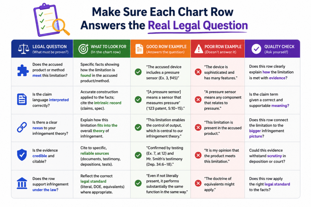
That target material may be a product guide, public web page, source code, API document, research paper, standard, demo video, or technical spec.
The form can change. The job does not. The row must connect a claim part to real proof in a clean and honest way.
The evidence must match the claim part, not just the topic
This is the most common issue with AI-generated charts. The AI finds something that talks about the same general topic, then acts like that is enough.
For example, a claim may require a model that changes its output based on user feedback. The AI may cite a page that says the product uses machine learning.
That is not enough. Machine learning is the topic. User feedback changing the output is the claim part. The reviewer must catch the gap.
The same problem appears in software claims. A claim may require a server to create a ranked list after comparing two data sets. The AI may cite a page that says the system ranks results.
That may sound helpful, but the key issue is whether the ranking happens after that specific comparison. If the proof does not show the comparison, the chart row is weak.
A strong row uses proof that is direct, plain, and tied to the claim
Good evidence does not make the reader guess. It shows the feature in a direct way. The best row usually has three parts working together.
It has the exact claim language. It has a short, clear explanation of why the proof matches. It has a precise citation to the source.
You should be careful with rows that contain long pasted text and only a tiny note. Long text can hide weak reasoning. A strong chart does not win by volume. It wins by fit.
When reviewing, look for the reason the AI gave. Is it clear? Is it specific? Does it explain how the proof meets the claim part? Or does it simply repeat the claim in slightly different words?
A poor row says the system includes “a ranking module” because the source mentions “ranked results.”
A stronger row explains that the source shows the system comparing two data sets, assigning scores, and ordering outputs based on those scores. The second row gives a reader something to trust.
Watch for missing links between claim parts
Many claims are not just a pile of separate features. They also describe how the features work together. This is where AI often struggles.
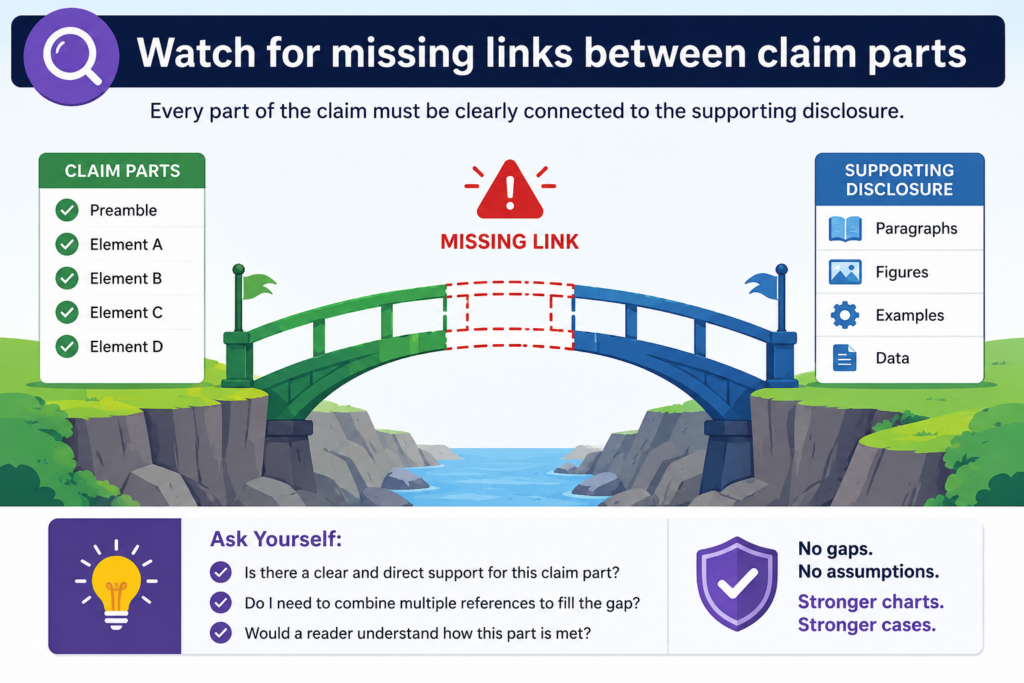
A chart can find each part somewhere in the source, yet still fail because it does not show the relationship between the parts. Legal quality depends on these links.
If the claim says one step happens “based on” another step, the chart must show that connection. If the claim says one module sends data to another module, the chart must show that flow.
If the claim says an action happens “in response to” a trigger, the proof must show the trigger-action link.
The words between the features often carry the weight
Small words can matter a lot. Words like “based on,” “in response to,” “after,” “before,” “using,” “from,” and “to” can shape the claim.
AI may pay more attention to nouns than relationships. It may find “training data,” “model,” and “prediction,” but miss whether the prediction is made using the trained model in the way the claim requires.
That is why a human review should slow down whenever a claim part describes a cause, order, source, or link.
A good question to ask is this: does the evidence show the same path as the claim?
If the claim describes data moving from a mobile device to a cloud server and then back to the mobile device, the proof should show that path. If the cited source only says data is stored in the cloud, the row is not enough.
The reviewer should trace the flow like an engineer debugging a system
Think of the claim as a simple flow. Something is received. Something is changed. Something is sent. Something is displayed.
The chart should let you trace that flow without guessing.
This is especially important for AI, robotics, chips, biotech tools, cloud systems, medical devices, and deep tech platforms. These inventions often depend on how pieces work together. A broad match can miss the real value.
For founders, this matters because weak charts can create false comfort. They can make you think you have strong support when the real proof is thin.
That can lead to wasted time, poor filing choices, or missed chances to protect the part of the invention that matters most.
PowerPatent is built for teams that need speed, but also need control. The goal is not to replace careful review.
The goal is to make careful review easier, faster, and less painful. See how the process works here: https://powerpatent.com/how-it-works
Check whether the AI is making hidden assumptions
AI can sound very sure even when it is guessing. This is one of the biggest risks in claim chart review. The chart may not say, “I am assuming this feature exists.” It may simply state the match as if it were proven.
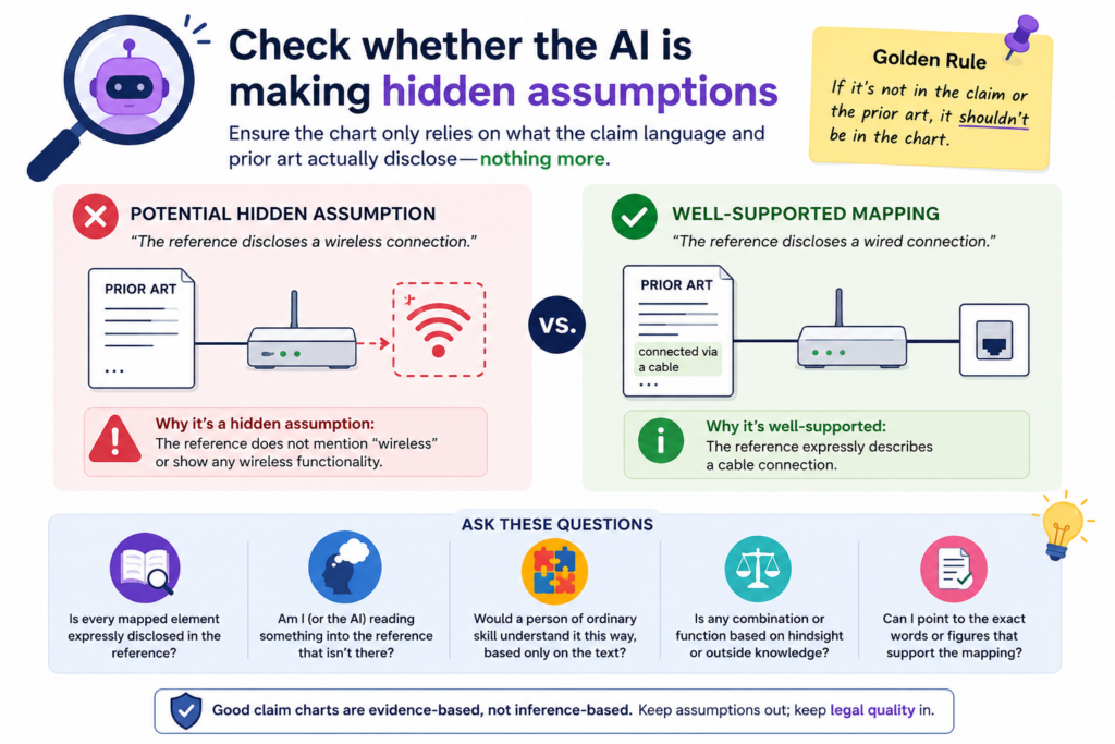
That is why you must look for hidden assumptions in every row.
These assumptions often appear when the source material is vague, when the product is complex, or when the claim uses terms that require technical judgment.
A hidden assumption turns weak proof into risky proof
Suppose the claim requires encrypting data before sending it. The AI may cite a page saying the product uses secure communication.
Secure communication may suggest encryption, but it may not prove when encryption happens or what data is encrypted.
That gap matters. The claim may require encryption before sending. The source may only show that the channel is secure. Those are not always the same thing.
Another example is a claim that requires a neural network to be trained with labeled data. The AI may cite a blog post saying the company uses artificial intelligence to classify images.
That may be true, but it does not prove the model uses labeled training data. The AI is filling in the blank.
A reviewer should mark assumptions instead of hiding them
Do not clean up weak rows by making them sound stronger than they are. That only moves the risk forward. A good review marks the issue clearly.
You can write that the source suggests the feature, but does not directly show it. You can note that more technical proof is needed.
You can flag the row for attorney review. The point is not to attack the chart. The point is to make the chart honest.
Honest charts are far more useful than polished charts. A polished chart may impress someone for five minutes. An honest chart helps a team make smart choices.
This is why attorney oversight matters. AI can speed up the first pass. It can help sort and compare large amounts of material. But the final quality check needs trained eyes.
It needs someone who knows when a match is real, when it is thin, and when the chart should not overstate the point.
Confirm that every citation is exact enough to be trusted
A claim chart is only as strong as its citations. If the citation is vague, the reader has to hunt. If the reader has to hunt, trust drops. This is true even when the evidence itself is good.
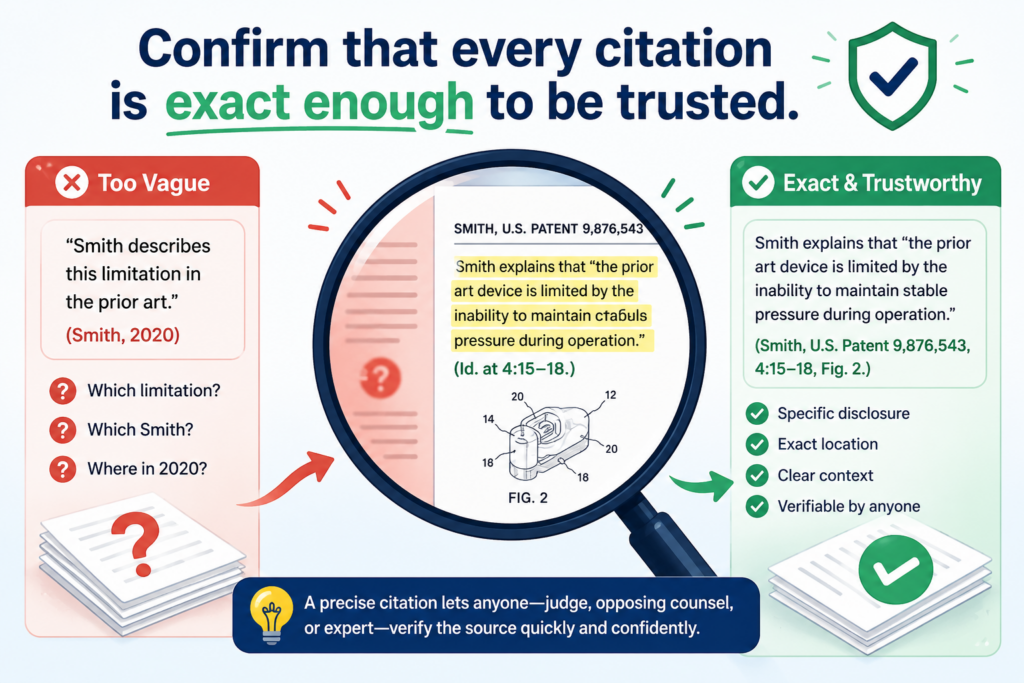
AI-generated charts often cite broad pages, long documents, or general sections. That can make the chart look sourced, but not truly supported.
A good legal-quality review checks whether the cited material points to the exact place where the claim part is shown.
A broad citation can hide a weak match
A citation to a 90-page guide is not very helpful if the chart does not name the page, section, figure, table, or code path that matters. The reviewer should not have to search the whole source to find the proof.
This matters even more when the evidence comes from technical material. A software guide may mention many features. A research paper may describe several model versions.
A product page may mix planned features, current features, and marketing claims. If the citation is too broad, the chart may accidentally rely on the wrong part of the source.
For example, a chart row may cite a product manual and say the system “generates a confidence score.” But if the manual has three scoring systems, the row must show which one matches the claim.
The same is true for source code. A citation to a full repository is not enough. A stronger chart points to the file, function, commit, or clear code block that supports the row.
The best citations let a busy reader verify the match fast
When you review the chart, act like a busy founder, attorney, or investor needs to check the work in minutes.
Can they go straight to the proof? Can they see why the proof matters? Can they confirm the AI did not stretch the source?
A high-quality row should make verification simple. It should name the source, identify the exact location, and explain the match in plain words.
The explanation should not bury the reader in copied text. It should guide the reader to the key fact.
If a row uses a video, the chart should include a timestamp. If it uses a web page, it should include the page title and the relevant part. If it uses code, it should include the file and function.
If it uses a standard, it should include the section number. If it uses a figure, it should explain what the figure shows.
This kind of care may feel small, but it saves real time later. It also helps avoid confusion when the chart is reviewed by a patent attorney, technical founder, or outside partner.
PowerPatent helps teams keep this kind of review organized, so the chart does not turn into a messy pile of notes.
The software helps speed up the work, while attorney oversight helps make sure the final chart is clear, useful, and not overbuilt on weak proof. You can see the workflow here: https://powerpatent.com/how-it-works
Look for claim terms that need a tighter meaning
Some claim words are simple. Some are loaded. AI may treat both the same, which can create risk.
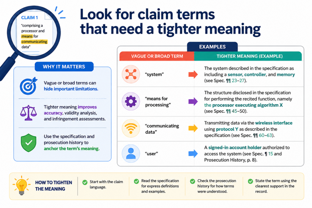
A claim term can have a plain meaning, a special meaning from the patent, or a meaning shaped by how the invention is described. A legal-quality review should look for terms that need care.
This does not mean turning the chart into a law school memo. It means checking whether the AI used the term in a fair and steady way.
The same word must mean the same thing across the chart
If a claim uses the word “model,” the chart should not treat it as a neural network in one row, a rule engine in another row, and a general software module in a third row unless the claim supports that range.
If the word “profile” means a user profile in one row and a device profile in another, the chart may become unclear.
This happens often in AI-generated work because AI is good at finding related language. It may see words that feel close and treat them as the same.
A human reviewer must ask whether they are actually the same in context.
Take the word “cluster.” In one technical field, it may mean a group of servers. In another, it may mean a group of data points.
In another, it may mean a group of cells. A chart that mixes meanings can look smooth but fail under review.
The reviewer should create a plain meaning check before judging the evidence
Before accepting the rows, write a simple working meaning for any term that seems important. Keep it short. Keep it tied to the claim.
Then check every row against that meaning.
This is not about making the chart longer. It is about making the chart stable. If the key term means one thing on page one and something else on page seven, the chart will confuse everyone.
This step is especially useful when reviewing charts for AI systems, medical tools, robotics, chips, clean energy, and biotech platforms.
These fields often use words that sound normal but carry a technical meaning. A term like “training,” “inference,” “signal,” “layer,” “sample,” “node,” or “agent” may need careful treatment.
You do not need fancy language to do this well. You only need to ask, “What does this word mean here?” and “Is the chart using it that way every time?”
That simple check can catch many hidden problems before they become expensive.
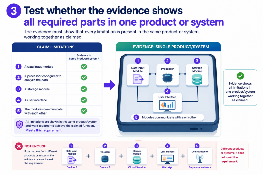
Test whether the evidence shows all required parts in one product or system
A common AI mistake is mixing proof from different places as if it all belongs together.
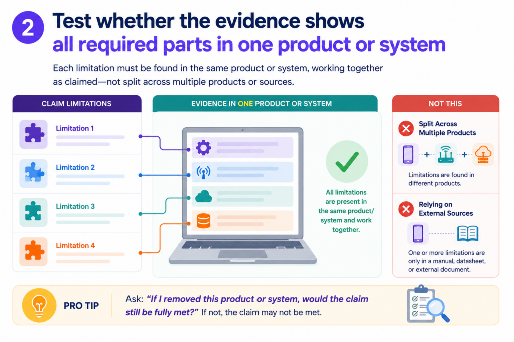
The chart may cite one product page for one feature, a research paper for another feature, and a support article for a third feature. Each source may be real.
The problem is whether they describe the same accused product, same version, same system, or same setup.
Legal quality depends on the fit between the claim and the actual target. You are not just asking whether each feature exists somewhere. You are asking whether the claimed combination is shown in the thing being charted.
A chart should not stitch together unrelated proof
This issue is easy to miss because each row can look fine on its own. The trouble appears when you zoom out.
For example, a chart may use a company blog post from 2021 to show model training, a 2024 product page to show deployment, and a developer guide for a different product line to show user feedback.
That may not prove one product performs the full claimed method. It may only prove the company has talked about similar ideas in different places.
The reviewer should check dates, versions, product names, release notes, and architecture.
If the sources do not line up, the chart should say so. Do not let the AI turn scattered facts into one clean story unless the sources support that story.
This is especially important for fast-moving startups and AI products. Features change. Models get replaced. APIs shift. Old blog posts may no longer match the current product.
Beta features may not be in the live system. A demo may show a prototype, not a released tool.
The reviewer should build a simple consistency trail
A strong chart should make it clear that the evidence points to the same thing. That does not always require a long explanation.
It may require a note that the source describes the same product version, the same platform, or the same workflow.
If that link is not clear, mark it. You might say the evidence supports the feature generally, but more proof is needed that the feature is present in the charted product. That kind of note is not a weakness. It is a sign of a careful review.
For founders, this matters because patent strategy depends on real facts.
You do not want to base a major decision on a chart that quietly blends different systems. You want a chart that shows what is known, what is likely, and what still needs review.
PowerPatent was built with this kind of practical problem in mind. Founders need speed, but they also need a process that catches gaps.
Smart tools can organize source material and chart rows faster, while real attorney review helps test the hard parts. Learn more here: https://powerpatent.com/how-it-works
Check whether the chart overstates what public evidence can prove
Public evidence is often useful, but it has limits. A product page, demo, help article, or white paper may show some claim parts clearly.
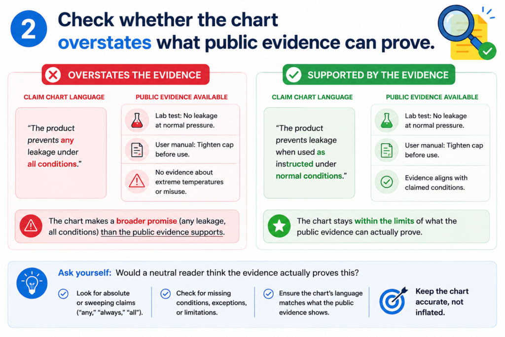
Other parts may happen behind the scenes. AI may try to fill those gaps with confident language.
A legal-quality review must separate what the public source proves from what it only suggests. That line matters. A chart that overstates public evidence can mislead the team using it.
Not every likely fact is a proven fact
In many technical systems, some steps are hidden. A user may see an output, but not the back-end process that created it.
A help article may say that recommendations are personalized, but it may not show what data is used or how the ranking is done. A demo may show a dashboard, but not the model pipeline.
AI often turns “this is probably how it works” into “this is how it works.” That is dangerous. The reviewer should soften or flag any row where the source does not directly prove the claim part.
This does not mean the row is useless. A suggested match can still be helpful. It may point the team toward better evidence.
It may support a first-pass review. It may help an attorney decide what to investigate next. But it should not be written like final proof.
The chart should label strong proof and thin proof in a clear way
A good review does not treat every row the same. Some rows are strong because the source directly says the feature exists.
Some rows are medium because the source shows the feature through a clear example. Some rows are weak because the feature is only implied.
You can use simple language in the chart notes. Say that the evidence directly supports the claim part.
Say that the evidence appears to support it, but needs more review. Say that the evidence does not clearly show it.
This kind of plain honesty makes the chart more useful. It helps the legal team move faster because they do not have to guess what the reviewer was thinking.
It helps the founder understand risk without needing a law degree. It helps the technical team know where more documents, logs, screenshots, or code notes may be needed.
The goal is not to make every chart perfect on the first pass. The goal is to make the chart reliable enough that good decisions can follow from it.
Review whether the chart uses the right level of detail for the claim
A strong claim chart does not explain too little, and it does not explain too much. It gives the right amount of detail for the claim part being reviewed.
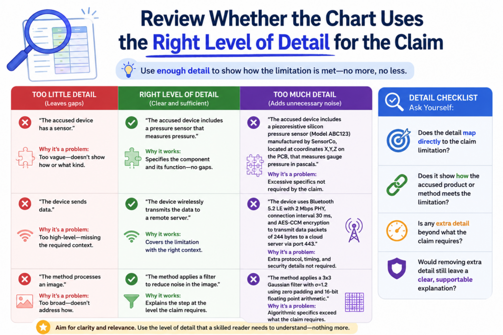
This balance matters because a chart should help a reader see the match without making them work too hard.
AI can miss this balance. Sometimes it gives a thin answer for a hard claim part. Other times it fills the row with long text for a simple claim part. Both can make the chart weaker.
The level of detail should match the level of risk
Some claim parts are easy to show. If the claim requires “a display,” and the evidence shows a screen in the product guide, the row may not need a long explanation.
But if the claim requires “selecting a model based on a confidence value from a prior output,” the row needs more care. That kind of claim part has more moving pieces.
When reviewing AI work, ask whether the chart gives more detail where the claim is harder. The key rows should not feel rushed. They should explain the match step by step in simple words.
This does not mean the row should become long just to look serious. Long is not the same as strong. The goal is clear proof.
If the claim part has three ideas inside it, the explanation should show all three. If the source only supports two of them, the chart should say that.
The best charts make hard ideas feel simple without hiding the hard parts
Good claim chart writing is plain, but not shallow. It should help a founder, engineer, or attorney understand the issue fast. The words should feel direct. The match should be easy to follow.
For example, a weak row may say that the product “uses AI to improve outputs.” That does not tell the reader much.
A stronger row may say that the source shows the system taking user feedback, updating a score, and using that score to change the next result shown to the user. That is still simple, but it is much more useful.
This is one reason founders should be careful when using AI alone. AI can make a chart look finished before the real review has happened. The chart may have rows, sources, and polished language, but still lack the detail needed to trust it.
PowerPatent helps solve this by pairing smart software with real attorney oversight. The software helps move fast.
The review helps protect against the kind of small gaps that can turn into big problems. You can see how PowerPatent works here: https://powerpatent.com/how-it-works
Check whether the chart handles negative or missing evidence honestly
A high-quality review is not just about finding matches. It is also about saying when a match is not there. This is where many AI-generated charts become too optimistic.
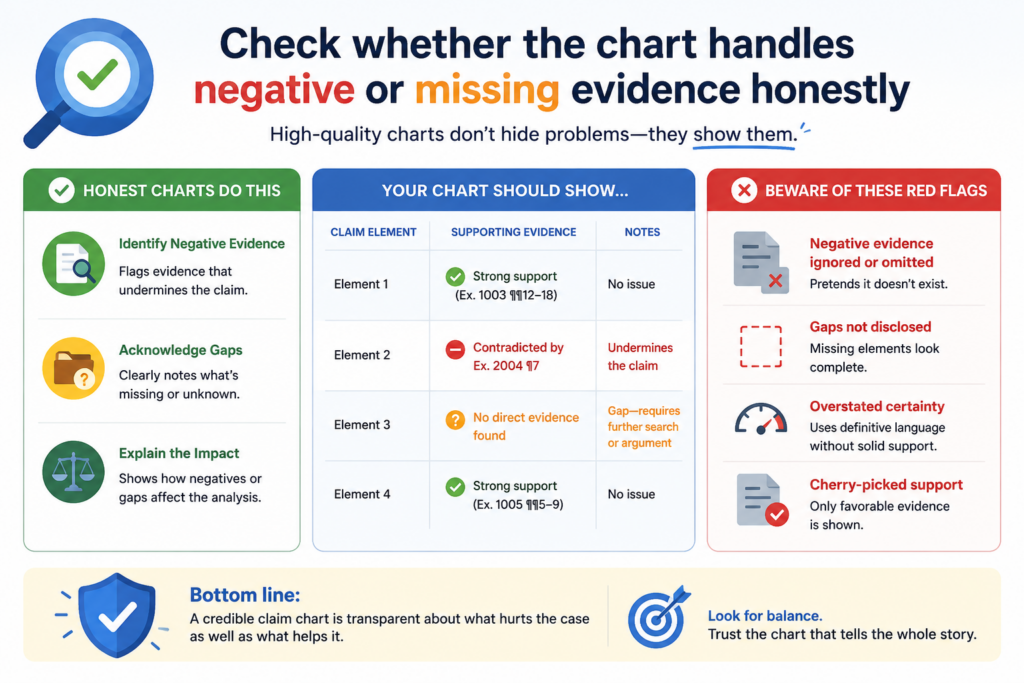
AI is often built to give an answer. That can be helpful, but it can also create a problem. If the evidence is weak, the AI may still try to complete the row.
It may use soft words, broad language, or implied links to make the match seem stronger than it is.
A missing element should not be hidden inside careful wording
When a claim part is not shown, the chart should say so plainly. It should not cover the gap with phrases that sound helpful but do not prove anything.
For example, if the claim requires “storing the updated model on a remote server,” and the source only says the product uses cloud features, that is not enough.
Cloud features may suggest remote storage, but they do not prove the updated model is stored there.
A reviewer should look for rows where the AI sounds vague. Words like “may,” “could,” “appears,” and “suggests” are not always bad.
In fact, they can be useful when used honestly. The issue is whether the chart still treats the row as if the claim part has been fully met.
A clear gap is better than a fake match
It may feel uncomfortable to write that evidence is missing. But that honesty is useful. It tells the team where more work is needed. It prevents bad choices. It helps an attorney focus on the right issue.
A chart that marks a gap is not a failed chart. It is a working chart. It is doing its job by showing what is known and what still needs proof.
This matters a lot when a founder is deciding what to file, how to improve a draft, or how to compare their invention against known systems.
A weak chart that hides gaps can send the team in the wrong direction. A clear chart helps the team move with more control.
When reviewing, treat missing proof as a real finding. Do not rush past it. Ask what kind of source would be needed.
It might be a technical manual, source code, screenshots, architecture notes, lab results, product logs, test data, or a deeper attorney review.
The best claim chart is not the one that says “yes” in every row. It is the one that tells the truth in a way the team can act on.
Make sure the chart does not copy source text without real analysis
AI can gather source text quickly. That is useful at the start, but it is not the same as legal-quality review.
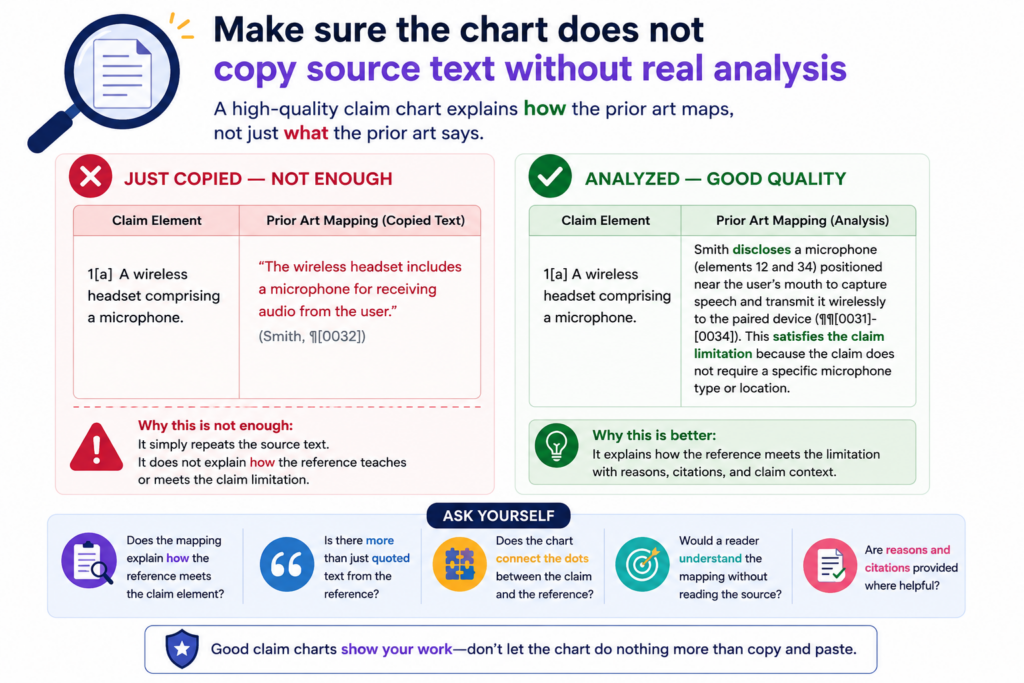
A chart full of copied passages may look detailed, yet still fail to explain why the evidence matters.
The job of a claim chart is not just to collect words. The job is to connect proof to claim language. That connection is the analysis. Without it, the reader is left to do the hard work.
Copied text should support the reasoning, not replace it
A good chart can include short source excerpts when they help. But the row should still explain the match in plain words. The explanation should be specific enough that a reader can see how the claim part is met.
For example, if the source says the system “generates a ranked list of recommended actions based on sensor input,” the chart should not stop there.
If the claim requires ranking “based on a risk score,” the row must explain whether the source shows that risk score. If it does not, the copied text is not enough.
This is a common AI issue. The AI may paste a passage that sounds close and assume the reader will accept it. A careful reviewer should not accept source text just because it has familiar words.
Strong analysis explains the match in the reviewer’s own clear words
When you review each row, ask whether the explanation adds value. Does it help the reader understand the fit? Does it point out the key phrase in the source? Does it show how the evidence maps to the claim part?
If the row only repeats the claim, it is weak. If it only repeats the source, it is also weak. A strong row sits between both. It explains the bridge.
This bridge can be written in simple words. You do not need long legal phrases. In fact, plain writing often works better. It forces the reviewer to say what is really going on.
A clean row may say that the cited source shows the device first collecting motion data, then filtering that data to remove noise, and then using the filtered data to decide whether to send an alert.
That kind of sentence does real work. It shows order, source, and purpose.
This is the kind of review that helps technical founders. It turns a chart from a document into a decision tool.
PowerPatent is designed for teams that want this kind of clarity without slowing down the company. It helps founders turn technical work into stronger patent assets with software support and attorney guidance. Learn more here: https://powerpatent.com/how-it-works
Test the chart against the invention story
A claim chart should not be reviewed in a vacuum. It should fit the larger invention story.
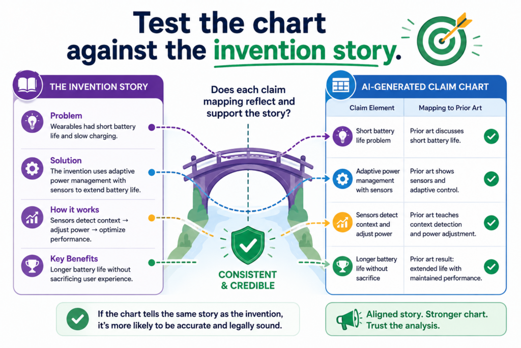
That does not mean forcing the evidence to match what you wish were true. It means asking whether the chart captures the real value of the invention.
For startups, this is critical. A patent is not just a form. It is part of the company’s moat.
It should protect what makes the product hard to copy, hard to replace, or hard to design around.
The chart should help you see what truly matters
A claim may include many parts, but not all parts carry the same business weight. Some parts are basic.
Some are the heart of the invention. The review should pay special attention to the parts that make the system different.
For example, a claim may cover an AI tool that gathers data, trains a model, and gives a result. Those steps may be common at a high level.
The real value may be in how the model selects training samples, how it handles low-quality data, how it reduces compute cost, or how it gives a safer answer. If the chart treats all rows as equal, it may miss the strongest part of the story.
A human reviewer should ask whether the chart shows the key technical move. What is the part a competitor would want to copy?
What is the part that saves time, cuts cost, improves accuracy, or makes the system work in a hard setting? The chart should make that part easy to see.
A strong chart supports better patent choices
When the chart is reviewed well, it can help the team make sharper choices.
It can show whether a claim is too broad, too narrow, too vague, or pointed at the wrong feature. It can also show where the invention deserves stronger claim language in a future filing.
This is where founders gain real leverage. Instead of treating patents as a slow legal task, they can use the chart to understand what should be protected and why.
That helps the team speak more clearly with patent counsel. It also helps avoid wasting time on claims that do not match the real product or the real market risk.
A good review may reveal that the current claim misses the most valuable feature. It may show that the evidence supports a stronger angle.
It may show that the company needs more technical notes before filing. These are not side issues. They shape the quality of the patent strategy.
PowerPatent helps founders protect what they are actually building, not just what fits into an old template.
With smart software and real attorney oversight, the process becomes faster, clearer, and more useful for serious teams. See how it works here: https://powerpatent.com/how-it-works
Review whether the AI has confused a feature with a result
A claim chart can go wrong when it treats the end result as proof of the steps that created that result. This is a quiet mistake, but it is very common in AI-generated charts.
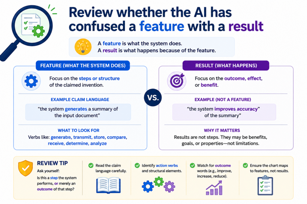
A product may show a smart result. It may give a fast answer, a better prediction, a cleaner signal, or a ranked output.
But the result alone does not always prove the claimed feature. The chart must show the thing the claim asks for, not just the outcome that might come from it.
The result may be visible while the real feature is hidden
Many technical products show only the surface. A user sees the answer.
They do not see the training method, the data flow, the back-end logic, the model selection step, or the chip-level operation. AI may look at the visible result and assume the hidden step must be there.
That is risky.
For example, a claim may require “normalizing sensor data before classification.” A product page may show that the system classifies sensor data with high accuracy.
That does not prove normalization happened before classification. It may have happened. It may not have happened. The chart needs proof.
The same issue appears in AI tools. A claim may require “selecting a prompt template based on a user intent score.” A demo may show a useful response to a user request.
That does not prove the tool used an intent score or selected a prompt template. The output is not enough.
A strong review separates what is seen from what is assumed
When you review the chart, ask what the evidence actually shows. Does it show the claimed step, or only a result that could come from that step? Does the source explain the process, or does it only praise the outcome?
A careful chart should use clear language when proof is indirect. It should not say the source “shows” a feature unless it truly does.
It can say the source “suggests” a feature, but that note should be paired with a warning that more proof may be needed.
This is not just a legal habit. It is good technical thinking. Engineers know that the same output can come from many designs. A claim chart should respect that.
PowerPatent helps founders avoid this kind of false match by bringing structure to the review process.
The software helps sort the evidence, while attorney oversight helps test whether the evidence really supports the claim. See how PowerPatent works here: https://powerpatent.com/how-it-works
Check whether the chart treats optional features as required features
Some product documents describe features that may be turned on, added, configured, or used only in special cases.
AI may treat those optional features as if they are always present. That can weaken a claim chart.
A chart should make clear whether the evidence shows the claimed feature as part of the normal system, an optional setting, a future plan, a plug-in, a beta feature, or a rare mode.
This detail can change how much trust the row deserves.
Optional language should slow the review down
Words like “can,” “may,” “optional,” “configurable,” “supports,” and “available” deserve attention. They do not always make evidence weak, but they do mean the reviewer should look closer.
If a product guide says the system “can export encrypted logs,” that may not prove every use of the system exports encrypted logs. If a support page says users “may enable adaptive learning,” that may not prove adaptive learning is active by default.
If a developer page says an API “supports feedback-based tuning,” that may not prove the product actually uses it in the accused workflow.
AI may miss these soft edges. It may turn a possible feature into a fixed feature. The reviewer should bring that edge back into view.
The chart should say when a feature depends on a setting or use case
A strong row tells the reader what conditions matter. If the feature appears only when a setting is enabled, the chart should say that.
If it appears only in an enterprise version, the chart should say that. If it appears only in one workflow, the chart should say that.
This is especially important for startup products, because many products change by tier, version, customer type, and release date.
A feature may exist in a demo but not in the live product. It may exist in a private build but not in the public release. It may be listed in docs but not yet turned on.
A good review does not ignore these details. It captures them in plain words.
This helps the team make better choices. A founder can see whether the chart supports a strong claim or only a narrower claim.
An attorney can decide whether more evidence is needed. An engineer can point to the right logs, settings, code, or release notes.
The goal is not to make the chart harder to read. The goal is to make it safer to rely on.
Make sure the chart does not blur product versions, dates, or releases
Time matters in claim charts. Product features change. Docs get updated. Code moves. AI models are replaced. A chart that ignores timing can become misleading even when the sources look real.
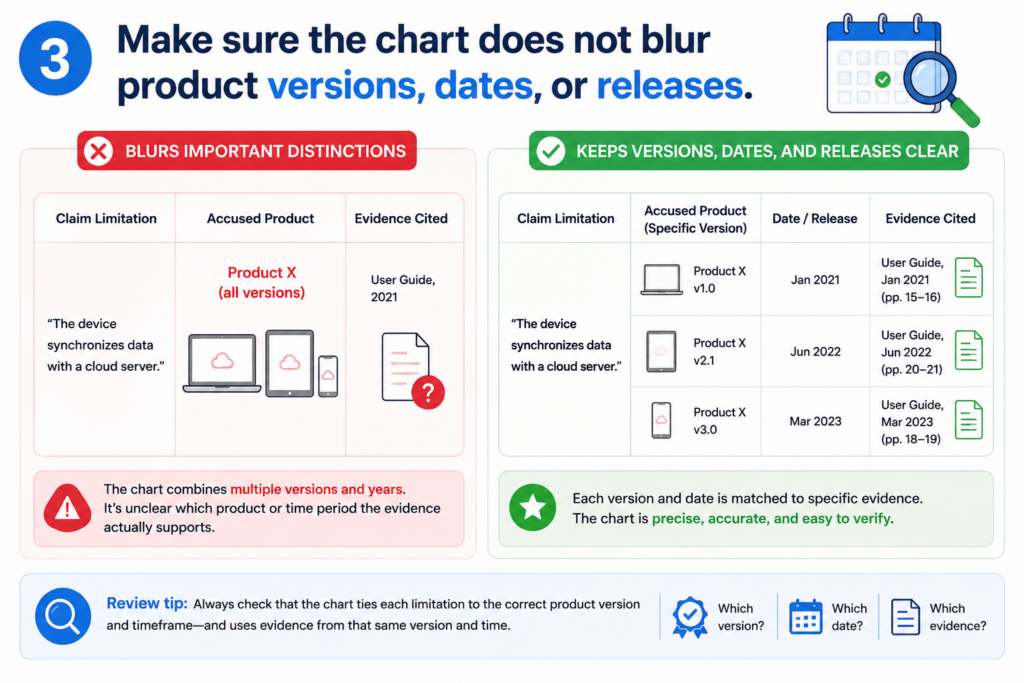
This is a major issue with AI-generated claim charts because AI may pull evidence from many places without checking whether each source belongs to the same time period or product release.
A source from the wrong date can point to the wrong truth
Imagine a product page from 2022 describing one architecture, a help article from 2024 describing another architecture, and a release note from 2025 describing a new model. If the chart treats all three as one system, it may tell a story that never existed at one time.
This problem can appear in many fields. In software, features roll out in stages. In medical devices, product versions may be tied to cleared or approved designs.
In chips, one generation may use a different layout than the next. In robotics, one demo may use a lab setup while a shipped product uses a simpler version.
When reviewing, check the date of each source. Check product names. Check version numbers.
Check whether a cited page has been updated. Check whether the source describes a current feature, old feature, future feature, or test feature.
The reviewer should build a clear time line inside the chart notes
The chart does not need a long history lesson. But it should make timing clear where timing matters. If the row relies on a 2024 manual, say so. If a feature was added in version 3.2, say so. If the evidence comes from a demo before launch, say so.
This is simple, but powerful. It keeps the chart grounded in facts. It also helps the legal team avoid mixing proof from different product states.
For founders, this can affect strategy. If your invention depends on a new feature, you need to know when that feature existed and how it was described.
If you are reviewing another system, you need to know whether the evidence shows the right version. If you are preparing a patent filing, you need to make sure your own records support the invention at the right time.
PowerPatent helps teams bring order to this kind of detail. It can help structure technical evidence, invention notes, and review work so the patent process does not depend on memory or scattered files. Learn more here: https://powerpatent.com/how-it-works
Look for vague words that make weak rows sound stronger than they are
AI writing can sound smooth. That is not always good. Smooth language can hide weak proof. When reviewing AI-generated claim charts, watch for words that make a row feel complete without actually showing the match.
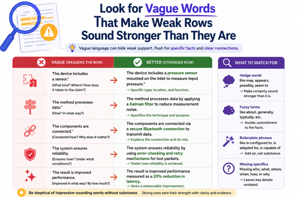
These words are not always wrong. But they should trigger a closer look. A legal-quality review should favor clear proof over polished language.
Vague words often appear where the evidence is thin
A row may say that the source “indicates,” “relates to,” “aligns with,” “corresponds to,” or “is consistent with” a claim part. These words may be fair in early analysis, but they are not the same as direct support.
For example, saying that a source “aligns with adaptive model training” does not explain whether the source shows adaptive model training.
Saying that a product “relates to secure data transfer” does not prove that it encrypts the claimed data before transmission. Saying that a document “corresponds to ranking based on user feedback” does not prove that feedback controls the ranking.
A reviewer should not let nice words carry the row. The row must still answer the hard question: where is the exact claim part shown?
Strong chart language is plain and testable
Good chart writing should be easy to test. If the row says the system receives data from a device, the source should show that.
If the row says the model updates based on feedback, the source should show that. If the row says a processor sends an alert after a threshold is met, the source should show that order.
Plain words make review easier. They also make weak spots easier to see. Instead of saying “the reference appears to contemplate a feedback-driven optimization process,” a stronger chart might say, “The source shows that user feedback changes the score used to rank the next output.”
That sentence is not fancy. It is better because it is clear.
When editing an AI-generated chart, replace soft language with direct language where the proof is strong. Where the proof is not strong, keep the soft language but mark the row for more review.
Do not upgrade weak proof by changing the words. Upgrade the row only when better evidence supports it.
This is one of the fastest ways to improve legal quality. You are not just editing style. You are making the chart more honest.
Check whether the chart proves the order of steps when order matters
Many claims are not just about what happens. They are about when things happen. Order can be the whole point.
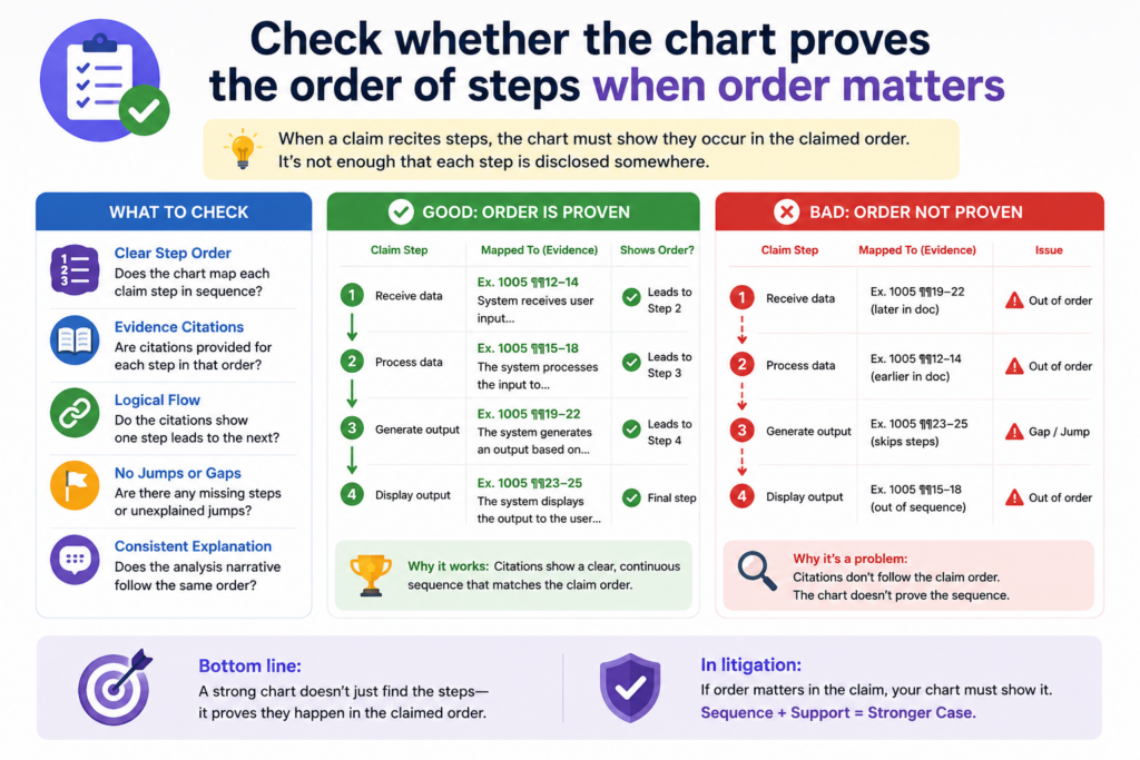
If the claim says one step happens after another step, the chart must show that order with care.
AI can miss this because it often finds matching ideas without checking the sequence. It may find proof that data is received, proof that data is scored, and proof that an alert is sent.
But if the claim requires the alert to be sent after the score is created, the chart must show that timing.
A claim chart should follow the same path as the claim
When reviewing the chart, read the claim like a process. Ask what happens first, what happens next, and what depends on what. Then compare that path to the evidence.
If the claim says that a system receives a medical image, detects a feature, assigns a risk value, and then displays a warning based on that risk value, each step has a place.
A source that only says the product displays warnings for medical images may not prove the full order. It may show the final result, but not the path.
This is common in AI systems. A claim may require training before deployment. It may require feedback after output.
It may require a model update after a user correction. These timing words are easy to miss, but they can shape the whole claim.
A reviewer should use timing as a quality test for every row
Do not only ask whether the source mentions the same feature. Ask whether the source shows the feature happening at the right time.
If the chart does not show timing, add a note. If the timing is only implied, say that. If the source clearly shows the sequence, make the row stronger by explaining it in plain words.
For example, a good row might say that the source shows the system first receiving a sensor stream, then applying a filter, and only after filtering sending the data to the prediction model.
That kind of wording helps because it follows the claim’s flow.
This is not extra polish. It is legal quality. It helps the reader see that the chart is not just matching words. It is checking how the system works.
PowerPatent helps founders move through this kind of review without getting buried in messy notes.
Smart software can help break down the claim and organize the proof, while attorney oversight can check whether the timing and links really hold up. See how it works here: https://powerpatent.com/how-it-works
Review whether the chart gives enough support for means, modules, and system parts
Some claims describe parts of a system. They may talk about modules, engines, processors, models, devices, controllers, circuits, agents, databases, or interfaces. AI may match these terms too loosely.
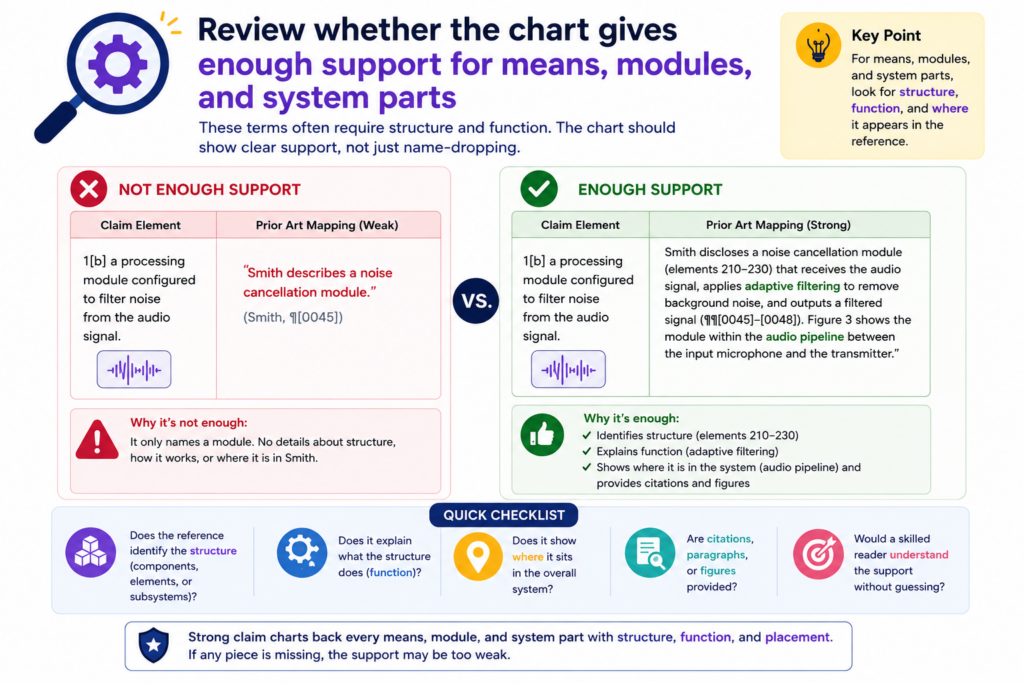
A system part is not always proven just because the source names something similar. The chart should show what that part does and how it fits into the claimed system.
A named part must still perform the claimed job
If a claim says there is a “ranking module configured to rank results based on a user score,” the chart should not stop at showing a ranking module. It must also show that the module ranks results based on the user score.
This matters because product documents often use broad names. A “recommendation engine” may do many things.
A “security layer” may include many protections. A “controller” may manage many steps. The chart must tie the named part to the claimed function.
AI can get excited when it finds a matching label. But labels are not enough. The review must check the job that label performs.
A good row connects the part, the action, and the proof
When reviewing a system claim, ask three simple questions. What is the part? What does the claim say the part must do? Where does the source show that exact action?
This can be written in clean language. For example, the row can say that the cited architecture diagram shows a scoring engine, and the text below the diagram states that this engine assigns a score to each candidate result based on user feedback. That connects the part to the action.
If the source only names the part but does not show the action, the row should be marked as incomplete.
If the action is shown somewhere else, the chart should explain how the two pieces connect.
This is where claim charts become more than simple tables. They become technical maps. They show not only that parts exist, but that the right parts perform the right roles.
For deep tech startups, this care matters. Your strongest patent value may live in how the pieces work together, not in the parts alone. A chart that misses that can weaken the strategy.
Check whether the AI used outside knowledge without saying so
AI may bring in facts that are not in the cited source. Sometimes those facts are common technical background.
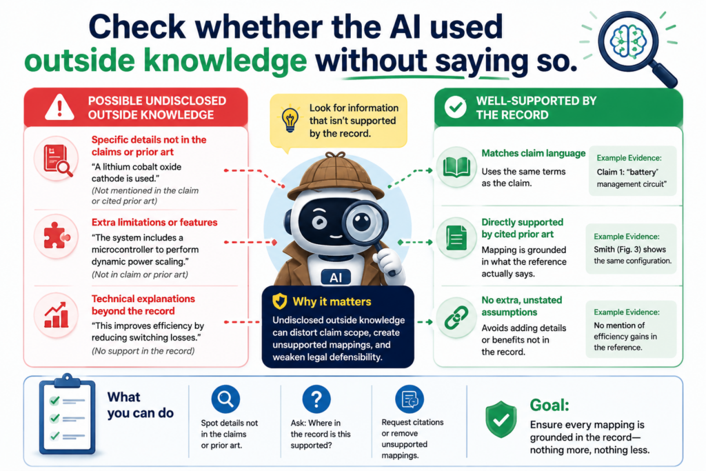
Sometimes they are assumptions. Sometimes they are wrong. A legal-quality review must catch this.
The chart should be based on evidence, not on hidden reasoning that the reader cannot verify.
If outside knowledge is needed to understand the source, the chart should make that clear.
Uncited technical leaps can make a chart hard to trust
Suppose the source says the system uses Transport Layer Security. The AI may write that the system encrypts data in transit.
That may be a fair technical point in many cases, but the chart should make clear where that support comes from. If the source does not explain the encryption details, the row should not overstate them.
Another example appears in machine learning. A source may say the system uses supervised learning. The AI may add that the system uses labeled training examples.
That may often be true, but the chart should still be careful. If the claim requires a specific type of label, training set, or update process, general background knowledge is not enough.
AI can also add product details from memory or from patterns seen in similar systems. That is a serious problem. The chart must be tied to the actual source material.
The reviewer should separate source proof from technical inference
A good review asks, “Did the cited source say this, or is the AI filling in the blank?”
If the source says it clearly, the row can be direct. If the source does not say it but the point follows from basic technical meaning, the row should explain that and may need attorney review.
If the point is just a guess, it should be removed or marked as unsupported.
This is a powerful habit because it keeps the chart clean. It also helps attorneys and founders see which rows are ready and which rows need more proof.
Do not punish the chart for using technical judgment. Technical judgment is often needed. But do not let judgment pretend to be evidence. Those are different things.
PowerPatent helps teams make this line easier to manage. Founders can bring in code, documents, diagrams, and notes, then work through them with smart software and real attorney review.
That means the final work is not just fast. It is more grounded. Learn more here: https://powerpatent.com/how-it-works
Make sure the chart is useful for the person who must act on it
A claim chart is not made to sit in a folder. It should help someone make a decision.
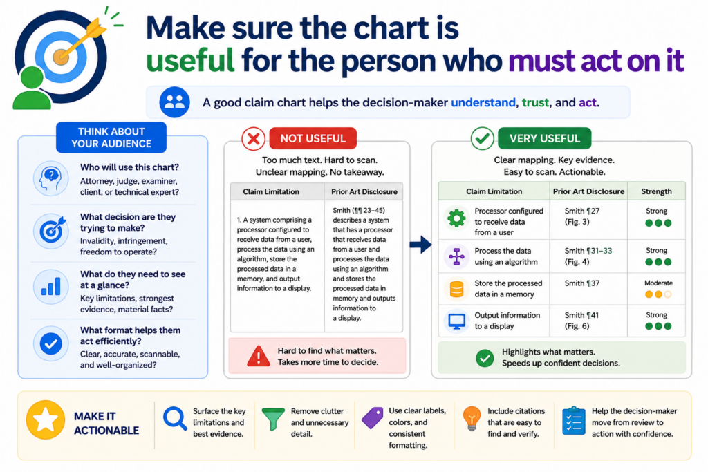
That person may be a founder, a patent attorney, an engineer, an investor, or a product lead. If the chart is hard to use, it is not doing its job.
Legal quality includes usability. A chart can be accurate but still painful to read. It can include good evidence but bury the key points. A strong review should make the chart clearer, not just more complete.
A useful chart shows the strength of the match without forcing the reader to guess
When someone reads the chart, they should quickly see which claim parts are strongly supported, which parts need more evidence, and which parts may be missing. This does not require a fancy format. It requires honest writing.
Each row should have a clear claim part, a clear source, and a clear reason why the source matters.
The notes should be short enough to read, but detailed enough to trust. The reader should not have to decode the reviewer’s thinking.
This matters because patent work is full of handoffs. An engineer may give notes to a founder. A founder may send material to counsel. Counsel may ask for more proof. If the chart is messy, every handoff creates delay.
The final review should turn the chart into a decision tool
Before calling the chart done, ask what action it supports. Does it help decide whether a claim is strong? Does it show where more evidence is needed?
Does it help improve a patent draft? Does it help compare a product against a claim? Does it help plan the next filing?
If the chart does not support a clear action, it may need another pass.
A practical final review should clean up vague rows, mark weak evidence, fix citations, note missing proof, and make the key technical story easier to see.
It should not add fluff. It should not make the chart sound more certain than it is. It should make the chart more useful.
This is where PowerPatent can be a strong fit for busy founders. You can move faster than the old way, but still keep real legal oversight in the loop.
You do not have to choose between speed and care. You can protect what you are building with more confidence. Start here: https://powerpatent.com/how-it-works
Conclusion
AI-generated claim charts can save time, but only careful review makes them useful. A strong chart does more than match words; it proves each claim part with clear facts, exact citations, honest notes, and sound human judgment. For founders, this is where speed turns into confidence.
You can spot weak proof, fix gaps, and protect the real value of what you are building before mistakes get costly. PowerPatent helps you move fast with smart software and real attorney oversight, so your patent work feels clearer, safer, and easier to trust. See how it works here: https://powerpatent.com/how-it-works
Leave a Reply