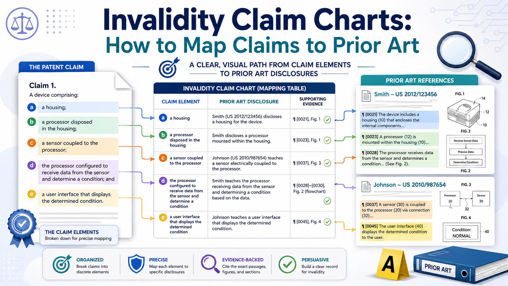
An invalidity claim chart is a side-by-side map. On one side, you place the patent claim. On the other side, you place the older proof that may show the idea was already known. That older proof is called prior art. It can be an old patent, paper, product page, manual, video, code base, public demo, or anything else that came before the patent.
An invalidity claim chart is a proof map, not a pile of quotes
An invalidity claim chart should make one thing easy to see: the patent claim is not as new as it looks. That is the whole job.
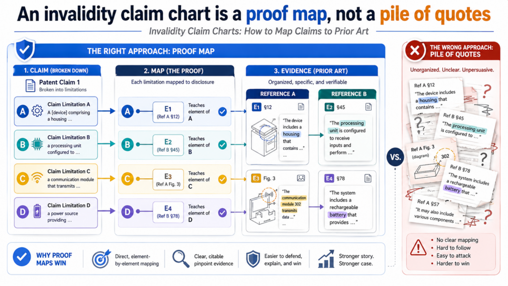
The chart does not need to sound fancy. It does not need to bury the reader in long blocks of text. It needs to show, in a clean way, where each part of the patent claim appears in older material.
Many people get this wrong because they treat the chart like a storage place for quotes. They copy a large block from an old patent, paste it next to a claim line, and hope the reader connects the dots. That is weak.
A strong chart does not make the reader work that hard. It walks the reader from the claim language to the exact part of the prior art that matters.
A strong chart makes the claim feel less mysterious
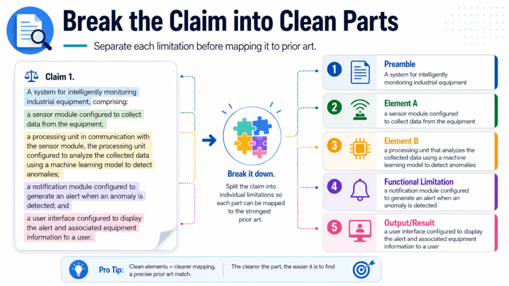
Patent claims can feel strange because they are written in a tight and formal way. One sentence may run for many lines.
That sentence may include many parts, and each part may matter. The first job is to break the claim into smaller pieces that a normal person can follow.
For example, a claim may describe a system with a processor, a memory, a trained model, and a step where the model sends a result to a user device.
In the chart, you do not treat that whole claim as one giant block. You split it into pieces. Then you match each piece to older proof.
This is where the chart becomes powerful. It turns a long claim into a set of clear questions. Did the older reference show the processor?
Did it show the memory? Did it show the trained model? Did it show the output being sent to a user device? If the answer is yes, the chart should show where and how.
The chart should help a busy reader trust the result
The person reading the chart may be a founder, lawyer, investor, patent owner, judge, examiner, or technical expert.
That person may not have time to hunt through a hundred pages of old documents. The chart should help them see the key facts fast.
This does not mean the chart should be shallow. It means the chart should be clear. The best invalidity charts are both deep and easy to read. They include exact support, but they do not bury the point.
They use short explanations to connect the claim part to the prior art. They also cite exact page numbers, figure numbers, paragraph numbers, table numbers, code lines, screen shots, dates, or product documents when those details matter.
Think of the chart as a bridge. The left side is the claim. The right side is the old proof. Your job is to build the bridge so strongly that the reader can cross it without guessing.
That is also the reason founders should care about this early. A startup may not be in a patent fight today, but it may face one later.
It may also want to understand how strong its own patent ideas are before filing.
PowerPatent helps founders turn invention details into stronger patent work with smart software and real attorney oversight, so the team can move fast without walking into easy-to-avoid mistakes. You can see how that works here: https://powerpatent.com/how-it-works
The first move is to break the claim into clean parts
Before you look for prior art, you need to understand the claim. This sounds simple, but it is where many bad charts start.
If you do not break the claim the right way, the rest of the chart becomes messy. You may map too much at once. You may miss a hidden limit. You may think a reference matches when it only matches part of the claim.
A claim is like a recipe. It may say what parts are needed, how they connect, and what action happens. If one part is missing, the full match may fail. That is why you should not rush this step.
Each claim part should be small enough to test
The best way to start is to place the claim in the left column and split it into short parts. Each part should contain one clear idea. You are not trying to rewrite the claim. You are trying to make it testable.
For example, a claim might say that a server receives sensor data from a device, cleans the data, applies a model, and sends an alert when the model finds a risk. That should not be treated as one lump.
It should become several claim parts. One part is about the server. One part is about receiving sensor data.
One part is about cleaning the data. One part is about using the model. One part is about sending the alert. One part may be about the condition that causes the alert.
That split matters because prior art may show some pieces but not all pieces. A product manual may show the sensor data and alert.
An older paper may show the model. A patent may show the server setup. A strong chart makes each match visible and honest.
The small words in a claim can change the whole chart
Small words often carry big weight. Words like “when,” “based on,” “before,” “after,” “in response to,” “without,” “automatically,” and “remote” may decide whether the prior art really fits. These words show order, cause, timing, control, or limits.
For example, there is a big difference between a system that sends an alert after a user asks for one and a system that sends an alert automatically when risk is found.
There is also a big difference between a model that only ranks results and a model that changes a control setting in a machine. The chart has to respect these details.
This is where founders and engineers often have an edge. They understand how the system actually works. They know whether one step causes another step.
They know if the model runs on a phone, in the cloud, or on a device. They know if data is cleaned before training or after capture. Those facts matter.
When you build or review a chart, do not ask only, “Does the old reference look similar?” Ask, “Does it show this exact claim part?” That small shift makes the chart much stronger.
A useful habit is to read the claim once like a lawyer, then again like an engineer. The legal reading helps you notice the exact words.
The engineering reading helps you notice whether the old system actually performs the same function.
You need both views. PowerPatent is built around that same idea: smart tools help gather and shape the technical story, while real attorney oversight helps protect the legal strength. Founders can learn more here: https://powerpatent.com/how-it-works
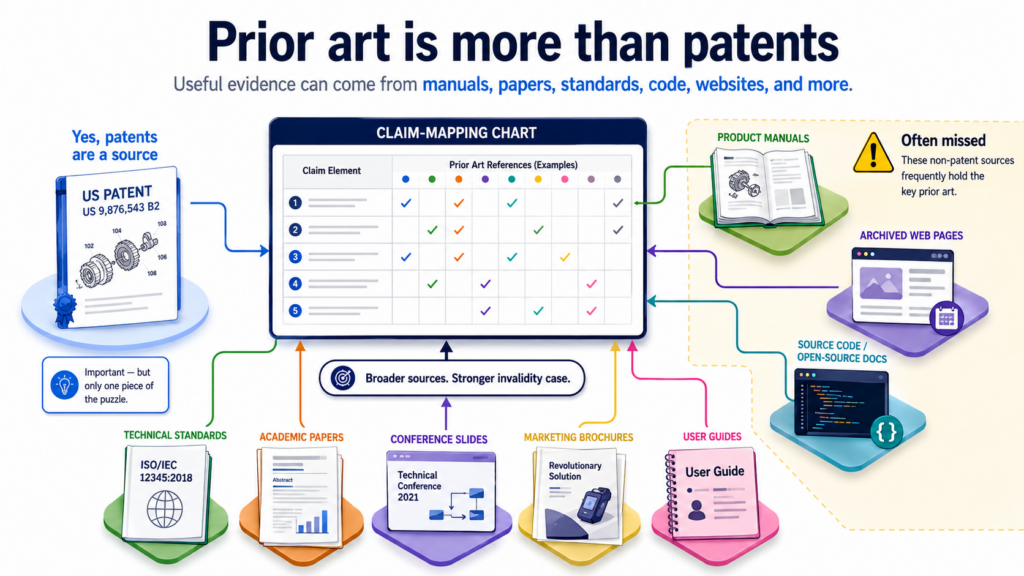
Good prior art is not always a patent, and that is where many teams miss value
Many people think prior art means old patents only. That is not true. Older patents can be very useful, but they are not the whole world. Prior art can include many public materials that show the idea before the patent’s key date.
The real question is whether the older material was available in a way that counts and whether it teaches the claim part you are mapping.
For technical founders, this is important because the best proof may be hiding in places that lawyers do not always check first.
It may be in an old GitHub repo. It may be in a conference deck. It may be in a product guide. It may be in a standards document. It may be in an old blog post from a technical team. It may be in a demo video where the product clearly shows the feature.
The best reference is the one that clearly teaches the claim
A good prior art reference is not just close. It is clear. It should show the claim part in a way that does not require too much guessing. If the chart depends on a long chain of assumptions, the match gets weaker.
For example, suppose a claim says a system uses a machine learning model to predict battery failure based on live sensor data. An older article that says “we monitor batteries” may not be enough.
An older paper that explains the sensor inputs, the model, and the failure prediction is much better.
An old product manual that shows the same live readings and failure warning may also be strong, especially if it was public before the patent date.
The chart should favor clear proof over clever proof. Clever proof may sound impressive, but clear proof wins trust. If a reader can see the match in seconds, your chart is doing its job.
Public dates are part of the proof, not a side note
Prior art only helps if it came early enough. That means the chart should not ignore dates.
You need to know when the patent was filed, when the claimed invention may have been made, and when the older material became public. This can get tricky, so the chart should be careful and factual.
A date on a web page may help, but it may not be enough by itself.
A dated manual, archived page, release note, paper publication date, conference date, product launch date, standards draft, app store listing, or source code commit history may give stronger support. In some cases, teams use more than one piece of proof to support the date.
Do not treat the date as something to clean up later. Track it while building the chart.
If you find a great reference but cannot show it was public early enough, it may not carry the weight you need. A chart with strong technical matches and weak date support can still fall apart.
This is also why startups should document what they build and when they share it. Public launches, papers, investor decks, pitch pages, and open-source releases can all affect patent rights.
The same facts that help one side attack a patent can also help a founder understand what should be filed before public release.
PowerPatent helps teams move from invention notes to attorney-backed patent work faster, so public sharing does not quietly create problems. See how the process works here: https://powerpatent.com/how-it-works
The mapping should explain the match in plain words
A claim chart is not strong just because it has citations. Citations matter, but they are only part of the job.
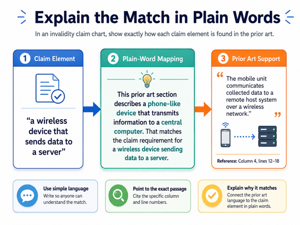
The chart also needs a short explanation that tells the reader why the citation matters. This is where plain words beat formal noise.
Bad charts often say things like, “This element is disclosed by the reference.” That sentence does not help much.
It sounds official, but it does not explain anything. A better chart says what the older reference shows and connects it directly to the claim part.
The reader should never have to guess why the quote is there
When you place a passage from prior art into the chart, explain its role.
If the claim part says the system receives sensor data from a wearable device, then the explanation should say that the old reference describes a wrist device sending heart rate and motion data to a server. That is simple. It is direct. It makes the link clear.
This matters even more when the words do not match exactly. Prior art does not always use the same words as the patent. A claim may say “mobile computing device,” while the old reference says “smartphone.”
A claim may say “risk score,” while the old reference says “probability of failure.”
A claim may say “training data,” while the old reference says “historical samples.” The chart should explain why the older term matches the claim meaning.
Still, be careful. Do not stretch words too far. If the old reference says one thing and the claim needs another, the chart should not pretend the gap is gone. It should either find better proof or state the issue clearly.
Honest charts are more useful than overconfident charts
The strongest charts are not the loudest charts. They are the most credible ones. If a reference clearly shows a claim part, say so. If the match is only partial, say that too.
If another reference may need to be combined with it, make that clear. This honesty helps the team make better decisions.
For example, one reference may show every part of the claim except the exact alert rule. Another reference may show the alert rule but in a different system.
That may still matter, but it is not the same as one reference showing everything. The chart should make that difference clear.
This is especially important when a startup is using a chart to assess risk. A founder does not need a chart that sounds tough but hides gaps.
A founder needs a chart that shows the real picture. Is the patent weak? Is it risky? Is there a strong defense? Is there a gap that needs expert review? Clear answers save time, money, and stress.
A good chart should feel like a sharp technical memo, not like a wall of legal fog.
It should say what the claim asks for, what the older proof shows, where it shows it, and what still needs to be checked. That is how you turn a patent dispute from a mystery into a set of facts.
A useful claim chart format makes the facts easy to test
The format of an invalidity claim chart should serve the reader, not impress the reader. A chart that looks complex may feel serious, but if it slows people down, it is not doing its job.
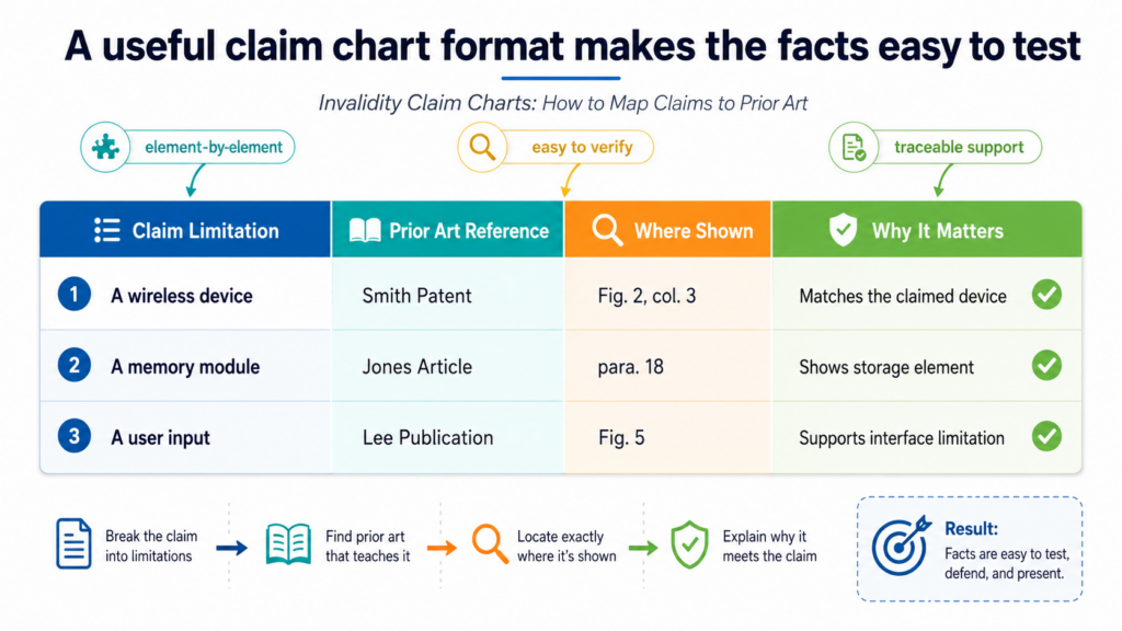
The best format is simple enough for a founder to follow and exact enough for a patent team to use.
Most charts use two main sides. One side shows the claim language. The other side shows the prior art support. Some teams add a third space for notes, comments, or gaps.
That can be helpful, but only when the notes are short and focused. The chart should not become a dumping ground for every thought the team has.
The claim language should stay visible and stable
A strong chart keeps the claim text easy to see. The reader should always know which exact claim part is being mapped.
Do not hide the claim inside long notes. Do not rewrite it so much that the original meaning gets lost. You can break the claim into parts, but the actual words should stay close enough that the reader can check your work.
This is important because small claim words can change the result. If the claim says “in response to receiving a request,” then the chart must show that link.
If the claim says “without user input,” then the prior art should show that the action happens without the user doing anything at that moment. If the chart hides those words, the analysis gets weak.
The cleanest charts often use short claim pieces followed by direct prior art support. Each piece gets its own space.
Each space has exact citations. Each citation is followed by a plain explanation. That makes the chart easy to review, easy to challenge, and easy to improve.
The notes column should show judgment, not noise
A notes column can be useful when the match is not perfect or when the team needs to flag a question.
But the notes should not repeat the same thing over and over. They should help the reader understand the strength of the match.
For example, a note might explain that a reference clearly shows a server and sensor data, but it only appears to imply the use of a trained model. That is a real issue.
Another note might explain that a figure shows the system flow, while the text explains the trigger condition. That helps the reader know why both cites matter.
Good notes also help teams decide what to do next. If a chart shows strong support for most claim parts but weak support for one step, the next search can focus on that step.
If the chart shows that one prior art reference is better for system parts while another is better for method steps, the team can decide whether a combined argument makes sense.
This is the kind of work that rewards care. A small gap in a chart can become a large problem later. A clean format helps teams see those gaps early, before they waste money or make bad decisions.
For founders who want to avoid slow, messy patent work, this is the same reason PowerPatent focuses on structure from the start: smart software helps organize the invention, and real attorney oversight helps shape it into stronger protection.
You can see the process here: https://powerpatent.com/how-it-works
The best mapping starts with the claim date and the right version of the patent
Before you map a claim to prior art, make sure you are working from the right patent, the right claim, and the right date. This sounds basic, but it is one of the easiest ways to make a chart unreliable.
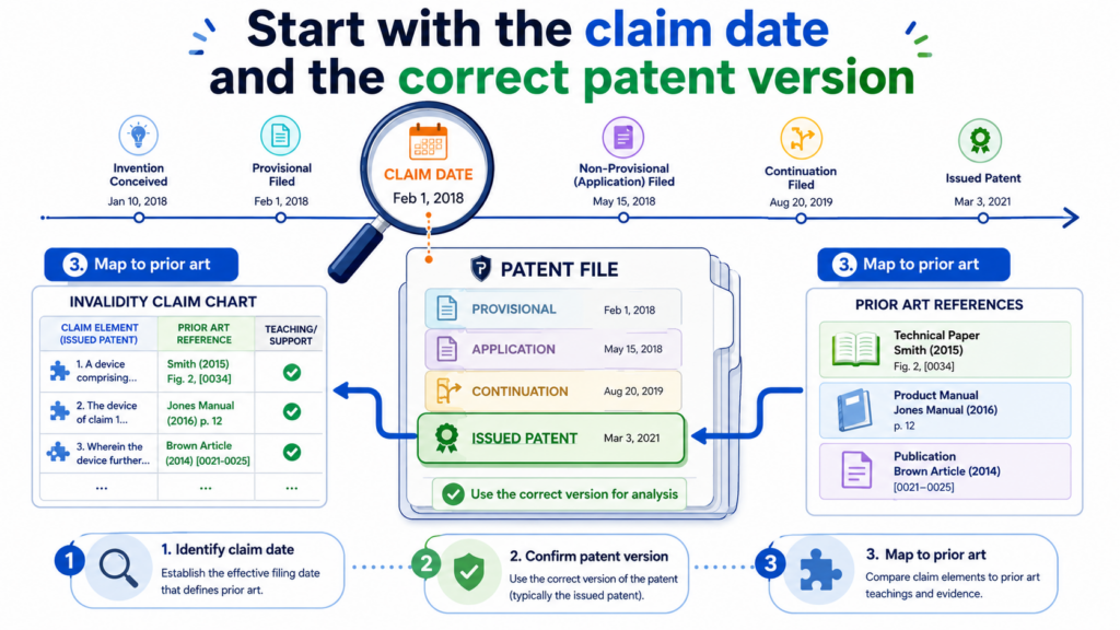
A beautiful chart built on the wrong claim version is not useful. A strong reference with the wrong date may not help. A chart that ignores the patent family can miss the real issue.
A patent can have related filings. It can have earlier applications. It can have later versions. Claims can also change during examination or later proceedings.
That means the exact claim text matters. You should not map from memory or from a quick summary. Use the actual issued claim or the claim version that matters for the review.
The key date controls what can count as older proof
The prior art date is not a side detail. It is central to the chart. The older proof must be old enough to matter against the patent claim being studied.
If the reference came after the key date, it may still help explain the field, but it may not work as invalidating prior art for that claim.
This is where teams need to slow down. A reference may look perfect because it describes the same feature in clear words. But if it was published too late, it cannot do the job you want it to do.
On the other hand, a less polished reference may be very strong if it clearly shows the feature and has a solid public date.
The key date can depend on several facts, such as the filing history and any earlier priority claim.
These issues can get technical, so teams should avoid guessing. The chart can flag date questions, but those questions should be reviewed with care.
Use the right claim set before you spend hours mapping
When a patent has many claims, it is tempting to start with the first claim and move fast. That can work, but only if the first claim is the one that matters. In a real dispute or risk review, a patent owner may focus on certain claims.
A founder may only care about claims that seem close to the product. An investor may want to know whether the broadest claim is weak. Each goal can change which claims should be mapped first.
Independent claims often deserve early attention because they stand on their own. Dependent claims add extra features, so they may need more detailed mapping later.
But do not assume dependent claims are harmless. Sometimes a dependent claim adds the feature that makes the patent harder to challenge. Sometimes it adds a narrow detail that is easy to find in older art. The chart should let the facts decide.
A practical way to stay focused is to begin with the claims that create the most business risk. If a claim appears to read on a core product feature, map that claim first.
If a claim is broad and could block a product line, map that claim early. If a claim is narrow and far from the product, it may wait.
This is also helpful before filing your own patents. When founders understand how claims are tested, they can describe their invention better.
They can give more detail about what is new, what is different, and why it matters.
PowerPatent helps teams capture those details while the invention is still fresh, then brings in real attorney oversight to help turn that story into stronger patent work. Learn more here: https://powerpatent.com/how-it-works
Prior art searching should follow the claim, not your first hunch
A common mistake is to search for the invention name instead of the claim idea. That can miss the best prior art. Patents often use broad words. Product teams often use brand names or internal names.
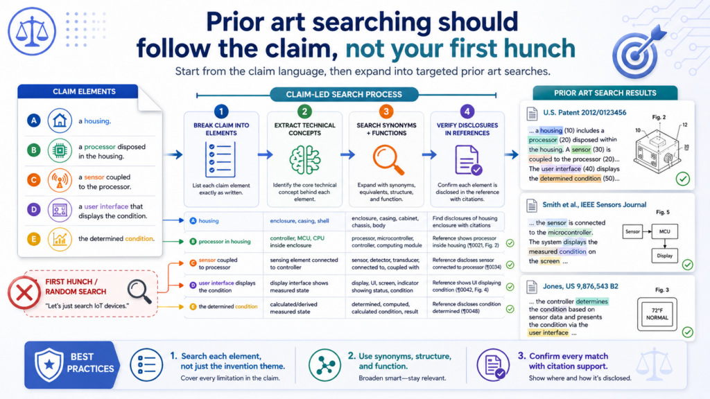
Papers may use academic terms. Developers may use plain engineering words. A strong search moves across all of these ways of saying the same thing.
Start with the claim. Ask what each claim part is really doing. Then search for older systems, papers, products, and documents that did that same thing.
Do not get trapped by the patent’s exact words. At the same time, do not drift so far that the search becomes vague.
Search by function, structure, data flow, and result
A good prior art search looks at the invention from several angles. One angle is function, meaning what the system does. Another angle is structure, meaning what parts the system uses.
Another angle is data flow, meaning where information starts, where it goes, and what happens to it. Another angle is the result, meaning what output the system creates.
For example, if a claim is about predicting machine failure from sensor data, you may search for predictive maintenance, sensor streams, anomaly detection, equipment alerts, and remote monitoring.
You may also search for the exact type of machine, the type of sensor, the model type, and the alert workflow. Each search angle can uncover a different kind of reference.
This method works well because prior art rarely matches your first search phrase perfectly. The best reference may use different words. It may come from a different industry.
A medical monitoring system may teach a data flow that looks like an industrial monitoring claim. A vehicle safety paper may teach a model trigger that resembles a robot control claim. The chart should care about what is taught, not only the field label.
Keep a search trail so the chart can be defended
As you search, track what you searched, where you searched, and why a reference mattered.
This does not need to be complex, but it should be clear. A search trail helps the team avoid repeating work. It also helps explain why certain references were selected.
When you find a strong reference, save the full document, not just the page that looks useful. Pages can move.
Websites can change. Videos can be removed. Product pages can be updated. If the material is important, preserve enough proof to show what it said and when it was available.
For code, save the repo details, commit dates, release tags, readme files, and relevant code lines. For videos, note the upload date, title, visible feature, and time stamps.
For product manuals, save the version, date, product name, and page numbers. For papers, save the publication venue, publication date, figures, and sections that matter. These details may later become the reason the chart holds together.
Prior art search is not about finding the most references. It is about finding the right ones. Ten weak references can create confusion. One strong reference can change the whole review. The chart should help the team separate noise from real proof.
This is one reason founders should not wait until a conflict starts to think about patents. The earlier you capture your technical edge, the easier it is to explain what is new.
PowerPatent helps founders move fast while still giving the invention the care it needs, with software that helps organize the work and attorneys who help review the substance. See how it works here: https://powerpatent.com/how-it-works
One strong reference is powerful, but combinations can matter too
Sometimes one prior art reference shows every part of a claim. That is often the cleanest case.
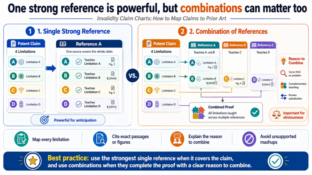
The chart can move piece by piece through the claim and show that the old reference already taught the full idea. When that happens, the story is simple and strong.
But many charts are not that neat. One reference may show most of the claim, while another reference shows the missing part.
That does not make the chart useless. It means the chart needs to be more careful. A combined mapping can be useful, but it should explain why the references belong together.
Do not combine references just because you need a missing piece
A weak chart grabs a missing feature from anywhere and drops it into the chart. That is not enough.
The reader needs to understand why a person working in the field would have looked at both references or why the pieces fit together in a sensible way.
For example, if one reference teaches a drone control system and another teaches a battery risk model for drones, the connection may be easy to explain.
They are in the same field and solve related problems. But if one reference is about hospital scheduling and another is about engine sensors, the connection may be harder.
It may still be possible, but the chart should not pretend it is obvious without support.
The chart should clearly show which reference maps to which claim part. It should also show the reason the combination makes sense.
That reason may come from the references themselves, from common design needs, from known problems in the field, or from how engineers commonly built systems at the time.
A combination chart should still feel clean and fair
When using more than one reference, clarity becomes even more important. The chart should not mix citations in a way that hides gaps. Each claim part should still have a clear match.
If a feature depends on Reference A, say that. If another feature depends on Reference B, say that. If the argument needs both, explain how they work together.
This is where short plain-language notes can help. The reader should be able to see whether the chart is making a single-reference argument, a combination argument, or both. If both are possible, keep them separate enough that the reader does not get lost.
Be careful with overloading the chart. Adding more references does not always make the argument stronger. Sometimes it makes the chart look desperate.
If a claim needs five different references to cover basic parts, the team should ask whether the mapping is truly strong. A tighter chart with two well-matched references may be more persuasive than a crowded chart full of weak links.
For startups, this lesson has a second use. When filing your own patents, you want to explain the invention in a way that shows the real technical difference. If your invention is only a loose mix of known parts, it may be harder to protect.
But if your team solved a real technical problem in a new way, that story should be captured clearly.
PowerPatent helps founders pull that story out of code, diagrams, notes, and product details, then adds attorney oversight so the patent work is not left to chance. You can explore the process here: https://powerpatent.com/how-it-works
The best charts treat every claim word like it was chosen on purpose
A claim chart gets stronger when it respects the full claim, not just the main idea. This is where many weak charts lose power.
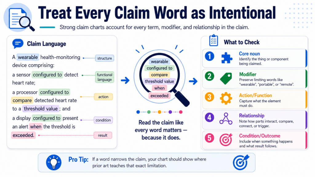
They map the “big picture” and ignore the small words that actually narrow the claim. That may look fine at first glance, but it can break down fast when someone asks hard questions.
Every claim word can matter. Some words define parts. Some words define order. Some words define timing. Some words define where data is stored, how it moves, or what causes the next step.
A good chart does not skip those details. It shows them, tests them, and explains them in plain words.
Small claim limits can decide whether the prior art really matches
A claim may say that one action happens “after” another action. That means order matters. If the old reference shows both actions but does not show the order, the match may be weaker.
A claim may say that a result is generated “based on” a certain input. That means the chart should show the link between the input and the result.
A claim may say that an action happens “automatically.” That means the chart should not rely on a user manually doing the same thing unless the reference also teaches automation.
This is why a chart should not just paste in broad passages. It should point to the exact proof for each limit. If the prior art shows a model, cite the model. If it shows the data source, cite the data source.
If it shows the trigger, cite the trigger. If it shows the output, cite the output. The more exact the mapping, the less room there is for confusion.
Good charting is a close reading exercise. It is also a technical exercise. You are asking whether the old material teaches the same working feature, not merely whether it talks about a similar goal.
The chart should make hidden assumptions visible
Assumptions are dangerous when they stay hidden. A team may assume that a server stores data because the system sends data to the cloud. A team may assume that a machine learning model is trained because the reference says “intelligent.”
A team may assume that a step is automatic because it sounds like it should be. These assumptions may be right, but the chart should not leave them floating.
If the match depends on an assumption, write it clearly. Then ask whether the prior art gives enough support.
If the reference says the system stores past readings and later uses them to improve results, that may support training or updating. If it only says the system is “smart,” that may not be enough.
This level of care helps founders in two ways. First, it helps them understand whether a patent threat is strong or weak.
Second, it helps them file better patents of their own. When your own invention is being described, vague words can hurt.
Clear technical detail helps. PowerPatent helps founders capture those details early, with smart software that guides the work and real attorney oversight that helps turn it into stronger filings. You can see how it works here: https://powerpatent.com/how-it-works
Strong citations make the chart feel solid instead of shaky
A claim chart is only as strong as the proof behind it. A clean explanation helps, but the reader still needs to see where the support comes from.
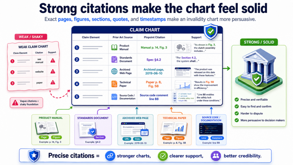
Strong citations let the reader check the work without hunting. Weak citations create doubt, even when the underlying reference is good.
A citation should be exact. Page numbers matter. Paragraph numbers matter. Figure numbers matter. Line numbers matter.
Time stamps matter. Version numbers matter. Commit hashes can matter. Product manual dates can matter. The goal is to make the proof easy to find and hard to misunderstand.
The best citation points to the smallest useful proof
A common mistake is citing a whole document when only one part matters. That puts too much work on the reader. If a claim part is shown in Figure 3 and described in paragraph 42, cite those places.
If a user guide shows the feature on page 17, cite page 17. If a video shows the feature at 2 minutes and 14 seconds, cite that time. If a code file performs the step on certain lines, cite those lines.
This does not mean you should ignore context. Sometimes a figure only makes sense when paired with the text around it.
Sometimes a table must be read with a definitions section. Sometimes a code line depends on a function called elsewhere. In that case, include enough support to show the full match, but keep the focus tight.
A good chart often uses both a quote and a plain explanation. The quote gives proof. The explanation gives meaning.
The chart should not rely on the quote alone, because old technical documents may use different words than the claim. The explanation helps the reader see why the citation matters.
Screenshots and figures can make technical proof much easier to understand
For software, hardware, and AI inventions, images often help. A system diagram may show the data flow better than a long paragraph.
A screenshot may show the feature in use. A figure may show that a device sends data to a server, the server processes the data, and the result returns to a user screen.
But images should not be used as decoration. They should prove something. If a figure supports a claim part, the chart should say what the figure shows.
If a screenshot shows a user alert, explain how that alert maps to the claim. If a diagram shows a training loop, explain which parts of the loop match the claimed steps.
This is especially useful when the patent claim is broad and the prior art is highly technical. A visual can help a reader grasp the system faster. Still, the chart should include exact references so the image can be checked.
For founders, this is a reminder to keep clear records of your own invention. Diagrams, architecture notes, model cards, test results, product specs, and release notes can all help tell the story of what you built.
PowerPatent helps bring those raw materials into a cleaner invention workflow, so the final patent work is not based on memory alone. Learn more here: https://powerpatent.com/how-it-works
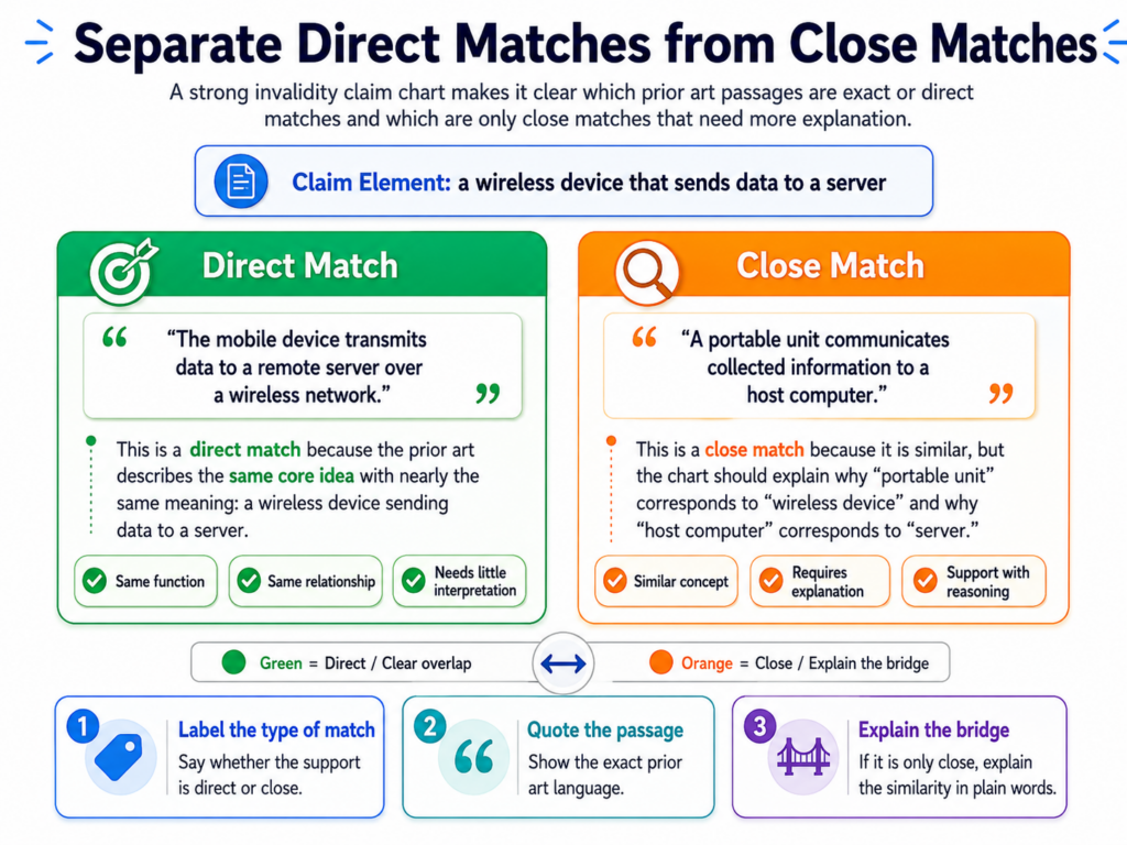
A chart should separate direct matches from close matches
Not every match is equal. Some claim parts are directly shown in the prior art. Other parts are only suggested. Some parts may be present, but not in the same way. A strong chart does not blur these differences. It makes them easy to see.
This matters because the chart is often used to make real decisions. A founder may decide whether to fight, settle, redesign, file a challenge, or keep building.
An investor may look at the chart to understand risk. A patent team may use it to decide where to spend more time. If the chart overstates the proof, the decision can be wrong.
A direct match should be stated with calm confidence
When the prior art clearly shows a claim part, say so in plain words.
For example, if the claim requires receiving sensor data from a wearable device and the older manual says the wrist device sends heart rate data to a cloud server, that is a direct and useful match. The chart can explain it without drama.
The strongest language is not loud. It is precise. Instead of saying the reference “clearly destroys the claim,” the chart should say that the reference shows the claimed device, the claimed data source, and the claimed transfer to the server. That is more persuasive because it sticks to the proof.
A close match needs different treatment. Suppose the claim requires a trained model, but the prior art only says the system uses “rules” or “logic.” That may not be enough.
Or suppose the claim requires a real-time alert, but the prior art shows a daily report. Those may be related, but they are not the same. The chart should not pretend they are.
A gap is not a failure if it helps the team act smarter
Finding a gap can be valuable. It tells the team where to search next. It also tells the team where the patent may be stronger than expected.
A gap may lead to a better reference. It may lead to an expert question. It may lead to a design change. It may also show that the current invalidity argument is not ready.
This is why claim charts should be built as working tools, not as showpieces. A working chart can say, “This part needs more support.”
It can say, “The current reference may imply this, but does not state it.” It can say, “Need a better source for timing.” That kind of honesty helps everyone.
For startup teams, this approach can save a lot of pain. It is better to see the truth early than to learn it after spending money in the wrong direction. This is also true when filing new patents.
If the invention story has gaps, fill them before filing. Describe the real technical steps. Show the real system. Capture the key options.
PowerPatent helps founders do that faster with guided software and attorney review, so the patent process feels less like guesswork and more like building a strong asset. Visit https://powerpatent.com/how-it-works to see the workflow.
The chart should tell a clear story without becoming a sales pitch
An invalidity claim chart is not a blog post, a pitch deck, or a courtroom speech. It should not try too hard to persuade with big claims. Its power comes from order, proof, and clarity.
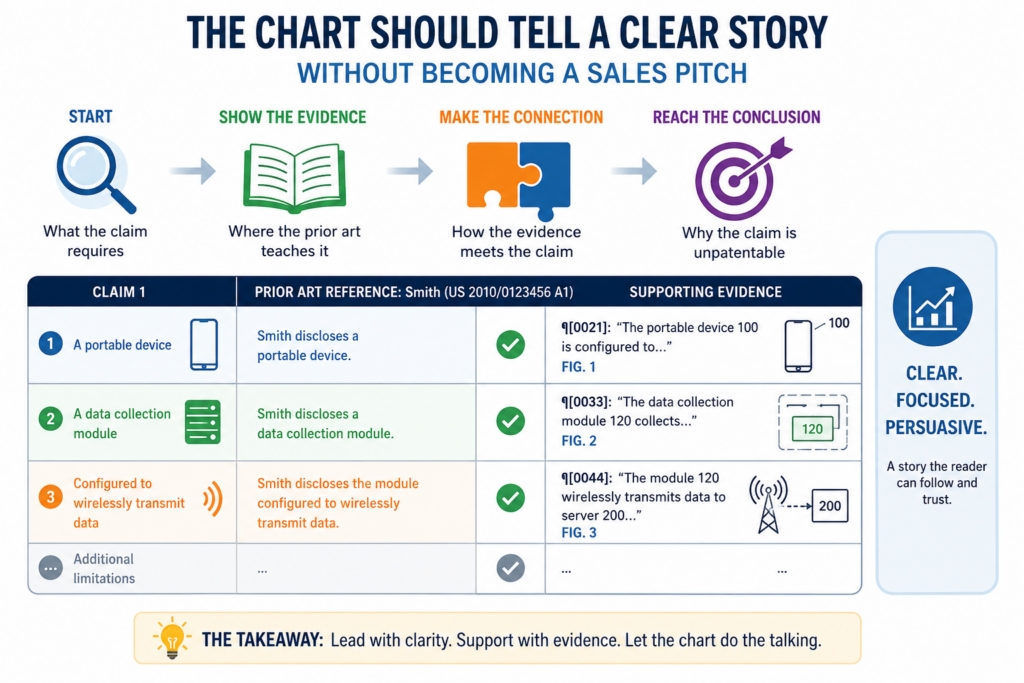
Still, a great chart does tell a story. It shows that the old material had the same pieces, arranged in the same way, before the patent claim was filed.
That story should be easy to follow from top to bottom. The reader should see the claim broken into parts, then see each part matched to older proof. By the end, the reader should understand the main point without needing a long meeting.
The story should follow the logic of the claim
Most claims have a built-in flow. A system has parts. A method has steps. A data process has inputs, actions, and outputs. The chart should follow that flow. Do not jump around without reason.
If the claim starts with a device, then moves to receiving data, then processing data, then sending a result, the chart should move the same way.
This makes the chart easier to read and easier to trust. The reader can see how each claim part fits into the next part.
The chart becomes more than a set of isolated matches. It becomes a complete map of the claimed invention against the older proof.
For software claims, this flow is especially important. Many software claims are about how data moves and changes.
The chart should show where the prior art receives the data, how it transforms the data, what logic or model is applied, and what output is produced. If the chart skips the flow, it may miss the heart of the claim.
A good chart makes the conclusion feel earned
The conclusion of the chart should not feel forced. By the time the reader reaches the end, the evidence should have done the work. The chart should not need hype. It should not need heavy language.
It should not need to attack the patent owner. It should simply show that the older proof teaches the claim parts.
A practical closing note can help. It may explain that one reference appears to show all parts of a claim. Or it may explain that the current mapping depends on combining two references.
Or it may flag that one feature needs more support before the chart is used for a major decision. This final note should be short, careful, and useful.
For founders, this is the larger lesson: patents get stronger when the story is clear from the start. If your invention solves a real problem in a real technical way, that story should not be buried in messy notes or rushed filings.
PowerPatent helps teams turn invention details into clearer, stronger patent work, backed by real attorneys and smart tools built for modern builders. You can explore the process here: https://powerpatent.com/how-it-works
A strong invalidity chart starts with the broad claim and then moves into the narrow claims
A patent often has many claims. Some are broad. Some are narrow. The broad claim usually gives the first big picture. The narrow claims often add smaller details, like a certain sensor, a certain model, a certain device, or a certain step.
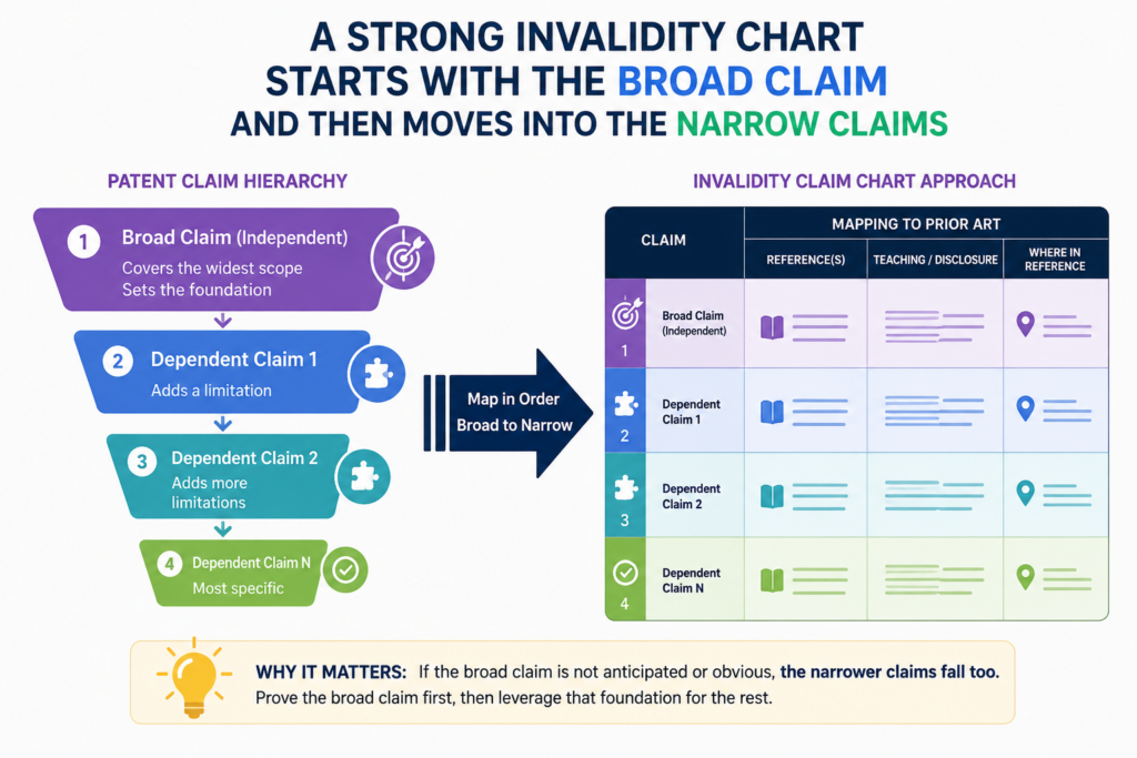
A good invalidity chart should not treat all claims the same way. It should begin where the risk is highest and then move deeper with care.
For many teams, the broad independent claim is the best place to start. If that claim is weak, the rest of the patent may lose much of its power. But the narrow claims still matter.
A patent owner may rely on those narrower claims if the broad claim is attacked. That is why a complete chart should not stop too early.
The broad claim shows the main fight
When you map the broad claim, you are asking whether the main idea was already known. This is where the chart should show the full shape of the older system or method. It should show the parts, the flow, the action, and the result.
For example, if the broad claim is about using a model to detect risk from device data and send an alert, the chart should show each of those parts in the older reference.
It should not only show that a model existed. It should also show the data source, the model use, the risk result, and the alert step.
This kind of mapping helps the team understand the real strength of the patent. If the broad claim is fully covered by strong prior art, the patent may be easier to challenge. If the broad claim has one missing piece, the team knows where to focus next.
The narrow claims can hide the part that matters most
Narrow claims often look small, but they can matter a lot. A dependent claim may add one detail that is hard to find in old material.
It may require a certain type of training data, a certain control action, or a certain device setting. That small detail can become the center of the dispute.
This is why the chart should not copy the broad claim mapping into every narrow claim without thinking.
Each added limit needs its own proof. If the narrow claim adds “wherein the alert is sent to a mobile device within a set time period,” the chart must show that detail. If the prior art only shows a general alert, that may not be enough.
The right way to handle this is to build from the broad claim. Use the broad claim mapping where it truly applies, then add fresh support for each new limit. This keeps the chart clean and avoids false confidence.
For founders, this is also a lesson in filing better patents. Broad claims are useful, but the narrower details can give real backup.
PowerPatent helps teams capture both the big idea and the small technical details, with smart software and real attorney review.
That helps founders move faster without filing thin patents that miss the point. You can see how it works here: https://powerpatent.com/how-it-works
The best invalidity charts are built for the next decision, not just for storage
A claim chart is not just a document. It is a decision tool. It should help a team decide what to do next.
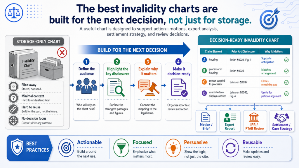
Should the team keep searching? Should it ask an expert? Should it challenge the patent? Should it change the product? Should it talk to the other side? Should it file its own patents to protect the next version?
A chart that does not help with decisions is only half useful. It may hold information, but it does not create direction. A stronger chart shows the quality of the match and makes the next move easier.
Every claim part should leave the reader with a clear sense of strength
After reading a mapped claim part, the reader should know whether the support is strong, medium, weak, or missing. You do not need fancy labels to do this. The writing itself can make it clear.
If the prior art directly shows the feature, say what it shows and where. If the prior art only suggests the feature, explain that carefully.
If the feature is not found, do not hide it. Say that more searching is needed. This kind of honest writing saves time because it prevents the team from treating weak proof like strong proof.
A good chart also helps a team avoid chasing every possible lead. If one part of the claim is already well supported, the team should not spend days looking for more proof on that same part. If another part is weak, that is where the next search should go.
The chart should help non-lawyers speak clearly with lawyers
Founders and engineers do not need to become patent lawyers to use claim charts well. But they do need a clear way to talk about the facts.
A good chart gives them that. It lets a founder say, “This old paper shows the model and the data flow, but we still need better proof for the automatic alert.” That is a useful sentence.
This kind of clarity helps attorney review go faster. It also helps the attorney ask better questions. Instead of starting from a messy pile of links, the team starts from a structured map. That can save time and reduce confusion.
The same idea works when filing patents. A clear technical map helps attorneys understand what the team actually built. It helps them see what is new, what matters, and what should be claimed.
PowerPatent is built for this kind of founder-friendly workflow. It helps turn raw invention details into cleaner patent inputs, then adds real attorney oversight so the final work is not left to software alone. You can learn more here: https://powerpatent.com/how-it-works
Good charts use simple language because simple language exposes weak thinking
Some people think patent work must sound complex to be serious. That is wrong. Complex language often hides weak analysis.
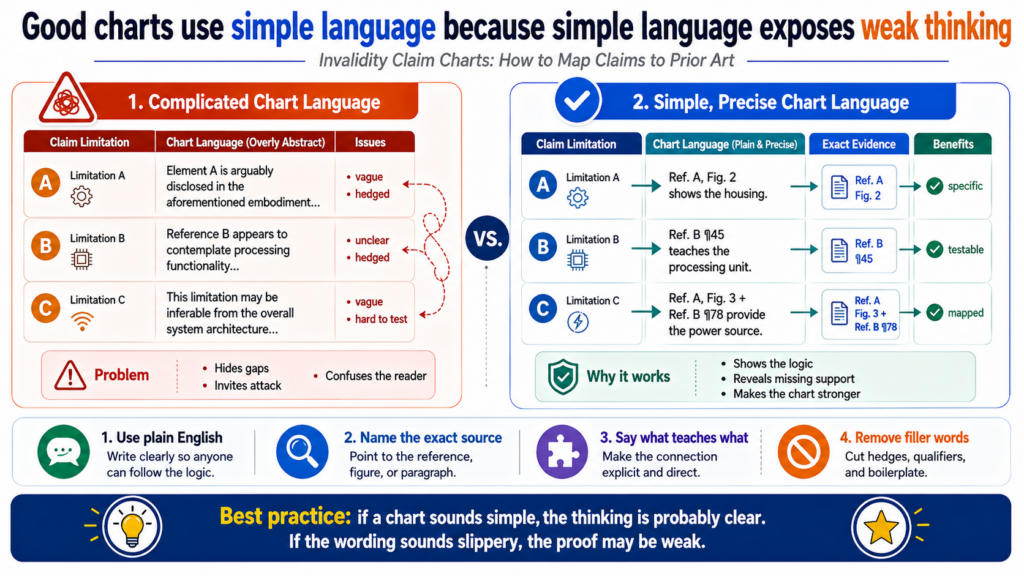
Simple language forces the chart to be clear. It makes gaps easier to spot. It makes strong proof easier to trust.
When a chart says, “The older system receives temperature readings from a sensor and sends them to a server,” everyone can understand it.
When a chart says, “The reference discloses acquisition and transmission of environmental data,” the sentence may sound formal, but it is less clear. The simpler sentence is usually better.
Plain words make the technical match easier to check
A claim chart should not make the reader decode every sentence. It should explain the match in plain words, especially when the prior art uses different terms than the claim.
If the claim says “mobile device” and the older reference says “phone,” the chart should explain that the phone is the mobile device. If the claim says “failure score” and the reference says “risk value,” the chart should explain why those ideas match.
This does not mean the chart should be casual or sloppy. It should still be careful. It should still use exact claim words when needed. But it should not use big words just to sound more legal.
The best tone is calm, direct, and precise. It should feel like an engineer explaining a system to a smart reader. It should not feel like a machine trying to sound official.
Simple writing also helps reveal when the prior art does not really fit
When you force yourself to explain the match in plain words, weak spots become obvious. If you cannot explain how the old reference shows the claim part, the problem may not be your writing. The problem may be the proof.
For example, suppose the claim requires a model that is updated using new user data. The old reference only says the system “improves over time.” That sounds close, but plain writing exposes the gap.
Does it improve because the user changes settings? Does it improve because a model is retrained? Does it improve because a rule set is adjusted? The chart should not skip that question.
This is why clear writing is not just style. It is quality control. It helps prevent overreach. It helps the team see what is proven and what is assumed.
Founders should want the same clarity in their own patent filings. A patent that hides the invention behind vague words may not protect the real business value.
A stronger filing explains the invention in a way that is clear, deep, and tied to the product’s real edge.
PowerPatent helps technical teams do that with a guided process and attorney review, so founders can keep building while still protecting what matters. See how it works here: https://powerpatent.com/how-it-works
The chart should handle missing pieces without panic
Almost every serious invalidity chart has a moment where the team finds a missing piece. That is normal. The first reference may not show every claim part. The first search may miss the best document.
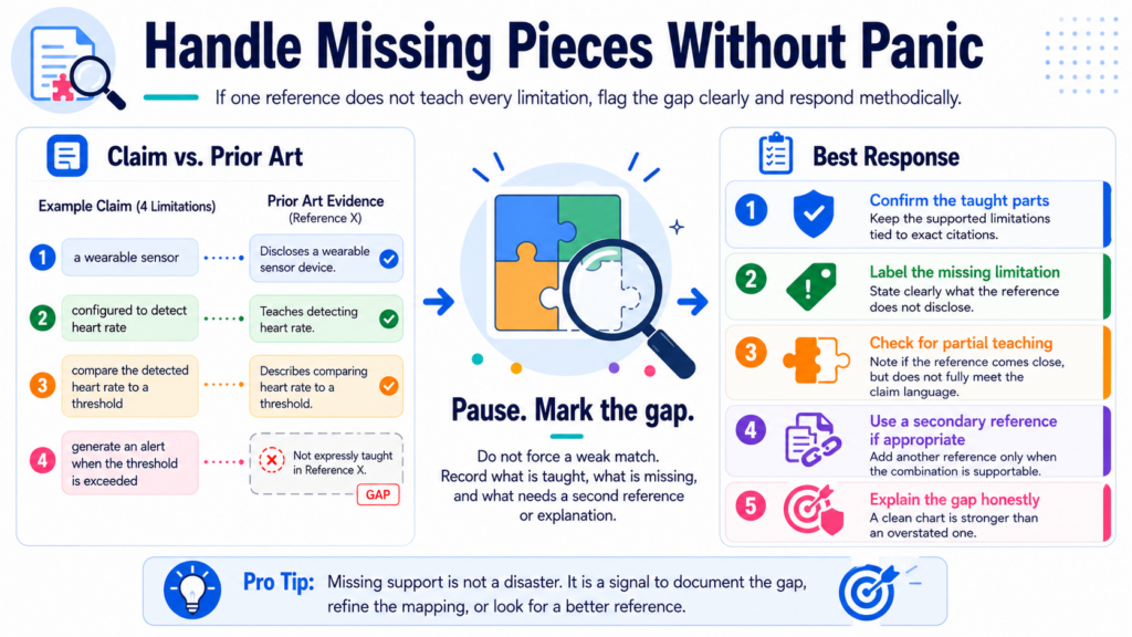
The old product page may show the feature but not the date. The paper may show the model but not the alert.
A missing piece does not mean the work failed. It means the chart has found the next question.
The worst move is to cover the gap with vague language. That may make the chart look complete for a moment, but it creates risk later. A better move is to mark the gap clearly and use it to guide the next search.
A gap should be written in a way that leads to action
When a claim part is not fully supported, the chart should explain what is missing. Not with drama. Not with blame. Just with a clear statement.
For example, the chart might say that the reference shows sensor data and model output, but does not clearly show that the alert is sent automatically.
That tells the team what to search for next. It might search for product manuals, release notes, demos, or related patents that show automatic alerts.
This is much more useful than pretending the gap is not there. A hidden gap wastes time. A clear gap creates direction.
The same approach works when the date is the issue. The chart may show that a product had the feature, but the team still needs proof that the feature was public before the patent date.
That means the next move may be to find archived pages, user guides, press releases, app updates, conference demos, or old customer documents.
Missing support can also show where the patent may be stronger
Sometimes the missing piece is not just a search problem. It may show that the patent claim has a real point of strength. That is valuable to know. A founder facing a patent risk needs truth, not comfort.
If the prior art shows every general idea but does not show the exact control step claimed in the patent, that control step may matter.
If the old systems used rules but the claim requires a trained model in a specific workflow, that may matter. If the old systems generated reports but did not trigger live actions, that may matter.
A good chart does not decide the whole case by itself. It helps the team see the facts clearly enough to make smart moves. It shows where the prior art is strong, where it is thin, and where expert review may be needed.
This is also how founders should think before filing their own patents. The best patent work starts by finding the real difference. Not the buzzword. Not the broad market idea. The real technical step that makes the product better.
PowerPatent helps founders find and shape that story, then brings attorney oversight into the process so the work is not rushed or shallow. You can explore the workflow here: https://powerpatent.com/how-it-works
A useful invalidity chart shows the difference between what is said and what is only hinted
Some prior art is very direct. It says the exact thing you need, in a clear way, with a clean date. That kind of proof is easy to map. But many older references are not that neat.
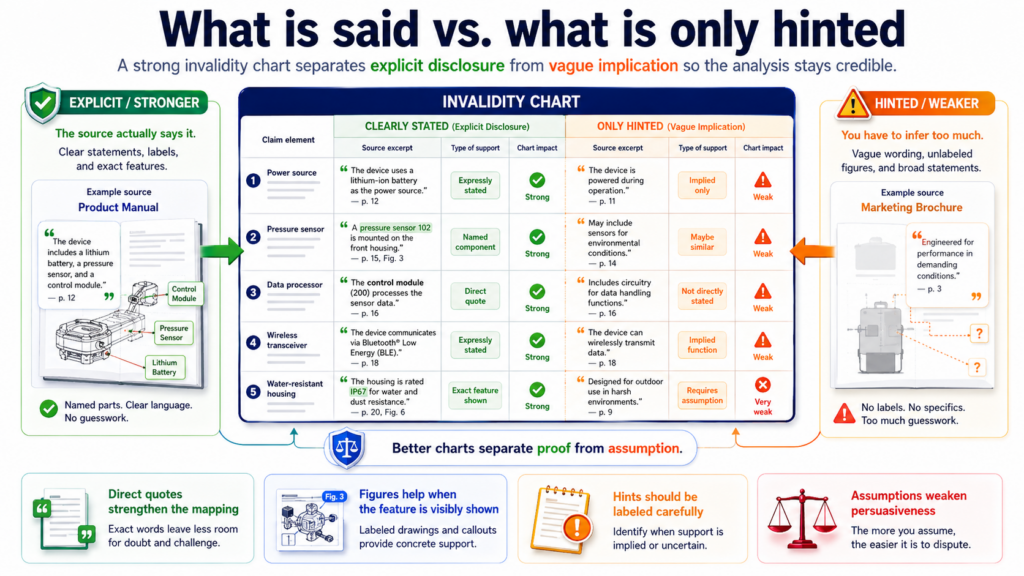
They may hint at a feature. They may show part of a workflow. They may use broad words that sound close to the claim, but do not fully prove the claim part.
This is where the chart needs careful judgment. The goal is not to force the prior art to fit. The goal is to show what the prior art truly teaches.
A good chart makes the difference clear between a direct teaching, a reasonable reading, and a guess.
The safest chart language stays close to the proof
When the prior art directly says a server receives image data from a camera, the chart can say that. When it only shows a network diagram with a camera connected to a server, the chart should be more careful.
It can explain that the figure appears to show image data moving from the camera to the server, but the text should be checked for more support.
This kind of careful writing helps the chart stay credible. It also helps the team avoid overplaying a weak reference.
Strong patent work depends on trust. Once a reader sees that a chart stretches one claim part too far, they may doubt the rest of the chart.
A good rule is simple: never make the chart say more than the reference can support. If the reference shows the feature, show it. If it suggests the feature, say that it suggests it. If it does not show the feature, do not hide the gap.
The strongest charts use plain words to mark the level of support
A chart does not need loud labels to show strength. The writing can do that naturally. A direct match might say the reference describes the same step.
A weaker match might say the reference appears to show the step, but more support may be needed. A missing part might say the current reference does not clearly disclose that limit.
This is useful because it turns the chart into a working tool. The reader can see which parts are ready and which parts still need research.
It also helps founders and engineers talk with patent counsel in a clear way. They do not need to pretend every detail is settled. They can point to the chart and say which part needs more proof.
That honesty is not weakness. It is discipline. A chart that admits uncertainty is often more valuable than a chart that sounds certain about everything. Patent decisions can be expensive. False confidence can cost more than a clear gap.
This same lesson applies when filing your own patents. Do not rely on vague words to describe what you built. Capture the real technical steps, the real data path, and the real reason the invention works.
PowerPatent helps founders do that faster, with smart software that structures the invention story and real attorney oversight that helps keep the work grounded. You can see the process here: https://powerpatent.com/how-it-works
A strong chart handles software and AI claims with extra care
Software and AI claims can be tricky because the important work often happens behind the screen. A user may only see a button, a result, or an alert.

But the claim may focus on what happens inside the system: how data is received, how a model is trained, how a score is made, how a rule is applied, or how an output changes the next action.
That means the chart cannot stop at the user interface. A screenshot may help, but it may not prove the hidden step.
The chart should look for documents that explain the system flow, model process, data inputs, and backend behavior.
AI terms should be mapped to real technical facts
A claim may use words like model, training data, feature vector, classifier, embedding, confidence score, or prediction.
Those words should not be treated as magic. The chart should ask what each term means in the claim and what the old reference actually shows.
If a prior art paper describes a trained neural network that receives sensor values and outputs a failure score, that may be strong support for a model-based claim.
If a product page says the system uses “smart insights,” that may be too vague. It may suggest intelligence, but it may not prove a trained model. The chart should make that difference clear.
The same care applies to training. A claim may require training a model using a certain set of data. An old reference that only uses a fixed rule may not match.
An old reference that says a model was trained on past device readings may be much stronger. The chart should not assume training just because a system makes predictions.
Code, papers, model cards, and product docs can each prove different pieces
For software and AI claims, no single source always tells the whole story. A paper may explain the model. A product manual may show the user workflow. A code repo may show the actual logic.
A release note may show when the feature became public. A demo video may show the feature in action.
A strong chart can use these sources carefully, but it should not mix them in a confusing way. Each source should have a job. If the code proves the scoring step, cite the code.
If the manual proves the alert screen, cite the manual. If the paper proves the training method, cite the paper. If the archive proves the date, note that clearly.
This is where modern founders need a smarter patent process. Invention details often live across code, product specs, Slack notes, diagrams, and model experiments. If those details are not captured early, the patent story can become thin or confused.
PowerPatent helps technical teams bring those pieces together and pairs the workflow with attorney review, so the patent work better reflects what was actually built. Learn more here: https://powerpatent.com/how-it-works
The best chart does not ignore product reality
Patent claims live on paper, but real products live in messy systems. A claim may describe one clean flow, while the actual product has edge cases, settings, versions, and optional features.
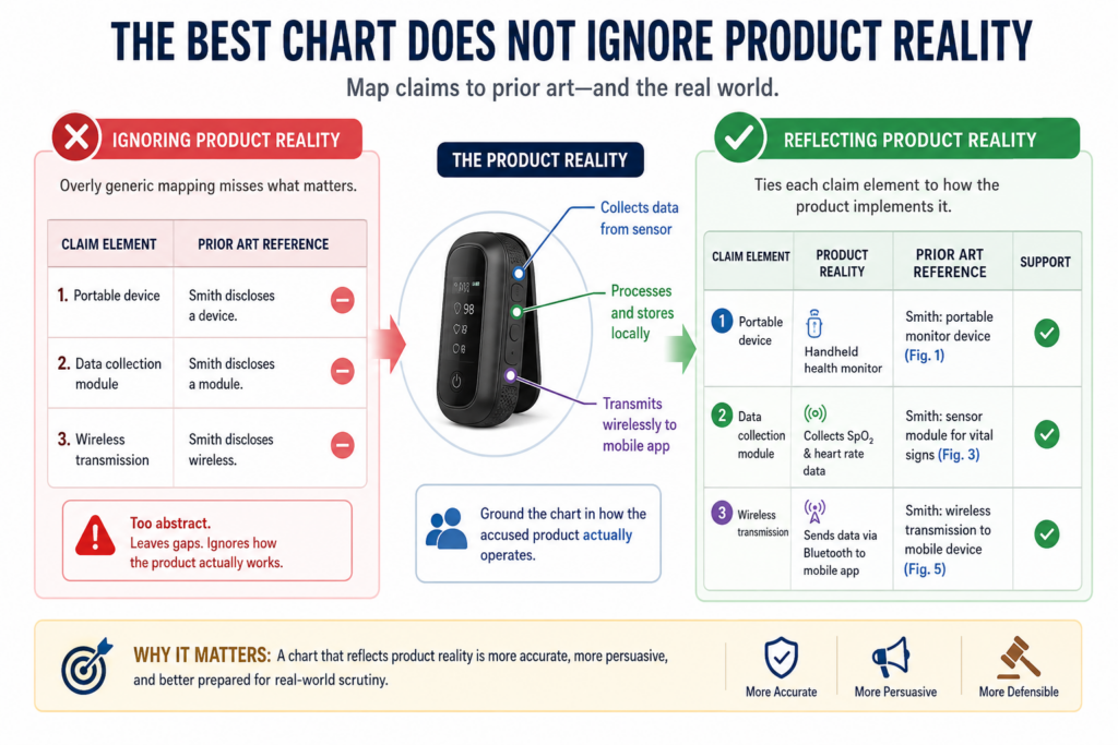
Prior art can have the same problem. An older product may include the feature in one version but not another. A manual may describe an option that users had to turn on. A video may show a demo build, not the released product.
A useful chart pays attention to this reality. It does not just ask whether a feature existed somewhere.
It asks whether the proof shows the feature in a way that maps to the claim and matters for the chart’s purpose.
Version control can decide whether the proof is strong
When prior art comes from a product, version details matter. A feature may have been added in version 2.0, changed in version 3.1, and removed later.
If the chart uses a manual from the wrong version, the mapping may be weak. If the patent date falls between versions, the timing can become central.
This is why product-based prior art should be handled with care. The chart should identify the product name, version, date, and source of the document.
If possible, it should show that the relevant feature was public and available before the patent’s key date.
The same is true for software releases. A public repo can be strong prior art, but the chart should point to the right commit, release tag, branch, or documentation page.
A current code file may not prove what existed years ago. The chart should avoid using today’s version as if it proves the past.
Real product proof often needs more than one document
A product manual may show how the feature works. A release note may show when the feature launched. An archived page may show that the product was public.
A user forum may show that customers used the feature. A video may show the workflow. Together, these sources can create a stronger picture.
But the chart should keep the roles clear. Do not use a release note to prove technical detail if it only proves timing.
Do not use a screenshot to prove backend processing if it only shows the final result. Do not use a marketing page to prove a specific algorithm unless it actually describes that algorithm.
This level of care makes the chart more useful and more believable. It also helps a startup understand its own records.
If your company is building something important, keep clean notes about releases, demos, architecture, and model changes. Those records can matter later.
PowerPatent helps founders protect inventions while the details are still fresh, not months later when everyone is trying to remember what changed and when.
The platform combines guided software with real attorney oversight, so teams can move fast while still building stronger patent assets. See how it works here: https://powerpatent.com/how-it-works
A chart should be reviewed like a product before anyone relies on it
A claim chart should not be treated as done just because the boxes are filled. It should be reviewed. It should be tested.
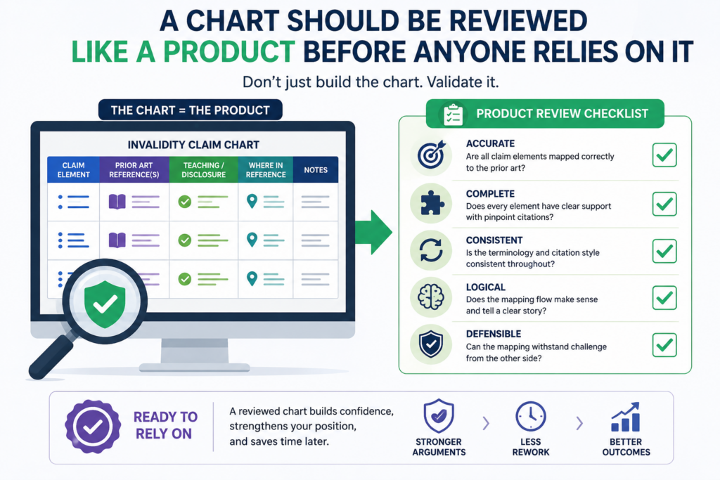
It should be challenged. A weak chart can create bad strategy. A clean review can turn a decent chart into a much stronger one.
Think of the chart like a product feature before launch. You would not ship code without checking the edge cases.
You should not rely on a claim chart without checking the weak spots. The review should ask whether the claim was split correctly, whether the prior art is old enough, whether the citations are exact, and whether the explanation is fair.
The first review should look for missing claim limits
The easiest way to test a chart is to read only the claim parts first. Then ask whether every word that matters has been mapped.
This catches many mistakes. It can reveal that the chart mapped the main feature but skipped timing, order, location, user action, automation, or a required connection between steps.
After that, read the prior art support. Ask whether the cited text or figure actually proves the claim part.
If the explanation depends on a leap, mark it. If the cite is too broad, tighten it. If the quote is too long, trim it and add a clearer explanation. If the source is weak, look for a better one.
This review should be direct but not harsh. The goal is not to defend the first draft. The goal is to improve the chart until it can support a real decision.
Engineer review and attorney review should work together
Engineers often see technical gaps that others miss. They can tell whether a data flow is real, whether a model is actually trained, whether a device could perform the claimed step, or whether the old system only looks similar on the surface. Their review can make the chart much sharper.
Attorney review adds a different layer. A patent attorney can help assess whether the mapping lines up with the claim language, whether the prior art theory is sound, and where legal risk remains.
The best review uses both views. The engineer helps ground the chart in technical reality. The attorney helps make sure the argument is usable.
This is the same balance PowerPatent brings to patent filing. Founders and engineers know the invention best.
Attorneys know how to protect it. Smart software can make the process faster and clearer, but human review still matters.
That is why PowerPatent combines guided invention capture with real attorney oversight. You can explore the workflow here: https://powerpatent.com/how-it-works
Conclusion
A strong invalidity claim chart does more than compare words. It helps founders see risk, protect money, and make faster decisions with less fear. When you break claims into clean parts, map each part to solid prior art, track dates, and explain the match in plain language, the whole patent story becomes clearer.
That clarity matters whether you are defending your company or filing your own patents. PowerPatent helps technical teams capture inventions, avoid gaps, and move faster with smart software plus real attorney oversight. See how it works here: https://powerpatent.com/how-it-works
Leave a Reply