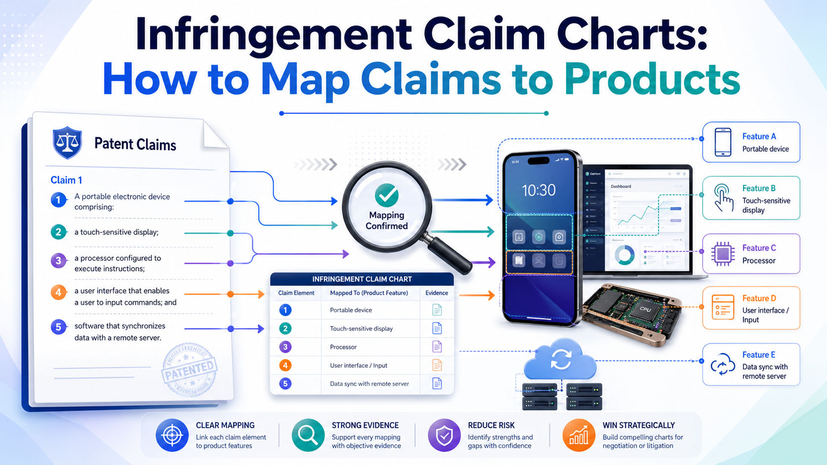
An infringement claim chart is simple in idea. It takes the words of a patent claim and lines them up against a real product, feature, system, app, chip, model, or process. The goal is to show, step by step, where each part of the claim appears in the product.
An infringement claim chart shows whether a product lines up with a patent claim
A patent claim is the part of a patent that says what the invention covers. Think of it as the fence around the idea.
An infringement claim chart looks at that fence, piece by piece, and checks whether a product steps inside it.
This is not guesswork. It is not a feeling that a competitor “copied us.” It is a careful match between claim words and real product facts. The chart forces you to slow down and prove each part.
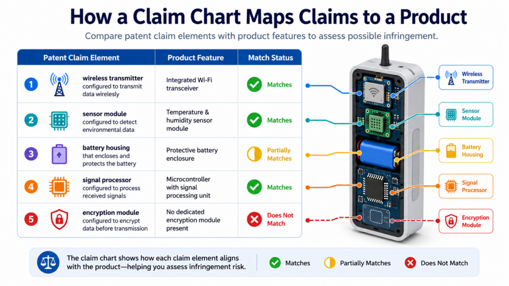
A claim chart is not just a table
Most people think a claim chart is just a table with two sides. One side has the claim language. The other side has proof from the product. That is true, but it is not the full story.
A good chart is really a story of proof. It says, “Here is what the patent requires. Here is where the product does that same thing.
Here is the source that backs it up.” When done well, the reader does not have to guess. They can follow the logic from start to finish.
The chart should make the hard parts feel clear
The best claim charts are calm, clean, and direct. They do not shout. They do not use big words to hide weak facts. They show the match in a way that a founder, engineer, investor, or attorney can understand fast.
This matters because patent claims can feel dry and strange. Product features can also be complex, especially in AI, chips, robotics, biotech tools, software systems, and deep tech platforms. The chart is the bridge between those two worlds.
If your startup is building something hard to explain, this bridge becomes even more important.
PowerPatent helps founders turn technical work into stronger patent assets with smart software and real attorney oversight. You can see how that process works at https://powerpatent.com/how-it-works.
The first job is to understand the claim before looking at the product
Many teams make the same mistake. They start with the product first. They see a feature that looks close to their invention, then they rush to say there is a match.
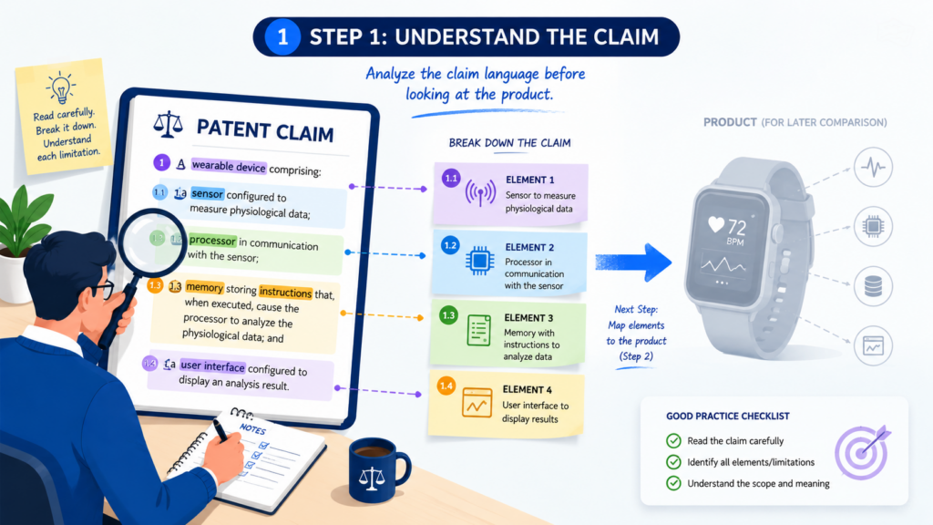
That is risky. The right way is to start with the patent claim. You need to know what the claim actually requires before you decide whether a product meets it. A claim may look broad at first, but one small phrase can change everything.
Read the full claim as one complete idea
A patent claim is written as one long sentence. That sentence may have many parts, but those parts work together. You cannot pick the exciting words and ignore the boring ones.
For example, a claim might talk about a system that receives data, trains a model, sends a signal, and updates a device.
If the product only receives data and trains a model, that may not be enough. The chart must account for each required step.
Every word can matter when you map the claim
Small words can carry big weight. Words like “before,” “after,” “based on,” “in response to,” “stored in,” and “by the device” can decide whether there is a real match.
This is where founders should be careful. A product may seem close at a high level, but the claim chart lives at the detail level.
The question is not, “Does this product feel similar?” The question is, “Can we show that this product has every required part of the claim?”
Break the claim into clean pieces before you build the chart
Once you understand the claim as a whole, you need to break it into pieces. These pieces are often called claim elements. In plain words, each element is one required part of the claim.
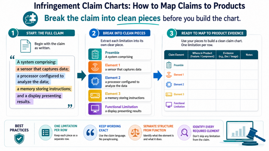
This step is where the chart starts to become useful. A long claim can feel hard to manage. But when you split it into smaller parts, you can test each part one at a time.
Each claim element should ask one clear question
The point is not to cut the claim into random chunks. The point is to turn the claim into clear proof questions.
For example, if the claim says the system receives sensor data from a wearable device, your chart should ask whether the accused product receives sensor data from a wearable device.
If the claim says the system updates a risk score based on that data, your chart should ask whether the product updates a risk score based on that data.
Clean claim splitting prevents weak arguments later
Messy claim splitting leads to messy charts. If one row includes too many ideas, the evidence becomes unclear. The reader may not know which part of the product is being matched to which part of the claim.
A clean chart makes each row focused. One row should cover one real requirement, or at least one tight group of words that work together. This makes the chart easier to review, easier to improve, and easier to defend.
The product side of the chart must be based on real evidence
A claim chart is only as strong as the evidence behind it. You may believe a competitor’s product works a certain way, but belief is not enough. You need sources.
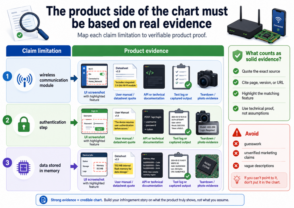
Evidence can come from public pages, product manuals, help docs, developer docs, white papers, app screens, demos, code behavior, API docs, marketing pages, patents, research papers, teardown notes, or test results.
The key is that the evidence must support the exact claim element.
Good evidence is specific, not vague
Weak evidence says a product is “smart,” “automated,” “AI-powered,” or “real time.” That may sound useful, but it often does not prove much.
Strong evidence shows what the product actually does. It may show that the product receives a certain input, performs a certain calculation, stores a certain value, sends a certain command, or changes a certain output.
The more specific the evidence, the more useful the chart becomes.
Screenshots and source links should tell the same story
When you use screenshots, they should not sit alone. A screenshot should connect to the claim language. The chart should explain what the screenshot shows and why it matters.
The same is true for links. Do not dump a link into the chart and expect the reader to figure it out. The chart should point to the exact part of the source that supports the match. A good claim chart saves the reader work.
The strongest charts use simple language to explain the match
A claim chart is not the place to show off. It is the place to make the match easy to see. That means the explanation should be plain, direct, and tied to the words of the claim.
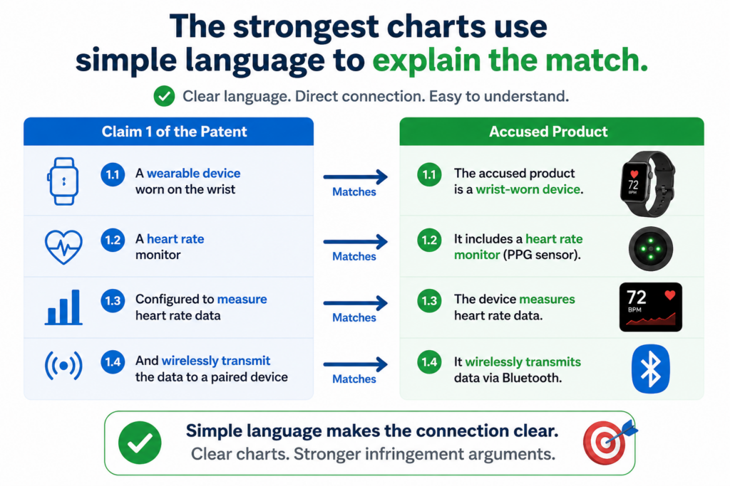
This is especially important when the product is technical. If the chart is full of thick language, the reader may miss the point. Clear writing is not less serious. Clear writing is often more powerful because it leaves less room for confusion.
The chart should explain why the evidence matters
Do not just paste product text next to claim text. Explain the link between them.
If the claim requires “generating a prediction based on input data,” and the product docs say the tool “uses uploaded activity data to predict churn risk,” the chart should say that the uploaded activity data maps to the input data, and the churn risk prediction maps to the generated prediction. That simple bridge is what makes the chart useful.
A good row should feel like a small proof
Each row should feel complete. The reader should see the claim part, the product fact, and the reason the two line up.
This does not mean each row must be long. It means each row must be clear. A short, exact explanation is better than a long paragraph that circles around the point.
Do not ignore the missing pieces because they are where the truth lives
The most useful part of a claim chart is not always the match. Sometimes the best value comes from finding what does not match.
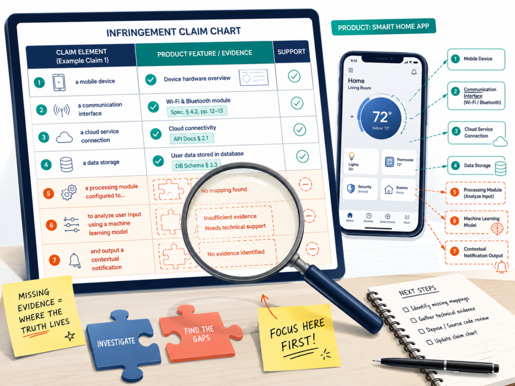
That may feel frustrating, but it is useful. If one claim element is missing, the chart helps you see the problem early. That can save a founder from spending time and money on a weak path.
A gap is not a failure if you find it early
A gap may mean the product does not infringe that claim. It may also mean you need better evidence.
Sometimes the feature is there, but it is not public. Sometimes the product works differently than you first thought. Sometimes another claim in the patent is a better fit.
This is why claim charts are not just for disputes. They are also tools for strategy. They help you decide what to do next with more confidence.
Mark uncertain points instead of forcing the match
Do not force a row just because you want the chart to look strong. If the evidence is weak, say so. If a fact is unknown, mark it as unknown. If more testing is needed, state that clearly.
This honest approach helps everyone. It gives attorneys better material to review. It helps business teams make better calls. It also protects founders from building a plan on shaky ground.
PowerPatent is built for this kind of careful work. The platform helps technical teams capture invention details early, shape them into stronger patent filings, and work with real patent attorneys without losing speed. Learn more at https://powerpatent.com/how-it-works.
Start with the right claim because not every claim deserves a chart
Before you map a patent to a product, choose the claim with care. This choice matters more than many teams think. A patent may have many claims, but not all of them are good targets for a claim chart.
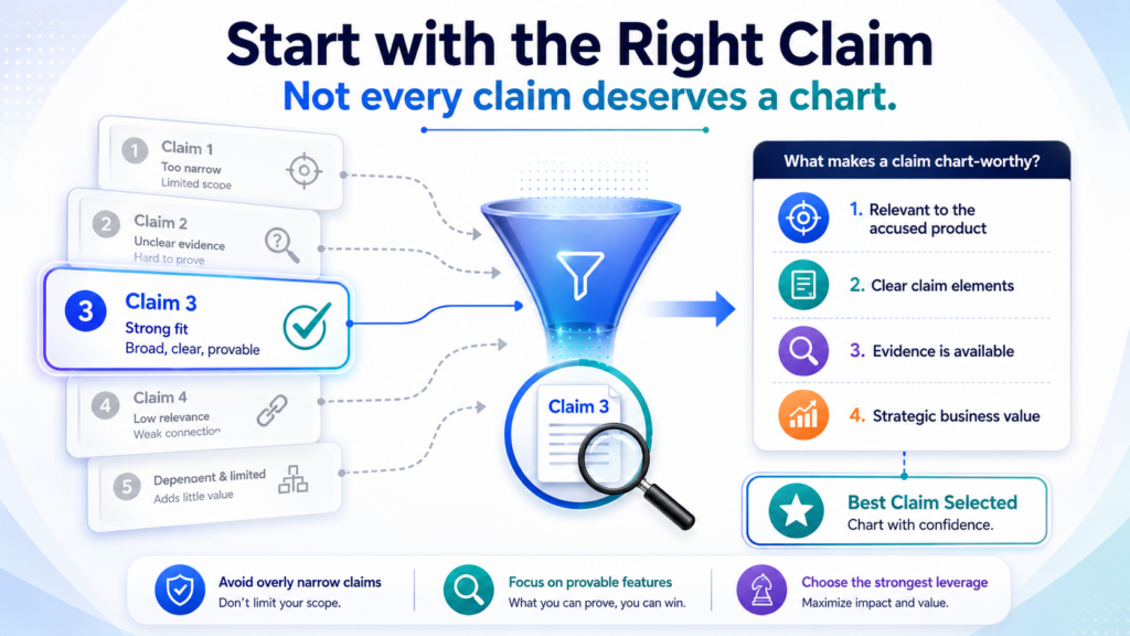
Some claims may be too narrow. Some may include steps that are hard to prove from the outside.
Some may cover a version of the invention that is not close to the product you are studying. The best claim is usually the one that gives you a clear path from the claim words to product proof.
A strong chart often starts with one claim, not ten. When you try to chart too many claims at once, the work can become messy.
It is better to build one clean, careful chart first. Then you can decide whether other claims deserve the same treatment.
The best claim is often the one with the easiest proof path
A claim can be powerful on paper, but hard to use in the real world. For example, a claim may require a hidden server step, a private model update, or an internal control process. If you cannot prove that step from public facts, the chart may hit a wall.
That does not mean the claim has no value. It means you need to know what kind of proof is needed.
Public evidence may be enough for some claim parts. For other parts, testing, product use, expert review, or later discovery may be needed.
This is why the claim choice should be practical. You are not just asking which claim sounds broad. You are asking which claim can be mapped with facts that someone can check.
A founder should look for claim words that connect to visible product behavior
Visible product behavior is often easier to chart. This may include user screens, data flows, inputs, outputs, settings, reports, alerts, APIs, device actions, model results, or hardware responses.
For a software product, visible behavior may include what happens when a user uploads data, clicks a button, trains a workflow, receives a score, or gets an alert.
For a device, visible behavior may include sensor readings, power changes, output signals, movement, display updates, or network messages.
The more you can observe, the easier the chart becomes. The less you can observe, the more careful you must be.
This is also why strong patent drafting matters from day one. If claims are written with real product proof in mind, they can be easier to enforce later.
PowerPatent helps founders capture technical details early and work with real patent attorneys to shape stronger patents before the market gets crowded. You can explore that process at https://powerpatent.com/how-it-works.
Read the product like an engineer, not like a fan or critic
When mapping claims to a product, your job is not to praise the product or attack it. Your job is to understand how it works. That means you need to read product material with an engineer’s eye.
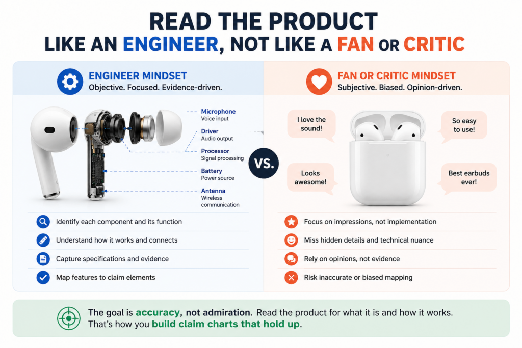
Marketing pages are useful, but they are often broad. They may tell you the product is fast, smart, secure, or automated.
That can help you find leads, but it rarely proves the full claim. You need to dig deeper into the material that shows actual function.
Look for pages that explain setup, data flow, user actions, system behavior, configuration, outputs, or technical architecture.
Developer docs, support pages, API references, demo videos, release notes, help center pages, white papers, and product screenshots often give better evidence than a homepage.
Your goal is to find product facts, not product promises
A product promise says what the company wants buyers to believe. A product fact shows what the system does.
For example, a promise might say, “Our platform improves decision-making with AI.” That is too broad.
A product fact might say, “The platform receives transaction records, detects abnormal patterns, assigns a risk score, and sends a review alert.” That is much more useful for a claim chart.
The second version gives you parts you can map. You can compare “receives transaction records” to a claim element about receiving input data.
You can compare “assigns a risk score” to a claim element about generating an output value. You can compare “sends a review alert” to a claim element about transmitting a notification.
The best evidence often comes from boring pages
Do not skip the boring material. Help docs, setup guides, admin manuals, SDK notes, and integration pages can be gold. They are written to help users operate the product, so they often reveal details that marketing pages leave out.
A support page may show what data is imported. A setup guide may show which system performs a step.
An API doc may show the exact request and response. A release note may show when a feature was added. A demo transcript may show the workflow in action.
These sources can make a chart stronger because they give the reader concrete facts. They also reduce the need for guesswork.
Build each row so the reader can see the match without working hard
The best claim chart rows are easy to follow. They do not make the reader hunt for the point. They show the claim language, the product evidence, and the explanation in a clean path.
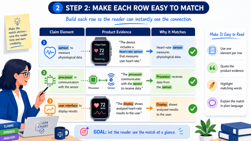
A weak row leaves the reader asking, “So what?” A strong row answers that question before it appears. It tells the reader what the claim requires, where the product shows that requirement, and why the match is fair.
This matters because the reader may not be deep in the technology.
They may be a founder, investor, business lead, attorney, engineer, licensing partner, or board member. Each person needs to understand the chart quickly enough to make a smart decision.
Each row should carry one clear idea from claim to product
When a row tries to do too much, it loses force. If one claim element includes several ideas, you may need to explain them in a careful order. The goal is not to make the chart longer. The goal is to make it readable.
For example, if the claim requires receiving image data, detecting an object, and sending a command based on the detected object, do not bury all of that inside a vague product quote.
Show how the product receives image data. Then explain how it detects the object. Then explain how it sends the command because of that detection.
The reader should feel like each step is natural. One fact leads to the next. The product evidence should sit close to the claim language it supports.
Good chart writing is plain, exact, and steady
Plain writing does not mean weak writing. It means the argument is easy to understand. In a claim chart, simple words are your friend.
You might write that the product appears to meet this claim element because its documentation shows that the system receives temperature readings from connected sensors and uses those readings to adjust the device setting. That kind of sentence is easy to read, but it still does real work.
Avoid dramatic language. Do not say the product “clearly steals” the invention. Do not say the match is “undeniable” unless the evidence truly supports that level of confidence. The chart should sound calm because calm proof is more persuasive than loud claims.
Treat hidden features with care because guessing can damage the chart
Many modern products hide the most important steps. AI systems may hide model training. Cloud tools may hide server actions.
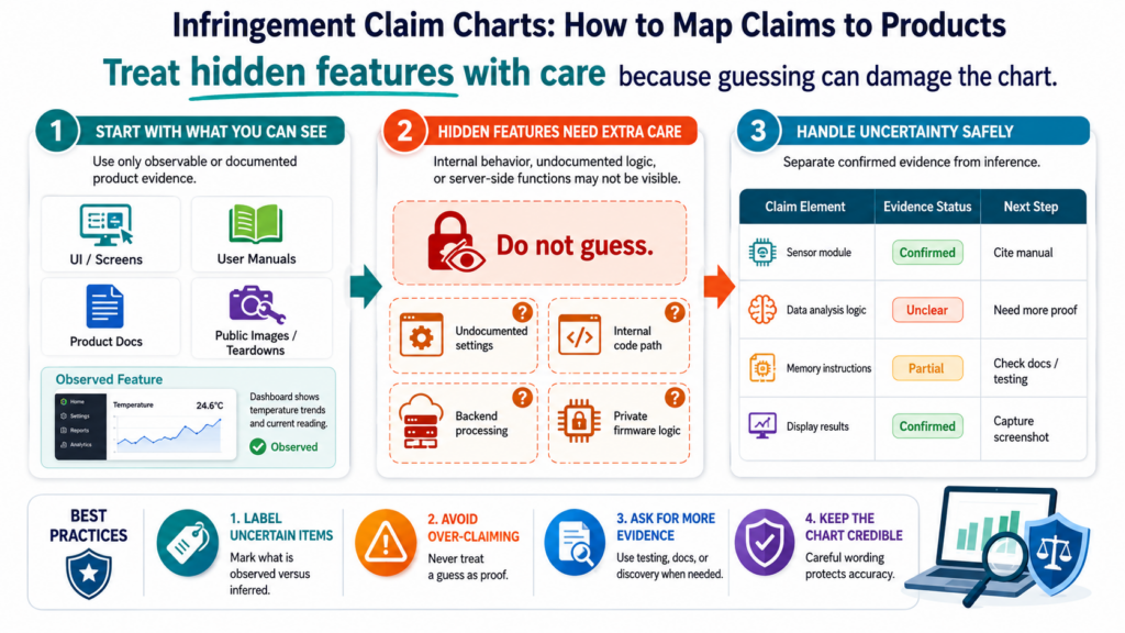
Chip products may hide internal signal paths. Medical tools may hide processing logic. Robotics products may hide control loops. Cybersecurity products may hide detection rules.
This creates a common problem. The claim may require something that likely happens inside the product, but the public evidence may not show it directly. That is where many weak charts go wrong.
They jump from “the product probably does this” to “the product does this” without enough support.
A better chart is honest about what is known and what is inferred. It can still be useful, but it must separate hard evidence from reasoned analysis.
An inference should be tied to product behavior and technical logic
An inference is a careful conclusion based on facts. It is not a wild guess. If the product produces an output that would normally require a certain process, you may be able to explain why that process is likely present.
For example, if a product claims to generate a custom route based on live traffic, user location, and vehicle limits, it may be reasonable to infer that the system receives those inputs and processes them to create the route.
But the chart should still point to the product material that supports each input and output.
The more technical the inference, the more care it needs. A good chart may say that the evidence suggests a match, but further testing or internal records may be needed to confirm the hidden step.
Do not turn a maybe into a fact just to make the chart look complete
A chart with honest limits is stronger than a chart that overstates the case. When you force a match, you create risk. Someone reviewing the chart may lose trust in the whole document if they find one row that goes too far.
It is better to write that the current public evidence does not confirm this element, but the product behavior suggests it may be present. Then state what proof would help.
That proof might be a technical test, a packet capture, a product teardown, a source code review, a user workflow test, or an internal document later in the process.
This kind of honesty helps a team make better choices. It also helps attorneys focus on the real issues instead of cleaning up overstatements.
Use screenshots and citations like proof, not decoration
Screenshots can make a claim chart much easier to understand. But screenshots are not decoration. They should prove something specific.
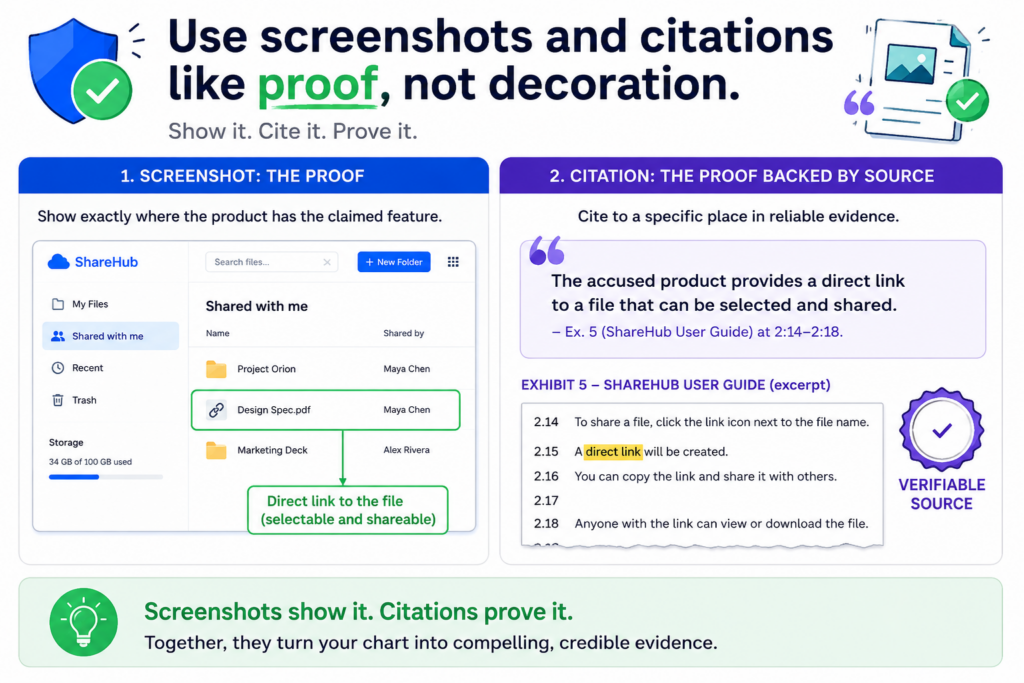
A screenshot of a dashboard may show that a product displays a risk score. A screenshot of a settings page may show that the product receives sensor data from a connected device.
A screenshot of an API response may show that the system sends a certain value after processing an input.
The screenshot should be close to the point it supports. Do not attach a pile of images at the end and expect the reader to connect them. Put the evidence where it matters.
Every screenshot should have a job
Before adding a screenshot, ask what it proves. If it does not prove a claim element or support a key inference, it may not belong in the chart.
A strong screenshot is often paired with a short explanation. The explanation should tell the reader what to notice.
For example, it may say that the screenshot shows the product receiving uploaded machine data and generating a predicted failure date. That connects the image to the claim.
Screenshots should also be saved carefully. Product pages change. Features move. Companies update docs. A chart should preserve what was seen, where it was found, and when it was captured.
Source details protect the chart from confusion later
Good source tracking matters. For each source, keep the page title, URL, access date, screenshot date, document version, product version if known, and any other details that may help later.
This may feel like extra work, but it can save time when the chart is reviewed months later.
Without source details, people may ask where the evidence came from or whether it still exists. With source details, the chart feels organized and dependable.
Strong patent work is not just about filing. It is about building assets that can stand up when they matter.
PowerPatent gives founders a better way to capture inventions, review them with attorney oversight, and move faster without losing quality. See how it works at https://powerpatent.com/how-it-works.
Map the product to the claim, not the claim to your hopes
This may be the most important rule in the whole process. You do not bend the claim to fit the product. You do not bend the product to fit the claim. You place them side by side and let the facts decide.
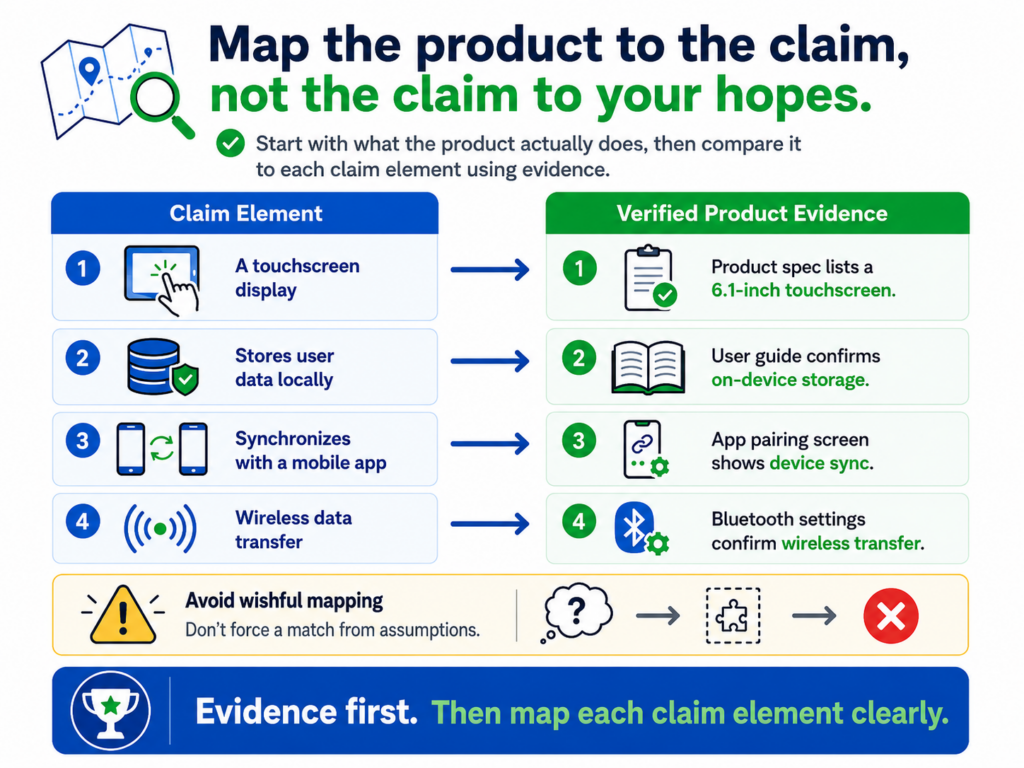
Founders are close to their inventions. That is natural. When you have spent years building something, it can feel obvious when another product seems too close. But a claim chart requires discipline. It asks you to move from emotion to evidence.
That shift is powerful. It helps you see the real strength of your patent position. It also helps you avoid weak moves that could burn money, time, and focus.
A strong chart makes business choices easier
The goal of a claim chart is not always to sue someone. In fact, many charts are used long before any dispute.
They can help with licensing talks, investor diligence, competitor review, patent sales, portfolio planning, product design, and internal strategy.
A chart can show that a patent may cover a key market feature. It can show that a competitor may be using the same technical path.
It can show that a claim needs more evidence. It can also show that the patent does not reach as far as the team thought.
That is useful business intelligence. It turns vague concern into a practical decision tool.
The real win is knowing what to do next
Once the chart is built, the next move becomes clearer. The team may decide to collect more evidence. It may ask counsel to review the chart. It may compare other claims.
It may study other products. It may prepare for a licensing conversation. It may also decide not to act because the match is too weak.
That is not a loss. That is control.
A good claim chart gives founders the thing they need most: a clearer view of risk, value, and options.
A strong chart starts with the exact claim language, not a summary
The first column of the chart should use the real claim language. Do not rewrite the claim in your own words and treat that as the claim. A summary can help you think, but the chart itself should stay close to the actual words.
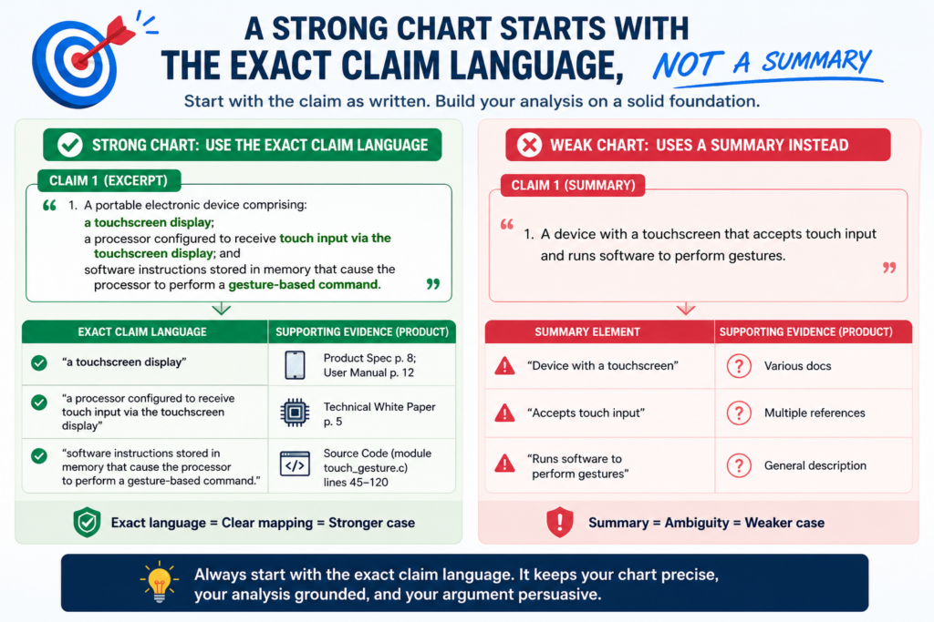
This matters because patent claims are precise. A single word may limit the claim.
A small phrase may require a certain order, place, device, action, or data type. If you summarize too early, you may smooth over the very words that decide whether the product matches.
A useful way to work is to copy the full claim first, then break it into smaller parts.
After that, you can add plain-language notes to explain what each part means. This keeps the chart grounded in the patent while still making it easy to read.
The claim language should stay visible throughout the chart
When the claim language is visible, the reader can check your work. They can see whether the evidence supports the exact words in the claim. They do not have to trust your memory or your summary.
This also helps technical teams stay honest. Engineers may see a product feature and think it matches their invention.
But when the actual claim words are in front of them, they may notice that the claim requires more than the feature they first saw.
For example, a claim may not just require “detecting motion.” It may require “detecting motion using a sensor mounted within a housing.”
That extra phrase matters. A product that detects motion through a remote camera may not fit the same way.
Plain-language notes should explain, not replace, the claim
Plain notes are helpful, but they should sit beside the claim language, not replace it. They can explain what a phrase means in everyday words. They can also help business readers understand why the element matters.
A good note may say that this part of the claim requires the product to receive a certain kind of data before creating an output. That kind of note helps the reader follow the chart without changing the claim.
This balance is key. The chart should be simple enough for a founder to use, but careful enough for an attorney to review.
The product evidence should be tied to the same time period as the concern
Products change. A feature that exists today may not have existed last year. A feature shown in an old manual may have been removed.
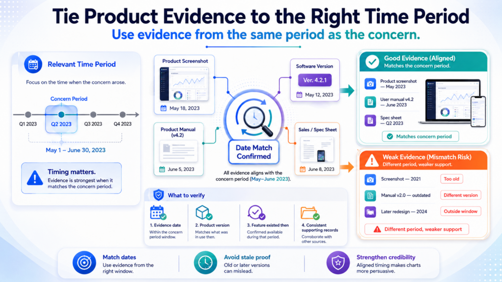
A demo page may show a future feature that is not yet live. This is why timing matters in a claim chart.
When you map claims to a product, you should ask when the product had the feature. You should also ask whether the evidence shows the current version, a past version, a beta version, or a planned release.
This is not just paperwork. Timing can shape the whole strategy. If the product only added the feature recently, that may affect damages, licensing talks, or business urgency.
If the feature was present for years, that may tell a different story.
Version details can make the chart much stronger
Whenever possible, tie the evidence to a product version, release date, user guide date, app version, model number, firmware version, API version, or public launch date.
These details help the reader understand what product you are actually charting.
For software, this may mean noting the date of a help center page, the version of an API, or the date a feature appeared in release notes. For hardware, it may mean noting the model number, chipset, firmware, or product generation.
Without these details, the chart can become unclear. People may later ask whether the evidence applies to the right product.
They may also ask whether the feature was available in the market or only described in a future-facing page.
A claim chart should avoid mixing versions without saying so
One common mistake is mixing evidence from different versions of a product.
A chart may use a screenshot from the newest interface, a manual from an older product, and a marketing page for a future release. If the chart does not explain this, it can create confusion.
Sometimes mixed sources are fine. They may show the same feature across several versions. But the chart should say that clearly. If the evidence comes from different versions, make that visible.
A careful chart does not hide timing issues. It brings them into the open so the team can make better decisions.
A useful chart explains the product workflow from start to finish
Many claim charts fail because they treat each row like a separate island. The rows may contain useful facts, but the full story is hard to follow. The reader sees pieces, but not the flow.
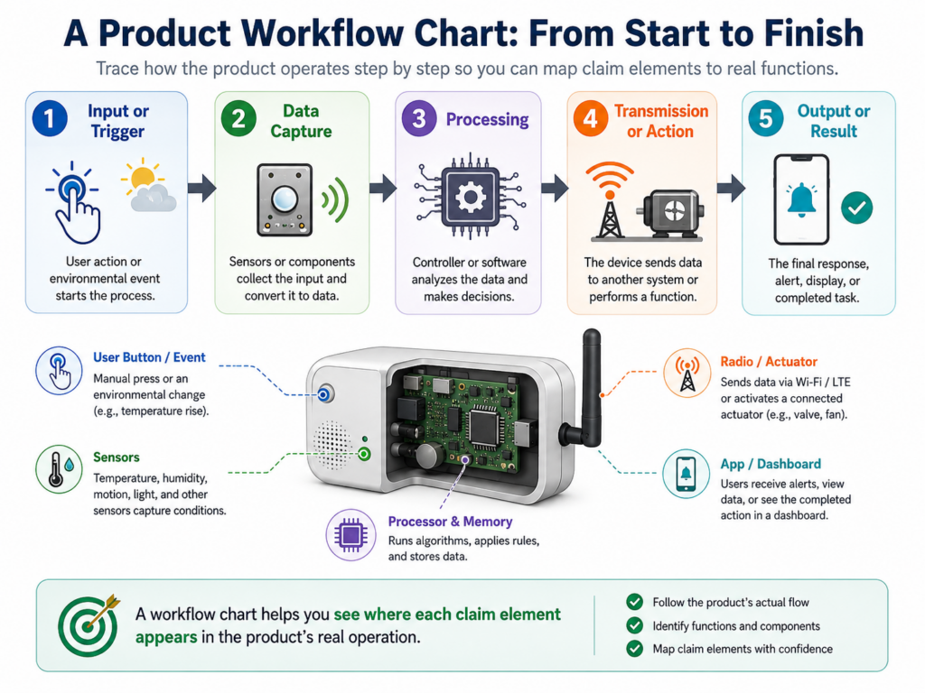
A stronger approach is to understand the product workflow first. What enters the system? What happens to it? What changes? What does the user see? What does the device do? What output is created? What happens after that?
When you know the flow, the chart becomes more natural. Each claim element can be matched to a real step in the product.
The workflow helps you find the right evidence for each element
Suppose a claim covers a system that receives sensor data, filters the data, detects a fault, creates a risk score, and sends an alert. If you understand the product workflow, you can look for evidence at each stage.
You might find sensor input in a setup guide. You might find filtering in a technical white paper. You might find fault detection in product docs.
You might find the risk score in a dashboard screenshot. You might find the alert in a help center article.
Each source supports a different part of the story. Together, they make the chart feel complete.
A workflow view also helps expose weak spots
When you draw the product flow in your mind, gaps become easier to see. You may realize that you have proof of the input and output, but not the middle step.
You may realize that the product sends an alert, but the evidence does not show what causes the alert.
That is helpful. It tells you where more work is needed. You may need testing. You may need a technical expert. You may need to review other public sources. You may need to chart a different claim.
The point is not to make every product fit. The point is to see the truth clearly enough to act with confidence.
PowerPatent helps founders protect what they are building before these hard proof questions become urgent.
With smart software and real attorney oversight, teams can move from raw technical ideas to stronger patent filings faster. See how it works at https://powerpatent.com/how-it-works.
The best charts use careful words when the evidence is not complete
Not every row will have perfect evidence. That is normal. Public product information is often incomplete.
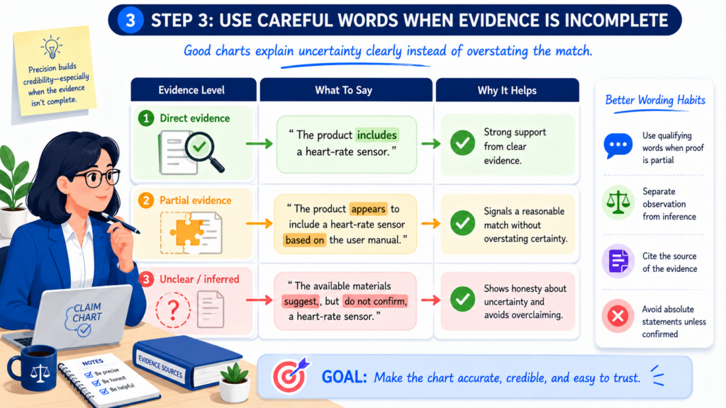
Companies do not always explain how their systems work behind the scenes. A competitor is not going to hand you a neat proof packet.
This is where wording matters. The chart should be firm where the evidence is firm. It should be careful where the evidence is partial. The right words help the chart stay useful without overstating the case.
You can say that the product documentation states a feature. You can say that a screenshot shows a certain output.
You can say that public materials suggest a hidden process. You can say that further testing may be needed to confirm an internal step.
Careful wording protects trust
Trust is the currency of a claim chart. Once the reader sees that you are honest about weak points, they are more likely to trust your strong points.
Overclaiming has the opposite effect. If one row says a product “clearly” performs a step, but the evidence only hints at it, the whole chart starts to feel shaky. That can hurt the business discussion, the legal review, and the next decision.
A strong chart does not need hype. It needs clean proof and careful reasoning.
Use confidence levels in the writing, not as a gimmick
You do not need a fancy score system to show confidence. Simple language can do the job.
For a strong row, you might write that the product documentation shows the claimed feature because it describes the same input, process, and output.
For a weaker row, you might write that the product appears to perform the claimed step based on the observed output, but public materials do not confirm the internal logic.
That kind of writing helps the reader understand the strength of each row. It also makes it easier for an attorney to review the chart and decide what to do next.
A claim chart should help business teams act, not just help lawyers argue
An infringement claim chart is often seen as a legal tool. It is that, but it is also a business tool. For a startup, this point is important.
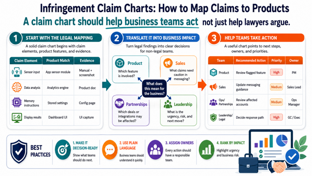
Founders do not have endless time. They cannot chase every possible issue. They need to know which patents matter, which products matter, and which actions make sense. A claim chart helps turn a vague concern into a grounded business choice.
It can support a licensing plan. It can help with investor talks. It can guide patent portfolio decisions.
It can help a team decide whether to keep watching a competitor or take the next step. It can also help show that a patent has real market value.
The chart should make the next move clearer
After reading the chart, a business team should have a better sense of what to do. If the chart is strong, the next move may be attorney review, deeper testing, licensing planning, or a broader product scan.
If the chart is weak, the next move may be to chart another claim, collect more facts, or put the issue aside.
Both outcomes are useful. A weak chart can save a startup from wasting energy. A strong chart can help a startup move with more confidence.
The key is that the chart should not end in confusion. It should make the facts clearer, the gaps clearer, and the options clearer.
The best patent strategy is built before the fight starts
Waiting until there is a problem is costly. By then, the market may be crowded. Competitors may already be shipping.
Investors may be asking hard questions. Evidence may be harder to collect. Your own invention story may be harder to reconstruct.
A better path is to build strong patent habits early. Capture invention details while they are fresh. File with care. Think about how claims may map to real products later. Keep your technical story clear.
That is the kind of work PowerPatent is built to support. It helps founders move fast, stay in control, and work with real patent attorneys without turning patents into a slow, painful process. Learn more at https://powerpatent.com/how-it-works.
The claim chart should separate direct facts from smart guesses
A good claim chart does not treat every statement the same. Some things are shown directly by the product.
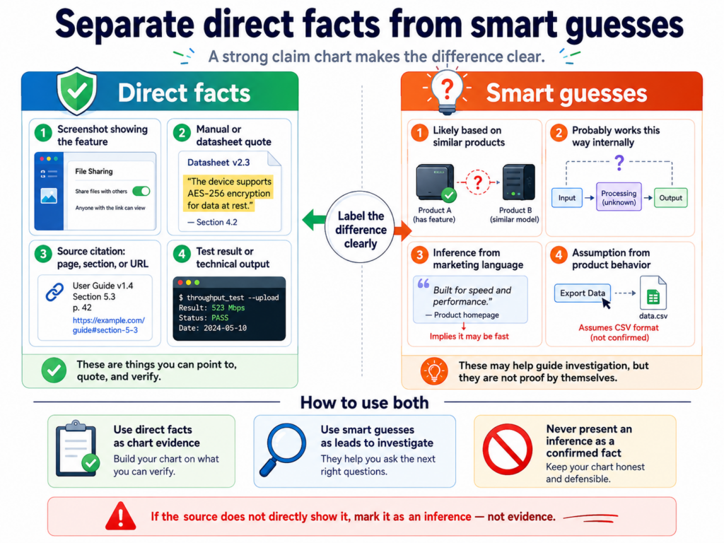
Other things are inferred from how the product behaves. Both can matter, but they should not be mixed together as if they carry the same weight.
Direct facts are the strongest. These are facts that come straight from the product, a manual, a screenshot, a demo, an API response, a public technical page, or a test result.
A smart guess, on the other hand, is a reasoned view based on what the product appears to do.
Direct evidence should be the backbone of the chart
Direct evidence gives the chart its base. It shows that the product has a feature, takes an input, produces an output, sends a message, stores data, updates a value, or performs some visible action.
For example, if a product page says the tool “imports machine sensor readings and predicts part failure,” that can directly support claim elements about receiving sensor data and generating a failure prediction.
If a dashboard screenshot shows a predicted failure date, that can support an element about presenting a prediction to a user.
The best charts rely on direct evidence wherever possible. This keeps the chart grounded and reduces the chance of overreach.
Smart guesses should be labeled with care and tied to clear facts
Sometimes a product does not reveal every internal step. That is common in software, AI, cloud systems, chips, and medical tools. In those cases, the chart may need to explain what appears likely based on the public facts.
For example, if a product says it predicts a machine failure using live sensor data, it likely processes that data before creating the prediction.
But the chart should not pretend the internal processing method is confirmed unless the evidence actually says so.
A careful chart may state that the product appears to perform the claimed processing step because its public materials show the same input and output.
It may also state that deeper testing or internal records would help confirm the match. That kind of wording is honest, useful, and more persuasive than a forced conclusion.
A chart should explain the meaning of claim words before arguing about the product
Sometimes the hardest part of a claim chart is not the product. It is the claim language itself. Patent claims often use words that sound simple but have a special meaning in context.
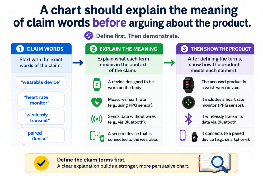
Before you decide whether the product matches a claim element, you need to understand what the claim element is asking for.
That does not mean turning the chart into a long legal memo. It means taking enough care so that the product comparison is fair.
The chart should respect the way the patent uses each term
A word in a claim may be explained by the patent description, drawings, examples, or other claims. The same word may also be shaped by how the patent uses it across the document.
For example, a claim may use the word “module.” In some patents, that may mean software code.
In others, it may mean a hardware part, a circuit, or a mix of hardware and software. You cannot assume the answer just because the word sounds familiar.
The chart should stay close to the patent’s own use of the term. This helps avoid a common mistake: mapping a product feature to a claim word based on a loose everyday meaning instead of the meaning supported by the patent.
Simple explanations can prevent big mistakes
A short plain-English note can help everyone read the chart the same way.
If the claim uses the phrase “training data,” the note might explain that the claim appears to require data used to adjust or build a model, not just any data shown to a user.
That simple note can change the product analysis. A product may display customer records, but that does not prove those records are used as training data. Without the note, the chart may jump too fast.
This is another reason founders should not treat patents as paperwork. The way claims are written can shape future options.
PowerPatent helps teams capture the real technical details behind the invention and work with patent attorneys who can shape those details into stronger filings. You can see how PowerPatent works at https://powerpatent.com/how-it-works.
The chart should show all required parts, not only the easy ones
A common weak chart shows the exciting match but skips the hard parts. It may prove that a product uses AI, receives data, or sends alerts.
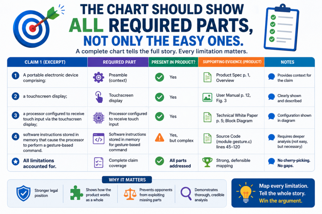
But if the claim also requires a certain kind of device, a certain order of steps, or a certain link between inputs and outputs, the chart must deal with that too.
A claim chart is not a highlight reel. It is a full check. Every required part of the claim must be considered.
One missing element can change the whole answer
In many cases, a product must meet each required part of the claim for the chart to support an infringement position.
That is why every element matters. A product can be very close in spirit and still miss a required claim element.
For example, a claim may require that a mobile device performs a step. If the product performs the step on a remote server, that difference may matter.
A claim may require that a value is updated “in response to” a certain event. If the product updates the value on a fixed schedule instead, that may matter too.
These details are not small when you are mapping claims. They are the work.
The hard rows deserve the most attention
The rows that feel uncertain are often the most important rows in the chart. Do not hide them. Do not rush past them. Spend time on them because they may decide whether the chart is useful.
If the product evidence is weak for a required element, say that clearly. Explain what is known, what is not known, and what evidence would help. This keeps the chart honest and gives the team a practical next step.
A strong chart does not need every row to be perfect on the first pass. But it does need every row to be addressed with care.
Conclusion
An infringement claim chart is not just a legal document; it is a clear map that shows whether a product matches the words of a patent claim.
When you build it with exact claim language, real product proof, careful notes, and honest gaps, it becomes a powerful tool for action. It helps founders protect hard work, spot risk, guide talks, and make smarter patent choices.
The sooner you capture your invention clearly, the stronger your options become. PowerPatent helps startups do this with smart software and real attorney oversight. See how it works here: https://powerpatent.com/how-it-works
Leave a Reply