
Patent claim charting can feel slow, dry, and hard to love. But for an IP team, it is one of the clearest ways to see what a patent really covers, where it is strong, where it is weak, and how it maps to a real product, system, or process.
What a Patent Claim Chart Really Does for an IP Team
A patent claim chart is not just a table. It is a work tool that helps an IP team see the match between patent words and real-world proof. That proof may be inside a product, a feature, a document, a test, a code base, a model, a system design, or a public source.
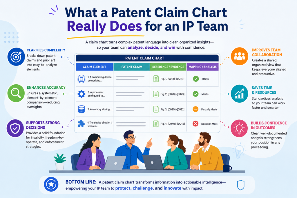
The goal is simple. You take one patent claim, break it into small parts, and then show where each part appears in the thing you are studying.
The thing may be your own product, a rival product, a draft invention, or a planned feature.
When the chart is clear, the team can make better choices. They can see if a patent claim is strong. They can spot gaps.
They can support a filing. They can prepare for talks with partners, buyers, or investors. They can also avoid making big calls based on guesswork.
Why claim charts are useful before there is a problem
Many teams wait too long to chart claims. They think claim charts are only for lawsuits or big disputes.
That is a costly way to think about them. A claim chart can help much earlier, when the team is still building, filing, testing, or shaping its patent plan.
For a startup, this is a huge advantage. When engineers and founders can see how their invention lines up with possible claim language, they can explain the invention better.
They can show what is truly new. They can also help the patent team avoid weak claims that sound broad but do not match the actual invention.
This is where strong patent work starts. It starts with clear facts, not fancy words.
A good claim chart turns vague patent talk into something the team can act on
Patent claims can feel hard to read because they are written in a very careful way. A claim chart makes them easier to use. It turns each claim part into a clear question: where is this feature shown, how does it work, and what proof supports it?
That simple shift changes the whole process. The IP team no longer has to rely on memory or long calls. The chart gives everyone a shared view. Engineers can point to technical proof.
Patent counsel can shape better claims. Business leaders can understand risk and value without getting lost.
PowerPatent was built for this kind of modern patent work. It helps founders and technical teams move from raw invention details to stronger patent output with smart software and real attorney oversight. You can see the process here: https://powerpatent.com/how-it-works.
The Basic Parts of a Claim Chart
A claim chart usually has two main sides. One side shows the patent claim. The other side shows the proof that matches each part of that claim.
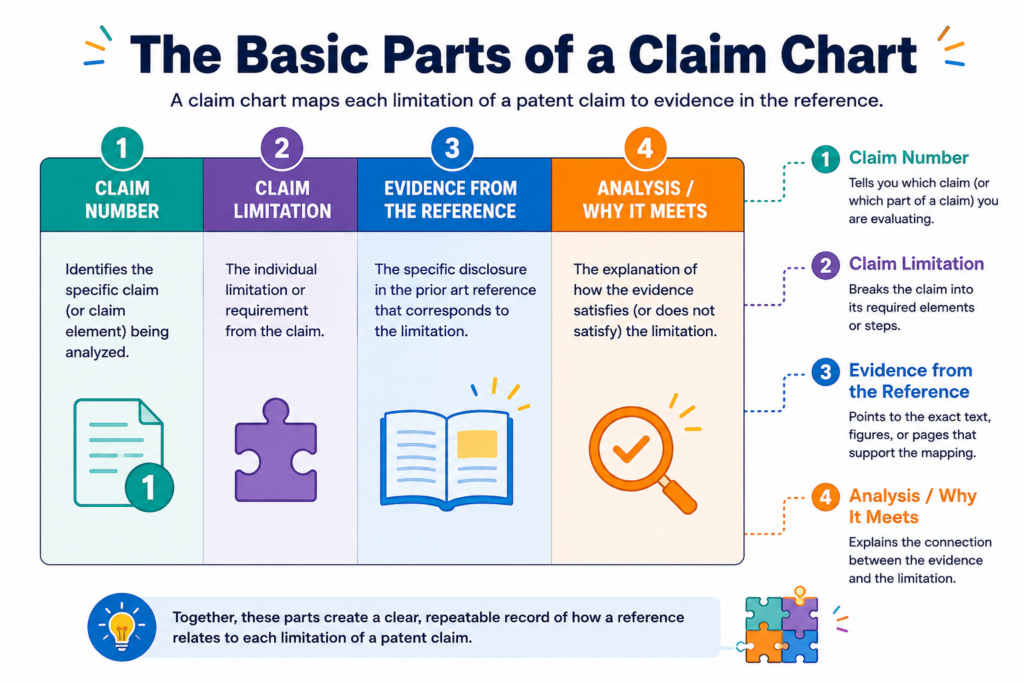
Some charts also include notes, source links, dates, screenshots, file names, product names, or attorney comments.
The exact format can change based on the use case. A chart for internal review may look different from a chart used in a dispute.
A chart for a startup filing strategy may look different from a chart used in a licensing talk. But the core idea stays the same. Each claim part must be matched with clear support.
A weak chart makes big jumps. It says a product has a feature but does not show where. A strong chart walks the reader step by step. It makes the match easy to follow.
The claim language is the starting point, not the whole story
The first column often includes the claim language. This is usually split into parts. Each part is called a limitation.
A limitation is just one required piece of the claim. If the claim says the system has a sensor, a processor, and a rule engine, each of those pieces may need its own row.
This split matters because patent claims are built piece by piece. Missing one piece can change the whole view. A product might match most of a claim but fail on one key part.
A draft claim might sound good but lack support in the invention notes. A rival product might seem close at first but not meet the full claim.
That is why careful splitting is so important. If the claim is chopped up badly, the whole chart becomes less useful.
The proof side must be clear enough for another person to trust it
The proof side should not be a vague note like “shown in product.” That does not help anyone. The proof should show where the feature appears and how it works.
It may point to a page in a manual, a screenshot, a code function, a system diagram, a demo video, a test output, or an engineering note.
Good proof does not need to be long, but it must be specific. The reader should be able to trace the point without hunting through a pile of files. When the chart says a feature is present, the support should make that clear.
For IP teams, this builds trust. It also saves time. When a founder, engineer, patent attorney, and investor all look at the same chart, they should not have to guess what the chart means.
When IP Teams Should Use Claim Charts
Claim charts are useful in more moments than most teams think. They are not only for legal fights.
They can help with patent drafting, product review, competitor study, funding prep, licensing talks, portfolio cleanup, and invention planning.
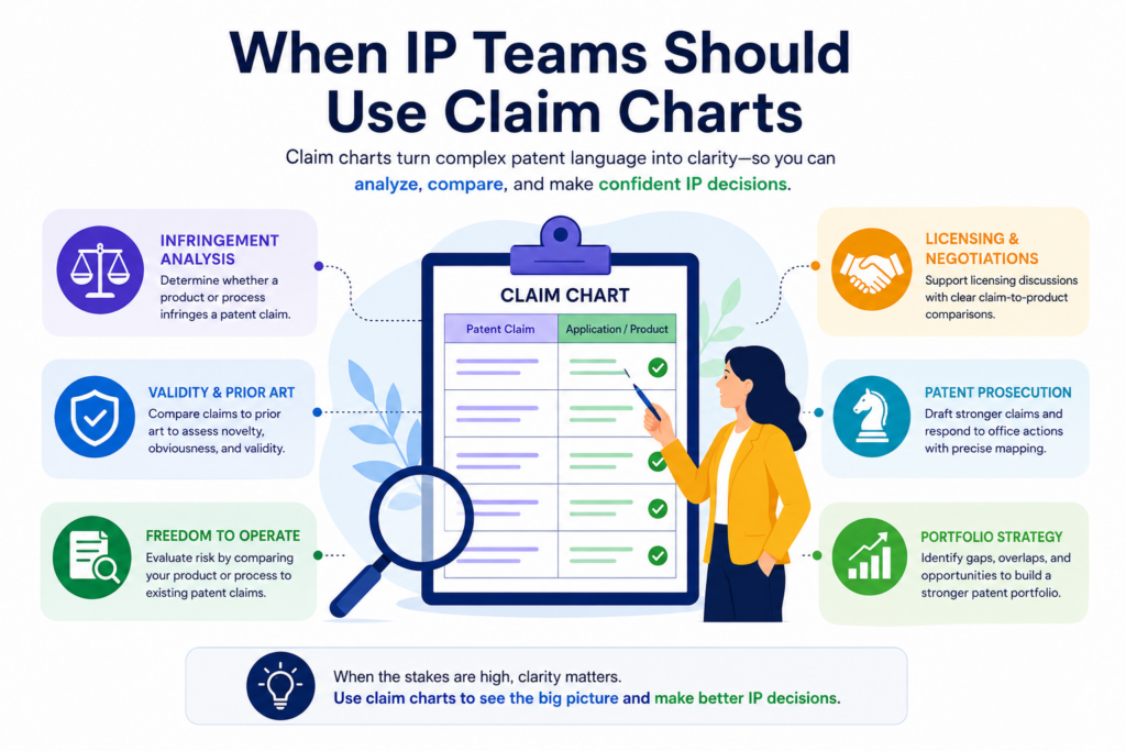
The best teams use claim charts as a way to make patent work more grounded. Instead of asking, “Do we have something patentable?” they ask, “What exact technical pieces do we have, where are they shown, and how could those pieces become strong claims?”
That is a much better question. It leads to better answers.
Claim charts help before a patent is filed
Before filing, a chart can help the team see what the invention really includes. This is very useful for deep tech teams, AI teams, robotics teams, software teams, and hardware teams.
These teams often have a lot of moving parts. The invention may be spread across code, models, test data, system flows, and design notes.
A claim chart can bring those pieces together. It can show which features are central and which are just nice extras. It can also help the team avoid filing claims that are too thin or not backed by the real work.
This is one reason PowerPatent is helpful for technical founders. The platform helps teams organize invention details in a way that makes patent work easier, faster, and less painful.
Real patent attorneys stay involved, so the final work is not just machine-made. Learn more here: https://powerpatent.com/how-it-works.
Claim charts also help after a patent is filed
After filing, claim charts can help the team understand what they own. This is important because many founders do not truly know what their patents cover. They may have a patent number, but they do not have a clear map of what the claims protect.
That can cause problems. A team may think a patent covers the main product when it only covers a narrow feature.
Or they may ignore a strong patent because no one has mapped it to the product. A claim chart can fix this. It shows what the patent actually reaches.
For IP teams, this can guide future filings. It can show where the portfolio is strong and where new filings may be needed. It can also help the business team explain the value of the patent portfolio in plain words.
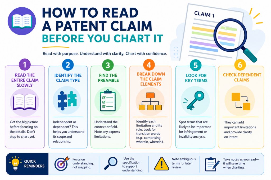
How to Read a Patent Claim Before You Chart It
Before you build a claim chart, you need to slow down and read the claim with care. This does not mean reading it like a lawyer. It means reading it like a builder who wants to know what parts must be present.
A patent claim is not a product description. It is a boundary. It defines what the patent is trying to protect.
Each word can matter. Each required part must be checked. If you rush this step, the chart may look clean but still be wrong.
A good IP team reads the claim more than once. The first read gives the big picture. The second read breaks it into parts. The third read checks how those parts work together.
Start by finding the main thing the claim is about
Every claim is directed to something. It may be a system, a method, a device, a computer-readable medium, a model pipeline, a sensor setup, or a data process. That main thing tells you what kind of proof you need.
For example, if the claim is about a method, the chart should show steps. If the claim is about a system, the chart should show parts and how they connect.
If the claim is about software, the chart may need to show logic, inputs, outputs, modules, or data flow.
This first step sounds simple, but it prevents many mistakes. Teams often chart a method claim as if it were a product claim. Or they chart a system claim without showing how the parts work together. That can make the chart weak.
Then break the claim into clean, small parts
Once you know the main thing, split the claim into pieces. Each piece should be small enough to test. The point is to make each row answerable. Does the product have this part?
Does the document show this step? Does the code perform this action? Does the model use this input?
Do not split the claim so much that it becomes hard to read. Do not keep it so broad that key details get buried. The best split is the one that helps the team make a clear match between the claim and the proof.
This is where strong process matters. When a chart is built with care, it becomes a decision tool. When it is rushed, it becomes a messy file that no one wants to open.
How to Build a Claim Chart Without Making It Painful
A good claim chart starts with a calm process. You do not need to make it fancy at the start.
You need to make it clear, clean, and useful. The job is to help the team see the match between the claim and the proof with as little confusion as possible.
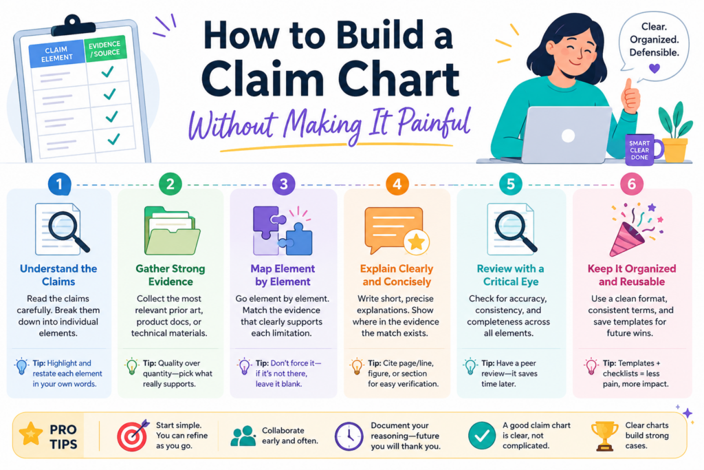
The common mistake is trying to make the chart perfect too early. That slows everyone down. A better way is to build a rough chart, test the logic, add stronger proof, and then clean it up. This gives the IP team something real to work with while the facts are still fresh.
Start with the claim and keep the proof close to the words
The claim should drive the chart. Do not start with the product and then force the claim to fit. That is how weak charts are made. Start by placing the claim language into the chart, then break it into parts that can be checked.
Once the claim is split, look for proof for each part. The proof should be close to the exact words in the claim.
If the claim says “receiving sensor data,” the proof should show where sensor data is received. If the claim says “training a model,” the proof should show training, not just model use.
This sounds strict, but it helps. Claim charts lose value when they rely on broad guesses. A chart should not say, “This is probably the same thing.” It should show the match in a way that another smart person can follow.
Use short notes that explain why the proof matters
Many teams add too much raw material to the chart. They paste long text, huge screenshots, or full code blocks without saying what matters. That creates noise. The better move is to include the key proof and add a short note that explains how it supports the claim part.
For example, if a system diagram shows a processor connected to a sensor, say that. If a code function shows a data filter, explain what the filter does. If a product page shows a feature, connect that feature back to the claim words.
This is where a chart becomes useful for both technical and legal teams. Engineers see the facts. Patent counsel sees the claim support. Business leaders see the value without needing to decode every line.
PowerPatent helps teams bring this kind of proof together without turning patent work into a long, painful task. The platform helps founders and engineers capture what they built, while real patent attorneys help shape it into stronger patent work. You can see how it works here: https://powerpatent.com/how-it-works.
The Difference Between a Strong Chart and a Weak Chart
A strong claim chart makes the reader feel grounded. They can see the claim part, the proof, and the reason the proof matters.
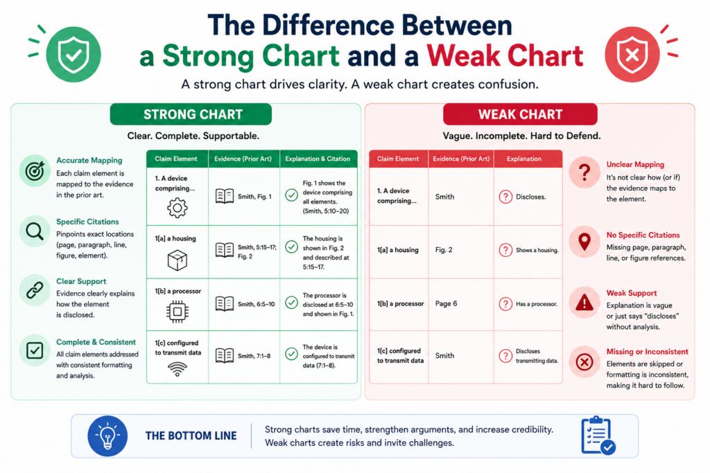
They do not have to guess. They do not have to ask five people what a row means. The chart answers the basic questions right inside the work.
A weak chart does the opposite. It may look full, but it does not prove much. It may include long quotes, unclear screenshots, or vague notes.
It may skip hard claim parts and spend too much time on easy ones. It may use terms from the claim without showing real support.
A strong chart is honest about gaps
The best claim charts do not hide weak spots. They show them clearly. This is not a bad thing. In fact, it is one of the biggest reasons to build the chart in the first place.
If a claim part has no proof, mark it as a gap. If the proof is weak, say so. If the product may perform a step but the team cannot confirm it, make that clear.
This helps the IP team decide what to do next. They may need more technical input. They may need a new test. They may need to adjust the claim. They may need to file a new patent that better fits the real product.
Trying to make every row look strong can hurt the team. It creates false confidence. It can lead to poor choices. A clear gap is better than a fake match.
A weak chart often sounds confident but says very little
Weak charts often use strong words without strong proof. They may say “clearly shown” when nothing is clear.
They may say “the product includes this feature” without showing where. They may point to a full manual but not the exact page or part. This makes the chart hard to trust.
A strong chart is more direct. It says what is known, where it is shown, and what still needs work.
That kind of honesty helps everyone move faster. It also makes the chart more useful if the team later uses it in a serious business or legal setting.
For startups, this matters because time is limited. Founders cannot waste weeks on unclear patent work. Engineers cannot stop building just to explain the same feature again and again. A well-made claim chart cuts down on repeat work and helps the team make better choices sooner.
How Claim Charts Help With Better Patent Drafting
Claim charts are not just for checking old patents. They can also help create better new ones.
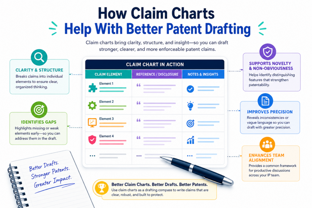
When used early, they help the team turn a raw invention into clear claim ideas. This is a big win for startups because the first patent filing often sets the tone for the whole IP plan.
A founder may know the product is special, but may not know how to explain the invention in patent terms. An engineer may know the system works in a new way, but may not know which part is most important to protect. A claim chart helps bridge that gap.
Charting forces the team to name the real invention
Many invention talks start too broad. Someone says the invention is an AI tool, a sensor platform, a workflow system, or a new automation layer.
That may be true, but it is not enough. A patent needs the deeper point. It needs to show what is new and how it works.
A claim chart helps the team find that deeper point. When you try to map claim parts to real proof, you quickly see what is solid.
You see what the team actually built. You see what is different from normal systems. You also see what parts are only ideas and what parts have real technical support.
That is useful before drafting. It helps the attorney write claims that fit the invention instead of using broad language that may not hold up later.
Strong drafting starts with clear invention evidence
The best patent applications are not built from vague notes. They are built from real invention evidence.
That may include architecture diagrams, model flows, training steps, test data, control logic, user flows, device layouts, or system outputs.
A claim chart can organize these pieces before the draft begins. It can show which details support which claim ideas. It can also help the team decide which version of the invention matters most. This is especially helpful when the product has changed many times, as startup products often do.
This is one of the reasons PowerPatent is built around both smart software and real attorney review. The software helps capture the invention in a structured way.
The attorney oversight helps make sure the patent work is thoughtful, clear, and built for the real world. To explore the process, visit https://powerpatent.com/how-it-works.
How Claim Charts Help IP Teams Work Better With Engineers
Engineers often dislike patent work because it feels far away from building. They may think it means long forms, slow calls, and strange wording.
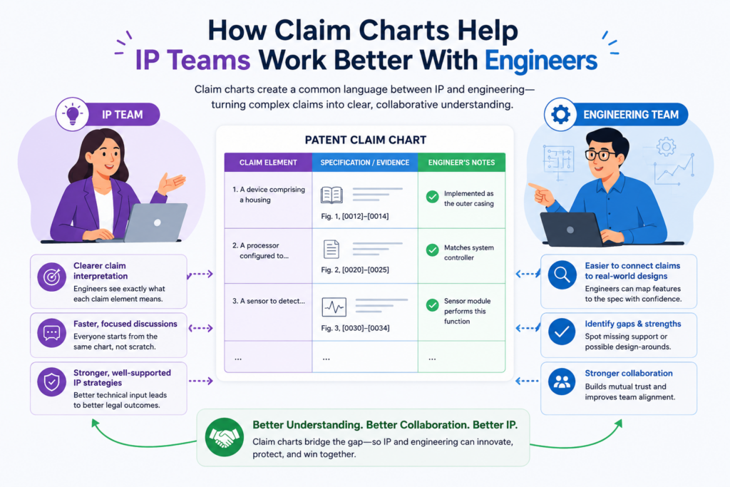
Claim charts can change that. A chart gives engineers a clear way to help without asking them to become patent experts.
Instead of asking an engineer to explain the whole invention from scratch, the IP team can ask focused questions. Where does this step happen? Which module performs this action?
What input is used here? What output is produced? Where is this shown in the code or design notes?
Good claim charts make engineer input faster and more exact
Engineers are usually happy to help when the question is clear. They are less happy when the request is broad and hard to answer.
A claim chart makes the request concrete. Each row points to one issue. The engineer can confirm, correct, or add proof.
This reduces back-and-forth. It also lowers the chance that important technical facts get lost.
The engineer does not need to read the whole patent draft. They can look at the parts that touch their work and give direct input.
For fast-moving startups, this is a big deal. The team may be shipping code, training models, testing hardware, or talking to customers at the same time the patent work is happening. A clean chart respects that pace.
Engineers can spot mistakes that others may miss
A chart may look right to a non-technical reader but still be wrong. An engineer can often spot the issue quickly. Maybe the chart says a model is trained in the product, but the product only runs a pre-trained model.
Maybe the chart says a sensor sends raw data, but the device sends filtered data. Maybe the claim says the system ranks results, but the actual system groups them.
These details matter. A small technical mismatch can change the value of a claim. That is why engineer review is so useful.
Claim charts give engineers a simple place to catch those problems before they become costly.
This also builds trust inside the company. The IP team is not working in a black box. The technical team is not being asked to bless something they do not understand. Everyone can see the same facts and improve the work together.
How Claim Charts Support Product and Portfolio Decisions
A patent portfolio should support the business. That means the IP team needs to know how patents connect to products, features, markets, and future plans. Claim charts help make those connections visible.
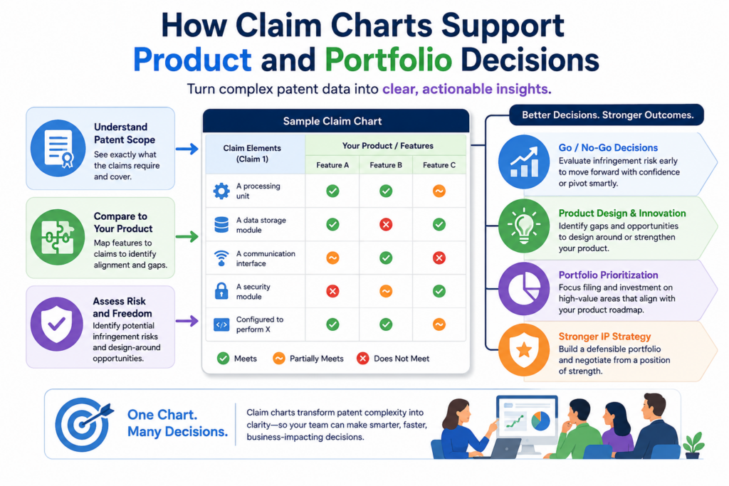
Without charts, a portfolio can become a pile of documents. The company may have patents, but not a clear view of what they protect. This can cause missed chances.
It can also create false comfort. A team may think it has strong coverage around a product when the claims only cover a small part of it.
Mapping claims to products shows where protection is real
When you chart claims against your own product, you learn what the patent actually covers. Some claims may match the core product.
Some may match older features. Some may not match anything the company sells anymore. This helps the team make smarter choices.
If a patent maps closely to a key product, it may be worth maintaining and building around.
If a patent does not map to the current business, the team may need to decide whether it still has value. If a major product has no strong patent coverage, that may signal the need for a new filing.
This kind of review is not just legal cleanup. It is business strategy. It helps the company protect what matters most.
Claim charts can reveal where new filings are needed
Startups change fast. A product that began as one tool may become a platform. A model may improve. A workflow may become more automated.
A hardware system may gain new sensors or controls. If the patent portfolio does not keep up, the company may leave important inventions exposed.
A claim chart can help spot those gaps. When the product has features that do not map to any claim, the team should pay attention.
Those features may be strong candidates for new patent filings, especially if they solve hard technical problems or create real market value.
This is where early action matters. Waiting too long can make patent work harder. Public launches, investor decks, sales pages, and customer demos can all affect timing.
PowerPatent helps founders move faster so they can protect important work before it slips through the cracks. You can learn more at https://powerpatent.com/how-it-works
How to Use Claim Charts for Competitor Review
A claim chart can help an IP team study a competitor with more care. Instead of making a broad claim like “they copied us” or “their product looks close,” the chart forces the team to slow down and check each claim part against real proof.
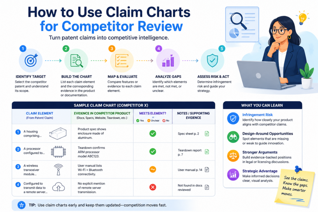
This is important because first impressions can be wrong. A competitor’s product may look similar on the surface but work in a very different way under the hood.
The opposite can also be true. A product may look different on the outside but still use the same key technical steps that your patent covers.
Claim charting helps remove the emotion from the review. It gives the team a cleaner way to ask what is present, what is missing, and what still needs more proof.
Public proof must be handled with care
When reviewing a competitor, the proof often comes from public sources. This may include product pages, help docs, white papers, demo videos, user guides, app screens, public code, API docs, job posts, technical talks, patents, or marketing pages.
The key is to keep the proof tied to the claim language. A product page may say the system “uses AI,” but that may not prove the exact model step in the claim.
A demo video may show an output, but not prove how that output was made. A white paper may explain a system design, but not show that the live product uses that same design.
This is why good IP teams do not rush. They mark what is shown clearly and what is only a fair guess. That makes the chart more useful and more honest.
A clean competitor chart helps leaders make smarter choices
A competitor claim chart should not be built to win an argument inside the company. It should be built to help the company decide what to do next. Maybe the team needs more research.
Maybe they need outside counsel to review the chart. Maybe they need to adjust their own product plan. Maybe they need to explore a license or a business talk.
The chart gives leaders a way to see the issue without reading every source document. It also helps counsel review the facts faster because the proof is already tied to the claim parts.
For startups, this matters because competitor questions can get heated fast. Founders may feel pressure from investors, customers, or the market. A claim chart brings the team back to facts. That is where strong IP decisions should start.
How to Pick the Right Patent Claims to Chart First
Not every claim needs to be charted right away. Some patents have many claims, and some portfolios have many patents. If an IP team tries to chart everything at once, the work can become slow and hard to manage.
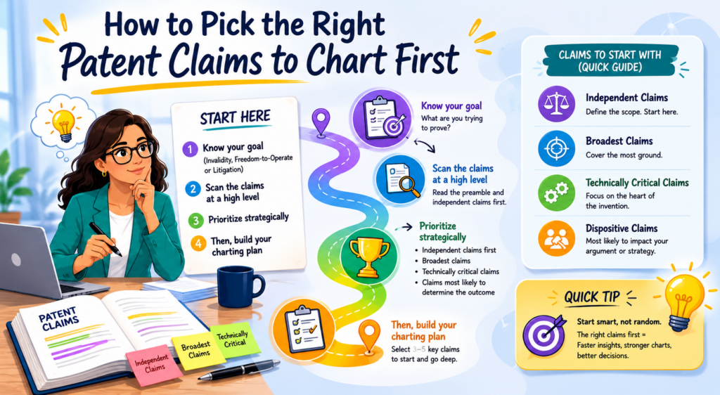
A better move is to start with the claims that matter most. This usually means the broadest independent claims, the claims tied to the main product, or the claims most likely to support a key business goal. The goal is not to do more work. The goal is to do the right work first.
The best claim charting projects are focused. They have a clear reason, a clear target, and a clear next decision.
Start with the claim that controls the big question
Before picking claims, ask what the team is trying to decide. If the team wants to know whether a patent protects the main product, start with the claim that seems closest to that product.
If the team wants to review a competitor, start with the claim that best matches the competitor’s public features. If the team wants to prepare a new filing, start with the claim idea that maps to the core invention.
This keeps the work useful. A chart should not be a filing cabinet exercise. It should help the team answer a real question.
For example, a startup may have one patent that covers an early version of its system and another filing that covers a newer model workflow.
If the current product is built around the newer workflow, the IP team should not spend all its time charting the older patent first. It should focus where the business value is strongest.
Do not ignore narrow claims if they protect a key feature
Broad claims often get the first look, but narrow claims can still matter. A narrow claim may cover a very specific feature that is central to the product. It may also be easier to map because the proof is clearer.
This is common in deep tech. The broad idea may be hard to prove from public sources, but a more specific feature may be easy to show.
For example, a robotics claim may include many system parts, while a narrower claim may focus on a control step that appears clearly in a demo or technical document.
The right claim to chart first is the one that helps the team make the next smart call. Sometimes that is the broadest claim.
Sometimes it is the cleanest claim. Sometimes it is the claim that maps to the feature customers care about most.
PowerPatent helps founders and IP teams move with this kind of focus. Instead of treating patents like slow paperwork, it helps teams capture the real invention and work with real patent attorneys in a faster, clearer way. See how it works here: https://powerpatent.com/how-it-works.
How to Gather Evidence for a Claim Chart
Evidence is the heart of a claim chart. Without evidence, the chart is just an opinion. With strong evidence, the chart becomes a useful tool that the team can trust.
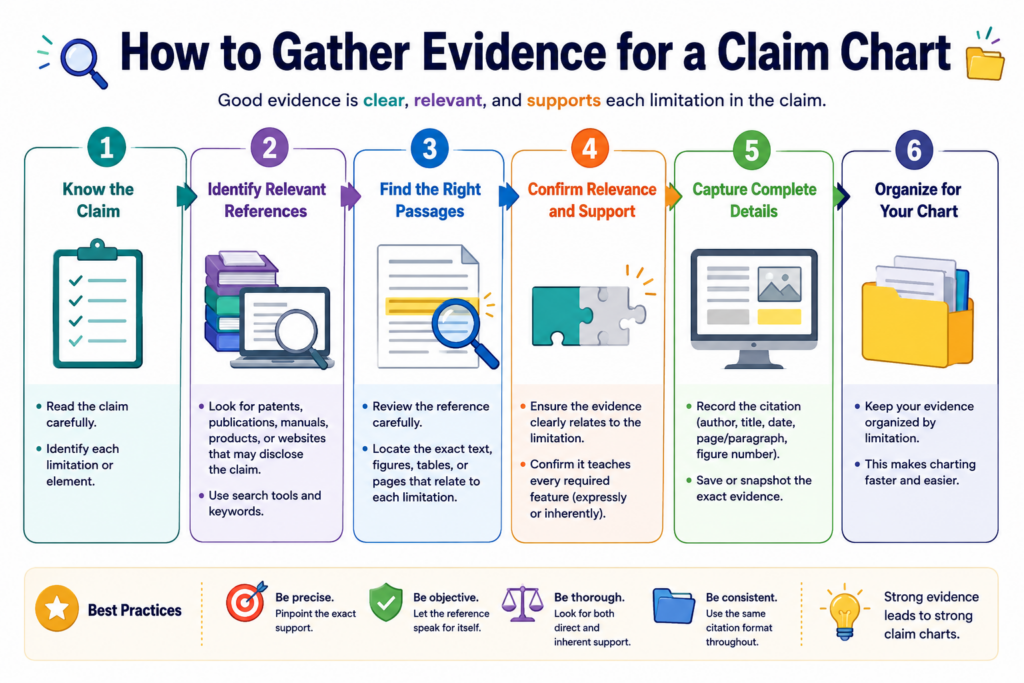
The evidence does not need to be fancy. It needs to be clear. It should show the feature, step, structure, input, output, or behavior that the claim requires. It should also be easy for another person to find and review later.
Good evidence habits save a lot of pain. They help the team avoid repeat searches. They also help counsel review the work without having to ask where every fact came from.
Keep the source path clear from the start
When you add evidence to a chart, save enough detail so the team can trace it later. If the proof came from a document, include the document name, page, section, and date if possible.
If it came from a webpage, save the page title, link, access date, and a copy or screenshot when needed. If it came from code, note the file, function, branch, commit, or version. If it came from a demo, note the timestamp and what is shown.
This may feel like extra work, but it prevents confusion later. A chart that says “shown in demo” is not very helpful six months later when no one remembers which demo it was. A chart that says exactly where the proof came from is far more useful.
Clear source tracking also helps when the product changes. Startup products move fast. Screens change. APIs change. Models change. Docs get rewritten. The chart should preserve what the team saw at the time of review.
Evidence should explain both presence and meaning
It is not enough to show that a word appears somewhere. The evidence should help explain why that source supports the claim part.
For example, a document may mention “ranking,” but the claim may require ranking based on a confidence score. The chart should show whether the evidence supports that full idea.
A code file may show a data filter, but the claim may require filtering before a model step. The chart should show the order, not just the feature.
This is where many charts fail. They collect proof but do not explain the link. A stronger chart gives the reader enough context to understand why the evidence matters.
That does not mean each row needs a long essay. It means each row should make the match clear. The reader should not be left wondering, “So what?”
How to Work With Patent Counsel During Claim Charting
Claim charting works best when the IP team and patent counsel work together early. The team brings the facts. Counsel brings claim judgment. When those two sides connect, the chart becomes much stronger.
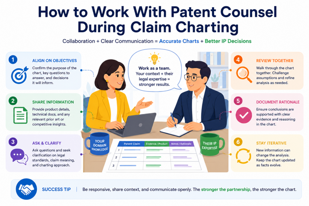
This matters because claim charting is not just a technical task. It is also a claim meaning task. The same word can carry weight in a patent.
The way a claim is read can change what evidence matters. Good counsel can help the team avoid weak matches and focus on the right proof.
At the same time, counsel needs clear technical facts. Even the best patent attorney cannot build a strong view from vague product notes. The more organized the evidence is, the faster and better the review can be.
Use counsel to test the hard rows
Not every row needs the same level of review. Some claim parts are simple. If the claim requires a display and the product has a display, that may be easy.
The hard rows are the ones where the match depends on technical detail, claim meaning, timing, data flow, or system structure.
Those rows deserve deeper review. Counsel can help decide whether the evidence is enough, whether more proof is needed, or whether the claim should be read in a different way.
This is especially important when drafting new patents. A founder may describe a feature one way, while the attorney may see a stronger way to claim it.
The chart can act as a bridge. It shows the technical proof and helps counsel shape better claim language around it.
Clear charts make attorney time more valuable
Attorney time is expensive and important. A messy chart wastes that time. A clean chart helps counsel focus on judgment, not cleanup.
When the chart is organized, counsel can quickly see what is known, what is missing, and what needs review.
This helps the team move faster and avoid long, scattered email threads. It also helps reduce the chance that a key technical fact gets buried.
PowerPatent is built around this idea. Founders should not have to choose between speed and quality.
PowerPatent combines smart software with real patent attorney oversight, so teams can move faster while still getting human legal review where it matters. You can explore the process here: https://powerpatent.com/how-it-works.
Common Claim Charting Mistakes That Slow Teams Down
Most claim charting problems come from rushing, guessing, or adding too much noise. The chart may look busy, but it does not help the team make a better decision. That is the danger. A full chart is not always a strong chart.
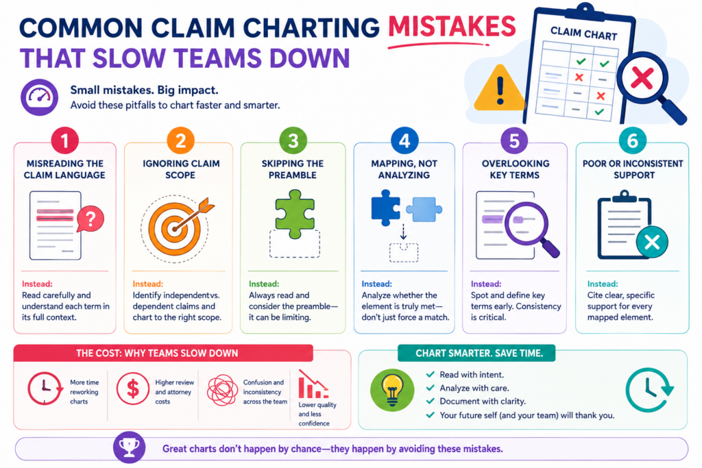
A good chart is simple to follow. It shows the claim part, the evidence, and the reason the evidence matters. If a row does not do that, it should be improved.
The best IP teams treat claim charts as living work tools. They clean them as they learn. They do not let unclear rows sit forever. They do not hide gaps. They do not confuse volume with quality.
One big mistake is charting the product instead of the claim
This happens often. The team gets excited about the product and starts listing features. The problem is that the claim chart is not a product brochure. It is a claim-by-claim match.
If the claim requires five parts, the chart must address those five parts. A great product feature does not matter unless it connects to the claim language. A chart that talks around the claim will not help much when the team needs a real answer.
This is why the claim should stay visible at all times. Every row should tie back to the claim words. Every proof point should answer the claim part in front of it.
Another mistake is treating guesses like facts
Sometimes the team believes a feature is present but cannot prove it yet. That is fine, as long as the chart says so. The problem begins when guesses are written like facts.
For example, a competitor may likely use a certain model process, but public materials may not show it. A product may probably store data in a certain way, but the chart may not include proof.
A system may seem to perform steps in a certain order, but the available evidence may not show that order.
A strong chart separates what is known from what is assumed. That makes the chart more useful, not less. It helps the team decide what research, testing, or review should happen next.
How to Keep Claim Charts Clean as Products Change
A claim chart is only useful if it stays close to the truth. That can be hard inside a fast company. Products change. Code changes. Features get renamed.
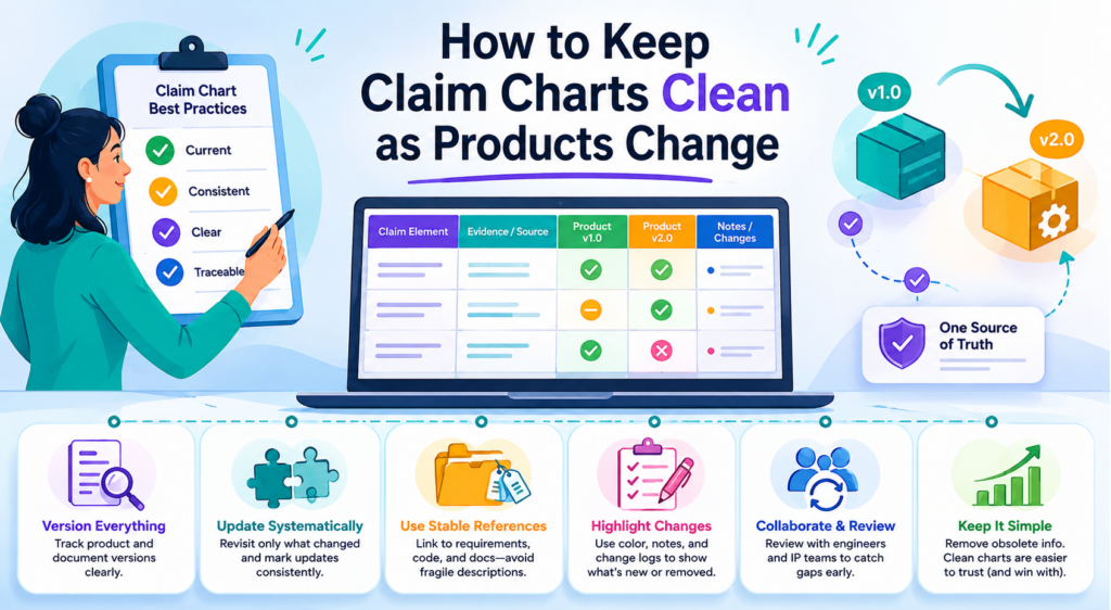
A model that worked one way in March may work a different way in June. A hardware design may move from one sensor layout to another. A user flow may be rebuilt after customer feedback.
This is why IP teams should treat claim charts as working files, not frozen documents.
A chart should show what was reviewed, when it was reviewed, and which version of the product or source was used. Without that context, the chart can become stale fast.
A stale chart can create bad confidence. The team may think a claim still maps to the product when the product has moved away from it. Or the team may miss a new feature that deserves a new filing because no one updated the chart after a major release.
Version control makes the chart much easier to trust
Every chart should make it clear which product version, document version, code version, or public source was reviewed.
This does not need to be hard. The team can note the release name, date, file path, branch, commit, page date, or source capture date.
This small habit saves a lot of trouble. When someone reviews the chart later, they can see the exact context. They do not have to guess whether the proof came from the current product or an old build.
For startups, this is especially important because product speed is part of the game. The IP process should not slow the team down, but it should keep up with what the team is building.
When claim charts are tied to versions, the IP team can move with the product instead of chasing it from behind.
A chart should be updated when the product crosses a real line
Not every small product change needs a full claim chart update. That would be too much work. The better move is to update the chart when the product crosses a real line.
That may happen when the team adds a core feature, changes the system flow, launches a new product tier, updates a model pipeline, changes a device structure, or moves from prototype to customer use.
These moments matter because they can change patent coverage. A new technical path may create new invention value.
A changed workflow may no longer match an older claim. A new architecture may need fresh protection.
This is where PowerPatent can help founders stay ahead. The platform helps teams capture invention details while they are still fresh, then brings in real patent attorney oversight so important work does not get lost in the rush. To see how that works, visit https://powerpatent.com/how-it-works.
How Claim Charts Help During Fundraising, Diligence, and Deals
Claim charts can be very useful when a company is raising money, selling the business, entering a partnership, or preparing for diligence.
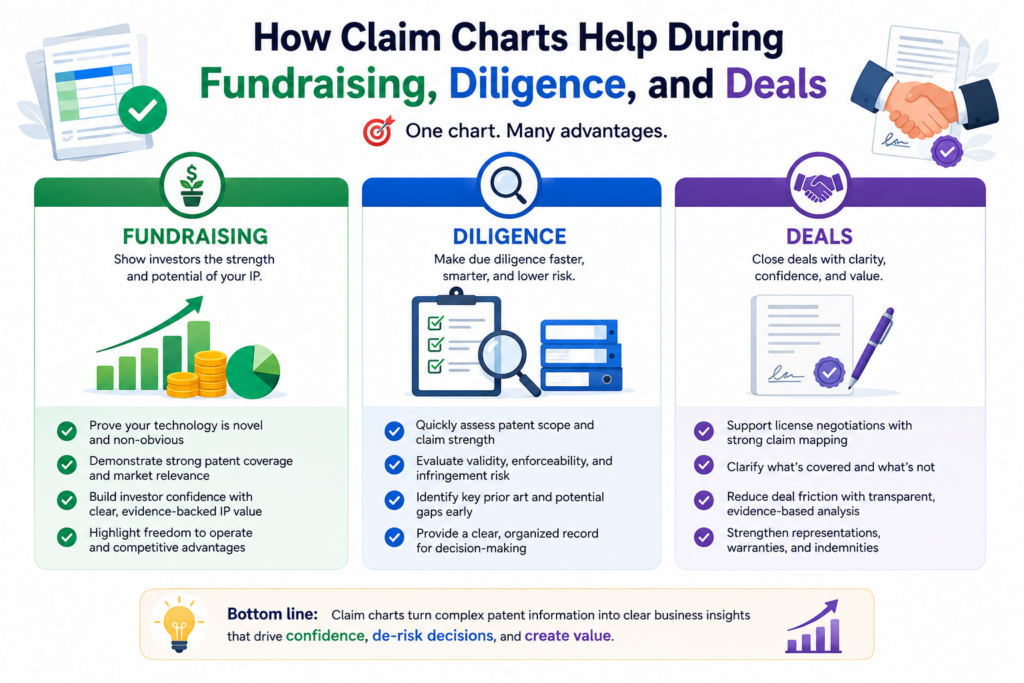
In these moments, people want to know what the company owns and how that ownership connects to the product.
A patent list alone does not answer that. A list may show patent numbers, titles, dates, and status.
But it does not show whether the claims cover the key product, the core technical edge, or the roadmap. A claim chart can make that link much clearer.
Investors and buyers do not always need every detail. But they do need confidence. A clean claim chart helps tell a stronger story because it connects the patent rights to the business in a simple, evidence-backed way.
A clear chart can make the patent story easier to understand
Many founders struggle to explain their patents. They may say, “We have three patents pending,” but that does not say much.
The better story is more specific. The founder can explain which product features are covered, which technical steps are protected, and how the filings support the company’s moat.
A claim chart gives the team the facts behind that story. It helps the founder avoid overclaiming. It also helps avoid underselling the portfolio.
Sometimes a company has stronger IP than it realizes, but no one has mapped the claims to the product in a clear way.
This can matter during diligence. A buyer or investor may ask how the patents relate to the current product. A team with clean charts can answer with calm confidence. A team without charts may need to scramble.
Better patent proof can support a stronger business case
A good claim chart does not replace business strategy, but it can support it. It can show that the patent portfolio is not random.
It can show that the filings were built around real technical work. It can show that the company took protection seriously from the start.
This is especially helpful for deep tech startups. These companies often spend years building hard things before the market fully sees the value. Strong claim charts can help explain why the technology is hard to copy and why the patent work matters.
PowerPatent helps founders build this kind of clarity earlier. Instead of waiting until diligence to organize the invention story, teams can capture key details as they build, then work with patent attorneys to protect them with more care. Learn more here: https://powerpatent.com/how-it-works.
How to Make Claim Charts Easier for Non-Legal Teams to Read
A claim chart should not feel like a wall of legal text. If only one person can understand it, the chart is not doing enough work for the team.
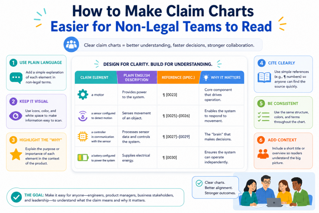
A good chart should help attorneys, engineers, founders, product leaders, and business teams see the same facts.
That does not mean the chart should be watered down. It means the chart should be written with care.
The claim language can stay exact, but the notes around it should be plain and useful. The chart should explain what the proof shows and why it matters.
Simple writing is not a weakness. It is a strength. It helps the team move faster and avoid mistakes.
Plain notes make the chart more useful
The notes in a claim chart should use normal words whenever possible. If the claim uses a hard phrase, the note can explain the idea in simple terms.
If the proof is technical, the note can point to the key part without making the reader decode everything alone.
For example, if a claim part is about “generating an output based on a trained model,” the note can explain what the model receives, what it produces, and where the proof shows that step. The reader should not have to guess.
This matters because different people use the chart for different reasons. An attorney may look for claim support.
An engineer may check technical truth. A founder may look for product fit. A business leader may look for value. Plain notes help all of them.
The best charts reduce meetings, not create more of them
A confusing claim chart creates more meetings. People ask what a row means. They ask where the proof came from.
They ask whether a claim part is really covered. They ask the same questions again because the chart did not answer them the first time.
A clear chart does the opposite. It reduces repeat work. It gives people enough context to review, comment, and decide. When a meeting is needed, the discussion is sharper because everyone starts from the same facts.
This is a practical reason to care about readability. A claim chart is not just a legal support file. It is a team tool. The easier it is to read, the more value it creates.
How AI Can Help With Claim Charting Without Taking Over Judgment
AI can make claim charting faster, but it should not replace human judgment. That is the key.
Claim charting involves technical facts, claim meaning, source review, and business context. AI can help organize and speed up parts of the work, but people still need to check the results.

This is especially true for startups. Speed matters, but so does trust. A fast chart that is wrong can create more harm than a slow chart that is right.
The best use of AI is to reduce manual work while keeping expert review in the loop.
AI can help find possible matches, summarize technical material, compare text, organize evidence, and flag gaps. But a patent attorney and the technical team should still review the important calls.
AI is best used as a helper for first drafts and evidence sorting
Claim charting often includes a lot of searching, reading, copying, and organizing.
AI can help with that. It can scan documents, pull out likely support, group related proof, and draft early notes. This can save time, especially when the team has many documents or complex technical files.
But early output is not final output. The team must verify the source. The team must check whether the evidence really supports the full claim part.
The team must make sure the chart does not turn a guess into a fact.
This is where a human review layer matters. Engineers can confirm how the product works. Patent counsel can review claim meaning. Business leaders can decide which questions matter most.
The right workflow combines speed, structure, and attorney oversight
The strongest modern patent workflow does not treat software and attorneys as enemies. It uses both. Software helps move faster and capture more detail. Attorneys help turn that detail into careful patent work.
That mix is powerful because it gives founders speed without leaving them alone with a high-stakes process.
PowerPatent was built around that idea. It gives founders and technical teams a smarter way to handle patent work, while real patent attorneys stay involved where judgment matters.
That helps teams avoid costly mistakes, protect key inventions sooner, and keep building with more confidence.
For IP teams that want claim charting to feel less painful, this is the path forward. Do not rely on messy spreadsheets alone.
Do not rely on AI alone. Build a workflow that keeps facts clear, uses automation where it helps, and brings in expert review when the stakes are high.
You can see how PowerPatent helps teams do this at https://powerpatent.com/how-it-works.
How to Review a Claim Chart Before Anyone Relies on It
A claim chart should not be treated as ready just because every row has text in it. A filled chart can still be weak.
Before the team uses it for a filing plan, product review, investor talk, licensing review, or competitor study, someone needs to test it with fresh eyes.
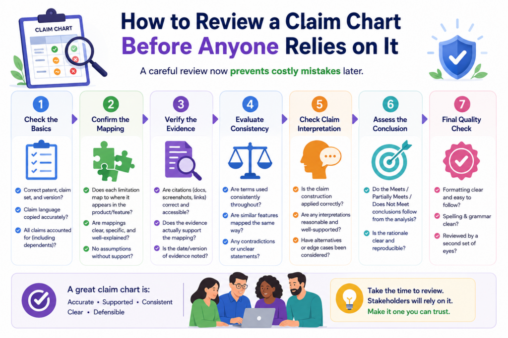
The review should be simple but strict. Each row should answer three questions. What does the claim require? What proof supports it? Why does that proof matter? If the row does not answer those questions clearly, it needs more work.
This review step is where many teams find the real value. They may discover that a key claim part has weak support.
They may see that the evidence is good but poorly explained. They may find that the claim language does not match the product as well as they thought.
A good review checks both the facts and the story
A claim chart has two jobs. It must be factually careful, and it must tell a clear story. The facts are the proof. The story is how those facts connect to the claim.
If the proof is strong but the explanation is unclear, the chart will slow people down. If the explanation sounds good but the proof is thin, the chart may create false confidence.
The best charts have both. They show real support and explain it in a way that a smart reader can follow.
This is why review should include both technical and patent input. Engineers can check whether the chart describes the product correctly.
Patent counsel can check whether the evidence fits the claim language. Business leaders can check whether the chart answers the question the team actually cares about.
The final review should remove noise, not just add more detail
When teams review a chart, they often add more and more material. That can help in some cases, but it can also make the chart harder to use. A better review does not only add detail. It removes noise.
If a screenshot does not support the claim part, remove it. If a long quote only has one useful sentence, keep the useful part and explain it.
If a note repeats what the evidence already says, tighten it. If a row includes three different ideas, split it or rewrite it.
A clean chart is not thin. It is focused. Every part has a job. That is what makes it easy to trust.
PowerPatent helps teams bring this kind of clarity into the patent process early. Instead of waiting until the work becomes messy, founders can capture invention details, organize support, and work with real patent attorneys in a more guided way. See how it works here: https://powerpatent.com/how-it-works.
How to Turn Claim Chart Findings Into Smart Next Steps
A claim chart is not the finish line. It is a decision tool. Once the team sees the match between claims and proof, the next question is simple. What should we do now?
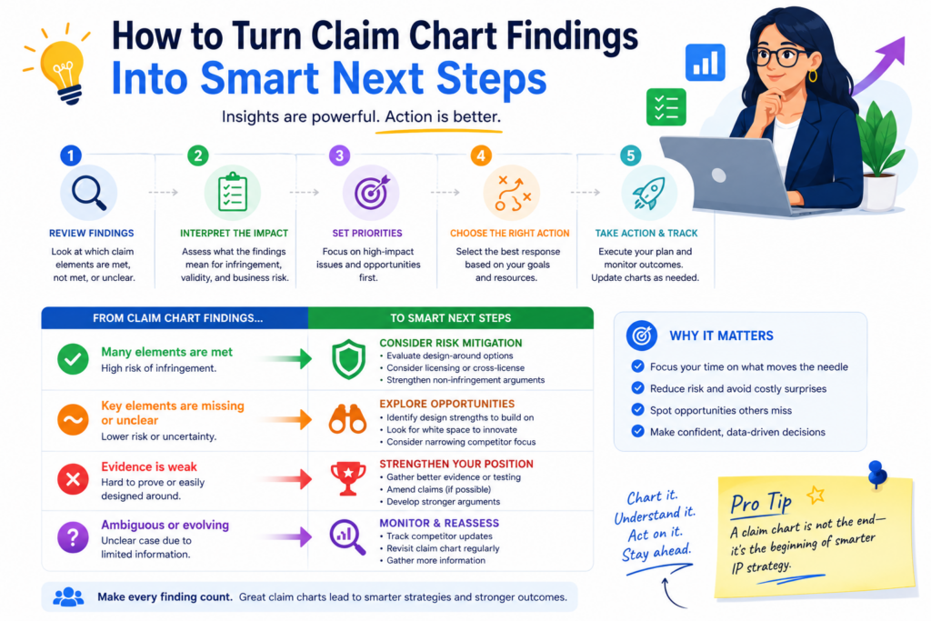
The answer depends on what the chart shows. A strong chart may support a filing strategy, a portfolio story, a product coverage review, or a business discussion.
A weak chart may show that more evidence is needed, a claim needs to be changed, or a new filing should be considered.
The value of the chart comes from action. If the team builds a chart and then lets it sit in a folder, the work is wasted.
Strong matches should be used to support real business goals
When a chart shows strong claim coverage, the team should use that insight. It may help explain the patent portfolio to leadership.
It may help guide future filings. It may help the company prepare for diligence. It may help the team decide which patents are most important to maintain.
For a startup, this can sharpen the IP story. Instead of saying, “We have patents,” the team can say, in plain terms, what those patents protect.
They can point to the features, systems, or methods that matter most to the company.
That kind of clarity is useful in founder updates, board talks, investor meetings, and buyer reviews. It also helps the product team understand where the company has stronger protection and where more work may be needed.
Weak matches are not failures because they show where to improve
A gap in a claim chart is not always bad news. Sometimes it is exactly what the team needed to see. A gap can show that the product has moved beyond an old filing.
It can show that a new feature deserves patent attention. It can show that the team needs better documentation. It can also show that a claim should not be relied on for a certain use.
This is why IP teams should not hide weak rows. Weak rows are signals. They help the company avoid poor decisions. They also help the team focus future work where it matters.
If the chart shows that a key product feature is not covered by current claims, the team should not panic. It should act.
The next move may be to gather more invention details, talk to engineers, review public disclosure timing, and work with patent counsel on whether a new filing makes sense.
PowerPatent is built for teams that want to act quickly without losing quality. It helps founders protect important inventions with a process that is faster, clearer, and still backed by real patent attorney review. You can explore it here: https://powerpatent.com/how-it-works.
Conclusion
Patent claim charting gives IP teams a clear way to turn patent words into real business action. It shows what each claim covers, where the proof lives, and what gaps need attention before they become expensive problems. For founders, engineers, and patent teams, this means less guessing, faster decisions, and stronger protection around the technology that matters most.
The best charts are simple, honest, and built on real evidence. With PowerPatent, startups can capture inventions, organize key details, and work with real patent attorneys without slowing down. Learn how it works at https://powerpatent.com/how-it-works and move with confidence right now today.
Leave a Reply